
Aug 26, 2026
Community Energy Impact Assessment Frameworks
Sustainability Strategy
In This Article
Build lean community energy assessment frameworks: baseline before launch, track five domains, assign data owners, and publish clear scorecards.
Community Energy Impact Assessment Frameworks
If you can’t show who saved money, who had a voice, and what changed over time, your energy project is only half measured.
I see one clear takeaway from this guide: a sound community energy assessment framework should do five things at once - set the unit of impact, track five domains, build baseline data before launch, assign a data source and owner to each metric, and turn results into scorecards for residents, staff, and funders. In plain terms, it should connect project output like kWh with resident results like lower annual utility bills in $, lower energy burden, local jobs, trust in the process, and system reliability.
If I had to boil the full article down fast, it says to:
Separate activity from change
Outputs = what the project delivered
Outcomes = what changed for households or the community
Impact = change linked to the project, compared with what likely would have happened without it
Pick a clear level of measurement
Project level
Household level
Community level
Portfolio level
Track more than power production
Climate-related results
Household cost savings
Social conditions like energy burden and indoor comfort
Community voice in decisions
System uptime and reliability
Start with baseline numbers before installation
Pre-project kWh use
Annual and monthly energy costs in USD ($)
Household income where energy burden is being measured
A comparison group when possible
Use data sources teams already have
Utility bills
Smart meters
Inverter and production monitoring data
Project financial records
U.S. Census data
Surveys, interviews, and focus groups
Match reporting to the audience
Residents need plain-language updates
Staff need dashboards
Funders need outcome and attribution reports
A few points matter most to me. First, a baseline done before launch is non-negotiable. Second, a short core metric set works better than a long list nobody can maintain. Third, portfolio growth only works when every site uses the same definitions, timing, and methods. Last, scorecards help only when the weighting is plain and tradeoffs stay visible.
What the framework must do | What that looks like |
|---|---|
Define impact clearly | Separate outputs, outcomes, and impact |
Measure resident results | Bill savings, energy burden, comfort, jobs, representation |
Support scale | Common metrics across pilots, multi-site programs, and portfolios |
Keep data usable | Assign source, owner, method, and reporting schedule |
Support decisions | Convert raw data into project and portfolio scorecards |
Bottom line: I’d use this article as a guide for building a lean, repeatable system that shows whether a community energy project changed residents’ lives - not just whether equipment produced power.
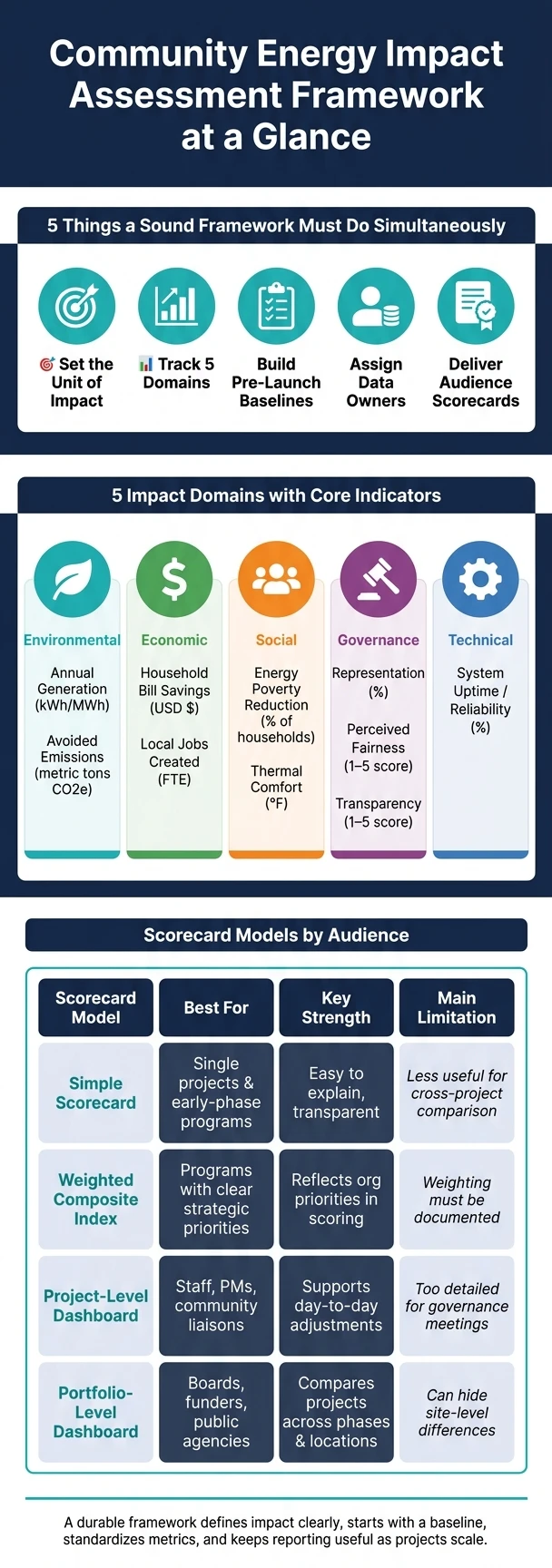
Community Energy Impact Assessment: 5 Domains, Key Indicators & Scorecard Models
Choose Indicators That Reflect Real Community Outcomes
Indicators should show one thing clearly: did residents benefit or not? Start by mapping the theory of change, then pick only the indicators that prove each link in that chain. Once the logic is in place, choose measures that can be baselined at the start and tracked the same way over time.
Select Indicators Across Five Impact Domains
A solid framework looks across five domains. Environmental indicators track the project’s climate resilience and impact. Economic indicators show whether residents are better off in dollar terms. Social indicators connect energy upgrades to health and day-to-day living. Governance indicators show whether the community has an actual voice in decisions. Technical indicators confirm that the system is doing the job it was meant to do.
Keep the list tight. If a team can’t track an indicator on a steady basis, it probably doesn’t belong in the core set.
Balance Quantitative and Qualitative Measures
Numbers matter, but they don’t tell the whole story. A project may show strong bill savings in USD ($) while residents still feel the process was unfair or that their input was brushed aside. That gap matters.
Measures like perceived fairness, scored through a simple 1–5 survey, and transparency, drawn from interviews, help surface issues that billing or performance data won’t show. Use the theory of change as a filter so every indicator connects back to a resident outcome and a decision the project team can act on.
Indicator Reference Table
Domain | Core Indicator | Unit | Type | Why It Matters |
|---|---|---|---|---|
Environmental | Annual Generation | kWh or MWh | Quantitative | Shows actual clean energy produced. |
Environmental | Avoided Emissions | Metric tons CO2e | Quantitative | Shows climate impact. |
Economic | Household Bill Savings | USD ($) | Quantitative | Measures direct financial relief for residents. |
Economic | Local Jobs Created | Full-time equivalent jobs | Quantitative | Shows local economic development impact. |
Social | Energy Poverty Reduction | % of households | Quantitative | Shows whether energy burden is falling. |
Social | Thermal Comfort | Indoor temperature (°F) | Mixed | Links energy upgrades to health and well-being. |
Governance | Representation | % | Quantitative | Shows whether leadership reflects the community. |
Governance | Perceived Fairness | Survey score (1–5) | Qualitative | Captures community trust and project legitimacy. |
Governance | Transparency | Interview-coded transparency score (1–5) | Qualitative | Builds long-term trust in the program. |
Technical | System Uptime / Reliability | % | Quantitative | Measures uptime and outage frequency. |
Next, turn these indicators into baselines and data collection methods that can be repeated over time.
Build Baselines and Data Collection Methods That Hold Up Over Time
A measurement framework lives or dies on its starting point. If you don’t lock in a sound baseline before the work starts, you can’t show what the project actually changed.
Design Strong Baselines Before Implementation
Begin with the project logic. That step helps you decide which variables belong in the baseline and which ones don’t. The baseline should reflect what would have happened without the project - the counterfactual, or what would have happened without the project's intervention.
Capture baseline measures first. That includes average monthly kWh consumption and annual household energy costs in U.S. dollars ($) before implementation. When possible, add a relative baseline with a comparison group, such as non-participating households in a similar neighborhood. Collect all of this before equipment installation or program launch. Those early numbers become the reference point for every later comparison.
Use Reliable U.S. Data Sources
Community-led teams don’t need to invent a data system from the ground up. In many cases, the best sources are already there - you just need to use them well.
Utility bills and smart meter exports can anchor energy and cost baselines. Production monitoring systems, inverter data, and NREL tools such as REopt or PVWatts can track system output. Project financial records and PPA invoices support cost and savings calculations. For demographic and equity data, the U.S. Census Bureau is a solid secondary source. If cost or revenue data are restricted, use public benchmarks or utility-level aggregates.
The next move is simple but easy to skip: assign each indicator a source, method, owner, and schedule.
Map Indicators to Methods, Owners, and Timing
The table below shows how core indicators connect to day-to-day collection methods and clear ownership. Each indicator needs someone responsible for it, a set collection method, and a regular reporting rhythm. Without that setup, data work tends to drift, especially when projects spread across multiple sites.
Indicator | Preferred Data Source | Collection Method | Owner | Frequency |
|---|---|---|---|---|
Energy Consumption | Utility bills / Smart meters | Automated export / Manual audit | Data Manager / Utility | Monthly |
Household Energy Costs | Project financial records / Utility bills | Bill auditing / Ledger review | Project Accountant | Quarterly |
GHG Emissions | Production monitoring systems | Calculation via emission factors | Technical Lead | Annually |
System Uptime / Reliability | On-site sensors / Inverter data | Remote monitoring | Project Engineer | Real-time |
Perceived Fairness | Surveys / Focus groups | Digital surveys / Interviews | Community Liaison | Annually |
Energy Burden | Utility bills / Household income data | Bill auditing / Income screening | Outreach Team | Annually |
Participant Demographics | Attendance logs / Participation records | Demographic mapping / Digital polls | Outreach Team | Per event / Quarterly |
For indicators that need to scale, automated collection should be the default. Smart meters, smart inverters, and remote monitoring are usually the best fit for energy, cost, and reliability data. Perceived fairness and energy burden need a different approach, with annual surveys and periodic focus groups. That mix gives teams steady inputs for project scorecards and portfolio reviews.
Turn Results Into Scorecards for Projects and Portfolios
Once you’re tracking indicators the same way across projects, the next step is to turn that data into scorecards people can read at a glance. In most governance meetings, raw tables slow things down. A scorecard changes measurement from a reporting exercise into something leaders can actually use.
Design Practical Scorecards
Start by putting indicators on a common scale. Then group them by domain, and use per-household or per-kW metrics when you’re comparing projects of different sizes. That keeps a large site from looking better just because it’s large. It also makes it easier to compare locations while still leaving room for local context.
Build Composite Indices Without Masking Tradeoffs
Composite scores can help, but only if people can see how they were built. Keep outputs, outcomes, and impact separate. Add a composite score only when the weighting is spelled out for public review.
During implementation, lean on process and output indicators to track progress. For long-term impact, use verified bill savings and other sustained changes. That split matters. Otherwise, short-term activity can get confused with lasting results.
Be plain about the weighting. Readers should be able to tell how much each domain shapes the final score and where the tradeoffs sit.
Scorecard Model Comparison
The best format depends on who’s reading it. Early projects often need simple scorecards. Operations teams usually need dashboards. Governance groups tend to need portfolio views. In scaled programs, you’ll usually need both project-level detail and portfolio-level comparison.
Scorecard Model | Best For | Key Strength | Main Limitation |
|---|---|---|---|
Simple Scorecard | Single projects and early-phase programs | Easy to explain and transparent | Less useful for cross-project comparison |
Weighted Composite Index | Programs with clear strategic priorities | Reflects organizational priorities in scoring | Weighting choices must be documented to avoid hidden tradeoffs |
Project-Level Dashboard | Staff, project managers, and community liaisons | Supports day-to-day adjustments | Too detailed for broad governance meetings |
Portfolio-Level Dashboard | Boards, funders, and public agencies | Compares projects across phases, locations, and technologies | Can hide site-level differences |
Use one format for each audience. Keep the underlying data the same across every view so decisions stay tied to one framework, not several competing ones. From there, you can use each format to shape the right report and review cycle for the people in the room.
Report, Govern, and Improve the Framework as Projects Scale
Reporting should do more than display scorecard data. It should help people make decisions. As projects move from a pilot to a full portfolio, the framework needs to stay clear, comparable, and useful for each group involved.
Match Reporting Formats to Each Audience
Residents and community members need plain-language summaries that show what happened and whether promised benefits were delivered. Project teams need dashboard updates tied to operational milestones, with data collection scheduled to catch meaningful change without putting too much strain on staff or participants. Funders and foundations need technical reports that spell out the theory of change, outcome evidence, and attribution analysis [2].
The core metrics should stay the same, but the format should shift to fit the reader: plain-language summaries for residents, dashboards for operators, and technical reports for funders.
Reporting Level | Primary Focus | Key Metrics |
|---|---|---|
Pilot Phase | Implementation & learning | Process indicators, implementation quality, fast feedback |
Portfolio Phase | Outcomes & impact | Avoided emissions, cumulative bill savings, local jobs |
Systemic Phase | Sector alignment | Shared metrics across organizations, contribution to regional/national goals |
Reporting only earns trust when the people affected by it have a chance to review it and shape changes.
Use Governance Structures to Review and Revise Results
As projects grow, governance needs to move from internal review to shared oversight. Resident panels, community advisory groups, or independent administrators can review results and help keep decisions open and visible.
Regular reviews help keep the framework tied to project goals. In some cases, a public reporting registry can also support third-party reporting and public recognition [1].
Conclusion: Key Elements of a Durable Framework
A durable framework defines impact clearly, starts with a baseline, standardizes core metrics across sites, and keeps reporting useful as projects scale.
FAQs
How many metrics should we track?
Don’t track so many metrics that reporting turns into a chore. Stick to a core set of indicators that gives you useful insight and is realistic to maintain.
Council Fire recommends a lean set matched to your community energy project. Put the focus on indicators you can measure the same way year after year. Split core metrics from optional ones, then review the list each year and cut anything that’s too burdensome or not doing the job.
What if we do not have baseline data yet?
If you don’t have baseline data, resist the urge to rush into a formal impact assessment. With brand-new interventions, early measurement can point you in the wrong direction. At that stage, the smarter move is to focus on program stability and implementation quality, then improve through rapid iteration.
Start with a clear theory of change. That gives you a simple map of how the work is supposed to lead to results. If primary data isn’t available, use tools like SLOPE, SAM, or REopt Lite to build estimates. And if your team is stretched thin, put your attention on intermediate outcomes rather than trying to prove long-term impact too soon.
How do we compare projects of different sizes?
Compare projects with standardized performance metrics, not raw totals. That shift matters. Absolute numbers can make a large project look stronger simply because it’s larger, not because it performs better.
Focus on measures such as:
energy yield per megawatt
percentage of installed capacity
return on investment
cost-to-energy-savings ratios
These metrics give you a cleaner side-by-side view of performance across projects of different sizes.
It also helps to use a consistent impact taxonomy with a shared set of core indicators for every project. Then, when needed, add project-specific indicators for a closer look. Think of it as using the same scorecard for everyone, with a few extra fields when a project has special goals or constraints. That approach makes cross-project comparisons more meaningful, even when the projects operate at very different scales.
Related Blog Posts
Latest Articles
©2026

Narrative Change and Power Building: The Missing Half of Advocacy
Narrative change is the process of disrupting dominant narratives that normalize inequity and advancing new narratives from historically marginalized communities.

Funding Resilience Without Federal Grants
BRIC is unreliable and FEMA is shrinking. Here's how cities fund climate resilience with dedicated revenue, blended finance, and a coordinating authority.

The ESG Blind Spot: How AI Is Finding Risks in Companies Nobody Else Is Watching
Norway's sovereign wealth fund uses AI to screen 7,200 portfolio companies for forced labor and corruption within 24 hours. The real story is the emerging-market coverage gap that traditional ESG data vendors miss — and what it means for any company with a global supply chain.
Narrative Change and Power Building: The Missing Half of Advocacy
Narrative change is the process of disrupting dominant narratives that normalize inequity and advancing new narratives from historically marginalized communities.
Funding Resilience Without Federal Grants
BRIC is unreliable and FEMA is shrinking. Here's how cities fund climate resilience with dedicated revenue, blended finance, and a coordinating authority.
The ESG Blind Spot: How AI Is Finding Risks in Companies Nobody Else Is Watching
Norway's sovereign wealth fund uses AI to screen 7,200 portfolio companies for forced labor and corruption within 24 hours. The real story is the emerging-market coverage gap that traditional ESG data vendors miss — and what it means for any company with a global supply chain.
FAQ
01
What does it really mean to “redefine profit”?
02
What makes Council Fire different?
03
Who does Council Fire work with?
04
What does working with Council Fire actually look like?
05
How does Council Fire help organizations turn big goals into action?
06
How does Council Fire define and measure success?
07
How does technology fit into Council Fire’s work?
Aug 26, 2026
Community Energy Impact Assessment Frameworks
Sustainability Strategy
In This Article
Build lean community energy assessment frameworks: baseline before launch, track five domains, assign data owners, and publish clear scorecards.
Community Energy Impact Assessment Frameworks
If you can’t show who saved money, who had a voice, and what changed over time, your energy project is only half measured.
I see one clear takeaway from this guide: a sound community energy assessment framework should do five things at once - set the unit of impact, track five domains, build baseline data before launch, assign a data source and owner to each metric, and turn results into scorecards for residents, staff, and funders. In plain terms, it should connect project output like kWh with resident results like lower annual utility bills in $, lower energy burden, local jobs, trust in the process, and system reliability.
If I had to boil the full article down fast, it says to:
Separate activity from change
Outputs = what the project delivered
Outcomes = what changed for households or the community
Impact = change linked to the project, compared with what likely would have happened without it
Pick a clear level of measurement
Project level
Household level
Community level
Portfolio level
Track more than power production
Climate-related results
Household cost savings
Social conditions like energy burden and indoor comfort
Community voice in decisions
System uptime and reliability
Start with baseline numbers before installation
Pre-project kWh use
Annual and monthly energy costs in USD ($)
Household income where energy burden is being measured
A comparison group when possible
Use data sources teams already have
Utility bills
Smart meters
Inverter and production monitoring data
Project financial records
U.S. Census data
Surveys, interviews, and focus groups
Match reporting to the audience
Residents need plain-language updates
Staff need dashboards
Funders need outcome and attribution reports
A few points matter most to me. First, a baseline done before launch is non-negotiable. Second, a short core metric set works better than a long list nobody can maintain. Third, portfolio growth only works when every site uses the same definitions, timing, and methods. Last, scorecards help only when the weighting is plain and tradeoffs stay visible.
What the framework must do | What that looks like |
|---|---|
Define impact clearly | Separate outputs, outcomes, and impact |
Measure resident results | Bill savings, energy burden, comfort, jobs, representation |
Support scale | Common metrics across pilots, multi-site programs, and portfolios |
Keep data usable | Assign source, owner, method, and reporting schedule |
Support decisions | Convert raw data into project and portfolio scorecards |
Bottom line: I’d use this article as a guide for building a lean, repeatable system that shows whether a community energy project changed residents’ lives - not just whether equipment produced power.
Community Energy Impact Assessment: 5 Domains, Key Indicators & Scorecard Models
Choose Indicators That Reflect Real Community Outcomes
Indicators should show one thing clearly: did residents benefit or not? Start by mapping the theory of change, then pick only the indicators that prove each link in that chain. Once the logic is in place, choose measures that can be baselined at the start and tracked the same way over time.
Select Indicators Across Five Impact Domains
A solid framework looks across five domains. Environmental indicators track the project’s climate resilience and impact. Economic indicators show whether residents are better off in dollar terms. Social indicators connect energy upgrades to health and day-to-day living. Governance indicators show whether the community has an actual voice in decisions. Technical indicators confirm that the system is doing the job it was meant to do.
Keep the list tight. If a team can’t track an indicator on a steady basis, it probably doesn’t belong in the core set.
Balance Quantitative and Qualitative Measures
Numbers matter, but they don’t tell the whole story. A project may show strong bill savings in USD ($) while residents still feel the process was unfair or that their input was brushed aside. That gap matters.
Measures like perceived fairness, scored through a simple 1–5 survey, and transparency, drawn from interviews, help surface issues that billing or performance data won’t show. Use the theory of change as a filter so every indicator connects back to a resident outcome and a decision the project team can act on.
Indicator Reference Table
Domain | Core Indicator | Unit | Type | Why It Matters |
|---|---|---|---|---|
Environmental | Annual Generation | kWh or MWh | Quantitative | Shows actual clean energy produced. |
Environmental | Avoided Emissions | Metric tons CO2e | Quantitative | Shows climate impact. |
Economic | Household Bill Savings | USD ($) | Quantitative | Measures direct financial relief for residents. |
Economic | Local Jobs Created | Full-time equivalent jobs | Quantitative | Shows local economic development impact. |
Social | Energy Poverty Reduction | % of households | Quantitative | Shows whether energy burden is falling. |
Social | Thermal Comfort | Indoor temperature (°F) | Mixed | Links energy upgrades to health and well-being. |
Governance | Representation | % | Quantitative | Shows whether leadership reflects the community. |
Governance | Perceived Fairness | Survey score (1–5) | Qualitative | Captures community trust and project legitimacy. |
Governance | Transparency | Interview-coded transparency score (1–5) | Qualitative | Builds long-term trust in the program. |
Technical | System Uptime / Reliability | % | Quantitative | Measures uptime and outage frequency. |
Next, turn these indicators into baselines and data collection methods that can be repeated over time.
Build Baselines and Data Collection Methods That Hold Up Over Time
A measurement framework lives or dies on its starting point. If you don’t lock in a sound baseline before the work starts, you can’t show what the project actually changed.
Design Strong Baselines Before Implementation
Begin with the project logic. That step helps you decide which variables belong in the baseline and which ones don’t. The baseline should reflect what would have happened without the project - the counterfactual, or what would have happened without the project's intervention.
Capture baseline measures first. That includes average monthly kWh consumption and annual household energy costs in U.S. dollars ($) before implementation. When possible, add a relative baseline with a comparison group, such as non-participating households in a similar neighborhood. Collect all of this before equipment installation or program launch. Those early numbers become the reference point for every later comparison.
Use Reliable U.S. Data Sources
Community-led teams don’t need to invent a data system from the ground up. In many cases, the best sources are already there - you just need to use them well.
Utility bills and smart meter exports can anchor energy and cost baselines. Production monitoring systems, inverter data, and NREL tools such as REopt or PVWatts can track system output. Project financial records and PPA invoices support cost and savings calculations. For demographic and equity data, the U.S. Census Bureau is a solid secondary source. If cost or revenue data are restricted, use public benchmarks or utility-level aggregates.
The next move is simple but easy to skip: assign each indicator a source, method, owner, and schedule.
Map Indicators to Methods, Owners, and Timing
The table below shows how core indicators connect to day-to-day collection methods and clear ownership. Each indicator needs someone responsible for it, a set collection method, and a regular reporting rhythm. Without that setup, data work tends to drift, especially when projects spread across multiple sites.
Indicator | Preferred Data Source | Collection Method | Owner | Frequency |
|---|---|---|---|---|
Energy Consumption | Utility bills / Smart meters | Automated export / Manual audit | Data Manager / Utility | Monthly |
Household Energy Costs | Project financial records / Utility bills | Bill auditing / Ledger review | Project Accountant | Quarterly |
GHG Emissions | Production monitoring systems | Calculation via emission factors | Technical Lead | Annually |
System Uptime / Reliability | On-site sensors / Inverter data | Remote monitoring | Project Engineer | Real-time |
Perceived Fairness | Surveys / Focus groups | Digital surveys / Interviews | Community Liaison | Annually |
Energy Burden | Utility bills / Household income data | Bill auditing / Income screening | Outreach Team | Annually |
Participant Demographics | Attendance logs / Participation records | Demographic mapping / Digital polls | Outreach Team | Per event / Quarterly |
For indicators that need to scale, automated collection should be the default. Smart meters, smart inverters, and remote monitoring are usually the best fit for energy, cost, and reliability data. Perceived fairness and energy burden need a different approach, with annual surveys and periodic focus groups. That mix gives teams steady inputs for project scorecards and portfolio reviews.
Turn Results Into Scorecards for Projects and Portfolios
Once you’re tracking indicators the same way across projects, the next step is to turn that data into scorecards people can read at a glance. In most governance meetings, raw tables slow things down. A scorecard changes measurement from a reporting exercise into something leaders can actually use.
Design Practical Scorecards
Start by putting indicators on a common scale. Then group them by domain, and use per-household or per-kW metrics when you’re comparing projects of different sizes. That keeps a large site from looking better just because it’s large. It also makes it easier to compare locations while still leaving room for local context.
Build Composite Indices Without Masking Tradeoffs
Composite scores can help, but only if people can see how they were built. Keep outputs, outcomes, and impact separate. Add a composite score only when the weighting is spelled out for public review.
During implementation, lean on process and output indicators to track progress. For long-term impact, use verified bill savings and other sustained changes. That split matters. Otherwise, short-term activity can get confused with lasting results.
Be plain about the weighting. Readers should be able to tell how much each domain shapes the final score and where the tradeoffs sit.
Scorecard Model Comparison
The best format depends on who’s reading it. Early projects often need simple scorecards. Operations teams usually need dashboards. Governance groups tend to need portfolio views. In scaled programs, you’ll usually need both project-level detail and portfolio-level comparison.
Scorecard Model | Best For | Key Strength | Main Limitation |
|---|---|---|---|
Simple Scorecard | Single projects and early-phase programs | Easy to explain and transparent | Less useful for cross-project comparison |
Weighted Composite Index | Programs with clear strategic priorities | Reflects organizational priorities in scoring | Weighting choices must be documented to avoid hidden tradeoffs |
Project-Level Dashboard | Staff, project managers, and community liaisons | Supports day-to-day adjustments | Too detailed for broad governance meetings |
Portfolio-Level Dashboard | Boards, funders, and public agencies | Compares projects across phases, locations, and technologies | Can hide site-level differences |
Use one format for each audience. Keep the underlying data the same across every view so decisions stay tied to one framework, not several competing ones. From there, you can use each format to shape the right report and review cycle for the people in the room.
Report, Govern, and Improve the Framework as Projects Scale
Reporting should do more than display scorecard data. It should help people make decisions. As projects move from a pilot to a full portfolio, the framework needs to stay clear, comparable, and useful for each group involved.
Match Reporting Formats to Each Audience
Residents and community members need plain-language summaries that show what happened and whether promised benefits were delivered. Project teams need dashboard updates tied to operational milestones, with data collection scheduled to catch meaningful change without putting too much strain on staff or participants. Funders and foundations need technical reports that spell out the theory of change, outcome evidence, and attribution analysis [2].
The core metrics should stay the same, but the format should shift to fit the reader: plain-language summaries for residents, dashboards for operators, and technical reports for funders.
Reporting Level | Primary Focus | Key Metrics |
|---|---|---|
Pilot Phase | Implementation & learning | Process indicators, implementation quality, fast feedback |
Portfolio Phase | Outcomes & impact | Avoided emissions, cumulative bill savings, local jobs |
Systemic Phase | Sector alignment | Shared metrics across organizations, contribution to regional/national goals |
Reporting only earns trust when the people affected by it have a chance to review it and shape changes.
Use Governance Structures to Review and Revise Results
As projects grow, governance needs to move from internal review to shared oversight. Resident panels, community advisory groups, or independent administrators can review results and help keep decisions open and visible.
Regular reviews help keep the framework tied to project goals. In some cases, a public reporting registry can also support third-party reporting and public recognition [1].
Conclusion: Key Elements of a Durable Framework
A durable framework defines impact clearly, starts with a baseline, standardizes core metrics across sites, and keeps reporting useful as projects scale.
FAQs
How many metrics should we track?
Don’t track so many metrics that reporting turns into a chore. Stick to a core set of indicators that gives you useful insight and is realistic to maintain.
Council Fire recommends a lean set matched to your community energy project. Put the focus on indicators you can measure the same way year after year. Split core metrics from optional ones, then review the list each year and cut anything that’s too burdensome or not doing the job.
What if we do not have baseline data yet?
If you don’t have baseline data, resist the urge to rush into a formal impact assessment. With brand-new interventions, early measurement can point you in the wrong direction. At that stage, the smarter move is to focus on program stability and implementation quality, then improve through rapid iteration.
Start with a clear theory of change. That gives you a simple map of how the work is supposed to lead to results. If primary data isn’t available, use tools like SLOPE, SAM, or REopt Lite to build estimates. And if your team is stretched thin, put your attention on intermediate outcomes rather than trying to prove long-term impact too soon.
How do we compare projects of different sizes?
Compare projects with standardized performance metrics, not raw totals. That shift matters. Absolute numbers can make a large project look stronger simply because it’s larger, not because it performs better.
Focus on measures such as:
energy yield per megawatt
percentage of installed capacity
return on investment
cost-to-energy-savings ratios
These metrics give you a cleaner side-by-side view of performance across projects of different sizes.
It also helps to use a consistent impact taxonomy with a shared set of core indicators for every project. Then, when needed, add project-specific indicators for a closer look. Think of it as using the same scorecard for everyone, with a few extra fields when a project has special goals or constraints. That approach makes cross-project comparisons more meaningful, even when the projects operate at very different scales.
Related Blog Posts
Latest Articles
©2026
Narrative Change and Power Building: The Missing Half of Advocacy
Narrative change is the process of disrupting dominant narratives that normalize inequity and advancing new narratives from historically marginalized communities.
Funding Resilience Without Federal Grants
BRIC is unreliable and FEMA is shrinking. Here's how cities fund climate resilience with dedicated revenue, blended finance, and a coordinating authority.
The ESG Blind Spot: How AI Is Finding Risks in Companies Nobody Else Is Watching
Norway's sovereign wealth fund uses AI to screen 7,200 portfolio companies for forced labor and corruption within 24 hours. The real story is the emerging-market coverage gap that traditional ESG data vendors miss — and what it means for any company with a global supply chain.
FAQ
01
What does it really mean to “redefine profit”?
02
What makes Council Fire different?
03
Who does Council Fire work with?
04
What does working with Council Fire actually look like?
05
How does Council Fire help organizations turn big goals into action?
06
How does Council Fire define and measure success?
07
How does technology fit into Council Fire’s work?
Aug 26, 2026
Community Energy Impact Assessment Frameworks
Sustainability Strategy
In This Article
Build lean community energy assessment frameworks: baseline before launch, track five domains, assign data owners, and publish clear scorecards.
Community Energy Impact Assessment Frameworks
If you can’t show who saved money, who had a voice, and what changed over time, your energy project is only half measured.
I see one clear takeaway from this guide: a sound community energy assessment framework should do five things at once - set the unit of impact, track five domains, build baseline data before launch, assign a data source and owner to each metric, and turn results into scorecards for residents, staff, and funders. In plain terms, it should connect project output like kWh with resident results like lower annual utility bills in $, lower energy burden, local jobs, trust in the process, and system reliability.
If I had to boil the full article down fast, it says to:
Separate activity from change
Outputs = what the project delivered
Outcomes = what changed for households or the community
Impact = change linked to the project, compared with what likely would have happened without it
Pick a clear level of measurement
Project level
Household level
Community level
Portfolio level
Track more than power production
Climate-related results
Household cost savings
Social conditions like energy burden and indoor comfort
Community voice in decisions
System uptime and reliability
Start with baseline numbers before installation
Pre-project kWh use
Annual and monthly energy costs in USD ($)
Household income where energy burden is being measured
A comparison group when possible
Use data sources teams already have
Utility bills
Smart meters
Inverter and production monitoring data
Project financial records
U.S. Census data
Surveys, interviews, and focus groups
Match reporting to the audience
Residents need plain-language updates
Staff need dashboards
Funders need outcome and attribution reports
A few points matter most to me. First, a baseline done before launch is non-negotiable. Second, a short core metric set works better than a long list nobody can maintain. Third, portfolio growth only works when every site uses the same definitions, timing, and methods. Last, scorecards help only when the weighting is plain and tradeoffs stay visible.
What the framework must do | What that looks like |
|---|---|
Define impact clearly | Separate outputs, outcomes, and impact |
Measure resident results | Bill savings, energy burden, comfort, jobs, representation |
Support scale | Common metrics across pilots, multi-site programs, and portfolios |
Keep data usable | Assign source, owner, method, and reporting schedule |
Support decisions | Convert raw data into project and portfolio scorecards |
Bottom line: I’d use this article as a guide for building a lean, repeatable system that shows whether a community energy project changed residents’ lives - not just whether equipment produced power.
Community Energy Impact Assessment: 5 Domains, Key Indicators & Scorecard Models
Choose Indicators That Reflect Real Community Outcomes
Indicators should show one thing clearly: did residents benefit or not? Start by mapping the theory of change, then pick only the indicators that prove each link in that chain. Once the logic is in place, choose measures that can be baselined at the start and tracked the same way over time.
Select Indicators Across Five Impact Domains
A solid framework looks across five domains. Environmental indicators track the project’s climate resilience and impact. Economic indicators show whether residents are better off in dollar terms. Social indicators connect energy upgrades to health and day-to-day living. Governance indicators show whether the community has an actual voice in decisions. Technical indicators confirm that the system is doing the job it was meant to do.
Keep the list tight. If a team can’t track an indicator on a steady basis, it probably doesn’t belong in the core set.
Balance Quantitative and Qualitative Measures
Numbers matter, but they don’t tell the whole story. A project may show strong bill savings in USD ($) while residents still feel the process was unfair or that their input was brushed aside. That gap matters.
Measures like perceived fairness, scored through a simple 1–5 survey, and transparency, drawn from interviews, help surface issues that billing or performance data won’t show. Use the theory of change as a filter so every indicator connects back to a resident outcome and a decision the project team can act on.
Indicator Reference Table
Domain | Core Indicator | Unit | Type | Why It Matters |
|---|---|---|---|---|
Environmental | Annual Generation | kWh or MWh | Quantitative | Shows actual clean energy produced. |
Environmental | Avoided Emissions | Metric tons CO2e | Quantitative | Shows climate impact. |
Economic | Household Bill Savings | USD ($) | Quantitative | Measures direct financial relief for residents. |
Economic | Local Jobs Created | Full-time equivalent jobs | Quantitative | Shows local economic development impact. |
Social | Energy Poverty Reduction | % of households | Quantitative | Shows whether energy burden is falling. |
Social | Thermal Comfort | Indoor temperature (°F) | Mixed | Links energy upgrades to health and well-being. |
Governance | Representation | % | Quantitative | Shows whether leadership reflects the community. |
Governance | Perceived Fairness | Survey score (1–5) | Qualitative | Captures community trust and project legitimacy. |
Governance | Transparency | Interview-coded transparency score (1–5) | Qualitative | Builds long-term trust in the program. |
Technical | System Uptime / Reliability | % | Quantitative | Measures uptime and outage frequency. |
Next, turn these indicators into baselines and data collection methods that can be repeated over time.
Build Baselines and Data Collection Methods That Hold Up Over Time
A measurement framework lives or dies on its starting point. If you don’t lock in a sound baseline before the work starts, you can’t show what the project actually changed.
Design Strong Baselines Before Implementation
Begin with the project logic. That step helps you decide which variables belong in the baseline and which ones don’t. The baseline should reflect what would have happened without the project - the counterfactual, or what would have happened without the project's intervention.
Capture baseline measures first. That includes average monthly kWh consumption and annual household energy costs in U.S. dollars ($) before implementation. When possible, add a relative baseline with a comparison group, such as non-participating households in a similar neighborhood. Collect all of this before equipment installation or program launch. Those early numbers become the reference point for every later comparison.
Use Reliable U.S. Data Sources
Community-led teams don’t need to invent a data system from the ground up. In many cases, the best sources are already there - you just need to use them well.
Utility bills and smart meter exports can anchor energy and cost baselines. Production monitoring systems, inverter data, and NREL tools such as REopt or PVWatts can track system output. Project financial records and PPA invoices support cost and savings calculations. For demographic and equity data, the U.S. Census Bureau is a solid secondary source. If cost or revenue data are restricted, use public benchmarks or utility-level aggregates.
The next move is simple but easy to skip: assign each indicator a source, method, owner, and schedule.
Map Indicators to Methods, Owners, and Timing
The table below shows how core indicators connect to day-to-day collection methods and clear ownership. Each indicator needs someone responsible for it, a set collection method, and a regular reporting rhythm. Without that setup, data work tends to drift, especially when projects spread across multiple sites.
Indicator | Preferred Data Source | Collection Method | Owner | Frequency |
|---|---|---|---|---|
Energy Consumption | Utility bills / Smart meters | Automated export / Manual audit | Data Manager / Utility | Monthly |
Household Energy Costs | Project financial records / Utility bills | Bill auditing / Ledger review | Project Accountant | Quarterly |
GHG Emissions | Production monitoring systems | Calculation via emission factors | Technical Lead | Annually |
System Uptime / Reliability | On-site sensors / Inverter data | Remote monitoring | Project Engineer | Real-time |
Perceived Fairness | Surveys / Focus groups | Digital surveys / Interviews | Community Liaison | Annually |
Energy Burden | Utility bills / Household income data | Bill auditing / Income screening | Outreach Team | Annually |
Participant Demographics | Attendance logs / Participation records | Demographic mapping / Digital polls | Outreach Team | Per event / Quarterly |
For indicators that need to scale, automated collection should be the default. Smart meters, smart inverters, and remote monitoring are usually the best fit for energy, cost, and reliability data. Perceived fairness and energy burden need a different approach, with annual surveys and periodic focus groups. That mix gives teams steady inputs for project scorecards and portfolio reviews.
Turn Results Into Scorecards for Projects and Portfolios
Once you’re tracking indicators the same way across projects, the next step is to turn that data into scorecards people can read at a glance. In most governance meetings, raw tables slow things down. A scorecard changes measurement from a reporting exercise into something leaders can actually use.
Design Practical Scorecards
Start by putting indicators on a common scale. Then group them by domain, and use per-household or per-kW metrics when you’re comparing projects of different sizes. That keeps a large site from looking better just because it’s large. It also makes it easier to compare locations while still leaving room for local context.
Build Composite Indices Without Masking Tradeoffs
Composite scores can help, but only if people can see how they were built. Keep outputs, outcomes, and impact separate. Add a composite score only when the weighting is spelled out for public review.
During implementation, lean on process and output indicators to track progress. For long-term impact, use verified bill savings and other sustained changes. That split matters. Otherwise, short-term activity can get confused with lasting results.
Be plain about the weighting. Readers should be able to tell how much each domain shapes the final score and where the tradeoffs sit.
Scorecard Model Comparison
The best format depends on who’s reading it. Early projects often need simple scorecards. Operations teams usually need dashboards. Governance groups tend to need portfolio views. In scaled programs, you’ll usually need both project-level detail and portfolio-level comparison.
Scorecard Model | Best For | Key Strength | Main Limitation |
|---|---|---|---|
Simple Scorecard | Single projects and early-phase programs | Easy to explain and transparent | Less useful for cross-project comparison |
Weighted Composite Index | Programs with clear strategic priorities | Reflects organizational priorities in scoring | Weighting choices must be documented to avoid hidden tradeoffs |
Project-Level Dashboard | Staff, project managers, and community liaisons | Supports day-to-day adjustments | Too detailed for broad governance meetings |
Portfolio-Level Dashboard | Boards, funders, and public agencies | Compares projects across phases, locations, and technologies | Can hide site-level differences |
Use one format for each audience. Keep the underlying data the same across every view so decisions stay tied to one framework, not several competing ones. From there, you can use each format to shape the right report and review cycle for the people in the room.
Report, Govern, and Improve the Framework as Projects Scale
Reporting should do more than display scorecard data. It should help people make decisions. As projects move from a pilot to a full portfolio, the framework needs to stay clear, comparable, and useful for each group involved.
Match Reporting Formats to Each Audience
Residents and community members need plain-language summaries that show what happened and whether promised benefits were delivered. Project teams need dashboard updates tied to operational milestones, with data collection scheduled to catch meaningful change without putting too much strain on staff or participants. Funders and foundations need technical reports that spell out the theory of change, outcome evidence, and attribution analysis [2].
The core metrics should stay the same, but the format should shift to fit the reader: plain-language summaries for residents, dashboards for operators, and technical reports for funders.
Reporting Level | Primary Focus | Key Metrics |
|---|---|---|
Pilot Phase | Implementation & learning | Process indicators, implementation quality, fast feedback |
Portfolio Phase | Outcomes & impact | Avoided emissions, cumulative bill savings, local jobs |
Systemic Phase | Sector alignment | Shared metrics across organizations, contribution to regional/national goals |
Reporting only earns trust when the people affected by it have a chance to review it and shape changes.
Use Governance Structures to Review and Revise Results
As projects grow, governance needs to move from internal review to shared oversight. Resident panels, community advisory groups, or independent administrators can review results and help keep decisions open and visible.
Regular reviews help keep the framework tied to project goals. In some cases, a public reporting registry can also support third-party reporting and public recognition [1].
Conclusion: Key Elements of a Durable Framework
A durable framework defines impact clearly, starts with a baseline, standardizes core metrics across sites, and keeps reporting useful as projects scale.
FAQs
How many metrics should we track?
Don’t track so many metrics that reporting turns into a chore. Stick to a core set of indicators that gives you useful insight and is realistic to maintain.
Council Fire recommends a lean set matched to your community energy project. Put the focus on indicators you can measure the same way year after year. Split core metrics from optional ones, then review the list each year and cut anything that’s too burdensome or not doing the job.
What if we do not have baseline data yet?
If you don’t have baseline data, resist the urge to rush into a formal impact assessment. With brand-new interventions, early measurement can point you in the wrong direction. At that stage, the smarter move is to focus on program stability and implementation quality, then improve through rapid iteration.
Start with a clear theory of change. That gives you a simple map of how the work is supposed to lead to results. If primary data isn’t available, use tools like SLOPE, SAM, or REopt Lite to build estimates. And if your team is stretched thin, put your attention on intermediate outcomes rather than trying to prove long-term impact too soon.
How do we compare projects of different sizes?
Compare projects with standardized performance metrics, not raw totals. That shift matters. Absolute numbers can make a large project look stronger simply because it’s larger, not because it performs better.
Focus on measures such as:
energy yield per megawatt
percentage of installed capacity
return on investment
cost-to-energy-savings ratios
These metrics give you a cleaner side-by-side view of performance across projects of different sizes.
It also helps to use a consistent impact taxonomy with a shared set of core indicators for every project. Then, when needed, add project-specific indicators for a closer look. Think of it as using the same scorecard for everyone, with a few extra fields when a project has special goals or constraints. That approach makes cross-project comparisons more meaningful, even when the projects operate at very different scales.
Related Blog Posts
Latest Articles
©2026
Narrative Change and Power Building: The Missing Half of Advocacy
Narrative change is the process of disrupting dominant narratives that normalize inequity and advancing new narratives from historically marginalized communities.
Funding Resilience Without Federal Grants
BRIC is unreliable and FEMA is shrinking. Here's how cities fund climate resilience with dedicated revenue, blended finance, and a coordinating authority.
The ESG Blind Spot: How AI Is Finding Risks in Companies Nobody Else Is Watching
Norway's sovereign wealth fund uses AI to screen 7,200 portfolio companies for forced labor and corruption within 24 hours. The real story is the emerging-market coverage gap that traditional ESG data vendors miss — and what it means for any company with a global supply chain.
FAQ
What does it really mean to “redefine profit”?
What makes Council Fire different?
Who does Council Fire work with?
What does working with Council Fire actually look like?
How does Council Fire help organizations turn big goals into action?
How does Council Fire define and measure success?
How does technology fit into Council Fire’s work?