
Sep 23, 2026
Monitoring ecosystem services over time: 7 metrics
Sustainability Strategy
In This Article
Seven actionable metrics to monitor ecosystem services—water, soil carbon, pollination, habitat, flood control, air quality, and land-cover.
Monitoring ecosystem services over time: 7 metrics
If I want ecosystem monitoring to help with decisions, I need to track more than site condition. I need a small set of metrics that show what nature can provide, what it is providing now, and what people or facilities get from it. This article narrows that down to 7 metrics: water flow, soil carbon, pollination, habitat condition, flood control, air quality, and land-cover change.
Here’s the short version:
Water flow and availability helps me track drought, supply stress, and flood risk.
Soil organic carbon shows slow soil change tied to carbon storage, water holding, and erosion.
Pollination links habitat and pollinator counts to crop output and yield risk.
Habitat condition shows whether land still works, not just how many acres remain.
Flood-control capacity tracks storage, runoff, infiltration, and avoided flood losses.
Air-quality regulation connects tree cover, pollution levels, and human exposure.
Land-cover change acts as the early warning sign for shifts in service supply.
A few facts make the case for long-term tracking. Animal pollination supports 5%–8% of global crop production by volume and is valued at $235 billion–$577 billion in 2015 U.S. dollars. Urban trees in the United States remove about 711,000 metric tons of air pollution each year, with an estimated value near $3.8 billion. And for water risk, a 7-day minimum streamflow can show dry-season stress that annual averages can hide.
What matters most is not tracking everything. It is picking the metric that fits the decision, setting a fixed baseline, using the same methods over time, and tying each metric to a clear response when conditions shift.
Quick comparison
Metric | What it helps me answer | Best time scale | Main data types |
|---|---|---|---|
Water flow & availability | Is there enough water, and when does risk show up? | Daily to seasonal | Gauges, wells, weather, models |
Soil organic carbon | Are soils gaining or losing stored carbon over time? | Every 3–5 years | Soil cores, lab tests, models |
Pollination | Are pollinators present, active, and helping crops? | Weekly or seasonal | Field surveys, bloom records, yield data |
Habitat condition | Does the habitat still function well? | Annual to multi-year | Plots, imagery, species surveys |
Flood-control capacity | Is the landscape slowing and storing stormwater? | Storm event to annual | Rainfall, water levels, flood maps |
Air-quality regulation | Are trees and vegetation linked to cleaner air and lower exposure? | Hourly to annual | Monitors, sensors, canopy data |
Land-cover change | Is the landscape changing in ways that affect service supply? | Annual to 5-year | Satellite imagery, GIS, field checks |
If I keep those seven metrics consistent year after year, I get a monitoring system that supports siting, permitting, risk review, restoration, and capital planning - without confusing raw ecological change with actual human outcomes.
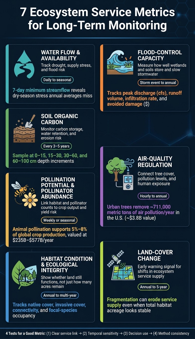
7 Ecosystem Service Metrics: What to Track, When & Why
Introduction to the Framework for Ecosystem Restoration Monitoring (FERM) Platform
What Makes a Good Long-Term Ecosystem-Service Metric
Not every ecological measurement works as a useful long-term metric. A number can look exact on paper and still point you in the wrong direction. That usually happens when it doesn’t tie back to a real service, can’t show meaningful change over time, or isn’t collected in a steady way from one year to the next. Four tests help sort the strong metrics from the ones that just fill a spreadsheet.
First, a metric needs a clear link between what you measure and the ecosystem service you care about. You should be able to say it in one sentence: a change in [ecological condition] is expected to change [specific service] for [identified beneficiaries]. That connection is the line between a metric that helps and data that’s merely descriptive.
The second test is temporal sensitivity. A metric has to pick up meaningful change, not just background noise. Some services move fast. Streamflow, pollinator activity, and air-pollutant concentrations can shift within a single season. Others change at a slower pace, like soil organic carbon or habitat condition, where annual or multi-year sampling makes more sense. The right sampling schedule is the one that catches change when it matters.
Third comes decision use. A metric should earn its place by helping someone make a real decision, whether that’s an impact assessment or business planning. If it doesn’t connect to an actual choice, there’s a good chance it gets measured once, filed away, and forgotten.
The fourth test is method consistency. A trend means something only when year-to-year differences reflect real ecosystem change rather than changes in how the data was collected. Methods need to stay steady across the full monitoring period.
These four criteria set the filter for the seven metrics below.
1. Water Flow and Availability
Service Relevance
Use this metric when water supply, drought, or flood risk is shaping the choice in front of you. Water flow and availability is, at its core, a water budget: precipitation, streamflow, groundwater, evapotranspiration, and human withdrawals all tied together. That budget shows how water moves through a place and where pressure is building.
Base flow helps keep aquatic habitat alive and supports downstream water supply during dry months. Groundwater recharge keeps wells, springs, and wetlands working the way they should. Peak-flow records show where flood exposure may hit hardest. The net water balance - inputs, losses, and withdrawals - can also flag drought risk and permitting trouble before shortages show up in plain sight.
Temporal Sensitivity
Annual totals can smooth over the very conditions that matter most. A watershed may end the year with near-normal precipitation and still face very low summer streamflow if evapotranspiration runs high or withdrawals spike during the driest stretch.
That’s why seasonal tracking matters just as much as the annual average. Watch spring recharge, summer low flow, and fall groundwater levels. For drought exposure, the 7-day minimum streamflow is a strong signal because it reflects sustained stress that monthly averages can miss.[3]
Decision Fit
For facility siting, compare candidate locations with a longer lens. Look at long-term availability, seasonal low-flow records, groundwater trends, and competing withdrawals instead of relying on annual supply alone.
For infrastructure capacity, peak-flow magnitude and flood frequency help set design needs for culverts, bridges, and stormwater systems. Low-flow records, on the other hand, show the lower bound for intake reliability.
For permitting, pull together withdrawal volumes, instream-flow requirements, groundwater-level trends, and drought restrictions, then check them against the rules from the state agency in charge. For watershed restoration, focus on signs like delayed runoff timing, reduced peak discharge, or longer late-summer base flow, not just higher annual volume. The table below links each indicator to its main use.
Measurement Rigor
USGS streamgages often record gage height and discharge every 15 to 60 minutes, and those data are often grouped into daily values for annual reporting.[2] For most U.S.-based monitoring programs, USGS streamgages offer a solid baseline.
Report streamflow in cubic feet per second (cfs) for instantaneous discharge and acre-feet for annual or seasonal volumes. Use inches for precipitation, recharge, and evapotranspiration. If you switch units, state the conversion clearly. Don’t leave readers guessing.
Before data collection starts, document gage and well locations, rating-curve revisions, missing-data rules, and estimation methods. Keep raw observations separate from corrected or modeled values. If you want to sort out project effects from regional climate shifts, use an unaffected reference basin.
Indicator | What it captures | Primary decision use |
|---|---|---|
Annual and seasonal streamflow | Overall water yield and timing | Watershed trend reporting, facility siting |
7-day minimum streamflow | Sustained drought and ecological stress | Drought exposure, ecological flow, permitting |
Peak-flow magnitude and frequency | Flood hazard and channel-forming events | Infrastructure capacity, flood control |
Base-flow contribution | Dry-season supply and aquatic habitat support | Restoration evaluation, water supply reliability |
Groundwater-level change | Aquifer depletion or recovery over time | Long-term supply security, permitting risk |
Precipitation minus evapotranspiration | Net water stress across the full system | Drought planning, operational scenario modeling |
2. Soil Organic Carbon
Unlike water metrics, SOC moves slowly. That makes it a better fit for multi-year monitoring and carbon accounting than for year-by-year checks.
Service Relevance
Use this metric when decisions hinge on land management, carbon accounting, drought resilience, or restoration results. Higher SOC helps soils function better: it supports nutrient cycling, improves water retention, helps resist erosion, and can make fields more resilient in dry periods.
Track SOC in two ways: concentration and stock. Concentration is reported as grams of carbon per kilogram of soil, or as percent carbon. Stock shows how much carbon is stored across an area, usually in metric tons per hectare. That distinction matters. Concentration on its own can point in the wrong direction. If soil compacts or bulk density changes, concentration may look higher even when there is no actual increase in carbon stored per unit area.[4][5]
Temporal Sensitivity
Sample every 3–5 years. SOC changes slowly, so annual sampling usually doesn’t tell you much. Timing within the year matters too. Sample at similar times each year so normal swings in biological activity don’t get mistaken for stock change.
Small year-to-year increases need care. Report confidence intervals and use replicate samples instead of calling something a trend from one comparison alone.
Decision Fit
This metric matters most when decisions depend on long-range soil performance rather than short-term field variation.
For carbon accounting, report SOC stock by depth, bulk density, coarse fragments, and uncertainty. For restoration work, compare treated sites against both baseline and reference conditions. For business planning, SOC trends make more sense when paired with tillage, cover crops, grazing intensity, infiltration, and yield.
Measurement Rigor
Follow USDA NRCS depth increments where field conditions allow: 0–15, 15–30, 30–60, and 60–100 cm. Report results by depth and by land-use type. Cropland, pasture, forest, restored prairie, and riparian areas should not be rolled together into one average.
SOC stock = bulk density × SOC concentration × layer thickness × (1 − coarse-fragment fraction).[9]
Measure bulk density for each depth interval. When possible, use the same intact core for both bulk density and SOC analysis. Stick with the same method across all sampling events.[6][7]
Use georeferenced permanent sampling points. Record land-use history and note any protocol changes. If methods change between sampling events, keep the original data intact and report the break plainly instead of merging results that don’t match.
On erosion-prone sites, pair SOC with ground cover, rills, or sediment loss. A drop in SOC upslope paired with a gain downslope may point to redistribution rather than sequestration.[8]
Indicator | What it captures | Primary decision use |
|---|---|---|
SOC concentration by depth | Carbon content at each soil layer | Soil-health screening, trend detection |
SOC stock by depth | Total carbon stored per unit area | Carbon accounting, restoration outcomes |
Bulk density by layer | Soil compaction and mass per volume | Stock calculation, compaction monitoring |
Annual stock change | Rate of carbon gain or loss | Impact assessment, regenerative management |
Erosion indicators | Carbon loss through soil movement | Sloped, disturbed, or bare-ground sites |
3. Pollination Potential and Pollinator Abundance
Animal pollination is a major farm input. It supports 5%–8% of global crop production by volume and carries an estimated annual value of $235 billion–$577 billion in 2015 U.S. dollars.[14][13] The risk is not abstract. Under total pollinator loss, more than 90% of production would be lost in 12% of leading global crops.[14][13] For growers and land managers, that points to a direct yield risk. And because pollination changes with bloom timing and weather, a one-time survey only tells part of the story. Long-term records help sort out normal seasonal swings from an actual decline.
Service Relevance
Track both presence and performance. Abundance and richness show whether pollinators are there. Visitation, pollen deposition, fruit set, and seed set show whether pollination is actually happening.
That split matters. A site can still have plenty of insects, yet pollination may weaken if a more diverse pollinator community is replaced by a smaller set of less-effective visitors. In plain terms: lots of movement in the field does not always mean the crop is getting the service it needs. That is why habitat condition also needs close attention.
Temporal Sensitivity
Annual surveys can miss the main action. Some solitary bees and hoverflies are active for less than a month.[10] If you only check once, you may miss them entirely.
A better approach is to schedule visits during early, peak, and late bloom - and monthly if possible. Each visit should also record:
Temperature
Cloud cover
Wind speed
Rainfall
Flowering stage
Without those weather covariates, it is hard to know what a low count means. Was the population down, or was it just a cold, windy morning? That distinction can change the whole read of the site.
Decision Fit
This metric works well when the goal is to estimate crop-yield risk, aim habitat spending where it can help most, and check whether restoration is improving pollination.
For crop-yield risk, pair pollinator observations with fruit set and yield records across several seasons. That helps flag fields where low visitation lines up with unstable production.
For land management, track whether steps like native flowering strips, longer bloom windows, less mowing during peak bloom, or different pesticide timing improve visitation and crop outcomes over time. USDA research adds an important warning here: isolation from natural areas is linked to lower mean levels and lower stability of flower-visitor richness and visitation rate.[12]
Measurement Rigor
Because pollinator counts can swing with bloom stage and weather, field methods need to stay fixed from one visit to the next. Use standardized transects or timed focal-flower observations, such as a 10-minute watch in a 50 × 50 centimeter quadrat.[11] Report results as visits per flower per minute so the data account for differences in flower abundance and observation time.[15]
Record pollinators to the lowest reliable taxonomic level. At a minimum, separate:
Honey bees
Bumble bees
Solitary bees
Hoverflies
Butterflies
Moths
The USDA Natural Resources Conservation Service recommends at least four years of censuses before making trend claims. Annual and seasonal variation can hide actual change.[16]
Use modeled pollination potential as a screening tool, not a final answer. Before making investment or land-use decisions, check the model against observed visitation or fruit set.
Indicator | Useful unit | Primary use |
|---|---|---|
Pollinator abundance | Individuals per transect or observation hour | Population-level trend tracking |
Species richness | Number of species or groups per site and season | Diversity and resilience assessment |
Visitation rate | Visits per flower per minute | Direct measure of pollination interaction |
Floral resources | Flowers per square meter; flowering species per survey | Food availability through the season |
Habitat area | Acres of suitable pollinator habitat | Supporting-habitat supply |
Connectivity | Distance to nearest patch; connected-habitat acreage | Fragmentation and movement-barrier assessment |
Pollination outcome | Fruit set, seed set, or yield per acre | Links ecological data to production risk |
Modeled potential | Pollination-supply score by field or landscape unit | Scenario planning where direct data are limited |
4. Habitat Condition and Ecological Integrity
Habitat area tells you how much land exists. Habitat condition tells you whether that land still works. In practice, this is the metric that shows whether a habitat can still support the other services people expect from it. It matters when a team needs to know if habitat value is stable, getting better, or slipping. If you look at acreage alone, you can end up giving too much credit to land that no longer functions well.
Service Relevance
A useful condition picture tracks native cover, invasive cover, structural diversity, patch size, core area, connectivity, and use by focal species. Landscape metrics such as extent, patch size, edge-to-area ratios, and connectivity show spatial pattern. Biotic indicators such as species composition, food-web structure, and population change show whether the system is still working as a living system.
That distinction matters. A site may look intact on a map and still be losing the species that depend on it. The reverse can happen too: a site may still hold much of its species list while the processes that keep those species going are starting to break down. That’s why temporal consistency matters as much as the metric itself. If methods shift every year, the trend stops meaning much.
Temporal Sensitivity
Land-cover metrics usually make sense on an annual cycle or every few years. Vegetation and invasive cover should be surveyed annually or every other year. Structural attributes often fit a 3–5 year cycle. Focal species checks may need to happen annually or by season, depending on the species and the site.
Permanent plots, photo points, and georeferenced transects help keep comparisons honest. They give managers the same reference points year after year, which cuts down on guesswork and makes trend lines more believable.
Decision Fit
This metric fits biodiversity-risk assessment, conservation investment, mitigation tracking, and restoration reporting. Each use case asks a slightly different question, but all of them need more than a simple acre count.
Biodiversity-risk assessment helps identify which assets or supply chains sit near degraded or fast-declining habitat. That can flag permitting, reputation, or supply-chain exposure.
Conservation investment helps direct funding toward high-value corridors, threatened habitat types, or sites where restoration is likely to produce measurable gains.
Mitigation tracking helps separate real ecological recovery from simple acreage totals. Reporting only acres treated can overstate success if habitat condition has not improved.[1]
Restoration reporting provides before-and-after evidence showing that a site moved from degraded to moderate or good condition.
Measurement Rigor
Condition classes such as good, moderate, and degraded should be tied to clear, habitat-specific thresholds based on reference conditions, not arbitrary scores. A grassland is not a riparian corridor, and neither should be judged like a coastal wetland. Each habitat type needs its own reference values for native cover, invasive cover, hydrology, and structural diversity.
The scoring rules should be public and plain. That includes indicator weights, minimum thresholds, and the way missing data are handled. Without that level of detail, results are hard to repeat across years and hard to defend to outside reviewers.[17][18]
Area and condition should also be reported separately. At a minimum, publish total habitat area, acreage in each condition class, the share of habitat in each class, and the trend over time. It also helps to track year-over-year change in native cover, invasive cover, patch size, connectivity, and focal-species occupancy. Fixed thresholds and permanent plots are what make those trends hold up over multiple years. Use the same thresholds each year so changes remain readable in impact assessment and restoration tracking.
Indicator | What it reveals | Main limitation if used alone |
|---|---|---|
Native vegetation cover | Whether characteristic plant communities remain | May miss fragmentation or species-level decline |
Invasive-species cover | Degree of biological pressure or disturbance | Low overall cover can still be serious if concentrated in sensitive areas |
Structural diversity | Whether habitat offers varied layers and niches | Structure can appear intact while species composition is degraded |
Connectivity and core area | Whether organisms can move and interior habitat remains | Models depend on scale, focal species, and land-cover assumptions |
Key-species occupancy | Evidence that selected species continue to use the habitat | Presence alone does not establish population viability |
Composite condition score | A concise basis for reporting and investment decisions | Scores can hide which underlying attribute is changing |
5. Flood-Control Capacity
Some habitats do more than support biodiversity. They also act like a landscape’s shock absorbers during storms. Wetlands, floodplains, riparian vegetation, and permeable soils can store, slow, soak in, and release stormwater before it turns into flood exposure. That’s why this service should be tracked with hydrologic and spatial indicators, not acreage alone and not dollars alone.
Service Relevance
Flood-control capacity measures how well wetlands, floodplains, riparian zones, and permeable soils store, slow, infiltrate, and release stormwater. Track it when flooding, stormwater design, or watershed resilience shapes the decision.
Wetlands and floodplains can hold stormwater and release it over time rather than all at once. That service is separate from the economic outcome it may produce, such as avoided damage, downtime, or displacement. Start with the biophysical indicators: peak discharge, runoff volume, infiltration rate, and soil-water storage. The economic effect comes after that, not before.
Temporal Sensitivity
Collect continuous rainfall, water-level, soil-moisture, and streamflow data during storms. Inspect sites after major storms and at least once a year. Update floodplain and land-cover maps every 1–3 years, and recalculate flood-risk estimates after major land-use or infrastructure change.
One storm after a project is not enough to show long-term performance. Monitoring needs to cover storms of different sizes, since a wetland may perform well during frequent events but hit its storage limit during an extreme one. Those measurements only help if they line up with the decision horizon.
Decision Fit
Use the metric differently depending on the job at hand:
Impact assessment: Compare pre- and post-project peak flow, storage, flood depth, and inundation duration to show whether the intervention reduced flood exposure.
Business planning: Compare avoided damage, downtime, and service interruption against project and maintenance cost to test whether the intervention is financially justified.
Resilience planning: Use flood depth, duration, and recurrence to identify where natural systems can substitute for or complement engineered defenses.
Measurement Rigor
Install rain gauges and stream sensors upstream and downstream of the ecosystem intervention. Pair rainfall data with water-level measurements and a site-specific stage–discharge relationship to estimate flow. Measure infiltration with double-ring infiltrometers or rainfall simulation, and monitor soil-water storage with probes at representative depths. Then connect those readings to flood-storage area and available storage volume. Loss of connected storage area matters more than loss of isolated acreage.[19]
Record flood depth, duration, frequency, and flooded area for each monitored location. Use pressure transducers, high-water marks, staff gauges, or calibrated hydraulic models where they fit the site.
Report assumptions clearly: analysis period, discount rate, asset values, event probabilities, inflation, and indirect effects. If those inputs stay visible, the estimate can be reviewed and updated as conditions change.
Indicator | What it captures | Typical units |
|---|---|---|
Peak discharge | Maximum flow during a storm event | cubic feet per second (cfs) |
Runoff volume | Total stormwater leaving a site or watershed | acre-feet or cubic feet |
Infiltration rate | Speed at which water enters the soil | inches per hour |
Soil-water storage | Available storage before saturation and runoff | inches or acre-feet |
Wetland/floodplain area | Connected space available to store floodwater | acres |
Flood depth | Exposure severity at a specific location | inches or feet |
Flood duration | How long a location stays inundated | hours or days |
Flood frequency | How often a specified magnitude occurs | return period or annual exceedance probability |
Avoided damage | Economic benefit of reduced flooding | U.S. dollars |
6. Air-Quality Regulation
Unlike earlier metrics that lean mostly on ecosystem condition, air quality is shaped by two moving parts at once: vegetation and outside emissions. Tree canopy can help by absorbing gases and trapping particles on leaf surfaces, but that’s only part of the picture. A sound program ties together four measures: emissions sources, ambient concentrations, canopy condition and modeled removal, and human exposure. Use this metric when exposure, urban greening, transportation corridors, or facility siting are driving the call. In those cases, exposure data matters just as much as canopy and removal estimates.
Service Relevance
Air-quality regulation shows how well vegetation - mainly tree canopy - removes or lowers concentrations of fine particulate matter (PM2.5), nitrogen dioxide (NO₂), and ground-level ozone (O₃). The U.S. Forest Service estimates that urban trees remove about 711,000 metric tons of air pollution each year across the country, with an estimated value of roughly $3.8 billion.[23] That number helps show ecosystem-service supply. It does not tell you whether people in a given neighborhood or at a job site are actually breathing cleaner air. For that, you need ambient concentration data.
Temporal Sensitivity
Air pollution doesn’t sit still. Ozone tends to peak during warm-season daylight hours. PM2.5 often jumps near combustion events, construction activity, and heavy-traffic periods. NO₂ closely follows vehicle and industrial activity across the year. A single season of monitoring usually misses that pattern, especially when a project expects tree benefits to grow slowly as canopy matures.
Collect continuous or high-frequency concentration data when you can, and keep hourly or daily records for event analysis. Compare the same time windows across years so you’re not mixing apples and oranges. Weather logs matter too. Always record wind speed and direction, temperature, humidity, and precipitation, because weather can swing measured concentrations in a big way without any link to vegetation change, emissions controls, or project actions.
Decision Fit
The same metric serves different jobs depending on the decision in front of you.
Worker and community exposure: Measure concentrations at facility boundaries, outdoor workstations, haul routes, schools, and residential areas. Useful indicators include population-weighted annual PM2.5, the number of days above health-based thresholds, and short-term peaks during high-activity periods.
Urban greening: Look for places where high pollution, high exposure, and practical planting opportunities overlap. A Portland, Oregon modeling study estimated that trees reduced NO₂ by about 15% (roughly 1.4 ppb).[20] Use that as a place-specific model result, not a standard you can copy everywhere.
Transportation project review: Set a pre-construction baseline, monitor during construction near haul routes and work zones, then check conditions again after the project opens.
Facility siting: Screen candidate sites for baseline PM2.5, NO₂, ozone, prevailing wind patterns, nearby sensitive populations, and existing nonattainment concerns before locking in a location.
Measurement Rigor
Match the averaging period to the decision, and present the benchmark as a reference point rather than the whole story.
Indicator | Units | Key benchmark |
|---|---|---|
Annual PM2.5 | µg/m³ | 9.0 µg/m³ (2024 primary annual standard)[24] |
24-hour PM2.5 | µg/m³ | |
Ozone (8-hour) | ppm | |
NO₂ annual mean | ppm | 0.053 ppm[22] |
NO₂ 1-hour peak | ppb | 100 ppb[22] |
Modeled PM2.5 removal | tons/year | Site-specific; report with uncertainty range |
Tree canopy cover | % or acres | Track change annually or seasonally |
Use calibrated reference-grade instruments for regulatory determinations. Low-cost sensors can help, but only after collocation and calibration; on their own, they should not be used for formal determinations. For modeled removal estimates - often produced with tools like i-Tree Eco - state the assumptions plainly: meteorology, canopy structure, deposition behavior, and the baseline concentration used. A modeled tonnage figure shows ecosystem-service supply, not a directly observed health outcome.[21]
7. Land-Cover Change and Ecosystem-Service Supply
Land-cover change is a pressure indicator. It helps you connect changes on the ground to ecological function, service delivery, and the decisions tied to them. If a wetland disappears, that may point to less flood storage and less habitat. But the actual effect on services depends on where that wetland sat, how well it linked to nearby habitat, and what took its place.
Service Relevance
Use land-cover change as the upstream screen for the other six metrics. In many cases, service supply starts shifting before the outcome shows up in monitoring results. That’s why it helps to track annual class area, percent change from baseline, conversion rate, impervious surface, patch size, edge density, connectivity, and condition within the watershed or buffer that fits the service in question.
The U.S. Geological Survey’s Annual National Land Cover Database (Annual NLCD) provides year-by-year land-cover, land-cover change, fractional impervious surface, and related products for the conterminous United States from 1985 through 2025 in its current Collection 1.2 release.[28] NOAA’s Coastal Change Analysis Program (C-CAP) offers standardized coastal land-cover and change data for coastal watersheds, wetlands, estuaries, and nearby uplands through repeatable, multi-date change detection.[25][26]
Pair each indicator with a service outcome that makes sense on the ground. For example:
Impervious-surface growth can signal more runoff.
Wetland loss can point to reduced flood storage.
Temporal Sensitivity
A small road project can split a much larger habitat patch. When that happens, edge density goes up and connectivity drops across an area far bigger than the road footprint. Fragmentation can erode service supply even when total habitat acreage looks stable.
Annual NLCD can pick up both slow trends and sudden disturbance events.[27][29] Annual change detection is most useful where development pressure moves fast. Slower ecological change may show up better on a five-year cycle. In those cases, update the main analysis every five years and track annual disturbance alerts in between.
One caution matters here: not every apparent shift is real. Small mapped changes can come from image timing, seasonal vegetation differences, or sensor conditions rather than actual land conversion. In plain terms, sometimes the map changed more than the landscape did.
Decision Fit
Match the boundary to the service you’re studying. Use a watershed for water, runoff, and flood services. Use a buffer around a project for local habitat and pollination effects. Use a corridor or connected landscape for migration and larger habitat networks.
Set the boundary before you calculate the baseline. Then compare the project area with an ecologically similar reference area, or compare conditions inside and outside a conservation or restoration action. That gives you a cleaner read on what changed and why.
For business planning, land-cover change can inform site selection, permitting review, source-water protection, and capital prioritization. Set thresholds ahead of time so monitoring leads to action instead of sitting in a report after the fact.
Measurement Rigor
Report both gross transitions and net change. Saying forest declined by 200 acres tells only part of the story. It is far more useful to say that 200 acres of forest were converted to low-density development while 50 acres of abandoned cropland naturally reforested. That kind of transition view shows what was lost, what was gained, and what was exchanged.
A transition matrix helps make those shifts plain. Keep classification rules, resolution, projection, and imagery windows consistent over time. If the method changes, it can look like the ecology changed when it didn’t. Use these land-cover signals to decide which service-specific metrics in the guide below need the closest follow-up.
Indicator | Unit | Ecosystem-service link |
|---|---|---|
Land-cover class area | Acres or % of area | Establishes the spatial supply base for habitat, carbon, water, flood, and pollination |
Annual conversion rate | Acres/year or %/year | Identifies accelerating loss or restoration pressure |
Impervious-surface % | % of watershed or buffer | Indicates runoff, infiltration, flood, and water-quality risk |
Patch size | Acres/patch (mean or median) | Assesses interior habitat, biodiversity, and ecological resilience |
Edge density | Miles of edge per square mile | Supports habitat-quality and pollination assessments |
Connectivity | Connected area, corridor length, or index | Supports biodiversity, pollination, migration, and watershed function |
Ecosystem condition | Score or % good/fair/poor | Distinguishes nominal extent from effective service supply |
Metric-to-Decision Reference Guide
Once you’ve looked at the seven metrics side by side, the next step is simple: match the metric to the decision you need to make. Each one picks up a different kind of change. Some move fast. Others take years to show a clear signal. That matters because a metric is only useful if it lines up with the pace of the decision behind it.
Metric | Best for Impact Assessment | Best for Business Planning | Typical Monitoring Cadence | Common Data Sources |
|---|---|---|---|---|
Water Flow & Availability | Detecting changes in runoff, base flow, or seasonal availability | Water-supply reliability, drought exposure, facility siting, production continuity | Continuous or daily; summarized seasonally and annually | USGS streamflow and groundwater records; EPA EnviroAtlas |
Soil Organic Carbon | Measuring whether land management or restoration is building or losing carbon stocks | Carbon-project feasibility, agricultural productivity, erosion risk, land-resilience investment | Field sampling every 3–5 years; modeled annual estimates | USDA NRCS SSURGO; lab samples; farm records; remote sensing |
Pollination Potential & Pollinator Abundance | Tracking native pollinator abundance, species richness, or habitat suitability before and after habitat interventions | Crop yield risk, supply-chain resilience, value of on-farm habitat features | Seasonal surveys, repeated annually or across multiple flowering seasons | Field observations; crop-dependency maps; habitat and pesticide records |
Habitat Condition & Ecological Integrity | Assessing whether conservation or restoration improves native-species composition, connectivity, or condition relative to a reference ecosystem | Biodiversity commitments, nature-related risk screening, project permitting | Annual to 3-year assessments; more frequent remote-sensing checks | Field surveys; aerial imagery; satellite land-cover data |
Flood-Control Capacity | Testing whether restoration reduces peak flows or increases floodplain storage after storm events | Site selection, infrastructure design, insurance exposure, avoided-damage planning | Event-based after major storms; annual or seasonal modeling | Land cover, elevation, rainfall, stream gauges, hydrologic models |
Air-Quality Regulation | Comparing pollutant concentrations or unhealthy-air days before and after green-infrastructure installation | Urban tree planting prioritization, worker and community exposure, permitting risk | Hourly or daily pollutant data; monthly and annual summaries | EPA air-quality monitors; local sensors; canopy and vegetation data |
Land-Cover Change & Ecosystem-Service Supply | Screening for habitat loss, fragmentation, or restoration gains across a watershed or project area | Site expansion planning, supply-chain exposure, cumulative impact review, capital prioritization | Annual to 5-year mapping, depending on the speed of change | USGS NLCD; satellite imagery; field surveys |
The main point isn’t to track all seven with the same level of effort. It’s to pick the metric that fits the decision horizon. Water and air data often need daily tracking because conditions can shift fast. Pollination tends to make more sense on a seasonal cycle. Soil carbon is slower, so a multi-year view is usually the right call.
It also helps to convert each metric into a term the business already uses. Instead of stopping at the indicator itself, tie it to things like water reliability, flood exposure, maintenance cost, insurance risk, compliance risk, or yield. That’s where the metric starts doing real work for planning, budgeting, and risk review.
Recommended Indicators, Units, and Methods for All 7 Metrics
The table below turns the seven metrics into an operating guide: what to track, how to report it, and how often to update it. It gives teams one shared setup for fieldwork, remote sensing, and modeling, which makes year-over-year comparison much cleaner.
Metric | Recommended Indicators | Typical Units | Update Frequency | Methods |
|---|---|---|---|---|
Water Flow & Availability | Stream discharge; groundwater level; annual runoff; 7-day minimum flow; surface-water extent; water temperature | Discharge: ft³/s; water yield: acre-feet/year; groundwater: feet below ground surface; temperature: °F | Continuous or daily for gauges and sensors; monthly or seasonal for groundwater; annual synthesis | Stream gauges; groundwater wells; field sensors; weather stations; remote sensing; watershed models |
Soil Organic Carbon | Soil organic carbon stock; carbon concentration; stock change; bulk density; soil moisture; erosion or sediment loss | Concentration: percent carbon; stock: metric tons of carbon/acre; change: metric tons of carbon per acre per year; bulk density: pounds per cubic foot; erosion: tons/acre/year | Baseline sampling, then annual modeling or remote-sensing updates, with field resampling every 3–5 years | Geolocated soil cores; laboratory analysis; calibrated remote sensing; repeated soil surveys; process-based or statistical models |
Pollination Potential & Pollinator Abundance | Pollinator abundance; species richness; visitation rate; nesting habitat; floral-resource availability; crop fruit set or seed set | Abundance: individuals per trap or survey hour; richness: number of species; visitation: visits/flower/hour; habitat: acres or percent cover; fruit set: % | Weekly or biweekly during the flowering season; annual habitat mapping; multi-year trend analysis | Standardized transects; pan traps; timed observations; vegetation surveys; remote sensing; habitat-suitability models |
Habitat Condition & Ecological Integrity | Native vegetation cover; structural diversity; invasive-species cover; habitat connectivity; indicator-species abundance; ecological-condition score | Cover: %; connectivity: acres, miles, or index score; abundance: individuals per unit effort; condition: standardized index score | Seasonal or annual for vegetation and disturbance; every 1–3 years for biodiversity surveys; after fire, storms, development, or restoration | Vegetation plots; wildlife or bioacoustic surveys; GIS analysis; aerial photography; satellite imagery; ecological-integrity models |
Flood-Control Capacity | Wetland, floodplain, and riparian extent; water-storage capacity; peak-flow attenuation; runoff volume; flood inundation extent; sediment retention | Storage: acre-feet; peak flow: ft³/s; runoff: acre-feet/event; inundation: acres or % of area; sediment: tons/acre/year | Continuous or event-based for gauges and flood sensors; after major storms; annual flood-risk assessment; every 1–5 years for land-cover and capacity-model updates | Rain and stream gauges; wetland and floodplain surveys; digital elevation models; satellite-based standing-water and inundation mapping; hydrologic and hydraulic models |
Air-Quality Regulation | PM₂.₅, PM₁₀, ozone, nitrogen dioxide, sulfur dioxide, and carbon monoxide; tree and vegetation cover; pollutant deposition or removal; canopy condition; population exposure | Pollutants: µg/m³ or ppb; vegetation cover: % or acres; removal: kilograms or metric tons/year; exposure: person-days or population-weighted concentration | Hourly to daily for regulatory pollutants; seasonal or annual vegetation updates; annual modeled removal and exposure estimates | Regulatory monitors; low-cost sensor networks with calibration; meteorological data; satellite products; emissions inventories; air-quality or deposition models |
Land-Cover Change & Ecosystem-Service Supply | Change in forest, wetland, grassland, cropland, developed land, water, and bare-ground area; fragmentation; service-supply change | Area: acres or square miles; change rate: acres/year; fragmentation: edge-to-area ratio or index score | Annual to every 2–5 years, depending on imagery and the required decision speed; event-based updates after wildfire, storms, or development | Satellite imagery; aerial photography; GIS classification; change-detection analysis; LiDAR; field validation; ecosystem-service models |
Use these specs to standardize fieldwork, remote sensing, and modeling across years. In practice, that means pairing continuous sensors with periodic field checks so the data stays grounded. A stream gauge may run all year, for example, but it still needs routine verification in the field. The same logic applies across the full set of metrics: steady measurement, regular validation, and one clear reporting format.
Building a Multi-Year Monitoring System From These 7 Metrics
The table above gives you the indicators, units, and methods. This section turns that into an operating system: cadence, thresholds, and response. The point is simple. You want these metrics to stay comparable from year to year and useful when real decisions need to be made.
Start with a monitoring plan before you collect a single data point. Be explicit about the decision the system is meant to support - restoration evaluation, flood-risk management, or a company’s land-use plan. Then spell out the geographic boundary, ecosystem types, beneficiaries, monitoring period, the seven metrics, sampling locations, responsible parties, and reporting frequency. Set a baseline and a reference condition before monitoring begins, and keep both fixed.
Before the first results arrive, define target, warning, and trigger levels for each metric. That way, managers know when to keep watching, when to flag a problem, and when to step in. A flood-control target, for instance, might be to keep a stated share of reference wetland storage capacity over a set period, with an earlier warning level so action can happen before the threshold is crossed. Every reported value should include its uncertainty range and a data-completeness measure. If observations are missing, label them clearly - observed, modeled, imputed, or insufficient data - instead of quietly filling gaps or leaving them unexplained.
Once those thresholds are in place, the monitoring cycle should make review routine. Use a fixed annual cycle with six stages: plan, collect, validate, interpret, decide, and archive. Build QC into the process, along with data review, stakeholder interpretation, and an annual decision meeting. Sampling should follow each metric’s natural rhythm rather than forcing all seven onto one calendar. And when a major event hits - a flood, drought, wildfire, pollution incident, or land-use change - collect extra observations and mark them as event-based. That label matters because it keeps unusual events from warping routine trend comparisons.
Interpretation is where the numbers start to mean something. Annotate each time series with climate and management events that could affect results: rainfall, temperature, drought indices, storms, fires, floods, management actions, construction, pesticide use, and nearby development. If a riparian restoration project started in a given year, compare treated sites with matched reference sites and look at whether water flow, habitat condition, and flood storage shifted in the years after the intervention - not just right away.
Method changes need the same level of care. Record every change in a version-controlled log. If a stream gauge is replaced with a remote sensor, or a land-cover classification scheme is updated, run both methods side by side for an overlap period and mark the change plainly on the dashboard time series. When a program changes methods without overlap or without a log, trend comparisons start to fall apart. That discipline keeps the record steady enough to support action over time.
From Measurement to Action
A monitoring system matters only if it leads to a clear response. After you set thresholds and indicators, the next move is simple: decide who acts when those thresholds are crossed.
The most practical place to start is a metric-to-decision register. Think of it as a plain working document that links each of the seven metrics to four things: the decision it informs, the person or team that owns it, the threshold to watch, and the response that follows. If streamflow drops below a seasonal minimum, or habitat condition declines across three years, the register should already show which team steps in and what happens next. Without that link, monitoring data tends to sit in reports instead of driving action.
The same metrics can serve different purposes, depending on the decision in front of you. Impact-assessment questions look at whether an activity changed ecosystem condition, which communities or ecological functions were affected, and whether mitigation commitments are still holding. Business-planning questions look at where the organization depends on a service and what the financial or operating exposure may be if that service weakens.
That difference matters. A flood-control metric, for example, can do two jobs at once. It can record ecological change for an impact assessment, and it can also guide site design, insurance exposure, and resilience investment for business planning.
The goal is to turn ecological change into operating consequences people can act on. Tie each metric to a direct outcome: water flow to production interruption risk, pollination to crop yield exposure, and flood storage to avoided damage.
Conclusion
Effective ecosystem-service monitoring starts with a simple idea: measure the right thing for the right decision. That’s the job of these seven metrics - water flow and availability, soil organic carbon, pollination, habitat condition, flood-control capacity, air-quality regulation, and land-cover change. Each one matters in a different way, and each one fits a different time horizon. The metric has to match the decision in front of you. It also has to stay consistent over time, with the same baseline, boundary, units, and methods used year after year.
Just as important, indicators should be treated as evidence of change, not automatic proof of cause. That distinction matters. If results come from models, label them separately from direct measurements. If there’s uncertainty, say so plainly. For impact assessment, compare post-project conditions against a documented baseline and, when possible, a reference site. For business planning, turn ecological trends into terms leaders can act on: exposure, resilience, compliance, and operating risk.
Done well, monitoring turns ecosystem change into a management signal people can actually use.
FAQs
How do I choose the right metric for my decision?
Start by mapping your business dependencies and impacts with the LEAP approach: Locate, Evaluate, Assess, and Prepare. It gives you a clear way to see where your operations and supply chain rely on nature, and where they put pressure on it.
From there, keep your metric set tight. Focus on the indicators that matter most to how your business runs and how your suppliers operate. Trying to track everything at once usually leads to noise, not insight.
For added credibility, align your metrics with frameworks such as TNFD or SBTN. That helps ground your reporting in methods that investors, partners, and other stakeholders already know.
A good mix of indicators should cover both sides of the picture:
Environmental pressures, such as water use or land use change
Ecosystem conditions, such as biodiversity or water quality
That balance matters. Measuring pressure alone tells you what your business is doing. Measuring ecosystem conditions shows what’s happening on the ground.
Which of the seven metrics should I track first?
Track water flow first. It’s a regulating ecosystem service with a direct link to flood control and water purification.
A water-flow baseline gives you a clear point of reference for tracking change over time. It also supports both impact assessment and business planning.
How often should each ecosystem service metric be monitored?
Monitoring frequency should match the project stage and the result you’re trying to track. For many sustainability projects, quarterly reviews work well. They help teams follow progress, spot gaps, and keep stakeholders accountable.
Habitat restoration and nature-based solutions work on a much longer clock. In many cases, monitoring runs for 10 to 30 years so teams can track ecosystem growth and long-term performance. That usually means a mix of automated sensors and on-site evaluations, with KPI reviews at set intervals as conditions shift and priorities change.
Related Blog Posts
Latest Articles
©2025

Narrative Change and Power Building: The Missing Half of Advocacy
Narrative change is the process of disrupting dominant narratives that normalize inequity and advancing new narratives from historically marginalized communities.

Funding Resilience Without Federal Grants
BRIC is unreliable and FEMA is shrinking. Here's how cities fund climate resilience with dedicated revenue, blended finance, and a coordinating authority.

The ESG Blind Spot: How AI Is Finding Risks in Companies Nobody Else Is Watching
Norway's sovereign wealth fund uses AI to screen 7,200 portfolio companies for forced labor and corruption within 24 hours. The real story is the emerging-market coverage gap that traditional ESG data vendors miss — and what it means for any company with a global supply chain.
Narrative Change and Power Building: The Missing Half of Advocacy
Narrative change is the process of disrupting dominant narratives that normalize inequity and advancing new narratives from historically marginalized communities.
Funding Resilience Without Federal Grants
BRIC is unreliable and FEMA is shrinking. Here's how cities fund climate resilience with dedicated revenue, blended finance, and a coordinating authority.
The ESG Blind Spot: How AI Is Finding Risks in Companies Nobody Else Is Watching
Norway's sovereign wealth fund uses AI to screen 7,200 portfolio companies for forced labor and corruption within 24 hours. The real story is the emerging-market coverage gap that traditional ESG data vendors miss — and what it means for any company with a global supply chain.
FAQ
01
What does it really mean to “redefine profit”?
02
What makes Council Fire different?
03
Who does Council Fire work with?
04
What does working with Council Fire actually look like?
05
How does Council Fire help organizations turn big goals into action?
06
How does Council Fire define and measure success?
Sep 23, 2026
Monitoring ecosystem services over time: 7 metrics
Sustainability Strategy
In This Article
Seven actionable metrics to monitor ecosystem services—water, soil carbon, pollination, habitat, flood control, air quality, and land-cover.
Monitoring ecosystem services over time: 7 metrics
If I want ecosystem monitoring to help with decisions, I need to track more than site condition. I need a small set of metrics that show what nature can provide, what it is providing now, and what people or facilities get from it. This article narrows that down to 7 metrics: water flow, soil carbon, pollination, habitat condition, flood control, air quality, and land-cover change.
Here’s the short version:
Water flow and availability helps me track drought, supply stress, and flood risk.
Soil organic carbon shows slow soil change tied to carbon storage, water holding, and erosion.
Pollination links habitat and pollinator counts to crop output and yield risk.
Habitat condition shows whether land still works, not just how many acres remain.
Flood-control capacity tracks storage, runoff, infiltration, and avoided flood losses.
Air-quality regulation connects tree cover, pollution levels, and human exposure.
Land-cover change acts as the early warning sign for shifts in service supply.
A few facts make the case for long-term tracking. Animal pollination supports 5%–8% of global crop production by volume and is valued at $235 billion–$577 billion in 2015 U.S. dollars. Urban trees in the United States remove about 711,000 metric tons of air pollution each year, with an estimated value near $3.8 billion. And for water risk, a 7-day minimum streamflow can show dry-season stress that annual averages can hide.
What matters most is not tracking everything. It is picking the metric that fits the decision, setting a fixed baseline, using the same methods over time, and tying each metric to a clear response when conditions shift.
Quick comparison
Metric | What it helps me answer | Best time scale | Main data types |
|---|---|---|---|
Water flow & availability | Is there enough water, and when does risk show up? | Daily to seasonal | Gauges, wells, weather, models |
Soil organic carbon | Are soils gaining or losing stored carbon over time? | Every 3–5 years | Soil cores, lab tests, models |
Pollination | Are pollinators present, active, and helping crops? | Weekly or seasonal | Field surveys, bloom records, yield data |
Habitat condition | Does the habitat still function well? | Annual to multi-year | Plots, imagery, species surveys |
Flood-control capacity | Is the landscape slowing and storing stormwater? | Storm event to annual | Rainfall, water levels, flood maps |
Air-quality regulation | Are trees and vegetation linked to cleaner air and lower exposure? | Hourly to annual | Monitors, sensors, canopy data |
Land-cover change | Is the landscape changing in ways that affect service supply? | Annual to 5-year | Satellite imagery, GIS, field checks |
If I keep those seven metrics consistent year after year, I get a monitoring system that supports siting, permitting, risk review, restoration, and capital planning - without confusing raw ecological change with actual human outcomes.
7 Ecosystem Service Metrics: What to Track, When & Why
Introduction to the Framework for Ecosystem Restoration Monitoring (FERM) Platform
What Makes a Good Long-Term Ecosystem-Service Metric
Not every ecological measurement works as a useful long-term metric. A number can look exact on paper and still point you in the wrong direction. That usually happens when it doesn’t tie back to a real service, can’t show meaningful change over time, or isn’t collected in a steady way from one year to the next. Four tests help sort the strong metrics from the ones that just fill a spreadsheet.
First, a metric needs a clear link between what you measure and the ecosystem service you care about. You should be able to say it in one sentence: a change in [ecological condition] is expected to change [specific service] for [identified beneficiaries]. That connection is the line between a metric that helps and data that’s merely descriptive.
The second test is temporal sensitivity. A metric has to pick up meaningful change, not just background noise. Some services move fast. Streamflow, pollinator activity, and air-pollutant concentrations can shift within a single season. Others change at a slower pace, like soil organic carbon or habitat condition, where annual or multi-year sampling makes more sense. The right sampling schedule is the one that catches change when it matters.
Third comes decision use. A metric should earn its place by helping someone make a real decision, whether that’s an impact assessment or business planning. If it doesn’t connect to an actual choice, there’s a good chance it gets measured once, filed away, and forgotten.
The fourth test is method consistency. A trend means something only when year-to-year differences reflect real ecosystem change rather than changes in how the data was collected. Methods need to stay steady across the full monitoring period.
These four criteria set the filter for the seven metrics below.
1. Water Flow and Availability
Service Relevance
Use this metric when water supply, drought, or flood risk is shaping the choice in front of you. Water flow and availability is, at its core, a water budget: precipitation, streamflow, groundwater, evapotranspiration, and human withdrawals all tied together. That budget shows how water moves through a place and where pressure is building.
Base flow helps keep aquatic habitat alive and supports downstream water supply during dry months. Groundwater recharge keeps wells, springs, and wetlands working the way they should. Peak-flow records show where flood exposure may hit hardest. The net water balance - inputs, losses, and withdrawals - can also flag drought risk and permitting trouble before shortages show up in plain sight.
Temporal Sensitivity
Annual totals can smooth over the very conditions that matter most. A watershed may end the year with near-normal precipitation and still face very low summer streamflow if evapotranspiration runs high or withdrawals spike during the driest stretch.
That’s why seasonal tracking matters just as much as the annual average. Watch spring recharge, summer low flow, and fall groundwater levels. For drought exposure, the 7-day minimum streamflow is a strong signal because it reflects sustained stress that monthly averages can miss.[3]
Decision Fit
For facility siting, compare candidate locations with a longer lens. Look at long-term availability, seasonal low-flow records, groundwater trends, and competing withdrawals instead of relying on annual supply alone.
For infrastructure capacity, peak-flow magnitude and flood frequency help set design needs for culverts, bridges, and stormwater systems. Low-flow records, on the other hand, show the lower bound for intake reliability.
For permitting, pull together withdrawal volumes, instream-flow requirements, groundwater-level trends, and drought restrictions, then check them against the rules from the state agency in charge. For watershed restoration, focus on signs like delayed runoff timing, reduced peak discharge, or longer late-summer base flow, not just higher annual volume. The table below links each indicator to its main use.
Measurement Rigor
USGS streamgages often record gage height and discharge every 15 to 60 minutes, and those data are often grouped into daily values for annual reporting.[2] For most U.S.-based monitoring programs, USGS streamgages offer a solid baseline.
Report streamflow in cubic feet per second (cfs) for instantaneous discharge and acre-feet for annual or seasonal volumes. Use inches for precipitation, recharge, and evapotranspiration. If you switch units, state the conversion clearly. Don’t leave readers guessing.
Before data collection starts, document gage and well locations, rating-curve revisions, missing-data rules, and estimation methods. Keep raw observations separate from corrected or modeled values. If you want to sort out project effects from regional climate shifts, use an unaffected reference basin.
Indicator | What it captures | Primary decision use |
|---|---|---|
Annual and seasonal streamflow | Overall water yield and timing | Watershed trend reporting, facility siting |
7-day minimum streamflow | Sustained drought and ecological stress | Drought exposure, ecological flow, permitting |
Peak-flow magnitude and frequency | Flood hazard and channel-forming events | Infrastructure capacity, flood control |
Base-flow contribution | Dry-season supply and aquatic habitat support | Restoration evaluation, water supply reliability |
Groundwater-level change | Aquifer depletion or recovery over time | Long-term supply security, permitting risk |
Precipitation minus evapotranspiration | Net water stress across the full system | Drought planning, operational scenario modeling |
2. Soil Organic Carbon
Unlike water metrics, SOC moves slowly. That makes it a better fit for multi-year monitoring and carbon accounting than for year-by-year checks.
Service Relevance
Use this metric when decisions hinge on land management, carbon accounting, drought resilience, or restoration results. Higher SOC helps soils function better: it supports nutrient cycling, improves water retention, helps resist erosion, and can make fields more resilient in dry periods.
Track SOC in two ways: concentration and stock. Concentration is reported as grams of carbon per kilogram of soil, or as percent carbon. Stock shows how much carbon is stored across an area, usually in metric tons per hectare. That distinction matters. Concentration on its own can point in the wrong direction. If soil compacts or bulk density changes, concentration may look higher even when there is no actual increase in carbon stored per unit area.[4][5]
Temporal Sensitivity
Sample every 3–5 years. SOC changes slowly, so annual sampling usually doesn’t tell you much. Timing within the year matters too. Sample at similar times each year so normal swings in biological activity don’t get mistaken for stock change.
Small year-to-year increases need care. Report confidence intervals and use replicate samples instead of calling something a trend from one comparison alone.
Decision Fit
This metric matters most when decisions depend on long-range soil performance rather than short-term field variation.
For carbon accounting, report SOC stock by depth, bulk density, coarse fragments, and uncertainty. For restoration work, compare treated sites against both baseline and reference conditions. For business planning, SOC trends make more sense when paired with tillage, cover crops, grazing intensity, infiltration, and yield.
Measurement Rigor
Follow USDA NRCS depth increments where field conditions allow: 0–15, 15–30, 30–60, and 60–100 cm. Report results by depth and by land-use type. Cropland, pasture, forest, restored prairie, and riparian areas should not be rolled together into one average.
SOC stock = bulk density × SOC concentration × layer thickness × (1 − coarse-fragment fraction).[9]
Measure bulk density for each depth interval. When possible, use the same intact core for both bulk density and SOC analysis. Stick with the same method across all sampling events.[6][7]
Use georeferenced permanent sampling points. Record land-use history and note any protocol changes. If methods change between sampling events, keep the original data intact and report the break plainly instead of merging results that don’t match.
On erosion-prone sites, pair SOC with ground cover, rills, or sediment loss. A drop in SOC upslope paired with a gain downslope may point to redistribution rather than sequestration.[8]
Indicator | What it captures | Primary decision use |
|---|---|---|
SOC concentration by depth | Carbon content at each soil layer | Soil-health screening, trend detection |
SOC stock by depth | Total carbon stored per unit area | Carbon accounting, restoration outcomes |
Bulk density by layer | Soil compaction and mass per volume | Stock calculation, compaction monitoring |
Annual stock change | Rate of carbon gain or loss | Impact assessment, regenerative management |
Erosion indicators | Carbon loss through soil movement | Sloped, disturbed, or bare-ground sites |
3. Pollination Potential and Pollinator Abundance
Animal pollination is a major farm input. It supports 5%–8% of global crop production by volume and carries an estimated annual value of $235 billion–$577 billion in 2015 U.S. dollars.[14][13] The risk is not abstract. Under total pollinator loss, more than 90% of production would be lost in 12% of leading global crops.[14][13] For growers and land managers, that points to a direct yield risk. And because pollination changes with bloom timing and weather, a one-time survey only tells part of the story. Long-term records help sort out normal seasonal swings from an actual decline.
Service Relevance
Track both presence and performance. Abundance and richness show whether pollinators are there. Visitation, pollen deposition, fruit set, and seed set show whether pollination is actually happening.
That split matters. A site can still have plenty of insects, yet pollination may weaken if a more diverse pollinator community is replaced by a smaller set of less-effective visitors. In plain terms: lots of movement in the field does not always mean the crop is getting the service it needs. That is why habitat condition also needs close attention.
Temporal Sensitivity
Annual surveys can miss the main action. Some solitary bees and hoverflies are active for less than a month.[10] If you only check once, you may miss them entirely.
A better approach is to schedule visits during early, peak, and late bloom - and monthly if possible. Each visit should also record:
Temperature
Cloud cover
Wind speed
Rainfall
Flowering stage
Without those weather covariates, it is hard to know what a low count means. Was the population down, or was it just a cold, windy morning? That distinction can change the whole read of the site.
Decision Fit
This metric works well when the goal is to estimate crop-yield risk, aim habitat spending where it can help most, and check whether restoration is improving pollination.
For crop-yield risk, pair pollinator observations with fruit set and yield records across several seasons. That helps flag fields where low visitation lines up with unstable production.
For land management, track whether steps like native flowering strips, longer bloom windows, less mowing during peak bloom, or different pesticide timing improve visitation and crop outcomes over time. USDA research adds an important warning here: isolation from natural areas is linked to lower mean levels and lower stability of flower-visitor richness and visitation rate.[12]
Measurement Rigor
Because pollinator counts can swing with bloom stage and weather, field methods need to stay fixed from one visit to the next. Use standardized transects or timed focal-flower observations, such as a 10-minute watch in a 50 × 50 centimeter quadrat.[11] Report results as visits per flower per minute so the data account for differences in flower abundance and observation time.[15]
Record pollinators to the lowest reliable taxonomic level. At a minimum, separate:
Honey bees
Bumble bees
Solitary bees
Hoverflies
Butterflies
Moths
The USDA Natural Resources Conservation Service recommends at least four years of censuses before making trend claims. Annual and seasonal variation can hide actual change.[16]
Use modeled pollination potential as a screening tool, not a final answer. Before making investment or land-use decisions, check the model against observed visitation or fruit set.
Indicator | Useful unit | Primary use |
|---|---|---|
Pollinator abundance | Individuals per transect or observation hour | Population-level trend tracking |
Species richness | Number of species or groups per site and season | Diversity and resilience assessment |
Visitation rate | Visits per flower per minute | Direct measure of pollination interaction |
Floral resources | Flowers per square meter; flowering species per survey | Food availability through the season |
Habitat area | Acres of suitable pollinator habitat | Supporting-habitat supply |
Connectivity | Distance to nearest patch; connected-habitat acreage | Fragmentation and movement-barrier assessment |
Pollination outcome | Fruit set, seed set, or yield per acre | Links ecological data to production risk |
Modeled potential | Pollination-supply score by field or landscape unit | Scenario planning where direct data are limited |
4. Habitat Condition and Ecological Integrity
Habitat area tells you how much land exists. Habitat condition tells you whether that land still works. In practice, this is the metric that shows whether a habitat can still support the other services people expect from it. It matters when a team needs to know if habitat value is stable, getting better, or slipping. If you look at acreage alone, you can end up giving too much credit to land that no longer functions well.
Service Relevance
A useful condition picture tracks native cover, invasive cover, structural diversity, patch size, core area, connectivity, and use by focal species. Landscape metrics such as extent, patch size, edge-to-area ratios, and connectivity show spatial pattern. Biotic indicators such as species composition, food-web structure, and population change show whether the system is still working as a living system.
That distinction matters. A site may look intact on a map and still be losing the species that depend on it. The reverse can happen too: a site may still hold much of its species list while the processes that keep those species going are starting to break down. That’s why temporal consistency matters as much as the metric itself. If methods shift every year, the trend stops meaning much.
Temporal Sensitivity
Land-cover metrics usually make sense on an annual cycle or every few years. Vegetation and invasive cover should be surveyed annually or every other year. Structural attributes often fit a 3–5 year cycle. Focal species checks may need to happen annually or by season, depending on the species and the site.
Permanent plots, photo points, and georeferenced transects help keep comparisons honest. They give managers the same reference points year after year, which cuts down on guesswork and makes trend lines more believable.
Decision Fit
This metric fits biodiversity-risk assessment, conservation investment, mitigation tracking, and restoration reporting. Each use case asks a slightly different question, but all of them need more than a simple acre count.
Biodiversity-risk assessment helps identify which assets or supply chains sit near degraded or fast-declining habitat. That can flag permitting, reputation, or supply-chain exposure.
Conservation investment helps direct funding toward high-value corridors, threatened habitat types, or sites where restoration is likely to produce measurable gains.
Mitigation tracking helps separate real ecological recovery from simple acreage totals. Reporting only acres treated can overstate success if habitat condition has not improved.[1]
Restoration reporting provides before-and-after evidence showing that a site moved from degraded to moderate or good condition.
Measurement Rigor
Condition classes such as good, moderate, and degraded should be tied to clear, habitat-specific thresholds based on reference conditions, not arbitrary scores. A grassland is not a riparian corridor, and neither should be judged like a coastal wetland. Each habitat type needs its own reference values for native cover, invasive cover, hydrology, and structural diversity.
The scoring rules should be public and plain. That includes indicator weights, minimum thresholds, and the way missing data are handled. Without that level of detail, results are hard to repeat across years and hard to defend to outside reviewers.[17][18]
Area and condition should also be reported separately. At a minimum, publish total habitat area, acreage in each condition class, the share of habitat in each class, and the trend over time. It also helps to track year-over-year change in native cover, invasive cover, patch size, connectivity, and focal-species occupancy. Fixed thresholds and permanent plots are what make those trends hold up over multiple years. Use the same thresholds each year so changes remain readable in impact assessment and restoration tracking.
Indicator | What it reveals | Main limitation if used alone |
|---|---|---|
Native vegetation cover | Whether characteristic plant communities remain | May miss fragmentation or species-level decline |
Invasive-species cover | Degree of biological pressure or disturbance | Low overall cover can still be serious if concentrated in sensitive areas |
Structural diversity | Whether habitat offers varied layers and niches | Structure can appear intact while species composition is degraded |
Connectivity and core area | Whether organisms can move and interior habitat remains | Models depend on scale, focal species, and land-cover assumptions |
Key-species occupancy | Evidence that selected species continue to use the habitat | Presence alone does not establish population viability |
Composite condition score | A concise basis for reporting and investment decisions | Scores can hide which underlying attribute is changing |
5. Flood-Control Capacity
Some habitats do more than support biodiversity. They also act like a landscape’s shock absorbers during storms. Wetlands, floodplains, riparian vegetation, and permeable soils can store, slow, soak in, and release stormwater before it turns into flood exposure. That’s why this service should be tracked with hydrologic and spatial indicators, not acreage alone and not dollars alone.
Service Relevance
Flood-control capacity measures how well wetlands, floodplains, riparian zones, and permeable soils store, slow, infiltrate, and release stormwater. Track it when flooding, stormwater design, or watershed resilience shapes the decision.
Wetlands and floodplains can hold stormwater and release it over time rather than all at once. That service is separate from the economic outcome it may produce, such as avoided damage, downtime, or displacement. Start with the biophysical indicators: peak discharge, runoff volume, infiltration rate, and soil-water storage. The economic effect comes after that, not before.
Temporal Sensitivity
Collect continuous rainfall, water-level, soil-moisture, and streamflow data during storms. Inspect sites after major storms and at least once a year. Update floodplain and land-cover maps every 1–3 years, and recalculate flood-risk estimates after major land-use or infrastructure change.
One storm after a project is not enough to show long-term performance. Monitoring needs to cover storms of different sizes, since a wetland may perform well during frequent events but hit its storage limit during an extreme one. Those measurements only help if they line up with the decision horizon.
Decision Fit
Use the metric differently depending on the job at hand:
Impact assessment: Compare pre- and post-project peak flow, storage, flood depth, and inundation duration to show whether the intervention reduced flood exposure.
Business planning: Compare avoided damage, downtime, and service interruption against project and maintenance cost to test whether the intervention is financially justified.
Resilience planning: Use flood depth, duration, and recurrence to identify where natural systems can substitute for or complement engineered defenses.
Measurement Rigor
Install rain gauges and stream sensors upstream and downstream of the ecosystem intervention. Pair rainfall data with water-level measurements and a site-specific stage–discharge relationship to estimate flow. Measure infiltration with double-ring infiltrometers or rainfall simulation, and monitor soil-water storage with probes at representative depths. Then connect those readings to flood-storage area and available storage volume. Loss of connected storage area matters more than loss of isolated acreage.[19]
Record flood depth, duration, frequency, and flooded area for each monitored location. Use pressure transducers, high-water marks, staff gauges, or calibrated hydraulic models where they fit the site.
Report assumptions clearly: analysis period, discount rate, asset values, event probabilities, inflation, and indirect effects. If those inputs stay visible, the estimate can be reviewed and updated as conditions change.
Indicator | What it captures | Typical units |
|---|---|---|
Peak discharge | Maximum flow during a storm event | cubic feet per second (cfs) |
Runoff volume | Total stormwater leaving a site or watershed | acre-feet or cubic feet |
Infiltration rate | Speed at which water enters the soil | inches per hour |
Soil-water storage | Available storage before saturation and runoff | inches or acre-feet |
Wetland/floodplain area | Connected space available to store floodwater | acres |
Flood depth | Exposure severity at a specific location | inches or feet |
Flood duration | How long a location stays inundated | hours or days |
Flood frequency | How often a specified magnitude occurs | return period or annual exceedance probability |
Avoided damage | Economic benefit of reduced flooding | U.S. dollars |
6. Air-Quality Regulation
Unlike earlier metrics that lean mostly on ecosystem condition, air quality is shaped by two moving parts at once: vegetation and outside emissions. Tree canopy can help by absorbing gases and trapping particles on leaf surfaces, but that’s only part of the picture. A sound program ties together four measures: emissions sources, ambient concentrations, canopy condition and modeled removal, and human exposure. Use this metric when exposure, urban greening, transportation corridors, or facility siting are driving the call. In those cases, exposure data matters just as much as canopy and removal estimates.
Service Relevance
Air-quality regulation shows how well vegetation - mainly tree canopy - removes or lowers concentrations of fine particulate matter (PM2.5), nitrogen dioxide (NO₂), and ground-level ozone (O₃). The U.S. Forest Service estimates that urban trees remove about 711,000 metric tons of air pollution each year across the country, with an estimated value of roughly $3.8 billion.[23] That number helps show ecosystem-service supply. It does not tell you whether people in a given neighborhood or at a job site are actually breathing cleaner air. For that, you need ambient concentration data.
Temporal Sensitivity
Air pollution doesn’t sit still. Ozone tends to peak during warm-season daylight hours. PM2.5 often jumps near combustion events, construction activity, and heavy-traffic periods. NO₂ closely follows vehicle and industrial activity across the year. A single season of monitoring usually misses that pattern, especially when a project expects tree benefits to grow slowly as canopy matures.
Collect continuous or high-frequency concentration data when you can, and keep hourly or daily records for event analysis. Compare the same time windows across years so you’re not mixing apples and oranges. Weather logs matter too. Always record wind speed and direction, temperature, humidity, and precipitation, because weather can swing measured concentrations in a big way without any link to vegetation change, emissions controls, or project actions.
Decision Fit
The same metric serves different jobs depending on the decision in front of you.
Worker and community exposure: Measure concentrations at facility boundaries, outdoor workstations, haul routes, schools, and residential areas. Useful indicators include population-weighted annual PM2.5, the number of days above health-based thresholds, and short-term peaks during high-activity periods.
Urban greening: Look for places where high pollution, high exposure, and practical planting opportunities overlap. A Portland, Oregon modeling study estimated that trees reduced NO₂ by about 15% (roughly 1.4 ppb).[20] Use that as a place-specific model result, not a standard you can copy everywhere.
Transportation project review: Set a pre-construction baseline, monitor during construction near haul routes and work zones, then check conditions again after the project opens.
Facility siting: Screen candidate sites for baseline PM2.5, NO₂, ozone, prevailing wind patterns, nearby sensitive populations, and existing nonattainment concerns before locking in a location.
Measurement Rigor
Match the averaging period to the decision, and present the benchmark as a reference point rather than the whole story.
Indicator | Units | Key benchmark |
|---|---|---|
Annual PM2.5 | µg/m³ | 9.0 µg/m³ (2024 primary annual standard)[24] |
24-hour PM2.5 | µg/m³ | |
Ozone (8-hour) | ppm | |
NO₂ annual mean | ppm | 0.053 ppm[22] |
NO₂ 1-hour peak | ppb | 100 ppb[22] |
Modeled PM2.5 removal | tons/year | Site-specific; report with uncertainty range |
Tree canopy cover | % or acres | Track change annually or seasonally |
Use calibrated reference-grade instruments for regulatory determinations. Low-cost sensors can help, but only after collocation and calibration; on their own, they should not be used for formal determinations. For modeled removal estimates - often produced with tools like i-Tree Eco - state the assumptions plainly: meteorology, canopy structure, deposition behavior, and the baseline concentration used. A modeled tonnage figure shows ecosystem-service supply, not a directly observed health outcome.[21]
7. Land-Cover Change and Ecosystem-Service Supply
Land-cover change is a pressure indicator. It helps you connect changes on the ground to ecological function, service delivery, and the decisions tied to them. If a wetland disappears, that may point to less flood storage and less habitat. But the actual effect on services depends on where that wetland sat, how well it linked to nearby habitat, and what took its place.
Service Relevance
Use land-cover change as the upstream screen for the other six metrics. In many cases, service supply starts shifting before the outcome shows up in monitoring results. That’s why it helps to track annual class area, percent change from baseline, conversion rate, impervious surface, patch size, edge density, connectivity, and condition within the watershed or buffer that fits the service in question.
The U.S. Geological Survey’s Annual National Land Cover Database (Annual NLCD) provides year-by-year land-cover, land-cover change, fractional impervious surface, and related products for the conterminous United States from 1985 through 2025 in its current Collection 1.2 release.[28] NOAA’s Coastal Change Analysis Program (C-CAP) offers standardized coastal land-cover and change data for coastal watersheds, wetlands, estuaries, and nearby uplands through repeatable, multi-date change detection.[25][26]
Pair each indicator with a service outcome that makes sense on the ground. For example:
Impervious-surface growth can signal more runoff.
Wetland loss can point to reduced flood storage.
Temporal Sensitivity
A small road project can split a much larger habitat patch. When that happens, edge density goes up and connectivity drops across an area far bigger than the road footprint. Fragmentation can erode service supply even when total habitat acreage looks stable.
Annual NLCD can pick up both slow trends and sudden disturbance events.[27][29] Annual change detection is most useful where development pressure moves fast. Slower ecological change may show up better on a five-year cycle. In those cases, update the main analysis every five years and track annual disturbance alerts in between.
One caution matters here: not every apparent shift is real. Small mapped changes can come from image timing, seasonal vegetation differences, or sensor conditions rather than actual land conversion. In plain terms, sometimes the map changed more than the landscape did.
Decision Fit
Match the boundary to the service you’re studying. Use a watershed for water, runoff, and flood services. Use a buffer around a project for local habitat and pollination effects. Use a corridor or connected landscape for migration and larger habitat networks.
Set the boundary before you calculate the baseline. Then compare the project area with an ecologically similar reference area, or compare conditions inside and outside a conservation or restoration action. That gives you a cleaner read on what changed and why.
For business planning, land-cover change can inform site selection, permitting review, source-water protection, and capital prioritization. Set thresholds ahead of time so monitoring leads to action instead of sitting in a report after the fact.
Measurement Rigor
Report both gross transitions and net change. Saying forest declined by 200 acres tells only part of the story. It is far more useful to say that 200 acres of forest were converted to low-density development while 50 acres of abandoned cropland naturally reforested. That kind of transition view shows what was lost, what was gained, and what was exchanged.
A transition matrix helps make those shifts plain. Keep classification rules, resolution, projection, and imagery windows consistent over time. If the method changes, it can look like the ecology changed when it didn’t. Use these land-cover signals to decide which service-specific metrics in the guide below need the closest follow-up.
Indicator | Unit | Ecosystem-service link |
|---|---|---|
Land-cover class area | Acres or % of area | Establishes the spatial supply base for habitat, carbon, water, flood, and pollination |
Annual conversion rate | Acres/year or %/year | Identifies accelerating loss or restoration pressure |
Impervious-surface % | % of watershed or buffer | Indicates runoff, infiltration, flood, and water-quality risk |
Patch size | Acres/patch (mean or median) | Assesses interior habitat, biodiversity, and ecological resilience |
Edge density | Miles of edge per square mile | Supports habitat-quality and pollination assessments |
Connectivity | Connected area, corridor length, or index | Supports biodiversity, pollination, migration, and watershed function |
Ecosystem condition | Score or % good/fair/poor | Distinguishes nominal extent from effective service supply |
Metric-to-Decision Reference Guide
Once you’ve looked at the seven metrics side by side, the next step is simple: match the metric to the decision you need to make. Each one picks up a different kind of change. Some move fast. Others take years to show a clear signal. That matters because a metric is only useful if it lines up with the pace of the decision behind it.
Metric | Best for Impact Assessment | Best for Business Planning | Typical Monitoring Cadence | Common Data Sources |
|---|---|---|---|---|
Water Flow & Availability | Detecting changes in runoff, base flow, or seasonal availability | Water-supply reliability, drought exposure, facility siting, production continuity | Continuous or daily; summarized seasonally and annually | USGS streamflow and groundwater records; EPA EnviroAtlas |
Soil Organic Carbon | Measuring whether land management or restoration is building or losing carbon stocks | Carbon-project feasibility, agricultural productivity, erosion risk, land-resilience investment | Field sampling every 3–5 years; modeled annual estimates | USDA NRCS SSURGO; lab samples; farm records; remote sensing |
Pollination Potential & Pollinator Abundance | Tracking native pollinator abundance, species richness, or habitat suitability before and after habitat interventions | Crop yield risk, supply-chain resilience, value of on-farm habitat features | Seasonal surveys, repeated annually or across multiple flowering seasons | Field observations; crop-dependency maps; habitat and pesticide records |
Habitat Condition & Ecological Integrity | Assessing whether conservation or restoration improves native-species composition, connectivity, or condition relative to a reference ecosystem | Biodiversity commitments, nature-related risk screening, project permitting | Annual to 3-year assessments; more frequent remote-sensing checks | Field surveys; aerial imagery; satellite land-cover data |
Flood-Control Capacity | Testing whether restoration reduces peak flows or increases floodplain storage after storm events | Site selection, infrastructure design, insurance exposure, avoided-damage planning | Event-based after major storms; annual or seasonal modeling | Land cover, elevation, rainfall, stream gauges, hydrologic models |
Air-Quality Regulation | Comparing pollutant concentrations or unhealthy-air days before and after green-infrastructure installation | Urban tree planting prioritization, worker and community exposure, permitting risk | Hourly or daily pollutant data; monthly and annual summaries | EPA air-quality monitors; local sensors; canopy and vegetation data |
Land-Cover Change & Ecosystem-Service Supply | Screening for habitat loss, fragmentation, or restoration gains across a watershed or project area | Site expansion planning, supply-chain exposure, cumulative impact review, capital prioritization | Annual to 5-year mapping, depending on the speed of change | USGS NLCD; satellite imagery; field surveys |
The main point isn’t to track all seven with the same level of effort. It’s to pick the metric that fits the decision horizon. Water and air data often need daily tracking because conditions can shift fast. Pollination tends to make more sense on a seasonal cycle. Soil carbon is slower, so a multi-year view is usually the right call.
It also helps to convert each metric into a term the business already uses. Instead of stopping at the indicator itself, tie it to things like water reliability, flood exposure, maintenance cost, insurance risk, compliance risk, or yield. That’s where the metric starts doing real work for planning, budgeting, and risk review.
Recommended Indicators, Units, and Methods for All 7 Metrics
The table below turns the seven metrics into an operating guide: what to track, how to report it, and how often to update it. It gives teams one shared setup for fieldwork, remote sensing, and modeling, which makes year-over-year comparison much cleaner.
Metric | Recommended Indicators | Typical Units | Update Frequency | Methods |
|---|---|---|---|---|
Water Flow & Availability | Stream discharge; groundwater level; annual runoff; 7-day minimum flow; surface-water extent; water temperature | Discharge: ft³/s; water yield: acre-feet/year; groundwater: feet below ground surface; temperature: °F | Continuous or daily for gauges and sensors; monthly or seasonal for groundwater; annual synthesis | Stream gauges; groundwater wells; field sensors; weather stations; remote sensing; watershed models |
Soil Organic Carbon | Soil organic carbon stock; carbon concentration; stock change; bulk density; soil moisture; erosion or sediment loss | Concentration: percent carbon; stock: metric tons of carbon/acre; change: metric tons of carbon per acre per year; bulk density: pounds per cubic foot; erosion: tons/acre/year | Baseline sampling, then annual modeling or remote-sensing updates, with field resampling every 3–5 years | Geolocated soil cores; laboratory analysis; calibrated remote sensing; repeated soil surveys; process-based or statistical models |
Pollination Potential & Pollinator Abundance | Pollinator abundance; species richness; visitation rate; nesting habitat; floral-resource availability; crop fruit set or seed set | Abundance: individuals per trap or survey hour; richness: number of species; visitation: visits/flower/hour; habitat: acres or percent cover; fruit set: % | Weekly or biweekly during the flowering season; annual habitat mapping; multi-year trend analysis | Standardized transects; pan traps; timed observations; vegetation surveys; remote sensing; habitat-suitability models |
Habitat Condition & Ecological Integrity | Native vegetation cover; structural diversity; invasive-species cover; habitat connectivity; indicator-species abundance; ecological-condition score | Cover: %; connectivity: acres, miles, or index score; abundance: individuals per unit effort; condition: standardized index score | Seasonal or annual for vegetation and disturbance; every 1–3 years for biodiversity surveys; after fire, storms, development, or restoration | Vegetation plots; wildlife or bioacoustic surveys; GIS analysis; aerial photography; satellite imagery; ecological-integrity models |
Flood-Control Capacity | Wetland, floodplain, and riparian extent; water-storage capacity; peak-flow attenuation; runoff volume; flood inundation extent; sediment retention | Storage: acre-feet; peak flow: ft³/s; runoff: acre-feet/event; inundation: acres or % of area; sediment: tons/acre/year | Continuous or event-based for gauges and flood sensors; after major storms; annual flood-risk assessment; every 1–5 years for land-cover and capacity-model updates | Rain and stream gauges; wetland and floodplain surveys; digital elevation models; satellite-based standing-water and inundation mapping; hydrologic and hydraulic models |
Air-Quality Regulation | PM₂.₅, PM₁₀, ozone, nitrogen dioxide, sulfur dioxide, and carbon monoxide; tree and vegetation cover; pollutant deposition or removal; canopy condition; population exposure | Pollutants: µg/m³ or ppb; vegetation cover: % or acres; removal: kilograms or metric tons/year; exposure: person-days or population-weighted concentration | Hourly to daily for regulatory pollutants; seasonal or annual vegetation updates; annual modeled removal and exposure estimates | Regulatory monitors; low-cost sensor networks with calibration; meteorological data; satellite products; emissions inventories; air-quality or deposition models |
Land-Cover Change & Ecosystem-Service Supply | Change in forest, wetland, grassland, cropland, developed land, water, and bare-ground area; fragmentation; service-supply change | Area: acres or square miles; change rate: acres/year; fragmentation: edge-to-area ratio or index score | Annual to every 2–5 years, depending on imagery and the required decision speed; event-based updates after wildfire, storms, or development | Satellite imagery; aerial photography; GIS classification; change-detection analysis; LiDAR; field validation; ecosystem-service models |
Use these specs to standardize fieldwork, remote sensing, and modeling across years. In practice, that means pairing continuous sensors with periodic field checks so the data stays grounded. A stream gauge may run all year, for example, but it still needs routine verification in the field. The same logic applies across the full set of metrics: steady measurement, regular validation, and one clear reporting format.
Building a Multi-Year Monitoring System From These 7 Metrics
The table above gives you the indicators, units, and methods. This section turns that into an operating system: cadence, thresholds, and response. The point is simple. You want these metrics to stay comparable from year to year and useful when real decisions need to be made.
Start with a monitoring plan before you collect a single data point. Be explicit about the decision the system is meant to support - restoration evaluation, flood-risk management, or a company’s land-use plan. Then spell out the geographic boundary, ecosystem types, beneficiaries, monitoring period, the seven metrics, sampling locations, responsible parties, and reporting frequency. Set a baseline and a reference condition before monitoring begins, and keep both fixed.
Before the first results arrive, define target, warning, and trigger levels for each metric. That way, managers know when to keep watching, when to flag a problem, and when to step in. A flood-control target, for instance, might be to keep a stated share of reference wetland storage capacity over a set period, with an earlier warning level so action can happen before the threshold is crossed. Every reported value should include its uncertainty range and a data-completeness measure. If observations are missing, label them clearly - observed, modeled, imputed, or insufficient data - instead of quietly filling gaps or leaving them unexplained.
Once those thresholds are in place, the monitoring cycle should make review routine. Use a fixed annual cycle with six stages: plan, collect, validate, interpret, decide, and archive. Build QC into the process, along with data review, stakeholder interpretation, and an annual decision meeting. Sampling should follow each metric’s natural rhythm rather than forcing all seven onto one calendar. And when a major event hits - a flood, drought, wildfire, pollution incident, or land-use change - collect extra observations and mark them as event-based. That label matters because it keeps unusual events from warping routine trend comparisons.
Interpretation is where the numbers start to mean something. Annotate each time series with climate and management events that could affect results: rainfall, temperature, drought indices, storms, fires, floods, management actions, construction, pesticide use, and nearby development. If a riparian restoration project started in a given year, compare treated sites with matched reference sites and look at whether water flow, habitat condition, and flood storage shifted in the years after the intervention - not just right away.
Method changes need the same level of care. Record every change in a version-controlled log. If a stream gauge is replaced with a remote sensor, or a land-cover classification scheme is updated, run both methods side by side for an overlap period and mark the change plainly on the dashboard time series. When a program changes methods without overlap or without a log, trend comparisons start to fall apart. That discipline keeps the record steady enough to support action over time.
From Measurement to Action
A monitoring system matters only if it leads to a clear response. After you set thresholds and indicators, the next move is simple: decide who acts when those thresholds are crossed.
The most practical place to start is a metric-to-decision register. Think of it as a plain working document that links each of the seven metrics to four things: the decision it informs, the person or team that owns it, the threshold to watch, and the response that follows. If streamflow drops below a seasonal minimum, or habitat condition declines across three years, the register should already show which team steps in and what happens next. Without that link, monitoring data tends to sit in reports instead of driving action.
The same metrics can serve different purposes, depending on the decision in front of you. Impact-assessment questions look at whether an activity changed ecosystem condition, which communities or ecological functions were affected, and whether mitigation commitments are still holding. Business-planning questions look at where the organization depends on a service and what the financial or operating exposure may be if that service weakens.
That difference matters. A flood-control metric, for example, can do two jobs at once. It can record ecological change for an impact assessment, and it can also guide site design, insurance exposure, and resilience investment for business planning.
The goal is to turn ecological change into operating consequences people can act on. Tie each metric to a direct outcome: water flow to production interruption risk, pollination to crop yield exposure, and flood storage to avoided damage.
Conclusion
Effective ecosystem-service monitoring starts with a simple idea: measure the right thing for the right decision. That’s the job of these seven metrics - water flow and availability, soil organic carbon, pollination, habitat condition, flood-control capacity, air-quality regulation, and land-cover change. Each one matters in a different way, and each one fits a different time horizon. The metric has to match the decision in front of you. It also has to stay consistent over time, with the same baseline, boundary, units, and methods used year after year.
Just as important, indicators should be treated as evidence of change, not automatic proof of cause. That distinction matters. If results come from models, label them separately from direct measurements. If there’s uncertainty, say so plainly. For impact assessment, compare post-project conditions against a documented baseline and, when possible, a reference site. For business planning, turn ecological trends into terms leaders can act on: exposure, resilience, compliance, and operating risk.
Done well, monitoring turns ecosystem change into a management signal people can actually use.
FAQs
How do I choose the right metric for my decision?
Start by mapping your business dependencies and impacts with the LEAP approach: Locate, Evaluate, Assess, and Prepare. It gives you a clear way to see where your operations and supply chain rely on nature, and where they put pressure on it.
From there, keep your metric set tight. Focus on the indicators that matter most to how your business runs and how your suppliers operate. Trying to track everything at once usually leads to noise, not insight.
For added credibility, align your metrics with frameworks such as TNFD or SBTN. That helps ground your reporting in methods that investors, partners, and other stakeholders already know.
A good mix of indicators should cover both sides of the picture:
Environmental pressures, such as water use or land use change
Ecosystem conditions, such as biodiversity or water quality
That balance matters. Measuring pressure alone tells you what your business is doing. Measuring ecosystem conditions shows what’s happening on the ground.
Which of the seven metrics should I track first?
Track water flow first. It’s a regulating ecosystem service with a direct link to flood control and water purification.
A water-flow baseline gives you a clear point of reference for tracking change over time. It also supports both impact assessment and business planning.
How often should each ecosystem service metric be monitored?
Monitoring frequency should match the project stage and the result you’re trying to track. For many sustainability projects, quarterly reviews work well. They help teams follow progress, spot gaps, and keep stakeholders accountable.
Habitat restoration and nature-based solutions work on a much longer clock. In many cases, monitoring runs for 10 to 30 years so teams can track ecosystem growth and long-term performance. That usually means a mix of automated sensors and on-site evaluations, with KPI reviews at set intervals as conditions shift and priorities change.
Related Blog Posts
Latest Articles
©2025
Narrative Change and Power Building: The Missing Half of Advocacy
Narrative change is the process of disrupting dominant narratives that normalize inequity and advancing new narratives from historically marginalized communities.
Funding Resilience Without Federal Grants
BRIC is unreliable and FEMA is shrinking. Here's how cities fund climate resilience with dedicated revenue, blended finance, and a coordinating authority.
The ESG Blind Spot: How AI Is Finding Risks in Companies Nobody Else Is Watching
Norway's sovereign wealth fund uses AI to screen 7,200 portfolio companies for forced labor and corruption within 24 hours. The real story is the emerging-market coverage gap that traditional ESG data vendors miss — and what it means for any company with a global supply chain.
FAQ
01
What does it really mean to “redefine profit”?
02
What makes Council Fire different?
03
Who does Council Fire work with?
04
What does working with Council Fire actually look like?
05
How does Council Fire help organizations turn big goals into action?
06
How does Council Fire define and measure success?
Sep 23, 2026
Monitoring ecosystem services over time: 7 metrics
Sustainability Strategy
In This Article
Seven actionable metrics to monitor ecosystem services—water, soil carbon, pollination, habitat, flood control, air quality, and land-cover.
Monitoring ecosystem services over time: 7 metrics
If I want ecosystem monitoring to help with decisions, I need to track more than site condition. I need a small set of metrics that show what nature can provide, what it is providing now, and what people or facilities get from it. This article narrows that down to 7 metrics: water flow, soil carbon, pollination, habitat condition, flood control, air quality, and land-cover change.
Here’s the short version:
Water flow and availability helps me track drought, supply stress, and flood risk.
Soil organic carbon shows slow soil change tied to carbon storage, water holding, and erosion.
Pollination links habitat and pollinator counts to crop output and yield risk.
Habitat condition shows whether land still works, not just how many acres remain.
Flood-control capacity tracks storage, runoff, infiltration, and avoided flood losses.
Air-quality regulation connects tree cover, pollution levels, and human exposure.
Land-cover change acts as the early warning sign for shifts in service supply.
A few facts make the case for long-term tracking. Animal pollination supports 5%–8% of global crop production by volume and is valued at $235 billion–$577 billion in 2015 U.S. dollars. Urban trees in the United States remove about 711,000 metric tons of air pollution each year, with an estimated value near $3.8 billion. And for water risk, a 7-day minimum streamflow can show dry-season stress that annual averages can hide.
What matters most is not tracking everything. It is picking the metric that fits the decision, setting a fixed baseline, using the same methods over time, and tying each metric to a clear response when conditions shift.
Quick comparison
Metric | What it helps me answer | Best time scale | Main data types |
|---|---|---|---|
Water flow & availability | Is there enough water, and when does risk show up? | Daily to seasonal | Gauges, wells, weather, models |
Soil organic carbon | Are soils gaining or losing stored carbon over time? | Every 3–5 years | Soil cores, lab tests, models |
Pollination | Are pollinators present, active, and helping crops? | Weekly or seasonal | Field surveys, bloom records, yield data |
Habitat condition | Does the habitat still function well? | Annual to multi-year | Plots, imagery, species surveys |
Flood-control capacity | Is the landscape slowing and storing stormwater? | Storm event to annual | Rainfall, water levels, flood maps |
Air-quality regulation | Are trees and vegetation linked to cleaner air and lower exposure? | Hourly to annual | Monitors, sensors, canopy data |
Land-cover change | Is the landscape changing in ways that affect service supply? | Annual to 5-year | Satellite imagery, GIS, field checks |
If I keep those seven metrics consistent year after year, I get a monitoring system that supports siting, permitting, risk review, restoration, and capital planning - without confusing raw ecological change with actual human outcomes.
7 Ecosystem Service Metrics: What to Track, When & Why
Introduction to the Framework for Ecosystem Restoration Monitoring (FERM) Platform
What Makes a Good Long-Term Ecosystem-Service Metric
Not every ecological measurement works as a useful long-term metric. A number can look exact on paper and still point you in the wrong direction. That usually happens when it doesn’t tie back to a real service, can’t show meaningful change over time, or isn’t collected in a steady way from one year to the next. Four tests help sort the strong metrics from the ones that just fill a spreadsheet.
First, a metric needs a clear link between what you measure and the ecosystem service you care about. You should be able to say it in one sentence: a change in [ecological condition] is expected to change [specific service] for [identified beneficiaries]. That connection is the line between a metric that helps and data that’s merely descriptive.
The second test is temporal sensitivity. A metric has to pick up meaningful change, not just background noise. Some services move fast. Streamflow, pollinator activity, and air-pollutant concentrations can shift within a single season. Others change at a slower pace, like soil organic carbon or habitat condition, where annual or multi-year sampling makes more sense. The right sampling schedule is the one that catches change when it matters.
Third comes decision use. A metric should earn its place by helping someone make a real decision, whether that’s an impact assessment or business planning. If it doesn’t connect to an actual choice, there’s a good chance it gets measured once, filed away, and forgotten.
The fourth test is method consistency. A trend means something only when year-to-year differences reflect real ecosystem change rather than changes in how the data was collected. Methods need to stay steady across the full monitoring period.
These four criteria set the filter for the seven metrics below.
1. Water Flow and Availability
Service Relevance
Use this metric when water supply, drought, or flood risk is shaping the choice in front of you. Water flow and availability is, at its core, a water budget: precipitation, streamflow, groundwater, evapotranspiration, and human withdrawals all tied together. That budget shows how water moves through a place and where pressure is building.
Base flow helps keep aquatic habitat alive and supports downstream water supply during dry months. Groundwater recharge keeps wells, springs, and wetlands working the way they should. Peak-flow records show where flood exposure may hit hardest. The net water balance - inputs, losses, and withdrawals - can also flag drought risk and permitting trouble before shortages show up in plain sight.
Temporal Sensitivity
Annual totals can smooth over the very conditions that matter most. A watershed may end the year with near-normal precipitation and still face very low summer streamflow if evapotranspiration runs high or withdrawals spike during the driest stretch.
That’s why seasonal tracking matters just as much as the annual average. Watch spring recharge, summer low flow, and fall groundwater levels. For drought exposure, the 7-day minimum streamflow is a strong signal because it reflects sustained stress that monthly averages can miss.[3]
Decision Fit
For facility siting, compare candidate locations with a longer lens. Look at long-term availability, seasonal low-flow records, groundwater trends, and competing withdrawals instead of relying on annual supply alone.
For infrastructure capacity, peak-flow magnitude and flood frequency help set design needs for culverts, bridges, and stormwater systems. Low-flow records, on the other hand, show the lower bound for intake reliability.
For permitting, pull together withdrawal volumes, instream-flow requirements, groundwater-level trends, and drought restrictions, then check them against the rules from the state agency in charge. For watershed restoration, focus on signs like delayed runoff timing, reduced peak discharge, or longer late-summer base flow, not just higher annual volume. The table below links each indicator to its main use.
Measurement Rigor
USGS streamgages often record gage height and discharge every 15 to 60 minutes, and those data are often grouped into daily values for annual reporting.[2] For most U.S.-based monitoring programs, USGS streamgages offer a solid baseline.
Report streamflow in cubic feet per second (cfs) for instantaneous discharge and acre-feet for annual or seasonal volumes. Use inches for precipitation, recharge, and evapotranspiration. If you switch units, state the conversion clearly. Don’t leave readers guessing.
Before data collection starts, document gage and well locations, rating-curve revisions, missing-data rules, and estimation methods. Keep raw observations separate from corrected or modeled values. If you want to sort out project effects from regional climate shifts, use an unaffected reference basin.
Indicator | What it captures | Primary decision use |
|---|---|---|
Annual and seasonal streamflow | Overall water yield and timing | Watershed trend reporting, facility siting |
7-day minimum streamflow | Sustained drought and ecological stress | Drought exposure, ecological flow, permitting |
Peak-flow magnitude and frequency | Flood hazard and channel-forming events | Infrastructure capacity, flood control |
Base-flow contribution | Dry-season supply and aquatic habitat support | Restoration evaluation, water supply reliability |
Groundwater-level change | Aquifer depletion or recovery over time | Long-term supply security, permitting risk |
Precipitation minus evapotranspiration | Net water stress across the full system | Drought planning, operational scenario modeling |
2. Soil Organic Carbon
Unlike water metrics, SOC moves slowly. That makes it a better fit for multi-year monitoring and carbon accounting than for year-by-year checks.
Service Relevance
Use this metric when decisions hinge on land management, carbon accounting, drought resilience, or restoration results. Higher SOC helps soils function better: it supports nutrient cycling, improves water retention, helps resist erosion, and can make fields more resilient in dry periods.
Track SOC in two ways: concentration and stock. Concentration is reported as grams of carbon per kilogram of soil, or as percent carbon. Stock shows how much carbon is stored across an area, usually in metric tons per hectare. That distinction matters. Concentration on its own can point in the wrong direction. If soil compacts or bulk density changes, concentration may look higher even when there is no actual increase in carbon stored per unit area.[4][5]
Temporal Sensitivity
Sample every 3–5 years. SOC changes slowly, so annual sampling usually doesn’t tell you much. Timing within the year matters too. Sample at similar times each year so normal swings in biological activity don’t get mistaken for stock change.
Small year-to-year increases need care. Report confidence intervals and use replicate samples instead of calling something a trend from one comparison alone.
Decision Fit
This metric matters most when decisions depend on long-range soil performance rather than short-term field variation.
For carbon accounting, report SOC stock by depth, bulk density, coarse fragments, and uncertainty. For restoration work, compare treated sites against both baseline and reference conditions. For business planning, SOC trends make more sense when paired with tillage, cover crops, grazing intensity, infiltration, and yield.
Measurement Rigor
Follow USDA NRCS depth increments where field conditions allow: 0–15, 15–30, 30–60, and 60–100 cm. Report results by depth and by land-use type. Cropland, pasture, forest, restored prairie, and riparian areas should not be rolled together into one average.
SOC stock = bulk density × SOC concentration × layer thickness × (1 − coarse-fragment fraction).[9]
Measure bulk density for each depth interval. When possible, use the same intact core for both bulk density and SOC analysis. Stick with the same method across all sampling events.[6][7]
Use georeferenced permanent sampling points. Record land-use history and note any protocol changes. If methods change between sampling events, keep the original data intact and report the break plainly instead of merging results that don’t match.
On erosion-prone sites, pair SOC with ground cover, rills, or sediment loss. A drop in SOC upslope paired with a gain downslope may point to redistribution rather than sequestration.[8]
Indicator | What it captures | Primary decision use |
|---|---|---|
SOC concentration by depth | Carbon content at each soil layer | Soil-health screening, trend detection |
SOC stock by depth | Total carbon stored per unit area | Carbon accounting, restoration outcomes |
Bulk density by layer | Soil compaction and mass per volume | Stock calculation, compaction monitoring |
Annual stock change | Rate of carbon gain or loss | Impact assessment, regenerative management |
Erosion indicators | Carbon loss through soil movement | Sloped, disturbed, or bare-ground sites |
3. Pollination Potential and Pollinator Abundance
Animal pollination is a major farm input. It supports 5%–8% of global crop production by volume and carries an estimated annual value of $235 billion–$577 billion in 2015 U.S. dollars.[14][13] The risk is not abstract. Under total pollinator loss, more than 90% of production would be lost in 12% of leading global crops.[14][13] For growers and land managers, that points to a direct yield risk. And because pollination changes with bloom timing and weather, a one-time survey only tells part of the story. Long-term records help sort out normal seasonal swings from an actual decline.
Service Relevance
Track both presence and performance. Abundance and richness show whether pollinators are there. Visitation, pollen deposition, fruit set, and seed set show whether pollination is actually happening.
That split matters. A site can still have plenty of insects, yet pollination may weaken if a more diverse pollinator community is replaced by a smaller set of less-effective visitors. In plain terms: lots of movement in the field does not always mean the crop is getting the service it needs. That is why habitat condition also needs close attention.
Temporal Sensitivity
Annual surveys can miss the main action. Some solitary bees and hoverflies are active for less than a month.[10] If you only check once, you may miss them entirely.
A better approach is to schedule visits during early, peak, and late bloom - and monthly if possible. Each visit should also record:
Temperature
Cloud cover
Wind speed
Rainfall
Flowering stage
Without those weather covariates, it is hard to know what a low count means. Was the population down, or was it just a cold, windy morning? That distinction can change the whole read of the site.
Decision Fit
This metric works well when the goal is to estimate crop-yield risk, aim habitat spending where it can help most, and check whether restoration is improving pollination.
For crop-yield risk, pair pollinator observations with fruit set and yield records across several seasons. That helps flag fields where low visitation lines up with unstable production.
For land management, track whether steps like native flowering strips, longer bloom windows, less mowing during peak bloom, or different pesticide timing improve visitation and crop outcomes over time. USDA research adds an important warning here: isolation from natural areas is linked to lower mean levels and lower stability of flower-visitor richness and visitation rate.[12]
Measurement Rigor
Because pollinator counts can swing with bloom stage and weather, field methods need to stay fixed from one visit to the next. Use standardized transects or timed focal-flower observations, such as a 10-minute watch in a 50 × 50 centimeter quadrat.[11] Report results as visits per flower per minute so the data account for differences in flower abundance and observation time.[15]
Record pollinators to the lowest reliable taxonomic level. At a minimum, separate:
Honey bees
Bumble bees
Solitary bees
Hoverflies
Butterflies
Moths
The USDA Natural Resources Conservation Service recommends at least four years of censuses before making trend claims. Annual and seasonal variation can hide actual change.[16]
Use modeled pollination potential as a screening tool, not a final answer. Before making investment or land-use decisions, check the model against observed visitation or fruit set.
Indicator | Useful unit | Primary use |
|---|---|---|
Pollinator abundance | Individuals per transect or observation hour | Population-level trend tracking |
Species richness | Number of species or groups per site and season | Diversity and resilience assessment |
Visitation rate | Visits per flower per minute | Direct measure of pollination interaction |
Floral resources | Flowers per square meter; flowering species per survey | Food availability through the season |
Habitat area | Acres of suitable pollinator habitat | Supporting-habitat supply |
Connectivity | Distance to nearest patch; connected-habitat acreage | Fragmentation and movement-barrier assessment |
Pollination outcome | Fruit set, seed set, or yield per acre | Links ecological data to production risk |
Modeled potential | Pollination-supply score by field or landscape unit | Scenario planning where direct data are limited |
4. Habitat Condition and Ecological Integrity
Habitat area tells you how much land exists. Habitat condition tells you whether that land still works. In practice, this is the metric that shows whether a habitat can still support the other services people expect from it. It matters when a team needs to know if habitat value is stable, getting better, or slipping. If you look at acreage alone, you can end up giving too much credit to land that no longer functions well.
Service Relevance
A useful condition picture tracks native cover, invasive cover, structural diversity, patch size, core area, connectivity, and use by focal species. Landscape metrics such as extent, patch size, edge-to-area ratios, and connectivity show spatial pattern. Biotic indicators such as species composition, food-web structure, and population change show whether the system is still working as a living system.
That distinction matters. A site may look intact on a map and still be losing the species that depend on it. The reverse can happen too: a site may still hold much of its species list while the processes that keep those species going are starting to break down. That’s why temporal consistency matters as much as the metric itself. If methods shift every year, the trend stops meaning much.
Temporal Sensitivity
Land-cover metrics usually make sense on an annual cycle or every few years. Vegetation and invasive cover should be surveyed annually or every other year. Structural attributes often fit a 3–5 year cycle. Focal species checks may need to happen annually or by season, depending on the species and the site.
Permanent plots, photo points, and georeferenced transects help keep comparisons honest. They give managers the same reference points year after year, which cuts down on guesswork and makes trend lines more believable.
Decision Fit
This metric fits biodiversity-risk assessment, conservation investment, mitigation tracking, and restoration reporting. Each use case asks a slightly different question, but all of them need more than a simple acre count.
Biodiversity-risk assessment helps identify which assets or supply chains sit near degraded or fast-declining habitat. That can flag permitting, reputation, or supply-chain exposure.
Conservation investment helps direct funding toward high-value corridors, threatened habitat types, or sites where restoration is likely to produce measurable gains.
Mitigation tracking helps separate real ecological recovery from simple acreage totals. Reporting only acres treated can overstate success if habitat condition has not improved.[1]
Restoration reporting provides before-and-after evidence showing that a site moved from degraded to moderate or good condition.
Measurement Rigor
Condition classes such as good, moderate, and degraded should be tied to clear, habitat-specific thresholds based on reference conditions, not arbitrary scores. A grassland is not a riparian corridor, and neither should be judged like a coastal wetland. Each habitat type needs its own reference values for native cover, invasive cover, hydrology, and structural diversity.
The scoring rules should be public and plain. That includes indicator weights, minimum thresholds, and the way missing data are handled. Without that level of detail, results are hard to repeat across years and hard to defend to outside reviewers.[17][18]
Area and condition should also be reported separately. At a minimum, publish total habitat area, acreage in each condition class, the share of habitat in each class, and the trend over time. It also helps to track year-over-year change in native cover, invasive cover, patch size, connectivity, and focal-species occupancy. Fixed thresholds and permanent plots are what make those trends hold up over multiple years. Use the same thresholds each year so changes remain readable in impact assessment and restoration tracking.
Indicator | What it reveals | Main limitation if used alone |
|---|---|---|
Native vegetation cover | Whether characteristic plant communities remain | May miss fragmentation or species-level decline |
Invasive-species cover | Degree of biological pressure or disturbance | Low overall cover can still be serious if concentrated in sensitive areas |
Structural diversity | Whether habitat offers varied layers and niches | Structure can appear intact while species composition is degraded |
Connectivity and core area | Whether organisms can move and interior habitat remains | Models depend on scale, focal species, and land-cover assumptions |
Key-species occupancy | Evidence that selected species continue to use the habitat | Presence alone does not establish population viability |
Composite condition score | A concise basis for reporting and investment decisions | Scores can hide which underlying attribute is changing |
5. Flood-Control Capacity
Some habitats do more than support biodiversity. They also act like a landscape’s shock absorbers during storms. Wetlands, floodplains, riparian vegetation, and permeable soils can store, slow, soak in, and release stormwater before it turns into flood exposure. That’s why this service should be tracked with hydrologic and spatial indicators, not acreage alone and not dollars alone.
Service Relevance
Flood-control capacity measures how well wetlands, floodplains, riparian zones, and permeable soils store, slow, infiltrate, and release stormwater. Track it when flooding, stormwater design, or watershed resilience shapes the decision.
Wetlands and floodplains can hold stormwater and release it over time rather than all at once. That service is separate from the economic outcome it may produce, such as avoided damage, downtime, or displacement. Start with the biophysical indicators: peak discharge, runoff volume, infiltration rate, and soil-water storage. The economic effect comes after that, not before.
Temporal Sensitivity
Collect continuous rainfall, water-level, soil-moisture, and streamflow data during storms. Inspect sites after major storms and at least once a year. Update floodplain and land-cover maps every 1–3 years, and recalculate flood-risk estimates after major land-use or infrastructure change.
One storm after a project is not enough to show long-term performance. Monitoring needs to cover storms of different sizes, since a wetland may perform well during frequent events but hit its storage limit during an extreme one. Those measurements only help if they line up with the decision horizon.
Decision Fit
Use the metric differently depending on the job at hand:
Impact assessment: Compare pre- and post-project peak flow, storage, flood depth, and inundation duration to show whether the intervention reduced flood exposure.
Business planning: Compare avoided damage, downtime, and service interruption against project and maintenance cost to test whether the intervention is financially justified.
Resilience planning: Use flood depth, duration, and recurrence to identify where natural systems can substitute for or complement engineered defenses.
Measurement Rigor
Install rain gauges and stream sensors upstream and downstream of the ecosystem intervention. Pair rainfall data with water-level measurements and a site-specific stage–discharge relationship to estimate flow. Measure infiltration with double-ring infiltrometers or rainfall simulation, and monitor soil-water storage with probes at representative depths. Then connect those readings to flood-storage area and available storage volume. Loss of connected storage area matters more than loss of isolated acreage.[19]
Record flood depth, duration, frequency, and flooded area for each monitored location. Use pressure transducers, high-water marks, staff gauges, or calibrated hydraulic models where they fit the site.
Report assumptions clearly: analysis period, discount rate, asset values, event probabilities, inflation, and indirect effects. If those inputs stay visible, the estimate can be reviewed and updated as conditions change.
Indicator | What it captures | Typical units |
|---|---|---|
Peak discharge | Maximum flow during a storm event | cubic feet per second (cfs) |
Runoff volume | Total stormwater leaving a site or watershed | acre-feet or cubic feet |
Infiltration rate | Speed at which water enters the soil | inches per hour |
Soil-water storage | Available storage before saturation and runoff | inches or acre-feet |
Wetland/floodplain area | Connected space available to store floodwater | acres |
Flood depth | Exposure severity at a specific location | inches or feet |
Flood duration | How long a location stays inundated | hours or days |
Flood frequency | How often a specified magnitude occurs | return period or annual exceedance probability |
Avoided damage | Economic benefit of reduced flooding | U.S. dollars |
6. Air-Quality Regulation
Unlike earlier metrics that lean mostly on ecosystem condition, air quality is shaped by two moving parts at once: vegetation and outside emissions. Tree canopy can help by absorbing gases and trapping particles on leaf surfaces, but that’s only part of the picture. A sound program ties together four measures: emissions sources, ambient concentrations, canopy condition and modeled removal, and human exposure. Use this metric when exposure, urban greening, transportation corridors, or facility siting are driving the call. In those cases, exposure data matters just as much as canopy and removal estimates.
Service Relevance
Air-quality regulation shows how well vegetation - mainly tree canopy - removes or lowers concentrations of fine particulate matter (PM2.5), nitrogen dioxide (NO₂), and ground-level ozone (O₃). The U.S. Forest Service estimates that urban trees remove about 711,000 metric tons of air pollution each year across the country, with an estimated value of roughly $3.8 billion.[23] That number helps show ecosystem-service supply. It does not tell you whether people in a given neighborhood or at a job site are actually breathing cleaner air. For that, you need ambient concentration data.
Temporal Sensitivity
Air pollution doesn’t sit still. Ozone tends to peak during warm-season daylight hours. PM2.5 often jumps near combustion events, construction activity, and heavy-traffic periods. NO₂ closely follows vehicle and industrial activity across the year. A single season of monitoring usually misses that pattern, especially when a project expects tree benefits to grow slowly as canopy matures.
Collect continuous or high-frequency concentration data when you can, and keep hourly or daily records for event analysis. Compare the same time windows across years so you’re not mixing apples and oranges. Weather logs matter too. Always record wind speed and direction, temperature, humidity, and precipitation, because weather can swing measured concentrations in a big way without any link to vegetation change, emissions controls, or project actions.
Decision Fit
The same metric serves different jobs depending on the decision in front of you.
Worker and community exposure: Measure concentrations at facility boundaries, outdoor workstations, haul routes, schools, and residential areas. Useful indicators include population-weighted annual PM2.5, the number of days above health-based thresholds, and short-term peaks during high-activity periods.
Urban greening: Look for places where high pollution, high exposure, and practical planting opportunities overlap. A Portland, Oregon modeling study estimated that trees reduced NO₂ by about 15% (roughly 1.4 ppb).[20] Use that as a place-specific model result, not a standard you can copy everywhere.
Transportation project review: Set a pre-construction baseline, monitor during construction near haul routes and work zones, then check conditions again after the project opens.
Facility siting: Screen candidate sites for baseline PM2.5, NO₂, ozone, prevailing wind patterns, nearby sensitive populations, and existing nonattainment concerns before locking in a location.
Measurement Rigor
Match the averaging period to the decision, and present the benchmark as a reference point rather than the whole story.
Indicator | Units | Key benchmark |
|---|---|---|
Annual PM2.5 | µg/m³ | 9.0 µg/m³ (2024 primary annual standard)[24] |
24-hour PM2.5 | µg/m³ | |
Ozone (8-hour) | ppm | |
NO₂ annual mean | ppm | 0.053 ppm[22] |
NO₂ 1-hour peak | ppb | 100 ppb[22] |
Modeled PM2.5 removal | tons/year | Site-specific; report with uncertainty range |
Tree canopy cover | % or acres | Track change annually or seasonally |
Use calibrated reference-grade instruments for regulatory determinations. Low-cost sensors can help, but only after collocation and calibration; on their own, they should not be used for formal determinations. For modeled removal estimates - often produced with tools like i-Tree Eco - state the assumptions plainly: meteorology, canopy structure, deposition behavior, and the baseline concentration used. A modeled tonnage figure shows ecosystem-service supply, not a directly observed health outcome.[21]
7. Land-Cover Change and Ecosystem-Service Supply
Land-cover change is a pressure indicator. It helps you connect changes on the ground to ecological function, service delivery, and the decisions tied to them. If a wetland disappears, that may point to less flood storage and less habitat. But the actual effect on services depends on where that wetland sat, how well it linked to nearby habitat, and what took its place.
Service Relevance
Use land-cover change as the upstream screen for the other six metrics. In many cases, service supply starts shifting before the outcome shows up in monitoring results. That’s why it helps to track annual class area, percent change from baseline, conversion rate, impervious surface, patch size, edge density, connectivity, and condition within the watershed or buffer that fits the service in question.
The U.S. Geological Survey’s Annual National Land Cover Database (Annual NLCD) provides year-by-year land-cover, land-cover change, fractional impervious surface, and related products for the conterminous United States from 1985 through 2025 in its current Collection 1.2 release.[28] NOAA’s Coastal Change Analysis Program (C-CAP) offers standardized coastal land-cover and change data for coastal watersheds, wetlands, estuaries, and nearby uplands through repeatable, multi-date change detection.[25][26]
Pair each indicator with a service outcome that makes sense on the ground. For example:
Impervious-surface growth can signal more runoff.
Wetland loss can point to reduced flood storage.
Temporal Sensitivity
A small road project can split a much larger habitat patch. When that happens, edge density goes up and connectivity drops across an area far bigger than the road footprint. Fragmentation can erode service supply even when total habitat acreage looks stable.
Annual NLCD can pick up both slow trends and sudden disturbance events.[27][29] Annual change detection is most useful where development pressure moves fast. Slower ecological change may show up better on a five-year cycle. In those cases, update the main analysis every five years and track annual disturbance alerts in between.
One caution matters here: not every apparent shift is real. Small mapped changes can come from image timing, seasonal vegetation differences, or sensor conditions rather than actual land conversion. In plain terms, sometimes the map changed more than the landscape did.
Decision Fit
Match the boundary to the service you’re studying. Use a watershed for water, runoff, and flood services. Use a buffer around a project for local habitat and pollination effects. Use a corridor or connected landscape for migration and larger habitat networks.
Set the boundary before you calculate the baseline. Then compare the project area with an ecologically similar reference area, or compare conditions inside and outside a conservation or restoration action. That gives you a cleaner read on what changed and why.
For business planning, land-cover change can inform site selection, permitting review, source-water protection, and capital prioritization. Set thresholds ahead of time so monitoring leads to action instead of sitting in a report after the fact.
Measurement Rigor
Report both gross transitions and net change. Saying forest declined by 200 acres tells only part of the story. It is far more useful to say that 200 acres of forest were converted to low-density development while 50 acres of abandoned cropland naturally reforested. That kind of transition view shows what was lost, what was gained, and what was exchanged.
A transition matrix helps make those shifts plain. Keep classification rules, resolution, projection, and imagery windows consistent over time. If the method changes, it can look like the ecology changed when it didn’t. Use these land-cover signals to decide which service-specific metrics in the guide below need the closest follow-up.
Indicator | Unit | Ecosystem-service link |
|---|---|---|
Land-cover class area | Acres or % of area | Establishes the spatial supply base for habitat, carbon, water, flood, and pollination |
Annual conversion rate | Acres/year or %/year | Identifies accelerating loss or restoration pressure |
Impervious-surface % | % of watershed or buffer | Indicates runoff, infiltration, flood, and water-quality risk |
Patch size | Acres/patch (mean or median) | Assesses interior habitat, biodiversity, and ecological resilience |
Edge density | Miles of edge per square mile | Supports habitat-quality and pollination assessments |
Connectivity | Connected area, corridor length, or index | Supports biodiversity, pollination, migration, and watershed function |
Ecosystem condition | Score or % good/fair/poor | Distinguishes nominal extent from effective service supply |
Metric-to-Decision Reference Guide
Once you’ve looked at the seven metrics side by side, the next step is simple: match the metric to the decision you need to make. Each one picks up a different kind of change. Some move fast. Others take years to show a clear signal. That matters because a metric is only useful if it lines up with the pace of the decision behind it.
Metric | Best for Impact Assessment | Best for Business Planning | Typical Monitoring Cadence | Common Data Sources |
|---|---|---|---|---|
Water Flow & Availability | Detecting changes in runoff, base flow, or seasonal availability | Water-supply reliability, drought exposure, facility siting, production continuity | Continuous or daily; summarized seasonally and annually | USGS streamflow and groundwater records; EPA EnviroAtlas |
Soil Organic Carbon | Measuring whether land management or restoration is building or losing carbon stocks | Carbon-project feasibility, agricultural productivity, erosion risk, land-resilience investment | Field sampling every 3–5 years; modeled annual estimates | USDA NRCS SSURGO; lab samples; farm records; remote sensing |
Pollination Potential & Pollinator Abundance | Tracking native pollinator abundance, species richness, or habitat suitability before and after habitat interventions | Crop yield risk, supply-chain resilience, value of on-farm habitat features | Seasonal surveys, repeated annually or across multiple flowering seasons | Field observations; crop-dependency maps; habitat and pesticide records |
Habitat Condition & Ecological Integrity | Assessing whether conservation or restoration improves native-species composition, connectivity, or condition relative to a reference ecosystem | Biodiversity commitments, nature-related risk screening, project permitting | Annual to 3-year assessments; more frequent remote-sensing checks | Field surveys; aerial imagery; satellite land-cover data |
Flood-Control Capacity | Testing whether restoration reduces peak flows or increases floodplain storage after storm events | Site selection, infrastructure design, insurance exposure, avoided-damage planning | Event-based after major storms; annual or seasonal modeling | Land cover, elevation, rainfall, stream gauges, hydrologic models |
Air-Quality Regulation | Comparing pollutant concentrations or unhealthy-air days before and after green-infrastructure installation | Urban tree planting prioritization, worker and community exposure, permitting risk | Hourly or daily pollutant data; monthly and annual summaries | EPA air-quality monitors; local sensors; canopy and vegetation data |
Land-Cover Change & Ecosystem-Service Supply | Screening for habitat loss, fragmentation, or restoration gains across a watershed or project area | Site expansion planning, supply-chain exposure, cumulative impact review, capital prioritization | Annual to 5-year mapping, depending on the speed of change | USGS NLCD; satellite imagery; field surveys |
The main point isn’t to track all seven with the same level of effort. It’s to pick the metric that fits the decision horizon. Water and air data often need daily tracking because conditions can shift fast. Pollination tends to make more sense on a seasonal cycle. Soil carbon is slower, so a multi-year view is usually the right call.
It also helps to convert each metric into a term the business already uses. Instead of stopping at the indicator itself, tie it to things like water reliability, flood exposure, maintenance cost, insurance risk, compliance risk, or yield. That’s where the metric starts doing real work for planning, budgeting, and risk review.
Recommended Indicators, Units, and Methods for All 7 Metrics
The table below turns the seven metrics into an operating guide: what to track, how to report it, and how often to update it. It gives teams one shared setup for fieldwork, remote sensing, and modeling, which makes year-over-year comparison much cleaner.
Metric | Recommended Indicators | Typical Units | Update Frequency | Methods |
|---|---|---|---|---|
Water Flow & Availability | Stream discharge; groundwater level; annual runoff; 7-day minimum flow; surface-water extent; water temperature | Discharge: ft³/s; water yield: acre-feet/year; groundwater: feet below ground surface; temperature: °F | Continuous or daily for gauges and sensors; monthly or seasonal for groundwater; annual synthesis | Stream gauges; groundwater wells; field sensors; weather stations; remote sensing; watershed models |
Soil Organic Carbon | Soil organic carbon stock; carbon concentration; stock change; bulk density; soil moisture; erosion or sediment loss | Concentration: percent carbon; stock: metric tons of carbon/acre; change: metric tons of carbon per acre per year; bulk density: pounds per cubic foot; erosion: tons/acre/year | Baseline sampling, then annual modeling or remote-sensing updates, with field resampling every 3–5 years | Geolocated soil cores; laboratory analysis; calibrated remote sensing; repeated soil surveys; process-based or statistical models |
Pollination Potential & Pollinator Abundance | Pollinator abundance; species richness; visitation rate; nesting habitat; floral-resource availability; crop fruit set or seed set | Abundance: individuals per trap or survey hour; richness: number of species; visitation: visits/flower/hour; habitat: acres or percent cover; fruit set: % | Weekly or biweekly during the flowering season; annual habitat mapping; multi-year trend analysis | Standardized transects; pan traps; timed observations; vegetation surveys; remote sensing; habitat-suitability models |
Habitat Condition & Ecological Integrity | Native vegetation cover; structural diversity; invasive-species cover; habitat connectivity; indicator-species abundance; ecological-condition score | Cover: %; connectivity: acres, miles, or index score; abundance: individuals per unit effort; condition: standardized index score | Seasonal or annual for vegetation and disturbance; every 1–3 years for biodiversity surveys; after fire, storms, development, or restoration | Vegetation plots; wildlife or bioacoustic surveys; GIS analysis; aerial photography; satellite imagery; ecological-integrity models |
Flood-Control Capacity | Wetland, floodplain, and riparian extent; water-storage capacity; peak-flow attenuation; runoff volume; flood inundation extent; sediment retention | Storage: acre-feet; peak flow: ft³/s; runoff: acre-feet/event; inundation: acres or % of area; sediment: tons/acre/year | Continuous or event-based for gauges and flood sensors; after major storms; annual flood-risk assessment; every 1–5 years for land-cover and capacity-model updates | Rain and stream gauges; wetland and floodplain surveys; digital elevation models; satellite-based standing-water and inundation mapping; hydrologic and hydraulic models |
Air-Quality Regulation | PM₂.₅, PM₁₀, ozone, nitrogen dioxide, sulfur dioxide, and carbon monoxide; tree and vegetation cover; pollutant deposition or removal; canopy condition; population exposure | Pollutants: µg/m³ or ppb; vegetation cover: % or acres; removal: kilograms or metric tons/year; exposure: person-days or population-weighted concentration | Hourly to daily for regulatory pollutants; seasonal or annual vegetation updates; annual modeled removal and exposure estimates | Regulatory monitors; low-cost sensor networks with calibration; meteorological data; satellite products; emissions inventories; air-quality or deposition models |
Land-Cover Change & Ecosystem-Service Supply | Change in forest, wetland, grassland, cropland, developed land, water, and bare-ground area; fragmentation; service-supply change | Area: acres or square miles; change rate: acres/year; fragmentation: edge-to-area ratio or index score | Annual to every 2–5 years, depending on imagery and the required decision speed; event-based updates after wildfire, storms, or development | Satellite imagery; aerial photography; GIS classification; change-detection analysis; LiDAR; field validation; ecosystem-service models |
Use these specs to standardize fieldwork, remote sensing, and modeling across years. In practice, that means pairing continuous sensors with periodic field checks so the data stays grounded. A stream gauge may run all year, for example, but it still needs routine verification in the field. The same logic applies across the full set of metrics: steady measurement, regular validation, and one clear reporting format.
Building a Multi-Year Monitoring System From These 7 Metrics
The table above gives you the indicators, units, and methods. This section turns that into an operating system: cadence, thresholds, and response. The point is simple. You want these metrics to stay comparable from year to year and useful when real decisions need to be made.
Start with a monitoring plan before you collect a single data point. Be explicit about the decision the system is meant to support - restoration evaluation, flood-risk management, or a company’s land-use plan. Then spell out the geographic boundary, ecosystem types, beneficiaries, monitoring period, the seven metrics, sampling locations, responsible parties, and reporting frequency. Set a baseline and a reference condition before monitoring begins, and keep both fixed.
Before the first results arrive, define target, warning, and trigger levels for each metric. That way, managers know when to keep watching, when to flag a problem, and when to step in. A flood-control target, for instance, might be to keep a stated share of reference wetland storage capacity over a set period, with an earlier warning level so action can happen before the threshold is crossed. Every reported value should include its uncertainty range and a data-completeness measure. If observations are missing, label them clearly - observed, modeled, imputed, or insufficient data - instead of quietly filling gaps or leaving them unexplained.
Once those thresholds are in place, the monitoring cycle should make review routine. Use a fixed annual cycle with six stages: plan, collect, validate, interpret, decide, and archive. Build QC into the process, along with data review, stakeholder interpretation, and an annual decision meeting. Sampling should follow each metric’s natural rhythm rather than forcing all seven onto one calendar. And when a major event hits - a flood, drought, wildfire, pollution incident, or land-use change - collect extra observations and mark them as event-based. That label matters because it keeps unusual events from warping routine trend comparisons.
Interpretation is where the numbers start to mean something. Annotate each time series with climate and management events that could affect results: rainfall, temperature, drought indices, storms, fires, floods, management actions, construction, pesticide use, and nearby development. If a riparian restoration project started in a given year, compare treated sites with matched reference sites and look at whether water flow, habitat condition, and flood storage shifted in the years after the intervention - not just right away.
Method changes need the same level of care. Record every change in a version-controlled log. If a stream gauge is replaced with a remote sensor, or a land-cover classification scheme is updated, run both methods side by side for an overlap period and mark the change plainly on the dashboard time series. When a program changes methods without overlap or without a log, trend comparisons start to fall apart. That discipline keeps the record steady enough to support action over time.
From Measurement to Action
A monitoring system matters only if it leads to a clear response. After you set thresholds and indicators, the next move is simple: decide who acts when those thresholds are crossed.
The most practical place to start is a metric-to-decision register. Think of it as a plain working document that links each of the seven metrics to four things: the decision it informs, the person or team that owns it, the threshold to watch, and the response that follows. If streamflow drops below a seasonal minimum, or habitat condition declines across three years, the register should already show which team steps in and what happens next. Without that link, monitoring data tends to sit in reports instead of driving action.
The same metrics can serve different purposes, depending on the decision in front of you. Impact-assessment questions look at whether an activity changed ecosystem condition, which communities or ecological functions were affected, and whether mitigation commitments are still holding. Business-planning questions look at where the organization depends on a service and what the financial or operating exposure may be if that service weakens.
That difference matters. A flood-control metric, for example, can do two jobs at once. It can record ecological change for an impact assessment, and it can also guide site design, insurance exposure, and resilience investment for business planning.
The goal is to turn ecological change into operating consequences people can act on. Tie each metric to a direct outcome: water flow to production interruption risk, pollination to crop yield exposure, and flood storage to avoided damage.
Conclusion
Effective ecosystem-service monitoring starts with a simple idea: measure the right thing for the right decision. That’s the job of these seven metrics - water flow and availability, soil organic carbon, pollination, habitat condition, flood-control capacity, air-quality regulation, and land-cover change. Each one matters in a different way, and each one fits a different time horizon. The metric has to match the decision in front of you. It also has to stay consistent over time, with the same baseline, boundary, units, and methods used year after year.
Just as important, indicators should be treated as evidence of change, not automatic proof of cause. That distinction matters. If results come from models, label them separately from direct measurements. If there’s uncertainty, say so plainly. For impact assessment, compare post-project conditions against a documented baseline and, when possible, a reference site. For business planning, turn ecological trends into terms leaders can act on: exposure, resilience, compliance, and operating risk.
Done well, monitoring turns ecosystem change into a management signal people can actually use.
FAQs
How do I choose the right metric for my decision?
Start by mapping your business dependencies and impacts with the LEAP approach: Locate, Evaluate, Assess, and Prepare. It gives you a clear way to see where your operations and supply chain rely on nature, and where they put pressure on it.
From there, keep your metric set tight. Focus on the indicators that matter most to how your business runs and how your suppliers operate. Trying to track everything at once usually leads to noise, not insight.
For added credibility, align your metrics with frameworks such as TNFD or SBTN. That helps ground your reporting in methods that investors, partners, and other stakeholders already know.
A good mix of indicators should cover both sides of the picture:
Environmental pressures, such as water use or land use change
Ecosystem conditions, such as biodiversity or water quality
That balance matters. Measuring pressure alone tells you what your business is doing. Measuring ecosystem conditions shows what’s happening on the ground.
Which of the seven metrics should I track first?
Track water flow first. It’s a regulating ecosystem service with a direct link to flood control and water purification.
A water-flow baseline gives you a clear point of reference for tracking change over time. It also supports both impact assessment and business planning.
How often should each ecosystem service metric be monitored?
Monitoring frequency should match the project stage and the result you’re trying to track. For many sustainability projects, quarterly reviews work well. They help teams follow progress, spot gaps, and keep stakeholders accountable.
Habitat restoration and nature-based solutions work on a much longer clock. In many cases, monitoring runs for 10 to 30 years so teams can track ecosystem growth and long-term performance. That usually means a mix of automated sensors and on-site evaluations, with KPI reviews at set intervals as conditions shift and priorities change.
Related Blog Posts
Latest Articles
©2025
Narrative Change and Power Building: The Missing Half of Advocacy
Narrative change is the process of disrupting dominant narratives that normalize inequity and advancing new narratives from historically marginalized communities.
Funding Resilience Without Federal Grants
BRIC is unreliable and FEMA is shrinking. Here's how cities fund climate resilience with dedicated revenue, blended finance, and a coordinating authority.
The ESG Blind Spot: How AI Is Finding Risks in Companies Nobody Else Is Watching
Norway's sovereign wealth fund uses AI to screen 7,200 portfolio companies for forced labor and corruption within 24 hours. The real story is the emerging-market coverage gap that traditional ESG data vendors miss — and what it means for any company with a global supply chain.
FAQ
What does it really mean to “redefine profit”?
What makes Council Fire different?
Who does Council Fire work with?
What does working with Council Fire actually look like?
How does Council Fire help organizations turn big goals into action?
How does Council Fire define and measure success?