Jul 24, 2026
Satellite Data for Biodiversity Baseline Studies
Sustainability Strategy
In This Article
How to build defensible biodiversity baselines using Landsat, Sentinel-2, MODIS, field validation, and clear documentation.
Satellite Data for Biodiversity Baseline Studies
If you want a baseline that holds up, I’d start with four things: the right sensor, a clear date range, field checks, and written rules. Satellite data can map habitat, track change back to the 1970s, and show condition through metrics like NDVI, surface temperature, evapotranspiration, and canopy cover. But on its own, it cannot tell me species richness, genetic diversity, or most animal presence.
Here’s the short version:
Landsat is best when I need long-term history, with records reaching back decades and steady 30-meter data from 1985–2025 in products like California’s Wildland Almanac.
Sentinel-2 helps when I need more detail, with 10–20 m pixels and a 5-day revisit cycle.
MODIS works for broad condition trends, with daily revisits but coarser pixels of 250 m to 1 km.
VHR imagery and old aerial photos are useful when small features matter, such as canopy gaps, fence lines, or site-scale structure.
A baseline should cover both what is there and how it is functioning.
The main failure points are plain: clouds, season mismatch, mixed pixels, weak field data, and class errors.
One case study found woodland canopy cover changed from 18.3% to 38.5% between 1935 and 2017 when old aerial photos were paired with newer remote sensing and local knowledge.
I’d treat satellite data as one part of the job, not the whole job. The map needs field data, local records, and a clear validation step before anyone uses it for permits, restoration targets, or site review.
A simple baseline workflow looks like this:
Pick the reference period before the project or disturbance.
Choose the sensor based on scale, archive length, detail, and budget.
Map habitats and add condition metrics such as greenness, moisture, heat, and canopy cover.
Check the map in the field and test accuracy with an independent sample.
Write down dates, rules, methods, and uncertainty so later updates stay consistent.
Source | Best use | Main tradeoff |
|---|---|---|
Landsat | Long-term change and past site condition | Less detail than newer higher-resolution imagery |
Sentinel-2 | Habitat mapping and recent vegetation change | Shorter archive |
MODIS | Large-area function trends | Too coarse for fine boundaries |
VHR / aerial | Small features and site detail | Higher cost and uneven archives |
The main point is simple: a good biodiversity baseline is built from fit-for-purpose imagery, multi-season timing, field validation, and clear documentation. That is what turns a map into something people can use and check later.
The Role of Satellite Data in Biodiversity Net Gain
Choosing Satellite Data Sources for Baseline Work
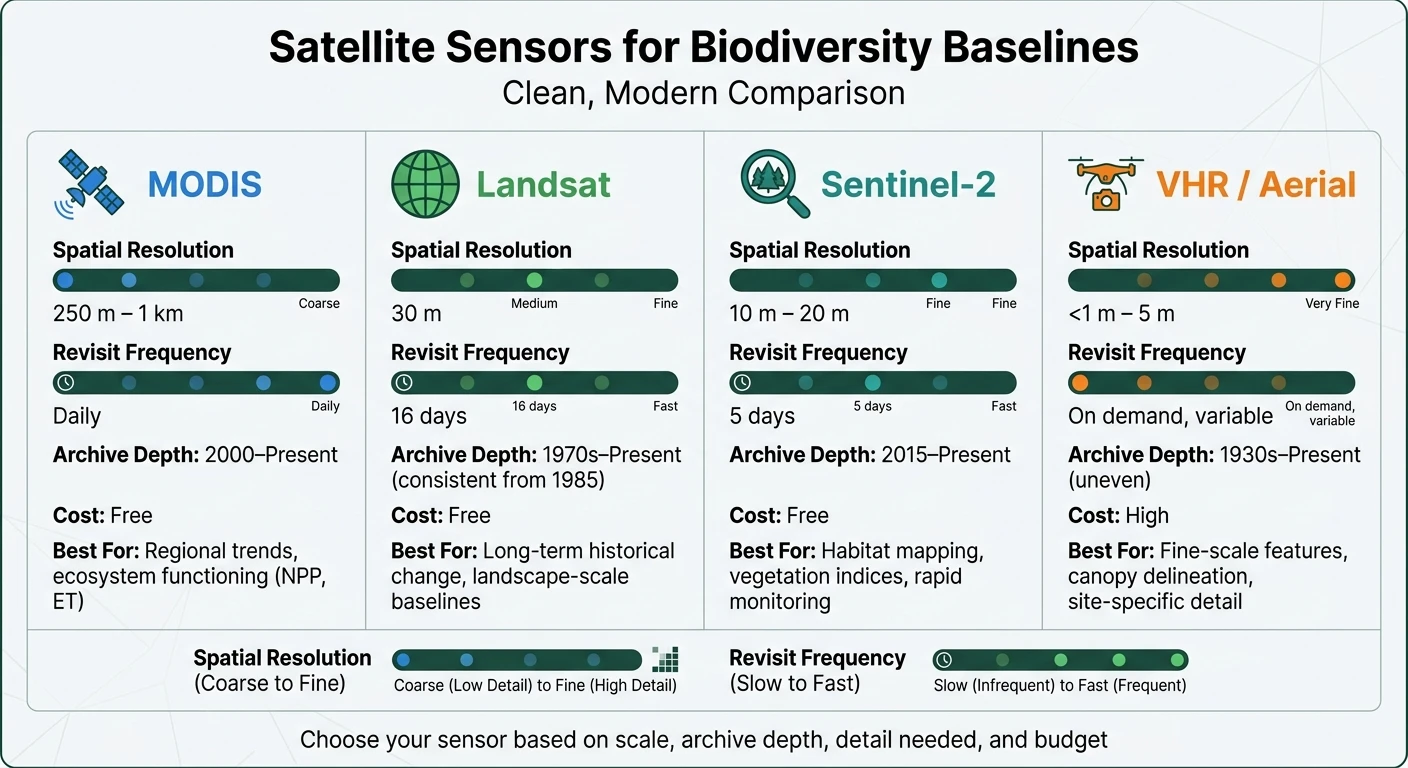
Satellite Sensors for Biodiversity Baselines: A Quick Comparison Guide
No single satellite sensor fits every baseline project. The right pick depends on a few plain factors: what you need to document, how big the area is, how far back the record must go, and how much money you can spend. A regional baseline calls for one type of data; a small-site canopy study calls for another. The two baseline jobs defined earlier - mapping habitat extent and measuring condition - both depend on matching the sensor to the scale and detail of the question. In practice, that means choosing the sensor based on the task at hand: historical reconstruction, fine-scale habitat mapping, or broad trend analysis.
Landsat, Sentinel-2, MODIS, and Very-High-Resolution Imagery
Landsat is the go-to option when a baseline needs a long historical record. Its archive reaches back to the 1970s, with consistent, analysis-ready data available from 1985 onward at 30-meter resolution. That makes it a strong fit for documenting pre-project conditions from decades earlier. In June 2026, the University of California released version v2026.1 of the Wildland Almanac, a Landsat-derived dataset covering all California wildlands at 30-meter resolution across 41 water years, from 1985 to 2025. The Wildland Almanac combines 41 years of Landsat observations with biophysical metrics that support long-term change tracking [3].
Sentinel-2 serves a different need. With 10- to 20-meter resolution and a 5-day revisit cycle, it works well for detailed habitat mapping and for spotting fast vegetation change. It is especially useful for recent baselines where finer spatial detail matters.
MODIS sits at the other end of the scale. Its daily revisits come with coarse resolution - 250 meters to 1 kilometer - so it is better for landscape-scale condition trends than for drawing fine habitat boundaries. It works best for broad ecosystem metrics such as primary production, evapotranspiration, and phenology across entire ecoregions.
Very-high-resolution (VHR) imagery and historical aerial photography matter when the baseline hinges on small features you simply can't see well with coarser sensors. If the work depends on tree-level canopy gaps, fence lines, or other small structural details, VHR imagery becomes necessary.
Tradeoffs in Resolution, Revisit Frequency, and Archive Depth
Every sensor comes with tradeoffs. Higher spatial resolution often means a shorter archive and a higher price tag. Daily revisits usually mean larger pixels. On the cost side, free open-access data from Landsat, Sentinel-2, and MODIS can ease budget pressure and leave more room for field validation and climate resilience management actions.
Sensor | Spatial Resolution | Revisit Frequency | Archive Depth | Cost | Best For |
|---|---|---|---|---|---|
MODIS | 250 m – 1 km | Daily | 2000–Present | Free | Regional trends, ecosystem functioning (NPP, ET) |
Landsat | 30 m | 16 days | 1970s–Present; consistent from 1985 onward | Free | Long-term historical change, landscape-scale baselines |
Sentinel-2 | 10 m – 20 m | 5 days | 2015–Present | Free | Habitat mapping, vegetation indices, rapid monitoring |
VHR / Aerial | <1 m – 5 m | On demand, variable | 1930s–Present (uneven) | High | Fine-scale features, canopy delineation, site-specific detail |
For big archives, COGs and STAC catalogs make multi-year datasets much easier to search and use in GIS [3].
Once the sensor is set, the next move is to turn imagery into habitat classes, indices, and validated condition maps.
Core Methods for Mapping Biodiversity Baselines
Once you’ve picked the right sensor, the work shifts from raw imagery to something people can actually use: map layers that show habitat extent and ecological condition. In practice, that means turning imagery into baseline products such as habitat maps, vegetation metrics, and tested indicators that can stand up in a biodiversity baseline.
Habitat Classification, Land Cover Mapping, and Vegetation Indices
Land cover mapping describes what sits on the ground or water surface: forest, grassland, open water, or developed land. Habitat classification takes that one step further. It translates those surface types into ecological categories that fit species assessments and planning.
A common workflow starts by classifying calibrated imagery, then refining those classes with spatial context, and finally translating them into habitat categories used in ecological assessments. BIO_SOS showed that this approach can produce habitat maps from very-high-resolution imagery across multiple Natura 2000 sites [4].
NDVI and related indices help track productivity, phenology, and vegetation stress. Still, they have limits, especially in sparse cover or places with strong seasonal swings. That’s why it helps to use both products side by side: one tells you what is there; the other gives a read on how it is functioning.
Supervised vs. Unsupervised Classification
Supervised classification relies on field-labeled samples, so it tends to work best when you have enough solid reference data. Unsupervised classification groups pixels by spectral similarity. It can help with early-stage mapping, but it still depends on expert interpretation to make sense of the output.
For biodiversity baselines, rule-based classification often works best because it puts ecological expertise directly into the map logic [4]. When habitat precision matters, use LCCS. It maps natural and semi-natural classes with more detail than broader land-cover schemes [4].
The method should also match the job the baseline needs to do. A baseline built for formal review, for example, may need tighter class definitions and stricter testing than one used for broad screening. If the goal is to set restoration targets, the bar shifts again.
Combining Imagery with Ground-Truth Data
Classification only starts to matter when it’s checked against the field. Field data should do two jobs: train the model and test accuracy on an independent basis. That only works if teams use the same field protocols across all sites.
Timing matters just as much as method. Match image dates to key phenological windows: leaf-out and peak growth for vegetation, plus both high- and low-water periods for wetlands and riparian zones [4].
A good example comes from the San Carlos Apache Forest Resources Program. It combined 1935 aerial photographs with 2017 remote sensing data and found that woodland tree canopy cover in one study area had more than doubled, moving from 18.3% to 38.5%. That gave the Tribe a measurable pre-project condition that could support restoration targets [2].
At every step, document the assumptions, imagery dates, classification rules, and validation results. If someone needs to check the baseline later - or defend it in review - that paper trail matters.
Indicators, Validation, and Common Baseline Pitfalls
Once the map is in place, the next job is simple in theory and messy in practice: check whether it’s right, and be honest about where it falls short.
Satellite-Derived Indicators for Baseline Studies
Satellite data can do a lot of heavy lifting in baseline studies. It can map habitat extent, fragmentation, connectivity, and landscape pattern. It can also estimate primary production, carbon gain, surface temperature, albedo, evapotranspiration, and precipitation use efficiency.
Spectral indices add another layer of insight. NDVI tracks vegetation productivity and greenness. The Water Band Index (WBI) shows moisture status. The Plant Senescence Reflectance Index (PSRI) points to vegetation stress and die-back [4]. Together, these indicators support the Essential Biodiversity Variables framework and many CBD-aligned monitoring needs.
That said, these metrics only help if you measure their accuracy and uncertainty. A polished map that hasn’t been checked can send people in the wrong direction fast.
Validation, Uncertainty, and the Limits of Satellite-Only Analysis
Every classified map should be validated with a confusion matrix and overall accuracy before anyone uses it to guide decisions. Field surveys and expert review should test class errors with independent evidence. Drone-based (UAV) imagery has also become a useful validation tool, showing up in 15% of ecological monitoring studies over the past decade [5].
Satellite analysis also has hard limits. It works well for habitat structure and ecosystem condition, but it cannot reliably detect species richness, genetic diversity, or most animal taxa that leave no spectral signature [1] [4]. In plain terms, satellites can show you a lot about the stage, but not always who’s on it.
Ecological niche modeling helps close part of that gap. It can use satellite-derived habitat maps as environmental variables, which can predict target species distributions more accurately than simple land-cover maps [4].
Most baseline failures don’t come from fancy theory breaking down. They usually come from familiar problems: seasonal mismatch, cloud cover, mixed pixels, and weak ground truth.
Common Errors and How to Reduce Them
The table below shows the main failure points and what to do about them.
Pitfall | Why It Matters | How to Reduce It |
|---|---|---|
Cloud cover | Creates data gaps, especially in tropical or mountainous regions | Use radar (SAR) data or multi-date composites |
Seasonal mismatch | Comparing images from different phenological stages can create false change signals | Use imagery covering before leaf-out, peak growth, and senescence |
Mixed pixels | Coarse sensors blend multiple land covers into one pixel | Supplement with VHR or drone imagery for sub-pixel validation |
Classification error | Habitats with similar spectral signatures can be mislabeled | Use expert-reviewed classes and formal accuracy testing |
Inconsistent baselines | Inconsistent class definitions break trend analysis | Standardize class definitions from the start and document all rules |
Overreliance on canopy cover | A dense canopy can hide degraded understory or weak ecosystem function | Pair structural metrics with functional indicators like primary production and evapotranspiration |
Document baseline quality and intended use with ISO 19115 metadata.
Building a Defensible Baseline for Decision-Making
A validated map is only the start. The other half is making sure that map stands up when people start asking hard questions during permitting reviews, environmental impact assessments, restoration plans, or land management decisions. That means being deliberate about timing, documentation, and the way satellite outputs are paired with local records and field evidence.
Setting Baseline Dates and Documenting Pre-Project Conditions
After validation, the next move is to lock the reference period and document the evidence behind it. A defensible baseline is not a snapshot pulled from a convenient date. It is a carefully chosen period that reflects the ecosystem's condition before the project, development, or disturbance at issue. When satellite archives do not go back far enough, historical aerials can extend the record.
Use multi-season imagery so normal seasonal shifts are not confused with long-term change. Then cross-check that reference window against field records and local knowledge. That step matters more than it may seem on paper. A map can look clean and precise, but if it ignores what people on the ground already know, it can miss the mark.
Just as important, document the imagery dates used, the validation approach, the assumptions made, and the known uncertainty so the baseline can be reproduced or updated. If it cannot be reproduced, it is not defensible.
From Technical Analysis to Implementation
Once the reference window is fixed, translate the results into formats planners and regulators can use. That is often the hard part. Producing satellite outputs is one thing; turning them into something people can act on is another. Functional metrics help bridge that gap by turning maps into management criteria, so decision-makers are working with quantitative standards instead of loose descriptions.
"Incorporating quantitative measurements of ecosystem functions into conservation practice is important given that it provides not only proxies for biodiversity patterns, but also new tools and criteria for management." - Alcaraz-Segura et al., Biodiversity and Conservation [1]
Use a fixed format so later updates remain comparable.
Conclusion: Key Practices for Reliable Biodiversity Baselines
Once you've handled sensor selection, mapping, and validation, the last step is turning the analysis into a baseline you can stand behind. A reliable biodiversity baseline comes from matching the imagery, timing, validation, and documentation to the ecological question at hand. If the goal is to track energy balance, use thermal infrared. If you're looking at phenology, high-revisit sensors matter more.
Multi-date archives help you capture both seasonal shifts and year-to-year variation. From there, add functional metrics such as net primary production, evapotranspiration, and albedo [1]. That extra layer can turn a simple land-cover view into something far more useful for ecological assessment.
Field validation is not optional. Spectral data has to be translated into biophysical variables with validated methods and ground-truth checks. Otherwise, the baseline may look polished on paper but fall apart under scrutiny.
Just as important, document everything: imagery dates, algorithms used, assumptions made, and the known limits of the analysis. A baseline that can't be reproduced is hard to defend. Clear methods and honest uncertainty are what make it defensible and usable. In the end, selection, timing, validation, and documentation are the pieces that make satellite-derived biodiversity baselines hold up.
FAQs
Which satellite source should I choose?
Choose the source that fits your biodiversity monitoring goals.
For broad habitat and biodiversity analysis, Landsat is a solid open-access starting point. It gives you a dependable view across large areas, which makes it useful for baseline mapping and long-term change tracking.
If you need more detail, Sentinel-2 is often the better pick. Its 10-meter resolution and 2- to 5-day revisit times make it well suited for spotting finer land-cover patterns and changes that Landsat may miss.
For a more accurate, actionable baseline, don’t rely on satellite data alone. Pair satellite metrics with field surveys, lidar data, and tools like IBAT. That mix gives you a stronger picture of what’s happening on the ground, not just what appears from space.
How much field validation is enough?
There’s no fixed universal threshold. The right amount of field validation depends on what your project is trying to do and how much statistical rigor you need.
Field data still plays a central role. It helps calibrate satellite observations and fill in what remote sensing can’t show on its own. If data gaps show up - and they often do - use credible secondary sources and well-chosen proxies, then document your method and limits with care.
Perfection isn’t the bar here. A credible effort on the ground matters more.
Can satellite data prove biodiversity gains?
Yes - satellite data can help prove biodiversity gains, especially when paired with ground-based monitoring. It offers a cost-effective way to track ecosystem signals such as vegetation structure, canopy cover, and land-use change.
Satellite imagery can reveal habitat recovery and other positive shifts across an ecosystem. At the same time, it can't replace field data when you need close-up taxonomic detail or small-scale species-level findings. Put the two together, though, and you get a much clearer view of progress.
Related Blog Posts
Latest Articles
©2026

Narrative Change and Power Building: The Missing Half of Advocacy
Narrative change is the process of disrupting dominant narratives that normalize inequity and advancing new narratives from historically marginalized communities.
Funding Resilience Without Federal Grants
BRIC is unreliable and FEMA is shrinking. Here's how cities fund climate resilience with dedicated revenue, blended finance, and a coordinating authority.

The ESG Blind Spot: How AI Is Finding Risks in Companies Nobody Else Is Watching
Norway's sovereign wealth fund uses AI to screen 7,200 portfolio companies for forced labor and corruption within 24 hours. The real story is the emerging-market coverage gap that traditional ESG data vendors miss — and what it means for any company with a global supply chain.
Narrative Change and Power Building: The Missing Half of Advocacy
Narrative change is the process of disrupting dominant narratives that normalize inequity and advancing new narratives from historically marginalized communities.
Funding Resilience Without Federal Grants
BRIC is unreliable and FEMA is shrinking. Here's how cities fund climate resilience with dedicated revenue, blended finance, and a coordinating authority.
The ESG Blind Spot: How AI Is Finding Risks in Companies Nobody Else Is Watching
Norway's sovereign wealth fund uses AI to screen 7,200 portfolio companies for forced labor and corruption within 24 hours. The real story is the emerging-market coverage gap that traditional ESG data vendors miss — and what it means for any company with a global supply chain.
FAQ
01
What does it really mean to “redefine profit”?
02
What makes Council Fire different?
03
Who does Council Fire work with?
04
What does working with Council Fire actually look like?
05
How does Council Fire help organizations turn big goals into action?
06
How does Council Fire define and measure success?
07
How does technology fit into Council Fire’s work?
Jul 24, 2026
Satellite Data for Biodiversity Baseline Studies
Sustainability Strategy
In This Article
How to build defensible biodiversity baselines using Landsat, Sentinel-2, MODIS, field validation, and clear documentation.
Satellite Data for Biodiversity Baseline Studies
If you want a baseline that holds up, I’d start with four things: the right sensor, a clear date range, field checks, and written rules. Satellite data can map habitat, track change back to the 1970s, and show condition through metrics like NDVI, surface temperature, evapotranspiration, and canopy cover. But on its own, it cannot tell me species richness, genetic diversity, or most animal presence.
Here’s the short version:
Landsat is best when I need long-term history, with records reaching back decades and steady 30-meter data from 1985–2025 in products like California’s Wildland Almanac.
Sentinel-2 helps when I need more detail, with 10–20 m pixels and a 5-day revisit cycle.
MODIS works for broad condition trends, with daily revisits but coarser pixels of 250 m to 1 km.
VHR imagery and old aerial photos are useful when small features matter, such as canopy gaps, fence lines, or site-scale structure.
A baseline should cover both what is there and how it is functioning.
The main failure points are plain: clouds, season mismatch, mixed pixels, weak field data, and class errors.
One case study found woodland canopy cover changed from 18.3% to 38.5% between 1935 and 2017 when old aerial photos were paired with newer remote sensing and local knowledge.
I’d treat satellite data as one part of the job, not the whole job. The map needs field data, local records, and a clear validation step before anyone uses it for permits, restoration targets, or site review.
A simple baseline workflow looks like this:
Pick the reference period before the project or disturbance.
Choose the sensor based on scale, archive length, detail, and budget.
Map habitats and add condition metrics such as greenness, moisture, heat, and canopy cover.
Check the map in the field and test accuracy with an independent sample.
Write down dates, rules, methods, and uncertainty so later updates stay consistent.
Source | Best use | Main tradeoff |
|---|---|---|
Landsat | Long-term change and past site condition | Less detail than newer higher-resolution imagery |
Sentinel-2 | Habitat mapping and recent vegetation change | Shorter archive |
MODIS | Large-area function trends | Too coarse for fine boundaries |
VHR / aerial | Small features and site detail | Higher cost and uneven archives |
The main point is simple: a good biodiversity baseline is built from fit-for-purpose imagery, multi-season timing, field validation, and clear documentation. That is what turns a map into something people can use and check later.
The Role of Satellite Data in Biodiversity Net Gain
Choosing Satellite Data Sources for Baseline Work
Satellite Sensors for Biodiversity Baselines: A Quick Comparison Guide
No single satellite sensor fits every baseline project. The right pick depends on a few plain factors: what you need to document, how big the area is, how far back the record must go, and how much money you can spend. A regional baseline calls for one type of data; a small-site canopy study calls for another. The two baseline jobs defined earlier - mapping habitat extent and measuring condition - both depend on matching the sensor to the scale and detail of the question. In practice, that means choosing the sensor based on the task at hand: historical reconstruction, fine-scale habitat mapping, or broad trend analysis.
Landsat, Sentinel-2, MODIS, and Very-High-Resolution Imagery
Landsat is the go-to option when a baseline needs a long historical record. Its archive reaches back to the 1970s, with consistent, analysis-ready data available from 1985 onward at 30-meter resolution. That makes it a strong fit for documenting pre-project conditions from decades earlier. In June 2026, the University of California released version v2026.1 of the Wildland Almanac, a Landsat-derived dataset covering all California wildlands at 30-meter resolution across 41 water years, from 1985 to 2025. The Wildland Almanac combines 41 years of Landsat observations with biophysical metrics that support long-term change tracking [3].
Sentinel-2 serves a different need. With 10- to 20-meter resolution and a 5-day revisit cycle, it works well for detailed habitat mapping and for spotting fast vegetation change. It is especially useful for recent baselines where finer spatial detail matters.
MODIS sits at the other end of the scale. Its daily revisits come with coarse resolution - 250 meters to 1 kilometer - so it is better for landscape-scale condition trends than for drawing fine habitat boundaries. It works best for broad ecosystem metrics such as primary production, evapotranspiration, and phenology across entire ecoregions.
Very-high-resolution (VHR) imagery and historical aerial photography matter when the baseline hinges on small features you simply can't see well with coarser sensors. If the work depends on tree-level canopy gaps, fence lines, or other small structural details, VHR imagery becomes necessary.
Tradeoffs in Resolution, Revisit Frequency, and Archive Depth
Every sensor comes with tradeoffs. Higher spatial resolution often means a shorter archive and a higher price tag. Daily revisits usually mean larger pixels. On the cost side, free open-access data from Landsat, Sentinel-2, and MODIS can ease budget pressure and leave more room for field validation and climate resilience management actions.
Sensor | Spatial Resolution | Revisit Frequency | Archive Depth | Cost | Best For |
|---|---|---|---|---|---|
MODIS | 250 m – 1 km | Daily | 2000–Present | Free | Regional trends, ecosystem functioning (NPP, ET) |
Landsat | 30 m | 16 days | 1970s–Present; consistent from 1985 onward | Free | Long-term historical change, landscape-scale baselines |
Sentinel-2 | 10 m – 20 m | 5 days | 2015–Present | Free | Habitat mapping, vegetation indices, rapid monitoring |
VHR / Aerial | <1 m – 5 m | On demand, variable | 1930s–Present (uneven) | High | Fine-scale features, canopy delineation, site-specific detail |
For big archives, COGs and STAC catalogs make multi-year datasets much easier to search and use in GIS [3].
Once the sensor is set, the next move is to turn imagery into habitat classes, indices, and validated condition maps.
Core Methods for Mapping Biodiversity Baselines
Once you’ve picked the right sensor, the work shifts from raw imagery to something people can actually use: map layers that show habitat extent and ecological condition. In practice, that means turning imagery into baseline products such as habitat maps, vegetation metrics, and tested indicators that can stand up in a biodiversity baseline.
Habitat Classification, Land Cover Mapping, and Vegetation Indices
Land cover mapping describes what sits on the ground or water surface: forest, grassland, open water, or developed land. Habitat classification takes that one step further. It translates those surface types into ecological categories that fit species assessments and planning.
A common workflow starts by classifying calibrated imagery, then refining those classes with spatial context, and finally translating them into habitat categories used in ecological assessments. BIO_SOS showed that this approach can produce habitat maps from very-high-resolution imagery across multiple Natura 2000 sites [4].
NDVI and related indices help track productivity, phenology, and vegetation stress. Still, they have limits, especially in sparse cover or places with strong seasonal swings. That’s why it helps to use both products side by side: one tells you what is there; the other gives a read on how it is functioning.
Supervised vs. Unsupervised Classification
Supervised classification relies on field-labeled samples, so it tends to work best when you have enough solid reference data. Unsupervised classification groups pixels by spectral similarity. It can help with early-stage mapping, but it still depends on expert interpretation to make sense of the output.
For biodiversity baselines, rule-based classification often works best because it puts ecological expertise directly into the map logic [4]. When habitat precision matters, use LCCS. It maps natural and semi-natural classes with more detail than broader land-cover schemes [4].
The method should also match the job the baseline needs to do. A baseline built for formal review, for example, may need tighter class definitions and stricter testing than one used for broad screening. If the goal is to set restoration targets, the bar shifts again.
Combining Imagery with Ground-Truth Data
Classification only starts to matter when it’s checked against the field. Field data should do two jobs: train the model and test accuracy on an independent basis. That only works if teams use the same field protocols across all sites.
Timing matters just as much as method. Match image dates to key phenological windows: leaf-out and peak growth for vegetation, plus both high- and low-water periods for wetlands and riparian zones [4].
A good example comes from the San Carlos Apache Forest Resources Program. It combined 1935 aerial photographs with 2017 remote sensing data and found that woodland tree canopy cover in one study area had more than doubled, moving from 18.3% to 38.5%. That gave the Tribe a measurable pre-project condition that could support restoration targets [2].
At every step, document the assumptions, imagery dates, classification rules, and validation results. If someone needs to check the baseline later - or defend it in review - that paper trail matters.
Indicators, Validation, and Common Baseline Pitfalls
Once the map is in place, the next job is simple in theory and messy in practice: check whether it’s right, and be honest about where it falls short.
Satellite-Derived Indicators for Baseline Studies
Satellite data can do a lot of heavy lifting in baseline studies. It can map habitat extent, fragmentation, connectivity, and landscape pattern. It can also estimate primary production, carbon gain, surface temperature, albedo, evapotranspiration, and precipitation use efficiency.
Spectral indices add another layer of insight. NDVI tracks vegetation productivity and greenness. The Water Band Index (WBI) shows moisture status. The Plant Senescence Reflectance Index (PSRI) points to vegetation stress and die-back [4]. Together, these indicators support the Essential Biodiversity Variables framework and many CBD-aligned monitoring needs.
That said, these metrics only help if you measure their accuracy and uncertainty. A polished map that hasn’t been checked can send people in the wrong direction fast.
Validation, Uncertainty, and the Limits of Satellite-Only Analysis
Every classified map should be validated with a confusion matrix and overall accuracy before anyone uses it to guide decisions. Field surveys and expert review should test class errors with independent evidence. Drone-based (UAV) imagery has also become a useful validation tool, showing up in 15% of ecological monitoring studies over the past decade [5].
Satellite analysis also has hard limits. It works well for habitat structure and ecosystem condition, but it cannot reliably detect species richness, genetic diversity, or most animal taxa that leave no spectral signature [1] [4]. In plain terms, satellites can show you a lot about the stage, but not always who’s on it.
Ecological niche modeling helps close part of that gap. It can use satellite-derived habitat maps as environmental variables, which can predict target species distributions more accurately than simple land-cover maps [4].
Most baseline failures don’t come from fancy theory breaking down. They usually come from familiar problems: seasonal mismatch, cloud cover, mixed pixels, and weak ground truth.
Common Errors and How to Reduce Them
The table below shows the main failure points and what to do about them.
Pitfall | Why It Matters | How to Reduce It |
|---|---|---|
Cloud cover | Creates data gaps, especially in tropical or mountainous regions | Use radar (SAR) data or multi-date composites |
Seasonal mismatch | Comparing images from different phenological stages can create false change signals | Use imagery covering before leaf-out, peak growth, and senescence |
Mixed pixels | Coarse sensors blend multiple land covers into one pixel | Supplement with VHR or drone imagery for sub-pixel validation |
Classification error | Habitats with similar spectral signatures can be mislabeled | Use expert-reviewed classes and formal accuracy testing |
Inconsistent baselines | Inconsistent class definitions break trend analysis | Standardize class definitions from the start and document all rules |
Overreliance on canopy cover | A dense canopy can hide degraded understory or weak ecosystem function | Pair structural metrics with functional indicators like primary production and evapotranspiration |
Document baseline quality and intended use with ISO 19115 metadata.
Building a Defensible Baseline for Decision-Making
A validated map is only the start. The other half is making sure that map stands up when people start asking hard questions during permitting reviews, environmental impact assessments, restoration plans, or land management decisions. That means being deliberate about timing, documentation, and the way satellite outputs are paired with local records and field evidence.
Setting Baseline Dates and Documenting Pre-Project Conditions
After validation, the next move is to lock the reference period and document the evidence behind it. A defensible baseline is not a snapshot pulled from a convenient date. It is a carefully chosen period that reflects the ecosystem's condition before the project, development, or disturbance at issue. When satellite archives do not go back far enough, historical aerials can extend the record.
Use multi-season imagery so normal seasonal shifts are not confused with long-term change. Then cross-check that reference window against field records and local knowledge. That step matters more than it may seem on paper. A map can look clean and precise, but if it ignores what people on the ground already know, it can miss the mark.
Just as important, document the imagery dates used, the validation approach, the assumptions made, and the known uncertainty so the baseline can be reproduced or updated. If it cannot be reproduced, it is not defensible.
From Technical Analysis to Implementation
Once the reference window is fixed, translate the results into formats planners and regulators can use. That is often the hard part. Producing satellite outputs is one thing; turning them into something people can act on is another. Functional metrics help bridge that gap by turning maps into management criteria, so decision-makers are working with quantitative standards instead of loose descriptions.
"Incorporating quantitative measurements of ecosystem functions into conservation practice is important given that it provides not only proxies for biodiversity patterns, but also new tools and criteria for management." - Alcaraz-Segura et al., Biodiversity and Conservation [1]
Use a fixed format so later updates remain comparable.
Conclusion: Key Practices for Reliable Biodiversity Baselines
Once you've handled sensor selection, mapping, and validation, the last step is turning the analysis into a baseline you can stand behind. A reliable biodiversity baseline comes from matching the imagery, timing, validation, and documentation to the ecological question at hand. If the goal is to track energy balance, use thermal infrared. If you're looking at phenology, high-revisit sensors matter more.
Multi-date archives help you capture both seasonal shifts and year-to-year variation. From there, add functional metrics such as net primary production, evapotranspiration, and albedo [1]. That extra layer can turn a simple land-cover view into something far more useful for ecological assessment.
Field validation is not optional. Spectral data has to be translated into biophysical variables with validated methods and ground-truth checks. Otherwise, the baseline may look polished on paper but fall apart under scrutiny.
Just as important, document everything: imagery dates, algorithms used, assumptions made, and the known limits of the analysis. A baseline that can't be reproduced is hard to defend. Clear methods and honest uncertainty are what make it defensible and usable. In the end, selection, timing, validation, and documentation are the pieces that make satellite-derived biodiversity baselines hold up.
FAQs
Which satellite source should I choose?
Choose the source that fits your biodiversity monitoring goals.
For broad habitat and biodiversity analysis, Landsat is a solid open-access starting point. It gives you a dependable view across large areas, which makes it useful for baseline mapping and long-term change tracking.
If you need more detail, Sentinel-2 is often the better pick. Its 10-meter resolution and 2- to 5-day revisit times make it well suited for spotting finer land-cover patterns and changes that Landsat may miss.
For a more accurate, actionable baseline, don’t rely on satellite data alone. Pair satellite metrics with field surveys, lidar data, and tools like IBAT. That mix gives you a stronger picture of what’s happening on the ground, not just what appears from space.
How much field validation is enough?
There’s no fixed universal threshold. The right amount of field validation depends on what your project is trying to do and how much statistical rigor you need.
Field data still plays a central role. It helps calibrate satellite observations and fill in what remote sensing can’t show on its own. If data gaps show up - and they often do - use credible secondary sources and well-chosen proxies, then document your method and limits with care.
Perfection isn’t the bar here. A credible effort on the ground matters more.
Can satellite data prove biodiversity gains?
Yes - satellite data can help prove biodiversity gains, especially when paired with ground-based monitoring. It offers a cost-effective way to track ecosystem signals such as vegetation structure, canopy cover, and land-use change.
Satellite imagery can reveal habitat recovery and other positive shifts across an ecosystem. At the same time, it can't replace field data when you need close-up taxonomic detail or small-scale species-level findings. Put the two together, though, and you get a much clearer view of progress.
Related Blog Posts
Latest Articles
©2026
Narrative Change and Power Building: The Missing Half of Advocacy
Narrative change is the process of disrupting dominant narratives that normalize inequity and advancing new narratives from historically marginalized communities.
Funding Resilience Without Federal Grants
BRIC is unreliable and FEMA is shrinking. Here's how cities fund climate resilience with dedicated revenue, blended finance, and a coordinating authority.
The ESG Blind Spot: How AI Is Finding Risks in Companies Nobody Else Is Watching
Norway's sovereign wealth fund uses AI to screen 7,200 portfolio companies for forced labor and corruption within 24 hours. The real story is the emerging-market coverage gap that traditional ESG data vendors miss — and what it means for any company with a global supply chain.
FAQ
01
What does it really mean to “redefine profit”?
02
What makes Council Fire different?
03
Who does Council Fire work with?
04
What does working with Council Fire actually look like?
05
How does Council Fire help organizations turn big goals into action?
06
How does Council Fire define and measure success?
07
How does technology fit into Council Fire’s work?
Jul 24, 2026
Satellite Data for Biodiversity Baseline Studies
Sustainability Strategy
In This Article
How to build defensible biodiversity baselines using Landsat, Sentinel-2, MODIS, field validation, and clear documentation.
Satellite Data for Biodiversity Baseline Studies
If you want a baseline that holds up, I’d start with four things: the right sensor, a clear date range, field checks, and written rules. Satellite data can map habitat, track change back to the 1970s, and show condition through metrics like NDVI, surface temperature, evapotranspiration, and canopy cover. But on its own, it cannot tell me species richness, genetic diversity, or most animal presence.
Here’s the short version:
Landsat is best when I need long-term history, with records reaching back decades and steady 30-meter data from 1985–2025 in products like California’s Wildland Almanac.
Sentinel-2 helps when I need more detail, with 10–20 m pixels and a 5-day revisit cycle.
MODIS works for broad condition trends, with daily revisits but coarser pixels of 250 m to 1 km.
VHR imagery and old aerial photos are useful when small features matter, such as canopy gaps, fence lines, or site-scale structure.
A baseline should cover both what is there and how it is functioning.
The main failure points are plain: clouds, season mismatch, mixed pixels, weak field data, and class errors.
One case study found woodland canopy cover changed from 18.3% to 38.5% between 1935 and 2017 when old aerial photos were paired with newer remote sensing and local knowledge.
I’d treat satellite data as one part of the job, not the whole job. The map needs field data, local records, and a clear validation step before anyone uses it for permits, restoration targets, or site review.
A simple baseline workflow looks like this:
Pick the reference period before the project or disturbance.
Choose the sensor based on scale, archive length, detail, and budget.
Map habitats and add condition metrics such as greenness, moisture, heat, and canopy cover.
Check the map in the field and test accuracy with an independent sample.
Write down dates, rules, methods, and uncertainty so later updates stay consistent.
Source | Best use | Main tradeoff |
|---|---|---|
Landsat | Long-term change and past site condition | Less detail than newer higher-resolution imagery |
Sentinel-2 | Habitat mapping and recent vegetation change | Shorter archive |
MODIS | Large-area function trends | Too coarse for fine boundaries |
VHR / aerial | Small features and site detail | Higher cost and uneven archives |
The main point is simple: a good biodiversity baseline is built from fit-for-purpose imagery, multi-season timing, field validation, and clear documentation. That is what turns a map into something people can use and check later.
The Role of Satellite Data in Biodiversity Net Gain
Choosing Satellite Data Sources for Baseline Work
Satellite Sensors for Biodiversity Baselines: A Quick Comparison Guide
No single satellite sensor fits every baseline project. The right pick depends on a few plain factors: what you need to document, how big the area is, how far back the record must go, and how much money you can spend. A regional baseline calls for one type of data; a small-site canopy study calls for another. The two baseline jobs defined earlier - mapping habitat extent and measuring condition - both depend on matching the sensor to the scale and detail of the question. In practice, that means choosing the sensor based on the task at hand: historical reconstruction, fine-scale habitat mapping, or broad trend analysis.
Landsat, Sentinel-2, MODIS, and Very-High-Resolution Imagery
Landsat is the go-to option when a baseline needs a long historical record. Its archive reaches back to the 1970s, with consistent, analysis-ready data available from 1985 onward at 30-meter resolution. That makes it a strong fit for documenting pre-project conditions from decades earlier. In June 2026, the University of California released version v2026.1 of the Wildland Almanac, a Landsat-derived dataset covering all California wildlands at 30-meter resolution across 41 water years, from 1985 to 2025. The Wildland Almanac combines 41 years of Landsat observations with biophysical metrics that support long-term change tracking [3].
Sentinel-2 serves a different need. With 10- to 20-meter resolution and a 5-day revisit cycle, it works well for detailed habitat mapping and for spotting fast vegetation change. It is especially useful for recent baselines where finer spatial detail matters.
MODIS sits at the other end of the scale. Its daily revisits come with coarse resolution - 250 meters to 1 kilometer - so it is better for landscape-scale condition trends than for drawing fine habitat boundaries. It works best for broad ecosystem metrics such as primary production, evapotranspiration, and phenology across entire ecoregions.
Very-high-resolution (VHR) imagery and historical aerial photography matter when the baseline hinges on small features you simply can't see well with coarser sensors. If the work depends on tree-level canopy gaps, fence lines, or other small structural details, VHR imagery becomes necessary.
Tradeoffs in Resolution, Revisit Frequency, and Archive Depth
Every sensor comes with tradeoffs. Higher spatial resolution often means a shorter archive and a higher price tag. Daily revisits usually mean larger pixels. On the cost side, free open-access data from Landsat, Sentinel-2, and MODIS can ease budget pressure and leave more room for field validation and climate resilience management actions.
Sensor | Spatial Resolution | Revisit Frequency | Archive Depth | Cost | Best For |
|---|---|---|---|---|---|
MODIS | 250 m – 1 km | Daily | 2000–Present | Free | Regional trends, ecosystem functioning (NPP, ET) |
Landsat | 30 m | 16 days | 1970s–Present; consistent from 1985 onward | Free | Long-term historical change, landscape-scale baselines |
Sentinel-2 | 10 m – 20 m | 5 days | 2015–Present | Free | Habitat mapping, vegetation indices, rapid monitoring |
VHR / Aerial | <1 m – 5 m | On demand, variable | 1930s–Present (uneven) | High | Fine-scale features, canopy delineation, site-specific detail |
For big archives, COGs and STAC catalogs make multi-year datasets much easier to search and use in GIS [3].
Once the sensor is set, the next move is to turn imagery into habitat classes, indices, and validated condition maps.
Core Methods for Mapping Biodiversity Baselines
Once you’ve picked the right sensor, the work shifts from raw imagery to something people can actually use: map layers that show habitat extent and ecological condition. In practice, that means turning imagery into baseline products such as habitat maps, vegetation metrics, and tested indicators that can stand up in a biodiversity baseline.
Habitat Classification, Land Cover Mapping, and Vegetation Indices
Land cover mapping describes what sits on the ground or water surface: forest, grassland, open water, or developed land. Habitat classification takes that one step further. It translates those surface types into ecological categories that fit species assessments and planning.
A common workflow starts by classifying calibrated imagery, then refining those classes with spatial context, and finally translating them into habitat categories used in ecological assessments. BIO_SOS showed that this approach can produce habitat maps from very-high-resolution imagery across multiple Natura 2000 sites [4].
NDVI and related indices help track productivity, phenology, and vegetation stress. Still, they have limits, especially in sparse cover or places with strong seasonal swings. That’s why it helps to use both products side by side: one tells you what is there; the other gives a read on how it is functioning.
Supervised vs. Unsupervised Classification
Supervised classification relies on field-labeled samples, so it tends to work best when you have enough solid reference data. Unsupervised classification groups pixels by spectral similarity. It can help with early-stage mapping, but it still depends on expert interpretation to make sense of the output.
For biodiversity baselines, rule-based classification often works best because it puts ecological expertise directly into the map logic [4]. When habitat precision matters, use LCCS. It maps natural and semi-natural classes with more detail than broader land-cover schemes [4].
The method should also match the job the baseline needs to do. A baseline built for formal review, for example, may need tighter class definitions and stricter testing than one used for broad screening. If the goal is to set restoration targets, the bar shifts again.
Combining Imagery with Ground-Truth Data
Classification only starts to matter when it’s checked against the field. Field data should do two jobs: train the model and test accuracy on an independent basis. That only works if teams use the same field protocols across all sites.
Timing matters just as much as method. Match image dates to key phenological windows: leaf-out and peak growth for vegetation, plus both high- and low-water periods for wetlands and riparian zones [4].
A good example comes from the San Carlos Apache Forest Resources Program. It combined 1935 aerial photographs with 2017 remote sensing data and found that woodland tree canopy cover in one study area had more than doubled, moving from 18.3% to 38.5%. That gave the Tribe a measurable pre-project condition that could support restoration targets [2].
At every step, document the assumptions, imagery dates, classification rules, and validation results. If someone needs to check the baseline later - or defend it in review - that paper trail matters.
Indicators, Validation, and Common Baseline Pitfalls
Once the map is in place, the next job is simple in theory and messy in practice: check whether it’s right, and be honest about where it falls short.
Satellite-Derived Indicators for Baseline Studies
Satellite data can do a lot of heavy lifting in baseline studies. It can map habitat extent, fragmentation, connectivity, and landscape pattern. It can also estimate primary production, carbon gain, surface temperature, albedo, evapotranspiration, and precipitation use efficiency.
Spectral indices add another layer of insight. NDVI tracks vegetation productivity and greenness. The Water Band Index (WBI) shows moisture status. The Plant Senescence Reflectance Index (PSRI) points to vegetation stress and die-back [4]. Together, these indicators support the Essential Biodiversity Variables framework and many CBD-aligned monitoring needs.
That said, these metrics only help if you measure their accuracy and uncertainty. A polished map that hasn’t been checked can send people in the wrong direction fast.
Validation, Uncertainty, and the Limits of Satellite-Only Analysis
Every classified map should be validated with a confusion matrix and overall accuracy before anyone uses it to guide decisions. Field surveys and expert review should test class errors with independent evidence. Drone-based (UAV) imagery has also become a useful validation tool, showing up in 15% of ecological monitoring studies over the past decade [5].
Satellite analysis also has hard limits. It works well for habitat structure and ecosystem condition, but it cannot reliably detect species richness, genetic diversity, or most animal taxa that leave no spectral signature [1] [4]. In plain terms, satellites can show you a lot about the stage, but not always who’s on it.
Ecological niche modeling helps close part of that gap. It can use satellite-derived habitat maps as environmental variables, which can predict target species distributions more accurately than simple land-cover maps [4].
Most baseline failures don’t come from fancy theory breaking down. They usually come from familiar problems: seasonal mismatch, cloud cover, mixed pixels, and weak ground truth.
Common Errors and How to Reduce Them
The table below shows the main failure points and what to do about them.
Pitfall | Why It Matters | How to Reduce It |
|---|---|---|
Cloud cover | Creates data gaps, especially in tropical or mountainous regions | Use radar (SAR) data or multi-date composites |
Seasonal mismatch | Comparing images from different phenological stages can create false change signals | Use imagery covering before leaf-out, peak growth, and senescence |
Mixed pixels | Coarse sensors blend multiple land covers into one pixel | Supplement with VHR or drone imagery for sub-pixel validation |
Classification error | Habitats with similar spectral signatures can be mislabeled | Use expert-reviewed classes and formal accuracy testing |
Inconsistent baselines | Inconsistent class definitions break trend analysis | Standardize class definitions from the start and document all rules |
Overreliance on canopy cover | A dense canopy can hide degraded understory or weak ecosystem function | Pair structural metrics with functional indicators like primary production and evapotranspiration |
Document baseline quality and intended use with ISO 19115 metadata.
Building a Defensible Baseline for Decision-Making
A validated map is only the start. The other half is making sure that map stands up when people start asking hard questions during permitting reviews, environmental impact assessments, restoration plans, or land management decisions. That means being deliberate about timing, documentation, and the way satellite outputs are paired with local records and field evidence.
Setting Baseline Dates and Documenting Pre-Project Conditions
After validation, the next move is to lock the reference period and document the evidence behind it. A defensible baseline is not a snapshot pulled from a convenient date. It is a carefully chosen period that reflects the ecosystem's condition before the project, development, or disturbance at issue. When satellite archives do not go back far enough, historical aerials can extend the record.
Use multi-season imagery so normal seasonal shifts are not confused with long-term change. Then cross-check that reference window against field records and local knowledge. That step matters more than it may seem on paper. A map can look clean and precise, but if it ignores what people on the ground already know, it can miss the mark.
Just as important, document the imagery dates used, the validation approach, the assumptions made, and the known uncertainty so the baseline can be reproduced or updated. If it cannot be reproduced, it is not defensible.
From Technical Analysis to Implementation
Once the reference window is fixed, translate the results into formats planners and regulators can use. That is often the hard part. Producing satellite outputs is one thing; turning them into something people can act on is another. Functional metrics help bridge that gap by turning maps into management criteria, so decision-makers are working with quantitative standards instead of loose descriptions.
"Incorporating quantitative measurements of ecosystem functions into conservation practice is important given that it provides not only proxies for biodiversity patterns, but also new tools and criteria for management." - Alcaraz-Segura et al., Biodiversity and Conservation [1]
Use a fixed format so later updates remain comparable.
Conclusion: Key Practices for Reliable Biodiversity Baselines
Once you've handled sensor selection, mapping, and validation, the last step is turning the analysis into a baseline you can stand behind. A reliable biodiversity baseline comes from matching the imagery, timing, validation, and documentation to the ecological question at hand. If the goal is to track energy balance, use thermal infrared. If you're looking at phenology, high-revisit sensors matter more.
Multi-date archives help you capture both seasonal shifts and year-to-year variation. From there, add functional metrics such as net primary production, evapotranspiration, and albedo [1]. That extra layer can turn a simple land-cover view into something far more useful for ecological assessment.
Field validation is not optional. Spectral data has to be translated into biophysical variables with validated methods and ground-truth checks. Otherwise, the baseline may look polished on paper but fall apart under scrutiny.
Just as important, document everything: imagery dates, algorithms used, assumptions made, and the known limits of the analysis. A baseline that can't be reproduced is hard to defend. Clear methods and honest uncertainty are what make it defensible and usable. In the end, selection, timing, validation, and documentation are the pieces that make satellite-derived biodiversity baselines hold up.
FAQs
Which satellite source should I choose?
Choose the source that fits your biodiversity monitoring goals.
For broad habitat and biodiversity analysis, Landsat is a solid open-access starting point. It gives you a dependable view across large areas, which makes it useful for baseline mapping and long-term change tracking.
If you need more detail, Sentinel-2 is often the better pick. Its 10-meter resolution and 2- to 5-day revisit times make it well suited for spotting finer land-cover patterns and changes that Landsat may miss.
For a more accurate, actionable baseline, don’t rely on satellite data alone. Pair satellite metrics with field surveys, lidar data, and tools like IBAT. That mix gives you a stronger picture of what’s happening on the ground, not just what appears from space.
How much field validation is enough?
There’s no fixed universal threshold. The right amount of field validation depends on what your project is trying to do and how much statistical rigor you need.
Field data still plays a central role. It helps calibrate satellite observations and fill in what remote sensing can’t show on its own. If data gaps show up - and they often do - use credible secondary sources and well-chosen proxies, then document your method and limits with care.
Perfection isn’t the bar here. A credible effort on the ground matters more.
Can satellite data prove biodiversity gains?
Yes - satellite data can help prove biodiversity gains, especially when paired with ground-based monitoring. It offers a cost-effective way to track ecosystem signals such as vegetation structure, canopy cover, and land-use change.
Satellite imagery can reveal habitat recovery and other positive shifts across an ecosystem. At the same time, it can't replace field data when you need close-up taxonomic detail or small-scale species-level findings. Put the two together, though, and you get a much clearer view of progress.
Related Blog Posts
Latest Articles
©2026
Narrative Change and Power Building: The Missing Half of Advocacy
Narrative change is the process of disrupting dominant narratives that normalize inequity and advancing new narratives from historically marginalized communities.
Funding Resilience Without Federal Grants
BRIC is unreliable and FEMA is shrinking. Here's how cities fund climate resilience with dedicated revenue, blended finance, and a coordinating authority.
The ESG Blind Spot: How AI Is Finding Risks in Companies Nobody Else Is Watching
Norway's sovereign wealth fund uses AI to screen 7,200 portfolio companies for forced labor and corruption within 24 hours. The real story is the emerging-market coverage gap that traditional ESG data vendors miss — and what it means for any company with a global supply chain.
FAQ
What does it really mean to “redefine profit”?
What makes Council Fire different?
Who does Council Fire work with?
What does working with Council Fire actually look like?
How does Council Fire help organizations turn big goals into action?
How does Council Fire define and measure success?
How does technology fit into Council Fire’s work?