
Aug 4, 2026
Equity Scorecards Across Community Energy Sites
Sustainability Strategy
In This Article
Compare five equity scorecard models and how weighting, thresholds, and local tailoring change community energy outcomes.
Equity Scorecards Across Community Energy Sites
The main point is simple: the same community energy project can score very differently depending on the scorecard model. That matters because the model decides what gets counted, what gets more weight, and what can be hidden.
I see five main models in this comparison: equal-point rubrics, percentage-weighted scorecards, composite indexes, threshold-and-tier systems, and hybrid scorecards. Across them, the same core issues keep showing up: participation, access, benefits, governance, energy burden, reliability, and community ownership.
One fact sets the stakes: low-income U.S. households spend a median 8.3% of income on energy, versus 2.9% for all households. So if you want to compare projects across sites, you need more than one headline score. You need to know how the score was built.
What this article shows:
Equal-point rubrics are easy to read but can flatten local priorities.
Weighted scorecards reflect stated priorities, but the chosen weights can shift results fast.
Composite indexes turn many metrics into one number, which helps comparison but can hide weak spots.
Threshold models set minimum bars, so strong results in one area cannot offset failure in another.
Hybrid scorecards keep shared core metrics and add local measures for tribal, rural, renter, or climate-risk conditions.
What to keep in mind:
A high score in one state may reflect better policy rules, not just better project design.
A lower score may still show progress in a harder setting.
Cross-site benchmarking works best as a diagnostic tool, not a simple ranking list.
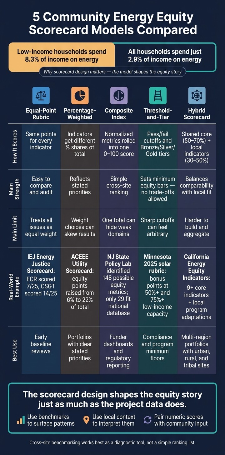
5 Community Energy Equity Scorecard Models Compared
Justice in 100: Scorecard for Equity in 100% Clean Energy Policies & Lessons from Washington State
Quick Comparison
Model | How it scores | Main strength | Main limit | Best use |
|---|---|---|---|---|
Equal-Point Rubric | Same points for each indicator | Easy to compare and audit | Treats all issues as equal | Early baseline reviews |
Percentage-Weighted | Indicators get different shares of total | Shows stated priorities | Weight choices can skew results | Portfolios with clear priorities |
Composite Index | Normalized metrics rolled into one score | Simple cross-site ranking | One total can hide weak domains | Dashboards and reporting |
Threshold-and-Tier | Pass/fail cutoffs and tiers | Sets minimum equity bars | Sharp cutoffs can feel arbitrary | Compliance and program floors |
Hybrid | Shared core plus local indicators | Balances comparison with local fit | Harder to build and aggregate | Multi-region portfolios |
If I had to boil the whole article down to one line, it would be this: the scorecard design shapes the equity story just as much as the project data does.
1. Equal-Point Rubric Scorecards
Equal-point rubric scorecards give every indicator the same top score. If a rubric has 20 indicators on a 0–5 scale, the highest total is 100 points. Each indicator counts the same, and the final score is just the sum of all items. That simple setup makes this model the easiest one to compare across sites.
Indicator Coverage
Most rubrics span four to six domains: participation and governance, access and affordability, distribution of benefits and burdens, cultural and linguistic appropriateness, and fair process. The Initiative for Energy Justice's Energy Justice Scorecard reviews energy policies across five indicators - Process, Restoration, Decision-making, Benefits, and Access - each scored 1–5, for a maximum of 25 points.[2][3]
That setup shows its value in California community energy case studies. The Enhanced Community Renewables (ECR) program scored 7/25, while the Community Solar Green Tariff (CSGT) program scored 14/25.[4] Same policy setting, same rubric, different results. That common frame makes it possible to read one site's performance against another without changing the scoring system each time.
Point Structure
The equal-point model assumes every indicator matters the same. On the plus side, scoring stays easy to follow. Readers can see where points were won or lost without digging through a complicated formula.
The downside is just as plain. A major local issue - like stopping displacement - gets no more numeric weight than a broad outreach metric. In practice, some programs work around this by repeating a high-priority indicator or setting required criteria that can cap the final score if a key item fails, while still keeping the main rubric on an equal-point basis.
Cross-Site Use
Equal-point rubrics are well-suited to high-level cross-site benchmarking. A dense urban site and a rural cooperative can both earn 3/5 on community governance and be compared directly. That's the appeal: a shared scoring language across very different places.
Still, scores need context notes. Without them, a lower score in one state can look like weaker effort when the project may simply be operating under tighter rules or fewer options on the ground.
Context Sensitivity
This is where the model starts to show strain. A uniform rubric can flatten major differences between sites. Two places may post the same score and still be dealing with very different limits.
Take affordability. A 3/5 means one thing for households in a high-cost coastal city and something else for rural households facing energy insecurity with lower average incomes. Standard thresholds can also miss tribal governance structures, long histories of disinvestment, or language access needs in immigrant communities.
The fix is pretty practical:
Co-create rubric definitions with local stakeholders
Add short site notes alongside scores
Flag local conditions, governance, and community priorities that may shape results
Those steps help the score stay comparable without stripping away the local story. The model's strength is its simplicity. Its weak spot is the same feature: it treats every indicator as equal, even when local priorities are not. That's why later models bring in weights, thresholds, or local tailoring.
2. Percentage-Weighted Scorecards
Percentage-weighted scorecards give each indicator a set share of the total score, so the result reflects priority, not simple equality across measures. Affordability might count for 30%, participation 25%, local economic benefit 20%, resilience 15%, and environmental performance 10%. You multiply raw scores by those weights, then add them together. The end result is easy for stakeholders to follow, while still leaving room for site-specific priorities.
That said, cross-site comparison only works if the weight-setting process is handled with care. Shared metrics matter, but so does the logic behind the weights. Teams should set weights through stakeholder input and document the reason for each choice. If residents keep ranking bill relief above carbon savings, the scorecard should show that order. A common setup uses a shared core, plus a smaller segment for local priorities.
Weighting can change the story in a big way. ACEEE's Utility Scorecard increased the share of equity-related points from 6% to 22% of total scoring by adding explicitly weighted indicators for low-income savings (5 points), low-income spending (4 points), stakeholder engagement (2 points), workforce development (2 points), financing (2 points), and utility shutoffs (1 point).[1] Similarly, the 2024 ACEEE City Clean Energy Scorecard allocated 48 out of 88 total performance points to equity-related metrics.[5][6]
These scorecards work well for cross-site comparison when sites share a common mission and use comparable data definitions, measurement periods, and scoring scales. But fixed weights can also skew results across places that are built very differently. A scoring system may end up favoring the kind of site it was designed around. When that happens, the numbers look neat, but the picture gets distorted. That's often the point where teams move toward a composite index.
A 30% weight on affordability will not mean the same thing in every place. In a remote rural community, reliability and outage resilience may deserve more weight. In a tribal community, governance, sovereignty, and cultural fit may need a larger share of the score. There isn't one national weighting template that fits all of those settings. Teams should record why weights were chosen, then test whether the same setup still holds when projects get more complicated. That tradeoff helps explain why later models split, stack, or set thresholds for equity measures instead of relying on weighting alone.
When weighted totals still blur key differences, composite index models add another layer of structure.
3. Composite Equity Index Models
Composite equity index models put different indicators on the same 0–100 scale, then apply weights to roll them into one score for cross-site comparison and trend tracking. That standardization step is what sets them apart from a simple weighted scorecard. Instead of mixing raw measures together, the model first translates each one into a shared format.
Indicator Coverage
These models usually sort indicators into domains like affordability, participation, environmental health, and community wealth-building. In U.S. practice, that can include measures such as the share of program benefits going to households below 80% of Area Median Income, along with jobs created for residents from priority groups, tracked through job counts and hourly wages in USD.
A New Jersey State Policy Lab project identified 148 possible energy equity metrics across recognition, procedural, distributive, and restorative dimensions.[7][8] That number tells an important story: it is very easy for a composite model to leave out procedural and restorative equity, even when those areas matter a lot on the ground. One score makes comparison across sites easier, but it can also flatten local detail that teams may need for action.
Weighting Approach
Weights may be set by experts, set by community members, or generated from data. That choice matters because it can shift site rankings in a big way. Strong savings do not automatically make up for weak governance if procedural equity carries more weight.
Take a simple example. A site may show high bill savings but low community voice. The minute procedural equity gets a larger share of the total, that same site can end up with a lower composite score. The math changes, and so does the story the index tells.
Benchmarking Fit
A composite index gives teams a shared yardstick, which makes cross-site comparison simple. Programs can sort sites into high, mid, and low bands and use those bands to target technical assistance.
The catch is just as clear: a high total score can hide deep problems in one domain. Weak procedural or governance performance can disappear inside the aggregate unless practitioners regularly break scores back out by indicator family next to the composite total. When one headline number starts masking the gaps that matter most, threshold or hybrid models help bring that missing detail back into view.
Context Sensitivity
There is no single national template that works for every community energy site. A rural tribal microgrid may need more weight on sovereignty and resilience. An urban multifamily solar program may put more emphasis on language access and renter participation.
Composite models deal with that difference through:
locally tailored indicator sets
community-driven weighting
relative baselines that track progress from local starting conditions instead of fixed national thresholds
It also helps to pair the score with short qualitative notes and community review. That keeps the model tied to local priorities instead of letting the index drift into a neat-looking number that misses what people in the community care about most.
4. Threshold-and-Tier Benchmark Scorecards
Unlike composite indexes, threshold-and-tier scorecards work with pass/fail cutoffs and tier labels. They do not total points and then average performance across categories. They ask a more direct question: does this project clear the bar? A project's final tier - Bronze, Silver, or Gold - depends on which minimum standards it meets, not on how well it balances out across the full scorecard.
That setup matters a lot in equity work. In a standard weighted scorecard, strong bill savings can make up for weak community governance. In a threshold-and-tier model, that tradeoff is blocked. If a project misses a minimum indicator - such as minimum participation from disadvantaged communities - its tier is capped, even if it does well everywhere else.
Indicator Coverage
This model uses the same equity indicator families, but treats them as minimum conditions rather than point-earning categories. The focus stays on a small group of equity-critical indicators: distributional equity, procedural equity, access and affordability, and recognition of communities with legacy pollution or high energy burdens.
A Bronze tier might require 20% of capacity to serve households at or below 80% AMI, along with language access. A Gold tier might require 50% or more, co-governance, and at least 30% bill savings for income-qualified participants. Federal tools like CEJST use the same threshold logic.[12][9]
Weighting Approach
Here, numeric weights give way to gating criteria. The indicators that define each tier set the lines between Bronze, Silver, and Gold. Optional indicators may lift a project within a tier or open the door to a premium level. The minimum indicators act as gatekeepers: miss one, and the project cannot move higher.
Minnesota's 2025 community solar scoring rubric shows how this can work in practice. It awards bonus points when projects allocate at least 50% of capacity to low-income subscribers, and more points when that share reaches 75% or more.[10]
Benchmarking Fit
A shared tier structure - Baseline, Emerging Equity, Strong Equity, Transformational Equity - gives administrators a simple way to sort dozens of sites using the same core thresholds. That makes it easier to spot patterns, set program goals, and direct technical assistance where it is needed most.
The main drawback is the sharp cutoff effect. A site delivering benefits to 49% of disadvantaged households might land in Silver, while a near-match at 51% earns Gold. That can feel a bit arbitrary, and in practice it often is. Tier labels also do not show absolute scale. A small rural microgrid and a large urban solar program can both earn Gold while serving very different numbers of households. Pairing tier labels with normalized metrics - such as per-household savings or per-dollar invested in disadvantaged communities - helps close that gap.
Context Sensitivity
One fixed tier structure can start to crack when it is applied across very different sites. A better path is to keep shared minimums for all sites, then allow locally adjusted routes above those minimums. That might mean tribal co-ownership on tribal lands and non-ownership enrollment routes in high-renter markets.
In regions with extreme energy burdens, thresholds can also be tied to absolute bill reduction targets, such as lowering average energy burden below 6% of household income, instead of relying only on relative participation shares.[14]
That tension between strict thresholds and cross-site comparability comes into view much more clearly when these models are placed side by side.
5. Locally Customized Hybrid Scorecards
This model sits in the middle ground between fixed thresholds and one shared rubric. It keeps a common base for comparison across sites, while leaving room for local indicators to shift with local priorities. In practice, that means teams can compare results across projects without wiping out the things that matter in a given place. Many teams use 10 to 15 core indicators - energy burden, income-qualified participation, bill savings, and reduced outage hours - then add 5 to 10 local indicators shaped with community members through workshops, surveys, or advisory boards.[20][21][22]
Indicator Coverage
The shared indicator groups usually cover distributional equity, procedural equity, recognition and cultural respect, and system change. That common frame gives everyone a baseline. The local layer is where the scorecard starts to reflect lived conditions on the ground.
A coastal site might track backup power and fishing livelihoods. A tribal project might track energy sovereignty and coverage for culturally significant facilities. A rural co-op might focus on farm productivity, reliability, and access to financing.[19][22] Same model, different pressures.
California’s Energy Equity Indicators framework shows how this can work at scale. It tracks at least nine core indicators, including high energy bills, energy efficiency, rooftop solar access, EVs, health and safety, and resilience. Local programs can then adapt those into local equity scorecards or indices.[17]
Weighting Approach
Hybrid scorecards divide scoring between a fixed core layer and a local layer. In many cases, the core indicators carry 50% to 70% of the total score, with standard weights that keep site-to-site comparison intact. The other 30% to 50% goes to locally defined indicators, which can be weighted more heavily when communities point to urgent needs, such as outage resilience for medically vulnerable residents or protection against displacement.[20]
Some programs also use participatory weighting. Residents distribute 100 points across indicators based on what matters most in their area. That can bring local values into the scoring process in a direct way. It also makes the reasoning behind the score easier to trace. Still, it only works if the process is documented well enough for cross-site analysts to see why one site puts more weight on affordability, another on resilience, and another on governance.
Benchmarking Fit
A common setup is simple: core indicators feed the cross-site index, while local indicators stay in the narrative dashboard. That split keeps comparison possible without sanding off local context. It’s a practical way to say, “Here’s what every site is measured on,” while still showing what makes each one different.
Hybrid scorecards fit fairly well into state and federal benchmarking systems when the core indicators line up with common policy metrics, such as participation rates for income-qualified households.[16][17]
That split between shared metrics and local detail is what makes cross-site comparison possible without flattening context.
Context Sensitivity
This model can do a much better job of showing who is actually receiving the gains. Results can be broken out by race or ethnicity, income bracket, housing tenure, and geography. That makes it easier to see whether support is reaching the households with the heaviest burdens.
Hybrid scorecards can also bring in climate risk data, such as extreme heat frequency, flood risk, and past outage patterns, to help direct funds toward neighborhoods carrying the highest combined burdens.[15][18][23] In other words, the scorecard doesn’t just ask whether a program worked. It asks for whom, where, and under what pressure.
The downside is plain enough. More local tailoring brings more moving parts. And indicator fatigue sets in fast when people give input but never see a change in decisions. That’s why many teams keep the indicator set small and pair scores with plain-language narrative summaries.[20]
This balance between comparability and local fit sets up the model comparison below.
How the Models Differ on Shared Indicators, Weighting, and Benchmarking
Shared Indicator Families Across Sites
Cross-site scorecards usually line up around five indicator families: procedural equity, distributive equity, access, energy burden, and reliability.
Procedural equity, energy burden, access, and reliability are usually the easiest to standardize. They tend to rest on shared definitions and matching reporting windows. Distributive equity and community ownership are tougher to compare from site to site because legal forms, governance setups, and local burdens can change a lot across places.[24][14]
Once those indicator families are in place, the next step is simple to ask but hard to settle: how much should each one count?
How Weighting Changes Results
Weighting can change results fast. Equal-point rubrics spread value across all families. Weighted scorecards push selected priorities higher. Composite indexes normalize first. Threshold models set minimum bars that projects must clear.
That means a site can move up or down in rank even when its underlying performance stays the same. Change the weights, and you change the outcome. If the scoring team doesn't explain why each family gets its share, the final score says more about the scorecard's design than the site's equity performance.[26][27]
After weighting comes another issue: scale. Even a well-built score still needs a common approach if you want fair cross-site comparison.
Normalization Methods for Cross-Site Comparison
Normalization decides whether sites with different sizes and customer mixes can be compared on fair terms. Percentile ranks tend to work best when baselines vary a lot. DOE's Energy Justice Mapping Tool uses percentile values to compare census tracts so raw size does not skew the result.[27][29][28]
Threshold-based categories ask a different question. Instead of asking, How does this site rank?, they ask, Does this site meet the standard? That shift matters when regulators or funders need to set a minimum equity floor across all funded projects, no matter the project's scale. It matters even more when sites serve different customer mixes or deal with different local limits.
Example Benchmarking Table for Three Hypothetical U.S. Sites
The table below shows how the same three hypothetical U.S. community energy sites look when each normalization method is applied to household energy burden and clean energy access.
Indicator | Site A: Urban EJ Solar (Chicago, IL) | Site B: Suburban Mixed-Income (Phoenix, AZ) | Site C: Rural Tribal Microgrid (Navajo Nation, NM) |
|---|---|---|---|
Energy burden (raw) | 5.8% of gross household income | 7.2% of gross household income | 9.0% of gross household income |
Energy burden (weighted score, 0–100) | 88 | 75 | 62 |
Energy burden (percentile rank) | 80th percentile | 60th percentile | 40th percentile |
Energy burden (threshold tier) | Gold | Silver | Bronze |
Clean energy access (raw) | 68% of eligible low-income households enrolled | 41% of eligible low-income households enrolled | 55% of eligible low-income households enrolled |
Clean energy access (weighted score, 0–100) | 82 | 58 | 71 |
Clean energy access (percentile rank) | 85th percentile | 42nd percentile | 68th percentile |
Site C has the highest raw energy burden at 9.0%, which puts it in the Bronze tier and at the 40th percentile. At the same time, its clean energy access score beats Site B on that measure. That points to stronger enrollment among tribal households, even with structural barriers in the way.
Site B tells a different story. Its short outage duration gives it a Gold reliability tier, yet its procedural equity engagement is the weakest of the three. In other words, one method highlights service performance, while another exposes gaps in how people are included.
That's the tension in benchmarking. Each method shows one slice of the equity picture, and each can hide another. Standardization helps create a common frame, but it can also flatten local context when the sites are not playing on equal ground.
Pros and Cons of Cross-Site Equity Scorecards
Because weighting and normalization can shift results, the next issue is straightforward: when does standardization help, and when does it flatten local context?
Where Standardization Helps
Standardization makes cross-site comparison possible. At the same time, it narrows the range of what equity measures can show.
Shared scorecards give funders, regulators, and managers a way to compare sites using the same core metrics because the scoring rules stay fixed. That consistency also helps state and federal programs show progress against equity targets.[13][37]
Standardized reporting can also help analysts see which project designs produce stronger results for priority populations.
Where Standardization Falls Short
The same features that make scorecards comparable can also make them blunt.
That tension shows up fast when sites work under very different conditions. One project identified 148 equity metrics, but only 29 could fit into a national quantitative database because of data gaps and inconsistent definitions.[30][38] In plain terms, much of what practitioners see as relevant to equity sits outside a standardized cross-site tool.
Fixed scorecards can also mis-rank sites when the main delivery model changes from place to place. A homeowner-heavy weighting can undervalue renter-majority urban sites. In the same way, standard governance measures may miss valid tribal or informal leadership structures.[31][32][33]
The deeper risk is score gaming: sites optimize for the metric, not the community outcome. That can lead to compliance theater rather than ranking distortion.
Comparison Table: Advantages, Disadvantages, and Best-Fit Uses
The table below turns those tradeoffs into a quick selection guide.
Scorecard Model | Advantages | Disadvantages | Best Fit |
|---|---|---|---|
Equal-Point Rubric | Simple, equal-weight, auditable | Misses urgent local priorities; no emphasis on priority populations | Early-stage portfolios needing a broad baseline |
Percentage-Weighted | Reflects stated priorities; more nuanced ranking | Weighting is subjective; low-weight gaps get masked | Mature portfolios with defined equity priorities |
Composite Equity Index | Single score for quick ranking and geographic allocation | Masks trade-offs across dimensions; hard to explain a low score | Funder dashboards; regulatory reporting requiring one index value |
Threshold-and-Tier Benchmark | Clear minimums; drives a race to the top; enforceable | Rigid cutoffs penalize sites just below a tier; limited within-tier granularity | Programs requiring a minimum equity floor; certification or compliance contexts |
Locally Customized Hybrid | Balances comparability with local relevance; captures tribal, rural, and renter-specific priorities | Resource-intensive to design; harder to aggregate across large portfolios | Multi-region portfolios with diverse urban, rural, and tribal sites |
No single model solves every problem. The practical move is to pair the model that fits your portfolio’s reporting needs with locally co-created indicators and qualitative community input. That way, the scorecard reflects what communities say matters, not just what national datasets can measure.[34][35][36]
Conclusion
Across the five models above, the strongest scorecards share one thing: a common set of core indicators, paired with local control over weighting and interpretation. That balance keeps comparisons useful without forcing every site into the same mold.[11][25][39]
In practice, benchmarking works best as a diagnostic tool, not a ranking system. It helps patterns come into view across sites. You might see persistently high energy burdens in Black, Latino, and Tribal communities even after project buildout. You might spot low enrollment among renters despite strong technical performance, or repeated gaps in community governance representation. Those patterns don’t just describe a problem - they show where more investment, better outreach, or program redesign is needed.
A lower composite score should be read as a map of specific weak points, not a verdict on the project as a whole. That’s why interpretation has to stay grounded in local conditions: state regulatory structures, utility rate design, community demographics, and long histories of energy injustice.
Pairing numeric results with qualitative community input helps close the gap between what a scorecard is supposed to measure and what residents actually live through. Use benchmarks to surface recurring inequities. Then use local context to make sense of them and respond.
FAQs
Which scorecard model is best for comparing different community energy sites?
There’s no one “best” scorecard model. In practice, the strongest setup is a unified scoring system that turns different metrics into a common format, then groups them by the priorities that matter most.
For multi-site comparisons, use a shared core set of indicators so every location is measured on the same basis. Then layer in site-specific data to reflect local needs, conditions, and challenges.
How do weighting choices change a project's equity score?
Weighting choices do more than tweak an equity score. They decide which community needs count most and which outcomes get the most attention. Since no single indicator works in every setting, organizations need to set those weights with residents, not for them. In one place, that may mean putting more weight on broadband access. In another, public safety may sit at the top of the list.
Those decisions also shape how success is judged. Is the project doing well because the overall average looks better, or because people in vulnerable, frontline groups are seeing clear gains? That distinction matters. It pushes time, money, and effort toward documented gaps instead of defaulting to internal assumptions about what the community needs.
Why can the same project score differently across states or communities?
Projects don’t earn the same score everywhere, and the reason is pretty simple: local rules change the math. Energy policies such as Renewable Portfolio Standards and net metering shape project economics, payment for exported energy, and available financing options.
Scores also change based on what a given place needs most. Demographics, economic conditions, permitting codes, geographic traits, and community priorities all play a part. That means two projects with the exact same design can still produce different measurable outcomes.
Related Blog Posts
Latest Articles
©2025

Narrative Change and Power Building: The Missing Half of Advocacy
Narrative change is the process of disrupting dominant narratives that normalize inequity and advancing new narratives from historically marginalized communities.

Funding Resilience Without Federal Grants
BRIC is unreliable and FEMA is shrinking. Here's how cities fund climate resilience with dedicated revenue, blended finance, and a coordinating authority.

The ESG Blind Spot: How AI Is Finding Risks in Companies Nobody Else Is Watching
Norway's sovereign wealth fund uses AI to screen 7,200 portfolio companies for forced labor and corruption within 24 hours. The real story is the emerging-market coverage gap that traditional ESG data vendors miss — and what it means for any company with a global supply chain.
Narrative Change and Power Building: The Missing Half of Advocacy
Narrative change is the process of disrupting dominant narratives that normalize inequity and advancing new narratives from historically marginalized communities.
Funding Resilience Without Federal Grants
BRIC is unreliable and FEMA is shrinking. Here's how cities fund climate resilience with dedicated revenue, blended finance, and a coordinating authority.
The ESG Blind Spot: How AI Is Finding Risks in Companies Nobody Else Is Watching
Norway's sovereign wealth fund uses AI to screen 7,200 portfolio companies for forced labor and corruption within 24 hours. The real story is the emerging-market coverage gap that traditional ESG data vendors miss — and what it means for any company with a global supply chain.
FAQ
01
What does it really mean to “redefine profit”?
02
What makes Council Fire different?
03
Who does Council Fire work with?
04
What does working with Council Fire actually look like?
05
How does Council Fire help organizations turn big goals into action?
06
How does Council Fire define and measure success?
Aug 4, 2026
Equity Scorecards Across Community Energy Sites
Sustainability Strategy
In This Article
Compare five equity scorecard models and how weighting, thresholds, and local tailoring change community energy outcomes.
Equity Scorecards Across Community Energy Sites
The main point is simple: the same community energy project can score very differently depending on the scorecard model. That matters because the model decides what gets counted, what gets more weight, and what can be hidden.
I see five main models in this comparison: equal-point rubrics, percentage-weighted scorecards, composite indexes, threshold-and-tier systems, and hybrid scorecards. Across them, the same core issues keep showing up: participation, access, benefits, governance, energy burden, reliability, and community ownership.
One fact sets the stakes: low-income U.S. households spend a median 8.3% of income on energy, versus 2.9% for all households. So if you want to compare projects across sites, you need more than one headline score. You need to know how the score was built.
What this article shows:
Equal-point rubrics are easy to read but can flatten local priorities.
Weighted scorecards reflect stated priorities, but the chosen weights can shift results fast.
Composite indexes turn many metrics into one number, which helps comparison but can hide weak spots.
Threshold models set minimum bars, so strong results in one area cannot offset failure in another.
Hybrid scorecards keep shared core metrics and add local measures for tribal, rural, renter, or climate-risk conditions.
What to keep in mind:
A high score in one state may reflect better policy rules, not just better project design.
A lower score may still show progress in a harder setting.
Cross-site benchmarking works best as a diagnostic tool, not a simple ranking list.
5 Community Energy Equity Scorecard Models Compared
Justice in 100: Scorecard for Equity in 100% Clean Energy Policies & Lessons from Washington State
Quick Comparison
Model | How it scores | Main strength | Main limit | Best use |
|---|---|---|---|---|
Equal-Point Rubric | Same points for each indicator | Easy to compare and audit | Treats all issues as equal | Early baseline reviews |
Percentage-Weighted | Indicators get different shares of total | Shows stated priorities | Weight choices can skew results | Portfolios with clear priorities |
Composite Index | Normalized metrics rolled into one score | Simple cross-site ranking | One total can hide weak domains | Dashboards and reporting |
Threshold-and-Tier | Pass/fail cutoffs and tiers | Sets minimum equity bars | Sharp cutoffs can feel arbitrary | Compliance and program floors |
Hybrid | Shared core plus local indicators | Balances comparison with local fit | Harder to build and aggregate | Multi-region portfolios |
If I had to boil the whole article down to one line, it would be this: the scorecard design shapes the equity story just as much as the project data does.
1. Equal-Point Rubric Scorecards
Equal-point rubric scorecards give every indicator the same top score. If a rubric has 20 indicators on a 0–5 scale, the highest total is 100 points. Each indicator counts the same, and the final score is just the sum of all items. That simple setup makes this model the easiest one to compare across sites.
Indicator Coverage
Most rubrics span four to six domains: participation and governance, access and affordability, distribution of benefits and burdens, cultural and linguistic appropriateness, and fair process. The Initiative for Energy Justice's Energy Justice Scorecard reviews energy policies across five indicators - Process, Restoration, Decision-making, Benefits, and Access - each scored 1–5, for a maximum of 25 points.[2][3]
That setup shows its value in California community energy case studies. The Enhanced Community Renewables (ECR) program scored 7/25, while the Community Solar Green Tariff (CSGT) program scored 14/25.[4] Same policy setting, same rubric, different results. That common frame makes it possible to read one site's performance against another without changing the scoring system each time.
Point Structure
The equal-point model assumes every indicator matters the same. On the plus side, scoring stays easy to follow. Readers can see where points were won or lost without digging through a complicated formula.
The downside is just as plain. A major local issue - like stopping displacement - gets no more numeric weight than a broad outreach metric. In practice, some programs work around this by repeating a high-priority indicator or setting required criteria that can cap the final score if a key item fails, while still keeping the main rubric on an equal-point basis.
Cross-Site Use
Equal-point rubrics are well-suited to high-level cross-site benchmarking. A dense urban site and a rural cooperative can both earn 3/5 on community governance and be compared directly. That's the appeal: a shared scoring language across very different places.
Still, scores need context notes. Without them, a lower score in one state can look like weaker effort when the project may simply be operating under tighter rules or fewer options on the ground.
Context Sensitivity
This is where the model starts to show strain. A uniform rubric can flatten major differences between sites. Two places may post the same score and still be dealing with very different limits.
Take affordability. A 3/5 means one thing for households in a high-cost coastal city and something else for rural households facing energy insecurity with lower average incomes. Standard thresholds can also miss tribal governance structures, long histories of disinvestment, or language access needs in immigrant communities.
The fix is pretty practical:
Co-create rubric definitions with local stakeholders
Add short site notes alongside scores
Flag local conditions, governance, and community priorities that may shape results
Those steps help the score stay comparable without stripping away the local story. The model's strength is its simplicity. Its weak spot is the same feature: it treats every indicator as equal, even when local priorities are not. That's why later models bring in weights, thresholds, or local tailoring.
2. Percentage-Weighted Scorecards
Percentage-weighted scorecards give each indicator a set share of the total score, so the result reflects priority, not simple equality across measures. Affordability might count for 30%, participation 25%, local economic benefit 20%, resilience 15%, and environmental performance 10%. You multiply raw scores by those weights, then add them together. The end result is easy for stakeholders to follow, while still leaving room for site-specific priorities.
That said, cross-site comparison only works if the weight-setting process is handled with care. Shared metrics matter, but so does the logic behind the weights. Teams should set weights through stakeholder input and document the reason for each choice. If residents keep ranking bill relief above carbon savings, the scorecard should show that order. A common setup uses a shared core, plus a smaller segment for local priorities.
Weighting can change the story in a big way. ACEEE's Utility Scorecard increased the share of equity-related points from 6% to 22% of total scoring by adding explicitly weighted indicators for low-income savings (5 points), low-income spending (4 points), stakeholder engagement (2 points), workforce development (2 points), financing (2 points), and utility shutoffs (1 point).[1] Similarly, the 2024 ACEEE City Clean Energy Scorecard allocated 48 out of 88 total performance points to equity-related metrics.[5][6]
These scorecards work well for cross-site comparison when sites share a common mission and use comparable data definitions, measurement periods, and scoring scales. But fixed weights can also skew results across places that are built very differently. A scoring system may end up favoring the kind of site it was designed around. When that happens, the numbers look neat, but the picture gets distorted. That's often the point where teams move toward a composite index.
A 30% weight on affordability will not mean the same thing in every place. In a remote rural community, reliability and outage resilience may deserve more weight. In a tribal community, governance, sovereignty, and cultural fit may need a larger share of the score. There isn't one national weighting template that fits all of those settings. Teams should record why weights were chosen, then test whether the same setup still holds when projects get more complicated. That tradeoff helps explain why later models split, stack, or set thresholds for equity measures instead of relying on weighting alone.
When weighted totals still blur key differences, composite index models add another layer of structure.
3. Composite Equity Index Models
Composite equity index models put different indicators on the same 0–100 scale, then apply weights to roll them into one score for cross-site comparison and trend tracking. That standardization step is what sets them apart from a simple weighted scorecard. Instead of mixing raw measures together, the model first translates each one into a shared format.
Indicator Coverage
These models usually sort indicators into domains like affordability, participation, environmental health, and community wealth-building. In U.S. practice, that can include measures such as the share of program benefits going to households below 80% of Area Median Income, along with jobs created for residents from priority groups, tracked through job counts and hourly wages in USD.
A New Jersey State Policy Lab project identified 148 possible energy equity metrics across recognition, procedural, distributive, and restorative dimensions.[7][8] That number tells an important story: it is very easy for a composite model to leave out procedural and restorative equity, even when those areas matter a lot on the ground. One score makes comparison across sites easier, but it can also flatten local detail that teams may need for action.
Weighting Approach
Weights may be set by experts, set by community members, or generated from data. That choice matters because it can shift site rankings in a big way. Strong savings do not automatically make up for weak governance if procedural equity carries more weight.
Take a simple example. A site may show high bill savings but low community voice. The minute procedural equity gets a larger share of the total, that same site can end up with a lower composite score. The math changes, and so does the story the index tells.
Benchmarking Fit
A composite index gives teams a shared yardstick, which makes cross-site comparison simple. Programs can sort sites into high, mid, and low bands and use those bands to target technical assistance.
The catch is just as clear: a high total score can hide deep problems in one domain. Weak procedural or governance performance can disappear inside the aggregate unless practitioners regularly break scores back out by indicator family next to the composite total. When one headline number starts masking the gaps that matter most, threshold or hybrid models help bring that missing detail back into view.
Context Sensitivity
There is no single national template that works for every community energy site. A rural tribal microgrid may need more weight on sovereignty and resilience. An urban multifamily solar program may put more emphasis on language access and renter participation.
Composite models deal with that difference through:
locally tailored indicator sets
community-driven weighting
relative baselines that track progress from local starting conditions instead of fixed national thresholds
It also helps to pair the score with short qualitative notes and community review. That keeps the model tied to local priorities instead of letting the index drift into a neat-looking number that misses what people in the community care about most.
4. Threshold-and-Tier Benchmark Scorecards
Unlike composite indexes, threshold-and-tier scorecards work with pass/fail cutoffs and tier labels. They do not total points and then average performance across categories. They ask a more direct question: does this project clear the bar? A project's final tier - Bronze, Silver, or Gold - depends on which minimum standards it meets, not on how well it balances out across the full scorecard.
That setup matters a lot in equity work. In a standard weighted scorecard, strong bill savings can make up for weak community governance. In a threshold-and-tier model, that tradeoff is blocked. If a project misses a minimum indicator - such as minimum participation from disadvantaged communities - its tier is capped, even if it does well everywhere else.
Indicator Coverage
This model uses the same equity indicator families, but treats them as minimum conditions rather than point-earning categories. The focus stays on a small group of equity-critical indicators: distributional equity, procedural equity, access and affordability, and recognition of communities with legacy pollution or high energy burdens.
A Bronze tier might require 20% of capacity to serve households at or below 80% AMI, along with language access. A Gold tier might require 50% or more, co-governance, and at least 30% bill savings for income-qualified participants. Federal tools like CEJST use the same threshold logic.[12][9]
Weighting Approach
Here, numeric weights give way to gating criteria. The indicators that define each tier set the lines between Bronze, Silver, and Gold. Optional indicators may lift a project within a tier or open the door to a premium level. The minimum indicators act as gatekeepers: miss one, and the project cannot move higher.
Minnesota's 2025 community solar scoring rubric shows how this can work in practice. It awards bonus points when projects allocate at least 50% of capacity to low-income subscribers, and more points when that share reaches 75% or more.[10]
Benchmarking Fit
A shared tier structure - Baseline, Emerging Equity, Strong Equity, Transformational Equity - gives administrators a simple way to sort dozens of sites using the same core thresholds. That makes it easier to spot patterns, set program goals, and direct technical assistance where it is needed most.
The main drawback is the sharp cutoff effect. A site delivering benefits to 49% of disadvantaged households might land in Silver, while a near-match at 51% earns Gold. That can feel a bit arbitrary, and in practice it often is. Tier labels also do not show absolute scale. A small rural microgrid and a large urban solar program can both earn Gold while serving very different numbers of households. Pairing tier labels with normalized metrics - such as per-household savings or per-dollar invested in disadvantaged communities - helps close that gap.
Context Sensitivity
One fixed tier structure can start to crack when it is applied across very different sites. A better path is to keep shared minimums for all sites, then allow locally adjusted routes above those minimums. That might mean tribal co-ownership on tribal lands and non-ownership enrollment routes in high-renter markets.
In regions with extreme energy burdens, thresholds can also be tied to absolute bill reduction targets, such as lowering average energy burden below 6% of household income, instead of relying only on relative participation shares.[14]
That tension between strict thresholds and cross-site comparability comes into view much more clearly when these models are placed side by side.
5. Locally Customized Hybrid Scorecards
This model sits in the middle ground between fixed thresholds and one shared rubric. It keeps a common base for comparison across sites, while leaving room for local indicators to shift with local priorities. In practice, that means teams can compare results across projects without wiping out the things that matter in a given place. Many teams use 10 to 15 core indicators - energy burden, income-qualified participation, bill savings, and reduced outage hours - then add 5 to 10 local indicators shaped with community members through workshops, surveys, or advisory boards.[20][21][22]
Indicator Coverage
The shared indicator groups usually cover distributional equity, procedural equity, recognition and cultural respect, and system change. That common frame gives everyone a baseline. The local layer is where the scorecard starts to reflect lived conditions on the ground.
A coastal site might track backup power and fishing livelihoods. A tribal project might track energy sovereignty and coverage for culturally significant facilities. A rural co-op might focus on farm productivity, reliability, and access to financing.[19][22] Same model, different pressures.
California’s Energy Equity Indicators framework shows how this can work at scale. It tracks at least nine core indicators, including high energy bills, energy efficiency, rooftop solar access, EVs, health and safety, and resilience. Local programs can then adapt those into local equity scorecards or indices.[17]
Weighting Approach
Hybrid scorecards divide scoring between a fixed core layer and a local layer. In many cases, the core indicators carry 50% to 70% of the total score, with standard weights that keep site-to-site comparison intact. The other 30% to 50% goes to locally defined indicators, which can be weighted more heavily when communities point to urgent needs, such as outage resilience for medically vulnerable residents or protection against displacement.[20]
Some programs also use participatory weighting. Residents distribute 100 points across indicators based on what matters most in their area. That can bring local values into the scoring process in a direct way. It also makes the reasoning behind the score easier to trace. Still, it only works if the process is documented well enough for cross-site analysts to see why one site puts more weight on affordability, another on resilience, and another on governance.
Benchmarking Fit
A common setup is simple: core indicators feed the cross-site index, while local indicators stay in the narrative dashboard. That split keeps comparison possible without sanding off local context. It’s a practical way to say, “Here’s what every site is measured on,” while still showing what makes each one different.
Hybrid scorecards fit fairly well into state and federal benchmarking systems when the core indicators line up with common policy metrics, such as participation rates for income-qualified households.[16][17]
That split between shared metrics and local detail is what makes cross-site comparison possible without flattening context.
Context Sensitivity
This model can do a much better job of showing who is actually receiving the gains. Results can be broken out by race or ethnicity, income bracket, housing tenure, and geography. That makes it easier to see whether support is reaching the households with the heaviest burdens.
Hybrid scorecards can also bring in climate risk data, such as extreme heat frequency, flood risk, and past outage patterns, to help direct funds toward neighborhoods carrying the highest combined burdens.[15][18][23] In other words, the scorecard doesn’t just ask whether a program worked. It asks for whom, where, and under what pressure.
The downside is plain enough. More local tailoring brings more moving parts. And indicator fatigue sets in fast when people give input but never see a change in decisions. That’s why many teams keep the indicator set small and pair scores with plain-language narrative summaries.[20]
This balance between comparability and local fit sets up the model comparison below.
How the Models Differ on Shared Indicators, Weighting, and Benchmarking
Shared Indicator Families Across Sites
Cross-site scorecards usually line up around five indicator families: procedural equity, distributive equity, access, energy burden, and reliability.
Procedural equity, energy burden, access, and reliability are usually the easiest to standardize. They tend to rest on shared definitions and matching reporting windows. Distributive equity and community ownership are tougher to compare from site to site because legal forms, governance setups, and local burdens can change a lot across places.[24][14]
Once those indicator families are in place, the next step is simple to ask but hard to settle: how much should each one count?
How Weighting Changes Results
Weighting can change results fast. Equal-point rubrics spread value across all families. Weighted scorecards push selected priorities higher. Composite indexes normalize first. Threshold models set minimum bars that projects must clear.
That means a site can move up or down in rank even when its underlying performance stays the same. Change the weights, and you change the outcome. If the scoring team doesn't explain why each family gets its share, the final score says more about the scorecard's design than the site's equity performance.[26][27]
After weighting comes another issue: scale. Even a well-built score still needs a common approach if you want fair cross-site comparison.
Normalization Methods for Cross-Site Comparison
Normalization decides whether sites with different sizes and customer mixes can be compared on fair terms. Percentile ranks tend to work best when baselines vary a lot. DOE's Energy Justice Mapping Tool uses percentile values to compare census tracts so raw size does not skew the result.[27][29][28]
Threshold-based categories ask a different question. Instead of asking, How does this site rank?, they ask, Does this site meet the standard? That shift matters when regulators or funders need to set a minimum equity floor across all funded projects, no matter the project's scale. It matters even more when sites serve different customer mixes or deal with different local limits.
Example Benchmarking Table for Three Hypothetical U.S. Sites
The table below shows how the same three hypothetical U.S. community energy sites look when each normalization method is applied to household energy burden and clean energy access.
Indicator | Site A: Urban EJ Solar (Chicago, IL) | Site B: Suburban Mixed-Income (Phoenix, AZ) | Site C: Rural Tribal Microgrid (Navajo Nation, NM) |
|---|---|---|---|
Energy burden (raw) | 5.8% of gross household income | 7.2% of gross household income | 9.0% of gross household income |
Energy burden (weighted score, 0–100) | 88 | 75 | 62 |
Energy burden (percentile rank) | 80th percentile | 60th percentile | 40th percentile |
Energy burden (threshold tier) | Gold | Silver | Bronze |
Clean energy access (raw) | 68% of eligible low-income households enrolled | 41% of eligible low-income households enrolled | 55% of eligible low-income households enrolled |
Clean energy access (weighted score, 0–100) | 82 | 58 | 71 |
Clean energy access (percentile rank) | 85th percentile | 42nd percentile | 68th percentile |
Site C has the highest raw energy burden at 9.0%, which puts it in the Bronze tier and at the 40th percentile. At the same time, its clean energy access score beats Site B on that measure. That points to stronger enrollment among tribal households, even with structural barriers in the way.
Site B tells a different story. Its short outage duration gives it a Gold reliability tier, yet its procedural equity engagement is the weakest of the three. In other words, one method highlights service performance, while another exposes gaps in how people are included.
That's the tension in benchmarking. Each method shows one slice of the equity picture, and each can hide another. Standardization helps create a common frame, but it can also flatten local context when the sites are not playing on equal ground.
Pros and Cons of Cross-Site Equity Scorecards
Because weighting and normalization can shift results, the next issue is straightforward: when does standardization help, and when does it flatten local context?
Where Standardization Helps
Standardization makes cross-site comparison possible. At the same time, it narrows the range of what equity measures can show.
Shared scorecards give funders, regulators, and managers a way to compare sites using the same core metrics because the scoring rules stay fixed. That consistency also helps state and federal programs show progress against equity targets.[13][37]
Standardized reporting can also help analysts see which project designs produce stronger results for priority populations.
Where Standardization Falls Short
The same features that make scorecards comparable can also make them blunt.
That tension shows up fast when sites work under very different conditions. One project identified 148 equity metrics, but only 29 could fit into a national quantitative database because of data gaps and inconsistent definitions.[30][38] In plain terms, much of what practitioners see as relevant to equity sits outside a standardized cross-site tool.
Fixed scorecards can also mis-rank sites when the main delivery model changes from place to place. A homeowner-heavy weighting can undervalue renter-majority urban sites. In the same way, standard governance measures may miss valid tribal or informal leadership structures.[31][32][33]
The deeper risk is score gaming: sites optimize for the metric, not the community outcome. That can lead to compliance theater rather than ranking distortion.
Comparison Table: Advantages, Disadvantages, and Best-Fit Uses
The table below turns those tradeoffs into a quick selection guide.
Scorecard Model | Advantages | Disadvantages | Best Fit |
|---|---|---|---|
Equal-Point Rubric | Simple, equal-weight, auditable | Misses urgent local priorities; no emphasis on priority populations | Early-stage portfolios needing a broad baseline |
Percentage-Weighted | Reflects stated priorities; more nuanced ranking | Weighting is subjective; low-weight gaps get masked | Mature portfolios with defined equity priorities |
Composite Equity Index | Single score for quick ranking and geographic allocation | Masks trade-offs across dimensions; hard to explain a low score | Funder dashboards; regulatory reporting requiring one index value |
Threshold-and-Tier Benchmark | Clear minimums; drives a race to the top; enforceable | Rigid cutoffs penalize sites just below a tier; limited within-tier granularity | Programs requiring a minimum equity floor; certification or compliance contexts |
Locally Customized Hybrid | Balances comparability with local relevance; captures tribal, rural, and renter-specific priorities | Resource-intensive to design; harder to aggregate across large portfolios | Multi-region portfolios with diverse urban, rural, and tribal sites |
No single model solves every problem. The practical move is to pair the model that fits your portfolio’s reporting needs with locally co-created indicators and qualitative community input. That way, the scorecard reflects what communities say matters, not just what national datasets can measure.[34][35][36]
Conclusion
Across the five models above, the strongest scorecards share one thing: a common set of core indicators, paired with local control over weighting and interpretation. That balance keeps comparisons useful without forcing every site into the same mold.[11][25][39]
In practice, benchmarking works best as a diagnostic tool, not a ranking system. It helps patterns come into view across sites. You might see persistently high energy burdens in Black, Latino, and Tribal communities even after project buildout. You might spot low enrollment among renters despite strong technical performance, or repeated gaps in community governance representation. Those patterns don’t just describe a problem - they show where more investment, better outreach, or program redesign is needed.
A lower composite score should be read as a map of specific weak points, not a verdict on the project as a whole. That’s why interpretation has to stay grounded in local conditions: state regulatory structures, utility rate design, community demographics, and long histories of energy injustice.
Pairing numeric results with qualitative community input helps close the gap between what a scorecard is supposed to measure and what residents actually live through. Use benchmarks to surface recurring inequities. Then use local context to make sense of them and respond.
FAQs
Which scorecard model is best for comparing different community energy sites?
There’s no one “best” scorecard model. In practice, the strongest setup is a unified scoring system that turns different metrics into a common format, then groups them by the priorities that matter most.
For multi-site comparisons, use a shared core set of indicators so every location is measured on the same basis. Then layer in site-specific data to reflect local needs, conditions, and challenges.
How do weighting choices change a project's equity score?
Weighting choices do more than tweak an equity score. They decide which community needs count most and which outcomes get the most attention. Since no single indicator works in every setting, organizations need to set those weights with residents, not for them. In one place, that may mean putting more weight on broadband access. In another, public safety may sit at the top of the list.
Those decisions also shape how success is judged. Is the project doing well because the overall average looks better, or because people in vulnerable, frontline groups are seeing clear gains? That distinction matters. It pushes time, money, and effort toward documented gaps instead of defaulting to internal assumptions about what the community needs.
Why can the same project score differently across states or communities?
Projects don’t earn the same score everywhere, and the reason is pretty simple: local rules change the math. Energy policies such as Renewable Portfolio Standards and net metering shape project economics, payment for exported energy, and available financing options.
Scores also change based on what a given place needs most. Demographics, economic conditions, permitting codes, geographic traits, and community priorities all play a part. That means two projects with the exact same design can still produce different measurable outcomes.
Related Blog Posts
Latest Articles
©2025
Narrative Change and Power Building: The Missing Half of Advocacy
Narrative change is the process of disrupting dominant narratives that normalize inequity and advancing new narratives from historically marginalized communities.
Funding Resilience Without Federal Grants
BRIC is unreliable and FEMA is shrinking. Here's how cities fund climate resilience with dedicated revenue, blended finance, and a coordinating authority.
The ESG Blind Spot: How AI Is Finding Risks in Companies Nobody Else Is Watching
Norway's sovereign wealth fund uses AI to screen 7,200 portfolio companies for forced labor and corruption within 24 hours. The real story is the emerging-market coverage gap that traditional ESG data vendors miss — and what it means for any company with a global supply chain.
FAQ
01
What does it really mean to “redefine profit”?
02
What makes Council Fire different?
03
Who does Council Fire work with?
04
What does working with Council Fire actually look like?
05
How does Council Fire help organizations turn big goals into action?
06
How does Council Fire define and measure success?
Aug 4, 2026
Equity Scorecards Across Community Energy Sites
Sustainability Strategy
In This Article
Compare five equity scorecard models and how weighting, thresholds, and local tailoring change community energy outcomes.
Equity Scorecards Across Community Energy Sites
The main point is simple: the same community energy project can score very differently depending on the scorecard model. That matters because the model decides what gets counted, what gets more weight, and what can be hidden.
I see five main models in this comparison: equal-point rubrics, percentage-weighted scorecards, composite indexes, threshold-and-tier systems, and hybrid scorecards. Across them, the same core issues keep showing up: participation, access, benefits, governance, energy burden, reliability, and community ownership.
One fact sets the stakes: low-income U.S. households spend a median 8.3% of income on energy, versus 2.9% for all households. So if you want to compare projects across sites, you need more than one headline score. You need to know how the score was built.
What this article shows:
Equal-point rubrics are easy to read but can flatten local priorities.
Weighted scorecards reflect stated priorities, but the chosen weights can shift results fast.
Composite indexes turn many metrics into one number, which helps comparison but can hide weak spots.
Threshold models set minimum bars, so strong results in one area cannot offset failure in another.
Hybrid scorecards keep shared core metrics and add local measures for tribal, rural, renter, or climate-risk conditions.
What to keep in mind:
A high score in one state may reflect better policy rules, not just better project design.
A lower score may still show progress in a harder setting.
Cross-site benchmarking works best as a diagnostic tool, not a simple ranking list.
5 Community Energy Equity Scorecard Models Compared
Justice in 100: Scorecard for Equity in 100% Clean Energy Policies & Lessons from Washington State
Quick Comparison
Model | How it scores | Main strength | Main limit | Best use |
|---|---|---|---|---|
Equal-Point Rubric | Same points for each indicator | Easy to compare and audit | Treats all issues as equal | Early baseline reviews |
Percentage-Weighted | Indicators get different shares of total | Shows stated priorities | Weight choices can skew results | Portfolios with clear priorities |
Composite Index | Normalized metrics rolled into one score | Simple cross-site ranking | One total can hide weak domains | Dashboards and reporting |
Threshold-and-Tier | Pass/fail cutoffs and tiers | Sets minimum equity bars | Sharp cutoffs can feel arbitrary | Compliance and program floors |
Hybrid | Shared core plus local indicators | Balances comparison with local fit | Harder to build and aggregate | Multi-region portfolios |
If I had to boil the whole article down to one line, it would be this: the scorecard design shapes the equity story just as much as the project data does.
1. Equal-Point Rubric Scorecards
Equal-point rubric scorecards give every indicator the same top score. If a rubric has 20 indicators on a 0–5 scale, the highest total is 100 points. Each indicator counts the same, and the final score is just the sum of all items. That simple setup makes this model the easiest one to compare across sites.
Indicator Coverage
Most rubrics span four to six domains: participation and governance, access and affordability, distribution of benefits and burdens, cultural and linguistic appropriateness, and fair process. The Initiative for Energy Justice's Energy Justice Scorecard reviews energy policies across five indicators - Process, Restoration, Decision-making, Benefits, and Access - each scored 1–5, for a maximum of 25 points.[2][3]
That setup shows its value in California community energy case studies. The Enhanced Community Renewables (ECR) program scored 7/25, while the Community Solar Green Tariff (CSGT) program scored 14/25.[4] Same policy setting, same rubric, different results. That common frame makes it possible to read one site's performance against another without changing the scoring system each time.
Point Structure
The equal-point model assumes every indicator matters the same. On the plus side, scoring stays easy to follow. Readers can see where points were won or lost without digging through a complicated formula.
The downside is just as plain. A major local issue - like stopping displacement - gets no more numeric weight than a broad outreach metric. In practice, some programs work around this by repeating a high-priority indicator or setting required criteria that can cap the final score if a key item fails, while still keeping the main rubric on an equal-point basis.
Cross-Site Use
Equal-point rubrics are well-suited to high-level cross-site benchmarking. A dense urban site and a rural cooperative can both earn 3/5 on community governance and be compared directly. That's the appeal: a shared scoring language across very different places.
Still, scores need context notes. Without them, a lower score in one state can look like weaker effort when the project may simply be operating under tighter rules or fewer options on the ground.
Context Sensitivity
This is where the model starts to show strain. A uniform rubric can flatten major differences between sites. Two places may post the same score and still be dealing with very different limits.
Take affordability. A 3/5 means one thing for households in a high-cost coastal city and something else for rural households facing energy insecurity with lower average incomes. Standard thresholds can also miss tribal governance structures, long histories of disinvestment, or language access needs in immigrant communities.
The fix is pretty practical:
Co-create rubric definitions with local stakeholders
Add short site notes alongside scores
Flag local conditions, governance, and community priorities that may shape results
Those steps help the score stay comparable without stripping away the local story. The model's strength is its simplicity. Its weak spot is the same feature: it treats every indicator as equal, even when local priorities are not. That's why later models bring in weights, thresholds, or local tailoring.
2. Percentage-Weighted Scorecards
Percentage-weighted scorecards give each indicator a set share of the total score, so the result reflects priority, not simple equality across measures. Affordability might count for 30%, participation 25%, local economic benefit 20%, resilience 15%, and environmental performance 10%. You multiply raw scores by those weights, then add them together. The end result is easy for stakeholders to follow, while still leaving room for site-specific priorities.
That said, cross-site comparison only works if the weight-setting process is handled with care. Shared metrics matter, but so does the logic behind the weights. Teams should set weights through stakeholder input and document the reason for each choice. If residents keep ranking bill relief above carbon savings, the scorecard should show that order. A common setup uses a shared core, plus a smaller segment for local priorities.
Weighting can change the story in a big way. ACEEE's Utility Scorecard increased the share of equity-related points from 6% to 22% of total scoring by adding explicitly weighted indicators for low-income savings (5 points), low-income spending (4 points), stakeholder engagement (2 points), workforce development (2 points), financing (2 points), and utility shutoffs (1 point).[1] Similarly, the 2024 ACEEE City Clean Energy Scorecard allocated 48 out of 88 total performance points to equity-related metrics.[5][6]
These scorecards work well for cross-site comparison when sites share a common mission and use comparable data definitions, measurement periods, and scoring scales. But fixed weights can also skew results across places that are built very differently. A scoring system may end up favoring the kind of site it was designed around. When that happens, the numbers look neat, but the picture gets distorted. That's often the point where teams move toward a composite index.
A 30% weight on affordability will not mean the same thing in every place. In a remote rural community, reliability and outage resilience may deserve more weight. In a tribal community, governance, sovereignty, and cultural fit may need a larger share of the score. There isn't one national weighting template that fits all of those settings. Teams should record why weights were chosen, then test whether the same setup still holds when projects get more complicated. That tradeoff helps explain why later models split, stack, or set thresholds for equity measures instead of relying on weighting alone.
When weighted totals still blur key differences, composite index models add another layer of structure.
3. Composite Equity Index Models
Composite equity index models put different indicators on the same 0–100 scale, then apply weights to roll them into one score for cross-site comparison and trend tracking. That standardization step is what sets them apart from a simple weighted scorecard. Instead of mixing raw measures together, the model first translates each one into a shared format.
Indicator Coverage
These models usually sort indicators into domains like affordability, participation, environmental health, and community wealth-building. In U.S. practice, that can include measures such as the share of program benefits going to households below 80% of Area Median Income, along with jobs created for residents from priority groups, tracked through job counts and hourly wages in USD.
A New Jersey State Policy Lab project identified 148 possible energy equity metrics across recognition, procedural, distributive, and restorative dimensions.[7][8] That number tells an important story: it is very easy for a composite model to leave out procedural and restorative equity, even when those areas matter a lot on the ground. One score makes comparison across sites easier, but it can also flatten local detail that teams may need for action.
Weighting Approach
Weights may be set by experts, set by community members, or generated from data. That choice matters because it can shift site rankings in a big way. Strong savings do not automatically make up for weak governance if procedural equity carries more weight.
Take a simple example. A site may show high bill savings but low community voice. The minute procedural equity gets a larger share of the total, that same site can end up with a lower composite score. The math changes, and so does the story the index tells.
Benchmarking Fit
A composite index gives teams a shared yardstick, which makes cross-site comparison simple. Programs can sort sites into high, mid, and low bands and use those bands to target technical assistance.
The catch is just as clear: a high total score can hide deep problems in one domain. Weak procedural or governance performance can disappear inside the aggregate unless practitioners regularly break scores back out by indicator family next to the composite total. When one headline number starts masking the gaps that matter most, threshold or hybrid models help bring that missing detail back into view.
Context Sensitivity
There is no single national template that works for every community energy site. A rural tribal microgrid may need more weight on sovereignty and resilience. An urban multifamily solar program may put more emphasis on language access and renter participation.
Composite models deal with that difference through:
locally tailored indicator sets
community-driven weighting
relative baselines that track progress from local starting conditions instead of fixed national thresholds
It also helps to pair the score with short qualitative notes and community review. That keeps the model tied to local priorities instead of letting the index drift into a neat-looking number that misses what people in the community care about most.
4. Threshold-and-Tier Benchmark Scorecards
Unlike composite indexes, threshold-and-tier scorecards work with pass/fail cutoffs and tier labels. They do not total points and then average performance across categories. They ask a more direct question: does this project clear the bar? A project's final tier - Bronze, Silver, or Gold - depends on which minimum standards it meets, not on how well it balances out across the full scorecard.
That setup matters a lot in equity work. In a standard weighted scorecard, strong bill savings can make up for weak community governance. In a threshold-and-tier model, that tradeoff is blocked. If a project misses a minimum indicator - such as minimum participation from disadvantaged communities - its tier is capped, even if it does well everywhere else.
Indicator Coverage
This model uses the same equity indicator families, but treats them as minimum conditions rather than point-earning categories. The focus stays on a small group of equity-critical indicators: distributional equity, procedural equity, access and affordability, and recognition of communities with legacy pollution or high energy burdens.
A Bronze tier might require 20% of capacity to serve households at or below 80% AMI, along with language access. A Gold tier might require 50% or more, co-governance, and at least 30% bill savings for income-qualified participants. Federal tools like CEJST use the same threshold logic.[12][9]
Weighting Approach
Here, numeric weights give way to gating criteria. The indicators that define each tier set the lines between Bronze, Silver, and Gold. Optional indicators may lift a project within a tier or open the door to a premium level. The minimum indicators act as gatekeepers: miss one, and the project cannot move higher.
Minnesota's 2025 community solar scoring rubric shows how this can work in practice. It awards bonus points when projects allocate at least 50% of capacity to low-income subscribers, and more points when that share reaches 75% or more.[10]
Benchmarking Fit
A shared tier structure - Baseline, Emerging Equity, Strong Equity, Transformational Equity - gives administrators a simple way to sort dozens of sites using the same core thresholds. That makes it easier to spot patterns, set program goals, and direct technical assistance where it is needed most.
The main drawback is the sharp cutoff effect. A site delivering benefits to 49% of disadvantaged households might land in Silver, while a near-match at 51% earns Gold. That can feel a bit arbitrary, and in practice it often is. Tier labels also do not show absolute scale. A small rural microgrid and a large urban solar program can both earn Gold while serving very different numbers of households. Pairing tier labels with normalized metrics - such as per-household savings or per-dollar invested in disadvantaged communities - helps close that gap.
Context Sensitivity
One fixed tier structure can start to crack when it is applied across very different sites. A better path is to keep shared minimums for all sites, then allow locally adjusted routes above those minimums. That might mean tribal co-ownership on tribal lands and non-ownership enrollment routes in high-renter markets.
In regions with extreme energy burdens, thresholds can also be tied to absolute bill reduction targets, such as lowering average energy burden below 6% of household income, instead of relying only on relative participation shares.[14]
That tension between strict thresholds and cross-site comparability comes into view much more clearly when these models are placed side by side.
5. Locally Customized Hybrid Scorecards
This model sits in the middle ground between fixed thresholds and one shared rubric. It keeps a common base for comparison across sites, while leaving room for local indicators to shift with local priorities. In practice, that means teams can compare results across projects without wiping out the things that matter in a given place. Many teams use 10 to 15 core indicators - energy burden, income-qualified participation, bill savings, and reduced outage hours - then add 5 to 10 local indicators shaped with community members through workshops, surveys, or advisory boards.[20][21][22]
Indicator Coverage
The shared indicator groups usually cover distributional equity, procedural equity, recognition and cultural respect, and system change. That common frame gives everyone a baseline. The local layer is where the scorecard starts to reflect lived conditions on the ground.
A coastal site might track backup power and fishing livelihoods. A tribal project might track energy sovereignty and coverage for culturally significant facilities. A rural co-op might focus on farm productivity, reliability, and access to financing.[19][22] Same model, different pressures.
California’s Energy Equity Indicators framework shows how this can work at scale. It tracks at least nine core indicators, including high energy bills, energy efficiency, rooftop solar access, EVs, health and safety, and resilience. Local programs can then adapt those into local equity scorecards or indices.[17]
Weighting Approach
Hybrid scorecards divide scoring between a fixed core layer and a local layer. In many cases, the core indicators carry 50% to 70% of the total score, with standard weights that keep site-to-site comparison intact. The other 30% to 50% goes to locally defined indicators, which can be weighted more heavily when communities point to urgent needs, such as outage resilience for medically vulnerable residents or protection against displacement.[20]
Some programs also use participatory weighting. Residents distribute 100 points across indicators based on what matters most in their area. That can bring local values into the scoring process in a direct way. It also makes the reasoning behind the score easier to trace. Still, it only works if the process is documented well enough for cross-site analysts to see why one site puts more weight on affordability, another on resilience, and another on governance.
Benchmarking Fit
A common setup is simple: core indicators feed the cross-site index, while local indicators stay in the narrative dashboard. That split keeps comparison possible without sanding off local context. It’s a practical way to say, “Here’s what every site is measured on,” while still showing what makes each one different.
Hybrid scorecards fit fairly well into state and federal benchmarking systems when the core indicators line up with common policy metrics, such as participation rates for income-qualified households.[16][17]
That split between shared metrics and local detail is what makes cross-site comparison possible without flattening context.
Context Sensitivity
This model can do a much better job of showing who is actually receiving the gains. Results can be broken out by race or ethnicity, income bracket, housing tenure, and geography. That makes it easier to see whether support is reaching the households with the heaviest burdens.
Hybrid scorecards can also bring in climate risk data, such as extreme heat frequency, flood risk, and past outage patterns, to help direct funds toward neighborhoods carrying the highest combined burdens.[15][18][23] In other words, the scorecard doesn’t just ask whether a program worked. It asks for whom, where, and under what pressure.
The downside is plain enough. More local tailoring brings more moving parts. And indicator fatigue sets in fast when people give input but never see a change in decisions. That’s why many teams keep the indicator set small and pair scores with plain-language narrative summaries.[20]
This balance between comparability and local fit sets up the model comparison below.
How the Models Differ on Shared Indicators, Weighting, and Benchmarking
Shared Indicator Families Across Sites
Cross-site scorecards usually line up around five indicator families: procedural equity, distributive equity, access, energy burden, and reliability.
Procedural equity, energy burden, access, and reliability are usually the easiest to standardize. They tend to rest on shared definitions and matching reporting windows. Distributive equity and community ownership are tougher to compare from site to site because legal forms, governance setups, and local burdens can change a lot across places.[24][14]
Once those indicator families are in place, the next step is simple to ask but hard to settle: how much should each one count?
How Weighting Changes Results
Weighting can change results fast. Equal-point rubrics spread value across all families. Weighted scorecards push selected priorities higher. Composite indexes normalize first. Threshold models set minimum bars that projects must clear.
That means a site can move up or down in rank even when its underlying performance stays the same. Change the weights, and you change the outcome. If the scoring team doesn't explain why each family gets its share, the final score says more about the scorecard's design than the site's equity performance.[26][27]
After weighting comes another issue: scale. Even a well-built score still needs a common approach if you want fair cross-site comparison.
Normalization Methods for Cross-Site Comparison
Normalization decides whether sites with different sizes and customer mixes can be compared on fair terms. Percentile ranks tend to work best when baselines vary a lot. DOE's Energy Justice Mapping Tool uses percentile values to compare census tracts so raw size does not skew the result.[27][29][28]
Threshold-based categories ask a different question. Instead of asking, How does this site rank?, they ask, Does this site meet the standard? That shift matters when regulators or funders need to set a minimum equity floor across all funded projects, no matter the project's scale. It matters even more when sites serve different customer mixes or deal with different local limits.
Example Benchmarking Table for Three Hypothetical U.S. Sites
The table below shows how the same three hypothetical U.S. community energy sites look when each normalization method is applied to household energy burden and clean energy access.
Indicator | Site A: Urban EJ Solar (Chicago, IL) | Site B: Suburban Mixed-Income (Phoenix, AZ) | Site C: Rural Tribal Microgrid (Navajo Nation, NM) |
|---|---|---|---|
Energy burden (raw) | 5.8% of gross household income | 7.2% of gross household income | 9.0% of gross household income |
Energy burden (weighted score, 0–100) | 88 | 75 | 62 |
Energy burden (percentile rank) | 80th percentile | 60th percentile | 40th percentile |
Energy burden (threshold tier) | Gold | Silver | Bronze |
Clean energy access (raw) | 68% of eligible low-income households enrolled | 41% of eligible low-income households enrolled | 55% of eligible low-income households enrolled |
Clean energy access (weighted score, 0–100) | 82 | 58 | 71 |
Clean energy access (percentile rank) | 85th percentile | 42nd percentile | 68th percentile |
Site C has the highest raw energy burden at 9.0%, which puts it in the Bronze tier and at the 40th percentile. At the same time, its clean energy access score beats Site B on that measure. That points to stronger enrollment among tribal households, even with structural barriers in the way.
Site B tells a different story. Its short outage duration gives it a Gold reliability tier, yet its procedural equity engagement is the weakest of the three. In other words, one method highlights service performance, while another exposes gaps in how people are included.
That's the tension in benchmarking. Each method shows one slice of the equity picture, and each can hide another. Standardization helps create a common frame, but it can also flatten local context when the sites are not playing on equal ground.
Pros and Cons of Cross-Site Equity Scorecards
Because weighting and normalization can shift results, the next issue is straightforward: when does standardization help, and when does it flatten local context?
Where Standardization Helps
Standardization makes cross-site comparison possible. At the same time, it narrows the range of what equity measures can show.
Shared scorecards give funders, regulators, and managers a way to compare sites using the same core metrics because the scoring rules stay fixed. That consistency also helps state and federal programs show progress against equity targets.[13][37]
Standardized reporting can also help analysts see which project designs produce stronger results for priority populations.
Where Standardization Falls Short
The same features that make scorecards comparable can also make them blunt.
That tension shows up fast when sites work under very different conditions. One project identified 148 equity metrics, but only 29 could fit into a national quantitative database because of data gaps and inconsistent definitions.[30][38] In plain terms, much of what practitioners see as relevant to equity sits outside a standardized cross-site tool.
Fixed scorecards can also mis-rank sites when the main delivery model changes from place to place. A homeowner-heavy weighting can undervalue renter-majority urban sites. In the same way, standard governance measures may miss valid tribal or informal leadership structures.[31][32][33]
The deeper risk is score gaming: sites optimize for the metric, not the community outcome. That can lead to compliance theater rather than ranking distortion.
Comparison Table: Advantages, Disadvantages, and Best-Fit Uses
The table below turns those tradeoffs into a quick selection guide.
Scorecard Model | Advantages | Disadvantages | Best Fit |
|---|---|---|---|
Equal-Point Rubric | Simple, equal-weight, auditable | Misses urgent local priorities; no emphasis on priority populations | Early-stage portfolios needing a broad baseline |
Percentage-Weighted | Reflects stated priorities; more nuanced ranking | Weighting is subjective; low-weight gaps get masked | Mature portfolios with defined equity priorities |
Composite Equity Index | Single score for quick ranking and geographic allocation | Masks trade-offs across dimensions; hard to explain a low score | Funder dashboards; regulatory reporting requiring one index value |
Threshold-and-Tier Benchmark | Clear minimums; drives a race to the top; enforceable | Rigid cutoffs penalize sites just below a tier; limited within-tier granularity | Programs requiring a minimum equity floor; certification or compliance contexts |
Locally Customized Hybrid | Balances comparability with local relevance; captures tribal, rural, and renter-specific priorities | Resource-intensive to design; harder to aggregate across large portfolios | Multi-region portfolios with diverse urban, rural, and tribal sites |
No single model solves every problem. The practical move is to pair the model that fits your portfolio’s reporting needs with locally co-created indicators and qualitative community input. That way, the scorecard reflects what communities say matters, not just what national datasets can measure.[34][35][36]
Conclusion
Across the five models above, the strongest scorecards share one thing: a common set of core indicators, paired with local control over weighting and interpretation. That balance keeps comparisons useful without forcing every site into the same mold.[11][25][39]
In practice, benchmarking works best as a diagnostic tool, not a ranking system. It helps patterns come into view across sites. You might see persistently high energy burdens in Black, Latino, and Tribal communities even after project buildout. You might spot low enrollment among renters despite strong technical performance, or repeated gaps in community governance representation. Those patterns don’t just describe a problem - they show where more investment, better outreach, or program redesign is needed.
A lower composite score should be read as a map of specific weak points, not a verdict on the project as a whole. That’s why interpretation has to stay grounded in local conditions: state regulatory structures, utility rate design, community demographics, and long histories of energy injustice.
Pairing numeric results with qualitative community input helps close the gap between what a scorecard is supposed to measure and what residents actually live through. Use benchmarks to surface recurring inequities. Then use local context to make sense of them and respond.
FAQs
Which scorecard model is best for comparing different community energy sites?
There’s no one “best” scorecard model. In practice, the strongest setup is a unified scoring system that turns different metrics into a common format, then groups them by the priorities that matter most.
For multi-site comparisons, use a shared core set of indicators so every location is measured on the same basis. Then layer in site-specific data to reflect local needs, conditions, and challenges.
How do weighting choices change a project's equity score?
Weighting choices do more than tweak an equity score. They decide which community needs count most and which outcomes get the most attention. Since no single indicator works in every setting, organizations need to set those weights with residents, not for them. In one place, that may mean putting more weight on broadband access. In another, public safety may sit at the top of the list.
Those decisions also shape how success is judged. Is the project doing well because the overall average looks better, or because people in vulnerable, frontline groups are seeing clear gains? That distinction matters. It pushes time, money, and effort toward documented gaps instead of defaulting to internal assumptions about what the community needs.
Why can the same project score differently across states or communities?
Projects don’t earn the same score everywhere, and the reason is pretty simple: local rules change the math. Energy policies such as Renewable Portfolio Standards and net metering shape project economics, payment for exported energy, and available financing options.
Scores also change based on what a given place needs most. Demographics, economic conditions, permitting codes, geographic traits, and community priorities all play a part. That means two projects with the exact same design can still produce different measurable outcomes.
Related Blog Posts
Latest Articles
©2025
Narrative Change and Power Building: The Missing Half of Advocacy
Narrative change is the process of disrupting dominant narratives that normalize inequity and advancing new narratives from historically marginalized communities.
Funding Resilience Without Federal Grants
BRIC is unreliable and FEMA is shrinking. Here's how cities fund climate resilience with dedicated revenue, blended finance, and a coordinating authority.
The ESG Blind Spot: How AI Is Finding Risks in Companies Nobody Else Is Watching
Norway's sovereign wealth fund uses AI to screen 7,200 portfolio companies for forced labor and corruption within 24 hours. The real story is the emerging-market coverage gap that traditional ESG data vendors miss — and what it means for any company with a global supply chain.
FAQ
What does it really mean to “redefine profit”?
What makes Council Fire different?
Who does Council Fire work with?
What does working with Council Fire actually look like?
How does Council Fire help organizations turn big goals into action?
How does Council Fire define and measure success?