
Aug 11, 2026
How Digital Tools Enable Industrial Symbiosis
Sustainability Strategy
In This Article
Guide to digital tools for industrial symbiosis: standardize data, find matches, coordinate pilots, and track material, energy, cost, and CO2e.
How Digital Tools Enable Industrial Symbiosis
If you want industrial symbiosis to work, start with clean data, clear match rules, shared workflows, and tracked results. I’d boil the whole article down to this: digital tools help you find by-product exchanges, check whether they make financial sense, move partners through review, and report outcomes like waste diverted, energy recovered, CO₂e avoided, and net savings in U.S. dollars.
Here’s the simple version:
Step 1: Standardize inputs
I need each site to report the same core fields: volume, composition, timing, logistics, cost, and regulatory status.
Step 2: Map supply and demand
I can use registries and GIS tools to show where materials, water, heat, and other streams exist within a workable transport radius.
Step 3: Rank the best matches
I first remove bad fits, then score the rest by distance, quality, volume, timing, and net value.
Step 4: Move outreach into one workspace
I keep NDAs, lab data, sample status, pilot tasks, and decisions in one shared place.
Step 5: Track actual results
I connect meters, weighbridges, and logistics data so teams can monitor exchanged tons,
MMBtu, kWh, avoided landfill, and annual savings.
Step 6: Report to each audience
I turn one validated dataset into reports for executives, funders, regulators, and public audiences.
A few facts stand out. The article notes that one platform reported only up to 33% accuracy for viable waste-resource matches when data quality was weak. It also points to the UK’s National Industrial Symbiosis Programme, which was linked to more than £2 billion in verified economic value, 39 million metric tons of waste diverted, and 34 million metric tons of CO₂ reduced.
The main point is simple: software does not create exchanges by itself, but it does cut the friction that often stops them. I’d use it to turn scattered site records and one-off conversations into a repeatable process with clear numbers, owners, and reporting.
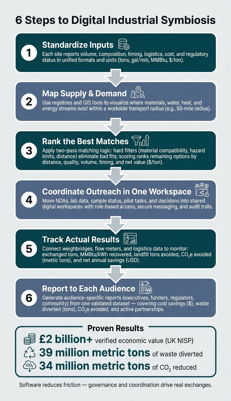
6-Step Digital Industrial Symbiosis Workflow
LIAISE COST Action Podcast- Episode 4: Digital tools and data for enabling Industrial Symbiosis
Step 1: Collect and Standardize Data Inputs
Step 1 turns scattered site records into a shared dataset the matching engine can actually use. Before an industrial symbiosis platform can screen a workable exchange, each site has to describe its material, water, or energy streams in enough detail for a possible partner to judge technical fit and cost. Those fields become the input for the match engine in the next step.
What Data Organizations Need Before Matching Can Begin
Each stream needs a core set of fields before it enters the matching pool:
Volume and flow rate - Solid streams in short tons/year, continuous liquid streams in gal/min or lb/hr, and energy streams in MMBtu/year.
Composition - Major constituents, moisture content, and contaminant levels that show whether a stream meets a partner's quality threshold.
Timing and reliability - Whether the stream is continuous, batch, or seasonal.
Logistics - Maximum transport radius in miles, typical shipment size in short tons, and packaging type.
Cost - Current disposal cost in $/ton or the avoided purchase cost a by-product could replace.
Regulatory status - RCRA hazardous waste codes, beneficial use determinations, and state permit requirements. Capture regulatory status at intake to avoid legal delays later.
Data Category | Key Fields | U.S. Units |
|---|---|---|
Volume & Flow | Annual quantity, flow rate | Short tons/year, gal/min, lb/hr |
Composition | Major constituents, moisture, contaminants | %, ppm, Btu/lb |
Energy | Waste heat, steam, fuel value | MMBtu/year, °F |
Logistics | Transport radius, shipment size, packaging | Miles, short tons/load |
Financial | Disposal cost, avoided purchase cost | $/ton, $/MMBtu |
Regulatory | RCRA codes, state waste codes, permit flags | Classification codes |
How Digital Templates and Flow Analysis Tools Improve Data Quality
Mixed reporting formats can wreck matching fast. One site logs liquid flow in gal/min, another uses lb/hr, and a third leaves fields blank. That kind of inconsistency makes side-by-side screening messy from the start.
Digital templates solve a lot of this at the entry point. They enforce one set of required fields and units, use controlled drop-down lists for stream categories, and apply validation rules that reject blank entries or values outside an accepted range. In plain terms, they keep bad data from getting through the door.
Material flow analysis, or MFA, tools push this further. They can connect straight to plant historians, SCADA systems, and utility meters to pull flow rates, temperatures, and energy readings automatically. If a facility's waste heat stream is measured continuously by sensors, the MFA tool can calculate its MMBtu/year in real time and flag when temperatures fall below a partner's minimum threshold. Tie in LIMS, and the platform can pull composition and contamination data on the same schedule. That matters because the dataset then reflects actual operating conditions, not a one-time sample taken during a good week.
Once inputs are standardized, the platform can compare streams across sites.
Where Governance and Cross-Site Coordination Matter Most
Tools help, but they don't settle process issues on their own. In a multi-site or cross-organization project, the most common failure point usually isn't the software. It's the lack of shared naming rules, clear data ownership, and version control.
Two sites may be talking about the same stream and still miss each other because they use different labels. Without a common taxonomy, the match may never happen. A consistent stream ID structure, backed by a central reference list of approved terms, keeps the dataset aligned as more partners come in.
Version control matters just as much. When a site's annual volume changes by more than 20%, or a new contaminant shows up, that change needs a timestamp, an author, and a reason. Affected partners also need a structured notice so they can reassess their plans.
With standardized inputs in place, the next step is to build a by-product map and opportunity catalog.
Steps 2–4: Map By-Products, Find Matches, and Coordinate Outreach
Build a By-Product Map and Opportunity Catalog
Once the data is standardized, the platform can start doing useful work. A digital by-product registry turns stream data into a searchable catalog that teams can sort, filter, and review without digging through scattered files. Each record should include disposal cost, transport cost, and the estimated annual CO₂e reduction from sending the stream to productive use instead of landfill.
GIS-based mapping adds a practical layer. When stream data sits on a map, users can spot material clusters fast - places within a workable transport radius where supply and demand for similar materials overlap. Add infrastructure layers like highways, rail hubs, and industrial parks, and the picture gets clearer: Can this move at a sane cost, or not? Regulatory and zoning layers help even earlier by flagging sites in air quality non-attainment areas or near environmental justice communities before outreach starts. The FISSAC platform showed this approach by using live georeferenced by-product flow maps. [2]
Once the catalog is live, the platform can begin screening exchanges that have a shot at working.
Use Matching Logic to Rank Feasible Exchanges
A match engine should work in two passes.
The first pass uses hard filters: material compatibility, maximum transport distance, and hazard limits. This step clears out options that should never move forward. For instance, a hazardous by-product should not be matched with food-contact applications unless a specific treatment or certification has been confirmed. If a match fails even one hard filter, it drops out before human review.
The second pass scores what remains using softer criteria: volume fit, timing alignment, contaminant levels against the target application’s thresholds, and net value. The point is not to dump every possible pairing onto someone’s desk. The platform should return a ranked shortlist.
Each suggested match should also include a short rationale. That note matters more than people think. It gives reviewers a quick read on why the platform made the recommendation. A note might say the match was selected because the materials have similar composition, the sites are within 30 miles, and the projected net benefit is $75 per ton.
Sharebox reported up to 33% accuracy for viable waste-resource matches, mainly because of data gaps and inconsistent classifications. [3] That’s exactly why rule-based matching with plain logic and human-readable notes helps. When data quality is uneven, black-box scoring can feel like a dead end.
Before outreach, the platform should run a techno-economic check. This is where teams flag needs like drying, grinding, blending, or neutralizing and then adjust the net value. A match that looks good in a spreadsheet can lose its appeal fast if major preprocessing is required. Those cases should rank below drop-in substitutions that need little extra handling.
From there, the shortlist is ready for partner outreach.
Manage Partner Outreach in Shared Digital Workspaces
At this stage, the job shifts from ranking options to moving people through a clear process. Shortlisted matches should move into shared digital workspaces where both organizations can talk, share documents, and track next steps in one place. The core setup is simple:
Role-based access control
Secure messaging with an audit trail
A shared document library for lab analyses, safety data sheets, and draft agreements
NDA status, sample shipment tracking, pilot milestones, and decision deadlines should live in that same workspace. Assign an owner to each task - sample shipment, lab review, pilot budget - so work doesn’t drift or stall.
Digital workspaces keep the process organized, but trust still comes from people. The Kalundborg symbiosis network in Denmark evolved over decades through direct relationships and mutual benefit, not software. [1] Platforms handle the logistics. Human facilitation handles the harder part: lining up incentives, addressing concerns, and keeping things moving when talks slow down.
Steps 5–6: Track Performance and Report Results
Track Material, Energy, Financial, and Emissions Outcomes
Once a pilot is live, the platform should move from planning to proof. It needs to capture actual flows and compare them with projected results, so teams can see what’s working and where numbers are drifting.
A well-set-up tracking system connects to weighbridge systems, flow meters, energy meters, and logistics platforms to pull data in automatically. That gives teams one live view of exchanged flows, updated daily or every 5 to 15 minutes for high-value energy and heat streams. Instead of chasing spreadsheets, users can open a dashboard and see the current picture right away.
Track four metrics across every project so results stay comparable over time:
Material flows: tons of by-products exchanged, tons diverted from landfill, and tons of virgin material avoided
Energy: kWh or MMBtu saved or recovered
Financial outcomes: avoided disposal fees in USD, new revenue from by-product sales, and net annual benefit
Emissions: metric tons of CO₂e avoided, calculated using approved emissions factors
Use standard U.S. formats for currency, dates, and units. Dashboards should also let users filter by time period, facility, material stream, and partner. That way, the right slice of data is always one click away, whether someone is checking last month’s landfill diversion totals or looking at one partner’s heat recovery stream.
Tracked outcomes should feed directly into management reviews and stakeholder reporting.
Turn Tracked Data into Audience-Specific Reports
Raw dashboard data doesn’t do much on its own. It starts to matter when each audience gets the version they can actually use. Digital tools can automate data pulls, charts, and summaries tailored to executives, funders, regulators, and community stakeholders. The key point is simple: every report should come from the same validated dataset, so each group sees the same performance view.
For executives, a one-page summary is often enough. Focus on total annual cost savings, tons of waste diverted, CO₂e avoided, and the number of active partnerships.
For funders, the report should tie outcomes to funded objectives. That may include tons of waste diverted, jobs created or retained, and local economic value generated.
For sustainability teams, the tool should map tracked metrics directly to GRI waste, materials, and energy indicators, SASB/ISSB disclosures, and emerging SEC climate disclosure requirements.
For regulators, the platform should export structured datasets such as tons by waste category, disposal route, and treatment method. It should also document the methodologies and emission factors used. If a number is questioned six months later, there needs to be a clear trail behind it.
For community stakeholders, a public-facing story map or simplified dashboard can show landfill reductions and traffic impacts without exposing sensitive data. That balance matters. People want to know what changed in their area, but site-level details may still need protection. Role-based access controls help make that possible while still sharing high-level outcomes across partners.
The table below summarizes the main digital tool categories used in tracking and reporting:
Digital Tool Category | Data Inputs Required | Main Outputs & KPIs | Typical Users |
|---|---|---|---|
Industrial Symbiosis Dashboards | Meter data, logistics logs, by-product weights | Avoided disposal (tons), virgin material savings, cost savings ($), CO₂e avoided | Facility managers, sustainability leads |
MFA/LCA-Integrated Platforms | Material flow records, energy consumption, emissions factors | GHG reductions (CO₂e), energy saved (MMBtu/kWh), environmental impact indicators | Sustainability teams, analysts |
IoT & Smart Meters | Real-time energy/water usage, flow rates | Resource intensity per unit, utility cost savings, near-real-time alerts | Facility managers, energy engineers |
Shared ESG Dashboards | Partner-uploaded metrics, project status, ESG data fields | Ecosystem-wide CO₂e, waste diversion rates, circularity indicators | Executives, funders, community stakeholders |
Blockchain Trackers | Chain-of-custody records, batch IDs, timestamped transactions | Material origin verification, immutable audit trails, provenance certificates | Procurement, auditors, regulators |
Use these outputs to compare projects with one shared metric set. Scenario analysis can then test ROI under different landfill fees, carbon prices, and commodity prices.
Conclusion: How to Build a Digital Industrial Symbiosis Roadmap
Once data, matching, outreach, tracking, and reporting are in place, the job becomes turning that workflow into an implementation roadmap. Digital tools can move industrial symbiosis along faster and make the process easier to see, but governance and coordination still decide whether exchanges happen in practice.
The UK's National Industrial Symbiosis Programme shows what this can look like at scale. One evaluation found more than £2 billion in verified economic value, 39 million metric tons of waste diverted, and 34 million metric tons of CO₂ reduced. [4][5]
Key Actions Leaders Should Take Next
Treat the workflow like an operating sequence, not a simple checklist. Start by defining your scope. Pin down which facilities are included, which by-product categories matter most, and what geographic boundary makes sense, such as a cluster of plants within a 50-mile radius. Tie those goals to targets your team already tracks. A one-page roadmap charter can keep tool selection, staffing, and investment choices pointed in the same direction.
Next, clean and standardize your data before you touch any matching tool. Set clear units like tons, kWh, MMBtu, and gallons. Lock in date formats and naming rules for by-products. Then pilot a by-product map using the materials that drive the most volume or disposal cost. Use matching logic to spot feasible exchanges, and document a small set of high-value quick wins. That early proof can help build internal support.
When pilots are live, set your four core tracking metrics:
Material flows
Energy
Financial outcomes in USD
Emissions in metric tons CO₂e
From there, set reporting cadences for operations, management, and sustainability teams. That gives you a steady rhythm for internal, regulatory, and stakeholder reporting.
Once the roadmap is set, the work shifts from planning to execution. If your organization is ready to move from pilots to implementation, Council Fire can help design the governance, digital roadmap, and tracking system.
FAQs
What data should we collect first?
Start with a thorough inventory of your waste streams and underused resources through a material flow analysis. Map the material and energy flows moving into and out of your facility, including inputs, finished products, emissions, and waste.
Pull from production logs, procurement records, waste manifests, and ERP systems to build a clear baseline of your current state. That baseline helps you spot value in materials that may have been treated as discard in the past.
How do digital tools identify the best exchange matches?
Digital tools find stronger exchange matches by working through detailed data on material makeup, volume, location, and timing. They map input and output streams side by side, which helps surface symbiotic opportunities that stand-alone operations often miss.
They also pull from production logs, procurement records, and waste manifests to connect waste producers with users whose needs line up with the by-products on hand. By pairing technical specifications with financial modeling, they help confirm that each match works on two levels: it cuts waste in a meaningful way and makes sense in dollar terms.
Which KPIs should we track to prove results?
Track a tiered set of KPIs across environmental, economic, and operational results. That means looking at CO2e, energy intensity, water use, waste diversion, recycling and reuse rates, renewable material use, cost savings from resource sharing, project success rates, and revenue from circular models.
This mix matters because one metric never tells the whole story. Lower emissions may look good on paper, but if costs climb or projects stall, the model won’t hold up. On the flip side, a project that saves money but sends more waste to landfill misses the point. A tiered KPI set keeps everyone looking at the same scoreboard from a few angles at once.
Use shared digital dashboards to standardize reporting across partners. When data lives in one place and follows the same format, it becomes easier to compare results, spot gaps, and act on what the numbers show. In plain terms, teams can stop arguing about whose spreadsheet is right and start making decisions with data that’s transparent, comparable, and actionable.
Related Blog Posts
Latest Articles
©2025

Narrative Change and Power Building: The Missing Half of Advocacy
Narrative change is the process of disrupting dominant narratives that normalize inequity and advancing new narratives from historically marginalized communities.

Funding Resilience Without Federal Grants
BRIC is unreliable and FEMA is shrinking. Here's how cities fund climate resilience with dedicated revenue, blended finance, and a coordinating authority.

The ESG Blind Spot: How AI Is Finding Risks in Companies Nobody Else Is Watching
Norway's sovereign wealth fund uses AI to screen 7,200 portfolio companies for forced labor and corruption within 24 hours. The real story is the emerging-market coverage gap that traditional ESG data vendors miss — and what it means for any company with a global supply chain.
Narrative Change and Power Building: The Missing Half of Advocacy
Narrative change is the process of disrupting dominant narratives that normalize inequity and advancing new narratives from historically marginalized communities.
Funding Resilience Without Federal Grants
BRIC is unreliable and FEMA is shrinking. Here's how cities fund climate resilience with dedicated revenue, blended finance, and a coordinating authority.
The ESG Blind Spot: How AI Is Finding Risks in Companies Nobody Else Is Watching
Norway's sovereign wealth fund uses AI to screen 7,200 portfolio companies for forced labor and corruption within 24 hours. The real story is the emerging-market coverage gap that traditional ESG data vendors miss — and what it means for any company with a global supply chain.
FAQ
01
What does it really mean to “redefine profit”?
02
What makes Council Fire different?
03
Who does Council Fire work with?
04
What does working with Council Fire actually look like?
05
How does Council Fire help organizations turn big goals into action?
06
How does Council Fire define and measure success?
Aug 11, 2026
How Digital Tools Enable Industrial Symbiosis
Sustainability Strategy
In This Article
Guide to digital tools for industrial symbiosis: standardize data, find matches, coordinate pilots, and track material, energy, cost, and CO2e.
How Digital Tools Enable Industrial Symbiosis
If you want industrial symbiosis to work, start with clean data, clear match rules, shared workflows, and tracked results. I’d boil the whole article down to this: digital tools help you find by-product exchanges, check whether they make financial sense, move partners through review, and report outcomes like waste diverted, energy recovered, CO₂e avoided, and net savings in U.S. dollars.
Here’s the simple version:
Step 1: Standardize inputs
I need each site to report the same core fields: volume, composition, timing, logistics, cost, and regulatory status.
Step 2: Map supply and demand
I can use registries and GIS tools to show where materials, water, heat, and other streams exist within a workable transport radius.
Step 3: Rank the best matches
I first remove bad fits, then score the rest by distance, quality, volume, timing, and net value.
Step 4: Move outreach into one workspace
I keep NDAs, lab data, sample status, pilot tasks, and decisions in one shared place.
Step 5: Track actual results
I connect meters, weighbridges, and logistics data so teams can monitor exchanged tons,
MMBtu, kWh, avoided landfill, and annual savings.
Step 6: Report to each audience
I turn one validated dataset into reports for executives, funders, regulators, and public audiences.
A few facts stand out. The article notes that one platform reported only up to 33% accuracy for viable waste-resource matches when data quality was weak. It also points to the UK’s National Industrial Symbiosis Programme, which was linked to more than £2 billion in verified economic value, 39 million metric tons of waste diverted, and 34 million metric tons of CO₂ reduced.
The main point is simple: software does not create exchanges by itself, but it does cut the friction that often stops them. I’d use it to turn scattered site records and one-off conversations into a repeatable process with clear numbers, owners, and reporting.
6-Step Digital Industrial Symbiosis Workflow
LIAISE COST Action Podcast- Episode 4: Digital tools and data for enabling Industrial Symbiosis
Step 1: Collect and Standardize Data Inputs
Step 1 turns scattered site records into a shared dataset the matching engine can actually use. Before an industrial symbiosis platform can screen a workable exchange, each site has to describe its material, water, or energy streams in enough detail for a possible partner to judge technical fit and cost. Those fields become the input for the match engine in the next step.
What Data Organizations Need Before Matching Can Begin
Each stream needs a core set of fields before it enters the matching pool:
Volume and flow rate - Solid streams in short tons/year, continuous liquid streams in gal/min or lb/hr, and energy streams in MMBtu/year.
Composition - Major constituents, moisture content, and contaminant levels that show whether a stream meets a partner's quality threshold.
Timing and reliability - Whether the stream is continuous, batch, or seasonal.
Logistics - Maximum transport radius in miles, typical shipment size in short tons, and packaging type.
Cost - Current disposal cost in $/ton or the avoided purchase cost a by-product could replace.
Regulatory status - RCRA hazardous waste codes, beneficial use determinations, and state permit requirements. Capture regulatory status at intake to avoid legal delays later.
Data Category | Key Fields | U.S. Units |
|---|---|---|
Volume & Flow | Annual quantity, flow rate | Short tons/year, gal/min, lb/hr |
Composition | Major constituents, moisture, contaminants | %, ppm, Btu/lb |
Energy | Waste heat, steam, fuel value | MMBtu/year, °F |
Logistics | Transport radius, shipment size, packaging | Miles, short tons/load |
Financial | Disposal cost, avoided purchase cost | $/ton, $/MMBtu |
Regulatory | RCRA codes, state waste codes, permit flags | Classification codes |
How Digital Templates and Flow Analysis Tools Improve Data Quality
Mixed reporting formats can wreck matching fast. One site logs liquid flow in gal/min, another uses lb/hr, and a third leaves fields blank. That kind of inconsistency makes side-by-side screening messy from the start.
Digital templates solve a lot of this at the entry point. They enforce one set of required fields and units, use controlled drop-down lists for stream categories, and apply validation rules that reject blank entries or values outside an accepted range. In plain terms, they keep bad data from getting through the door.
Material flow analysis, or MFA, tools push this further. They can connect straight to plant historians, SCADA systems, and utility meters to pull flow rates, temperatures, and energy readings automatically. If a facility's waste heat stream is measured continuously by sensors, the MFA tool can calculate its MMBtu/year in real time and flag when temperatures fall below a partner's minimum threshold. Tie in LIMS, and the platform can pull composition and contamination data on the same schedule. That matters because the dataset then reflects actual operating conditions, not a one-time sample taken during a good week.
Once inputs are standardized, the platform can compare streams across sites.
Where Governance and Cross-Site Coordination Matter Most
Tools help, but they don't settle process issues on their own. In a multi-site or cross-organization project, the most common failure point usually isn't the software. It's the lack of shared naming rules, clear data ownership, and version control.
Two sites may be talking about the same stream and still miss each other because they use different labels. Without a common taxonomy, the match may never happen. A consistent stream ID structure, backed by a central reference list of approved terms, keeps the dataset aligned as more partners come in.
Version control matters just as much. When a site's annual volume changes by more than 20%, or a new contaminant shows up, that change needs a timestamp, an author, and a reason. Affected partners also need a structured notice so they can reassess their plans.
With standardized inputs in place, the next step is to build a by-product map and opportunity catalog.
Steps 2–4: Map By-Products, Find Matches, and Coordinate Outreach
Build a By-Product Map and Opportunity Catalog
Once the data is standardized, the platform can start doing useful work. A digital by-product registry turns stream data into a searchable catalog that teams can sort, filter, and review without digging through scattered files. Each record should include disposal cost, transport cost, and the estimated annual CO₂e reduction from sending the stream to productive use instead of landfill.
GIS-based mapping adds a practical layer. When stream data sits on a map, users can spot material clusters fast - places within a workable transport radius where supply and demand for similar materials overlap. Add infrastructure layers like highways, rail hubs, and industrial parks, and the picture gets clearer: Can this move at a sane cost, or not? Regulatory and zoning layers help even earlier by flagging sites in air quality non-attainment areas or near environmental justice communities before outreach starts. The FISSAC platform showed this approach by using live georeferenced by-product flow maps. [2]
Once the catalog is live, the platform can begin screening exchanges that have a shot at working.
Use Matching Logic to Rank Feasible Exchanges
A match engine should work in two passes.
The first pass uses hard filters: material compatibility, maximum transport distance, and hazard limits. This step clears out options that should never move forward. For instance, a hazardous by-product should not be matched with food-contact applications unless a specific treatment or certification has been confirmed. If a match fails even one hard filter, it drops out before human review.
The second pass scores what remains using softer criteria: volume fit, timing alignment, contaminant levels against the target application’s thresholds, and net value. The point is not to dump every possible pairing onto someone’s desk. The platform should return a ranked shortlist.
Each suggested match should also include a short rationale. That note matters more than people think. It gives reviewers a quick read on why the platform made the recommendation. A note might say the match was selected because the materials have similar composition, the sites are within 30 miles, and the projected net benefit is $75 per ton.
Sharebox reported up to 33% accuracy for viable waste-resource matches, mainly because of data gaps and inconsistent classifications. [3] That’s exactly why rule-based matching with plain logic and human-readable notes helps. When data quality is uneven, black-box scoring can feel like a dead end.
Before outreach, the platform should run a techno-economic check. This is where teams flag needs like drying, grinding, blending, or neutralizing and then adjust the net value. A match that looks good in a spreadsheet can lose its appeal fast if major preprocessing is required. Those cases should rank below drop-in substitutions that need little extra handling.
From there, the shortlist is ready for partner outreach.
Manage Partner Outreach in Shared Digital Workspaces
At this stage, the job shifts from ranking options to moving people through a clear process. Shortlisted matches should move into shared digital workspaces where both organizations can talk, share documents, and track next steps in one place. The core setup is simple:
Role-based access control
Secure messaging with an audit trail
A shared document library for lab analyses, safety data sheets, and draft agreements
NDA status, sample shipment tracking, pilot milestones, and decision deadlines should live in that same workspace. Assign an owner to each task - sample shipment, lab review, pilot budget - so work doesn’t drift or stall.
Digital workspaces keep the process organized, but trust still comes from people. The Kalundborg symbiosis network in Denmark evolved over decades through direct relationships and mutual benefit, not software. [1] Platforms handle the logistics. Human facilitation handles the harder part: lining up incentives, addressing concerns, and keeping things moving when talks slow down.
Steps 5–6: Track Performance and Report Results
Track Material, Energy, Financial, and Emissions Outcomes
Once a pilot is live, the platform should move from planning to proof. It needs to capture actual flows and compare them with projected results, so teams can see what’s working and where numbers are drifting.
A well-set-up tracking system connects to weighbridge systems, flow meters, energy meters, and logistics platforms to pull data in automatically. That gives teams one live view of exchanged flows, updated daily or every 5 to 15 minutes for high-value energy and heat streams. Instead of chasing spreadsheets, users can open a dashboard and see the current picture right away.
Track four metrics across every project so results stay comparable over time:
Material flows: tons of by-products exchanged, tons diverted from landfill, and tons of virgin material avoided
Energy: kWh or MMBtu saved or recovered
Financial outcomes: avoided disposal fees in USD, new revenue from by-product sales, and net annual benefit
Emissions: metric tons of CO₂e avoided, calculated using approved emissions factors
Use standard U.S. formats for currency, dates, and units. Dashboards should also let users filter by time period, facility, material stream, and partner. That way, the right slice of data is always one click away, whether someone is checking last month’s landfill diversion totals or looking at one partner’s heat recovery stream.
Tracked outcomes should feed directly into management reviews and stakeholder reporting.
Turn Tracked Data into Audience-Specific Reports
Raw dashboard data doesn’t do much on its own. It starts to matter when each audience gets the version they can actually use. Digital tools can automate data pulls, charts, and summaries tailored to executives, funders, regulators, and community stakeholders. The key point is simple: every report should come from the same validated dataset, so each group sees the same performance view.
For executives, a one-page summary is often enough. Focus on total annual cost savings, tons of waste diverted, CO₂e avoided, and the number of active partnerships.
For funders, the report should tie outcomes to funded objectives. That may include tons of waste diverted, jobs created or retained, and local economic value generated.
For sustainability teams, the tool should map tracked metrics directly to GRI waste, materials, and energy indicators, SASB/ISSB disclosures, and emerging SEC climate disclosure requirements.
For regulators, the platform should export structured datasets such as tons by waste category, disposal route, and treatment method. It should also document the methodologies and emission factors used. If a number is questioned six months later, there needs to be a clear trail behind it.
For community stakeholders, a public-facing story map or simplified dashboard can show landfill reductions and traffic impacts without exposing sensitive data. That balance matters. People want to know what changed in their area, but site-level details may still need protection. Role-based access controls help make that possible while still sharing high-level outcomes across partners.
The table below summarizes the main digital tool categories used in tracking and reporting:
Digital Tool Category | Data Inputs Required | Main Outputs & KPIs | Typical Users |
|---|---|---|---|
Industrial Symbiosis Dashboards | Meter data, logistics logs, by-product weights | Avoided disposal (tons), virgin material savings, cost savings ($), CO₂e avoided | Facility managers, sustainability leads |
MFA/LCA-Integrated Platforms | Material flow records, energy consumption, emissions factors | GHG reductions (CO₂e), energy saved (MMBtu/kWh), environmental impact indicators | Sustainability teams, analysts |
IoT & Smart Meters | Real-time energy/water usage, flow rates | Resource intensity per unit, utility cost savings, near-real-time alerts | Facility managers, energy engineers |
Shared ESG Dashboards | Partner-uploaded metrics, project status, ESG data fields | Ecosystem-wide CO₂e, waste diversion rates, circularity indicators | Executives, funders, community stakeholders |
Blockchain Trackers | Chain-of-custody records, batch IDs, timestamped transactions | Material origin verification, immutable audit trails, provenance certificates | Procurement, auditors, regulators |
Use these outputs to compare projects with one shared metric set. Scenario analysis can then test ROI under different landfill fees, carbon prices, and commodity prices.
Conclusion: How to Build a Digital Industrial Symbiosis Roadmap
Once data, matching, outreach, tracking, and reporting are in place, the job becomes turning that workflow into an implementation roadmap. Digital tools can move industrial symbiosis along faster and make the process easier to see, but governance and coordination still decide whether exchanges happen in practice.
The UK's National Industrial Symbiosis Programme shows what this can look like at scale. One evaluation found more than £2 billion in verified economic value, 39 million metric tons of waste diverted, and 34 million metric tons of CO₂ reduced. [4][5]
Key Actions Leaders Should Take Next
Treat the workflow like an operating sequence, not a simple checklist. Start by defining your scope. Pin down which facilities are included, which by-product categories matter most, and what geographic boundary makes sense, such as a cluster of plants within a 50-mile radius. Tie those goals to targets your team already tracks. A one-page roadmap charter can keep tool selection, staffing, and investment choices pointed in the same direction.
Next, clean and standardize your data before you touch any matching tool. Set clear units like tons, kWh, MMBtu, and gallons. Lock in date formats and naming rules for by-products. Then pilot a by-product map using the materials that drive the most volume or disposal cost. Use matching logic to spot feasible exchanges, and document a small set of high-value quick wins. That early proof can help build internal support.
When pilots are live, set your four core tracking metrics:
Material flows
Energy
Financial outcomes in USD
Emissions in metric tons CO₂e
From there, set reporting cadences for operations, management, and sustainability teams. That gives you a steady rhythm for internal, regulatory, and stakeholder reporting.
Once the roadmap is set, the work shifts from planning to execution. If your organization is ready to move from pilots to implementation, Council Fire can help design the governance, digital roadmap, and tracking system.
FAQs
What data should we collect first?
Start with a thorough inventory of your waste streams and underused resources through a material flow analysis. Map the material and energy flows moving into and out of your facility, including inputs, finished products, emissions, and waste.
Pull from production logs, procurement records, waste manifests, and ERP systems to build a clear baseline of your current state. That baseline helps you spot value in materials that may have been treated as discard in the past.
How do digital tools identify the best exchange matches?
Digital tools find stronger exchange matches by working through detailed data on material makeup, volume, location, and timing. They map input and output streams side by side, which helps surface symbiotic opportunities that stand-alone operations often miss.
They also pull from production logs, procurement records, and waste manifests to connect waste producers with users whose needs line up with the by-products on hand. By pairing technical specifications with financial modeling, they help confirm that each match works on two levels: it cuts waste in a meaningful way and makes sense in dollar terms.
Which KPIs should we track to prove results?
Track a tiered set of KPIs across environmental, economic, and operational results. That means looking at CO2e, energy intensity, water use, waste diversion, recycling and reuse rates, renewable material use, cost savings from resource sharing, project success rates, and revenue from circular models.
This mix matters because one metric never tells the whole story. Lower emissions may look good on paper, but if costs climb or projects stall, the model won’t hold up. On the flip side, a project that saves money but sends more waste to landfill misses the point. A tiered KPI set keeps everyone looking at the same scoreboard from a few angles at once.
Use shared digital dashboards to standardize reporting across partners. When data lives in one place and follows the same format, it becomes easier to compare results, spot gaps, and act on what the numbers show. In plain terms, teams can stop arguing about whose spreadsheet is right and start making decisions with data that’s transparent, comparable, and actionable.
Related Blog Posts
Latest Articles
©2025
Narrative Change and Power Building: The Missing Half of Advocacy
Narrative change is the process of disrupting dominant narratives that normalize inequity and advancing new narratives from historically marginalized communities.
Funding Resilience Without Federal Grants
BRIC is unreliable and FEMA is shrinking. Here's how cities fund climate resilience with dedicated revenue, blended finance, and a coordinating authority.
The ESG Blind Spot: How AI Is Finding Risks in Companies Nobody Else Is Watching
Norway's sovereign wealth fund uses AI to screen 7,200 portfolio companies for forced labor and corruption within 24 hours. The real story is the emerging-market coverage gap that traditional ESG data vendors miss — and what it means for any company with a global supply chain.
FAQ
01
What does it really mean to “redefine profit”?
02
What makes Council Fire different?
03
Who does Council Fire work with?
04
What does working with Council Fire actually look like?
05
How does Council Fire help organizations turn big goals into action?
06
How does Council Fire define and measure success?
Aug 11, 2026
How Digital Tools Enable Industrial Symbiosis
Sustainability Strategy
In This Article
Guide to digital tools for industrial symbiosis: standardize data, find matches, coordinate pilots, and track material, energy, cost, and CO2e.
How Digital Tools Enable Industrial Symbiosis
If you want industrial symbiosis to work, start with clean data, clear match rules, shared workflows, and tracked results. I’d boil the whole article down to this: digital tools help you find by-product exchanges, check whether they make financial sense, move partners through review, and report outcomes like waste diverted, energy recovered, CO₂e avoided, and net savings in U.S. dollars.
Here’s the simple version:
Step 1: Standardize inputs
I need each site to report the same core fields: volume, composition, timing, logistics, cost, and regulatory status.
Step 2: Map supply and demand
I can use registries and GIS tools to show where materials, water, heat, and other streams exist within a workable transport radius.
Step 3: Rank the best matches
I first remove bad fits, then score the rest by distance, quality, volume, timing, and net value.
Step 4: Move outreach into one workspace
I keep NDAs, lab data, sample status, pilot tasks, and decisions in one shared place.
Step 5: Track actual results
I connect meters, weighbridges, and logistics data so teams can monitor exchanged tons,
MMBtu, kWh, avoided landfill, and annual savings.
Step 6: Report to each audience
I turn one validated dataset into reports for executives, funders, regulators, and public audiences.
A few facts stand out. The article notes that one platform reported only up to 33% accuracy for viable waste-resource matches when data quality was weak. It also points to the UK’s National Industrial Symbiosis Programme, which was linked to more than £2 billion in verified economic value, 39 million metric tons of waste diverted, and 34 million metric tons of CO₂ reduced.
The main point is simple: software does not create exchanges by itself, but it does cut the friction that often stops them. I’d use it to turn scattered site records and one-off conversations into a repeatable process with clear numbers, owners, and reporting.
6-Step Digital Industrial Symbiosis Workflow
LIAISE COST Action Podcast- Episode 4: Digital tools and data for enabling Industrial Symbiosis
Step 1: Collect and Standardize Data Inputs
Step 1 turns scattered site records into a shared dataset the matching engine can actually use. Before an industrial symbiosis platform can screen a workable exchange, each site has to describe its material, water, or energy streams in enough detail for a possible partner to judge technical fit and cost. Those fields become the input for the match engine in the next step.
What Data Organizations Need Before Matching Can Begin
Each stream needs a core set of fields before it enters the matching pool:
Volume and flow rate - Solid streams in short tons/year, continuous liquid streams in gal/min or lb/hr, and energy streams in MMBtu/year.
Composition - Major constituents, moisture content, and contaminant levels that show whether a stream meets a partner's quality threshold.
Timing and reliability - Whether the stream is continuous, batch, or seasonal.
Logistics - Maximum transport radius in miles, typical shipment size in short tons, and packaging type.
Cost - Current disposal cost in $/ton or the avoided purchase cost a by-product could replace.
Regulatory status - RCRA hazardous waste codes, beneficial use determinations, and state permit requirements. Capture regulatory status at intake to avoid legal delays later.
Data Category | Key Fields | U.S. Units |
|---|---|---|
Volume & Flow | Annual quantity, flow rate | Short tons/year, gal/min, lb/hr |
Composition | Major constituents, moisture, contaminants | %, ppm, Btu/lb |
Energy | Waste heat, steam, fuel value | MMBtu/year, °F |
Logistics | Transport radius, shipment size, packaging | Miles, short tons/load |
Financial | Disposal cost, avoided purchase cost | $/ton, $/MMBtu |
Regulatory | RCRA codes, state waste codes, permit flags | Classification codes |
How Digital Templates and Flow Analysis Tools Improve Data Quality
Mixed reporting formats can wreck matching fast. One site logs liquid flow in gal/min, another uses lb/hr, and a third leaves fields blank. That kind of inconsistency makes side-by-side screening messy from the start.
Digital templates solve a lot of this at the entry point. They enforce one set of required fields and units, use controlled drop-down lists for stream categories, and apply validation rules that reject blank entries or values outside an accepted range. In plain terms, they keep bad data from getting through the door.
Material flow analysis, or MFA, tools push this further. They can connect straight to plant historians, SCADA systems, and utility meters to pull flow rates, temperatures, and energy readings automatically. If a facility's waste heat stream is measured continuously by sensors, the MFA tool can calculate its MMBtu/year in real time and flag when temperatures fall below a partner's minimum threshold. Tie in LIMS, and the platform can pull composition and contamination data on the same schedule. That matters because the dataset then reflects actual operating conditions, not a one-time sample taken during a good week.
Once inputs are standardized, the platform can compare streams across sites.
Where Governance and Cross-Site Coordination Matter Most
Tools help, but they don't settle process issues on their own. In a multi-site or cross-organization project, the most common failure point usually isn't the software. It's the lack of shared naming rules, clear data ownership, and version control.
Two sites may be talking about the same stream and still miss each other because they use different labels. Without a common taxonomy, the match may never happen. A consistent stream ID structure, backed by a central reference list of approved terms, keeps the dataset aligned as more partners come in.
Version control matters just as much. When a site's annual volume changes by more than 20%, or a new contaminant shows up, that change needs a timestamp, an author, and a reason. Affected partners also need a structured notice so they can reassess their plans.
With standardized inputs in place, the next step is to build a by-product map and opportunity catalog.
Steps 2–4: Map By-Products, Find Matches, and Coordinate Outreach
Build a By-Product Map and Opportunity Catalog
Once the data is standardized, the platform can start doing useful work. A digital by-product registry turns stream data into a searchable catalog that teams can sort, filter, and review without digging through scattered files. Each record should include disposal cost, transport cost, and the estimated annual CO₂e reduction from sending the stream to productive use instead of landfill.
GIS-based mapping adds a practical layer. When stream data sits on a map, users can spot material clusters fast - places within a workable transport radius where supply and demand for similar materials overlap. Add infrastructure layers like highways, rail hubs, and industrial parks, and the picture gets clearer: Can this move at a sane cost, or not? Regulatory and zoning layers help even earlier by flagging sites in air quality non-attainment areas or near environmental justice communities before outreach starts. The FISSAC platform showed this approach by using live georeferenced by-product flow maps. [2]
Once the catalog is live, the platform can begin screening exchanges that have a shot at working.
Use Matching Logic to Rank Feasible Exchanges
A match engine should work in two passes.
The first pass uses hard filters: material compatibility, maximum transport distance, and hazard limits. This step clears out options that should never move forward. For instance, a hazardous by-product should not be matched with food-contact applications unless a specific treatment or certification has been confirmed. If a match fails even one hard filter, it drops out before human review.
The second pass scores what remains using softer criteria: volume fit, timing alignment, contaminant levels against the target application’s thresholds, and net value. The point is not to dump every possible pairing onto someone’s desk. The platform should return a ranked shortlist.
Each suggested match should also include a short rationale. That note matters more than people think. It gives reviewers a quick read on why the platform made the recommendation. A note might say the match was selected because the materials have similar composition, the sites are within 30 miles, and the projected net benefit is $75 per ton.
Sharebox reported up to 33% accuracy for viable waste-resource matches, mainly because of data gaps and inconsistent classifications. [3] That’s exactly why rule-based matching with plain logic and human-readable notes helps. When data quality is uneven, black-box scoring can feel like a dead end.
Before outreach, the platform should run a techno-economic check. This is where teams flag needs like drying, grinding, blending, or neutralizing and then adjust the net value. A match that looks good in a spreadsheet can lose its appeal fast if major preprocessing is required. Those cases should rank below drop-in substitutions that need little extra handling.
From there, the shortlist is ready for partner outreach.
Manage Partner Outreach in Shared Digital Workspaces
At this stage, the job shifts from ranking options to moving people through a clear process. Shortlisted matches should move into shared digital workspaces where both organizations can talk, share documents, and track next steps in one place. The core setup is simple:
Role-based access control
Secure messaging with an audit trail
A shared document library for lab analyses, safety data sheets, and draft agreements
NDA status, sample shipment tracking, pilot milestones, and decision deadlines should live in that same workspace. Assign an owner to each task - sample shipment, lab review, pilot budget - so work doesn’t drift or stall.
Digital workspaces keep the process organized, but trust still comes from people. The Kalundborg symbiosis network in Denmark evolved over decades through direct relationships and mutual benefit, not software. [1] Platforms handle the logistics. Human facilitation handles the harder part: lining up incentives, addressing concerns, and keeping things moving when talks slow down.
Steps 5–6: Track Performance and Report Results
Track Material, Energy, Financial, and Emissions Outcomes
Once a pilot is live, the platform should move from planning to proof. It needs to capture actual flows and compare them with projected results, so teams can see what’s working and where numbers are drifting.
A well-set-up tracking system connects to weighbridge systems, flow meters, energy meters, and logistics platforms to pull data in automatically. That gives teams one live view of exchanged flows, updated daily or every 5 to 15 minutes for high-value energy and heat streams. Instead of chasing spreadsheets, users can open a dashboard and see the current picture right away.
Track four metrics across every project so results stay comparable over time:
Material flows: tons of by-products exchanged, tons diverted from landfill, and tons of virgin material avoided
Energy: kWh or MMBtu saved or recovered
Financial outcomes: avoided disposal fees in USD, new revenue from by-product sales, and net annual benefit
Emissions: metric tons of CO₂e avoided, calculated using approved emissions factors
Use standard U.S. formats for currency, dates, and units. Dashboards should also let users filter by time period, facility, material stream, and partner. That way, the right slice of data is always one click away, whether someone is checking last month’s landfill diversion totals or looking at one partner’s heat recovery stream.
Tracked outcomes should feed directly into management reviews and stakeholder reporting.
Turn Tracked Data into Audience-Specific Reports
Raw dashboard data doesn’t do much on its own. It starts to matter when each audience gets the version they can actually use. Digital tools can automate data pulls, charts, and summaries tailored to executives, funders, regulators, and community stakeholders. The key point is simple: every report should come from the same validated dataset, so each group sees the same performance view.
For executives, a one-page summary is often enough. Focus on total annual cost savings, tons of waste diverted, CO₂e avoided, and the number of active partnerships.
For funders, the report should tie outcomes to funded objectives. That may include tons of waste diverted, jobs created or retained, and local economic value generated.
For sustainability teams, the tool should map tracked metrics directly to GRI waste, materials, and energy indicators, SASB/ISSB disclosures, and emerging SEC climate disclosure requirements.
For regulators, the platform should export structured datasets such as tons by waste category, disposal route, and treatment method. It should also document the methodologies and emission factors used. If a number is questioned six months later, there needs to be a clear trail behind it.
For community stakeholders, a public-facing story map or simplified dashboard can show landfill reductions and traffic impacts without exposing sensitive data. That balance matters. People want to know what changed in their area, but site-level details may still need protection. Role-based access controls help make that possible while still sharing high-level outcomes across partners.
The table below summarizes the main digital tool categories used in tracking and reporting:
Digital Tool Category | Data Inputs Required | Main Outputs & KPIs | Typical Users |
|---|---|---|---|
Industrial Symbiosis Dashboards | Meter data, logistics logs, by-product weights | Avoided disposal (tons), virgin material savings, cost savings ($), CO₂e avoided | Facility managers, sustainability leads |
MFA/LCA-Integrated Platforms | Material flow records, energy consumption, emissions factors | GHG reductions (CO₂e), energy saved (MMBtu/kWh), environmental impact indicators | Sustainability teams, analysts |
IoT & Smart Meters | Real-time energy/water usage, flow rates | Resource intensity per unit, utility cost savings, near-real-time alerts | Facility managers, energy engineers |
Shared ESG Dashboards | Partner-uploaded metrics, project status, ESG data fields | Ecosystem-wide CO₂e, waste diversion rates, circularity indicators | Executives, funders, community stakeholders |
Blockchain Trackers | Chain-of-custody records, batch IDs, timestamped transactions | Material origin verification, immutable audit trails, provenance certificates | Procurement, auditors, regulators |
Use these outputs to compare projects with one shared metric set. Scenario analysis can then test ROI under different landfill fees, carbon prices, and commodity prices.
Conclusion: How to Build a Digital Industrial Symbiosis Roadmap
Once data, matching, outreach, tracking, and reporting are in place, the job becomes turning that workflow into an implementation roadmap. Digital tools can move industrial symbiosis along faster and make the process easier to see, but governance and coordination still decide whether exchanges happen in practice.
The UK's National Industrial Symbiosis Programme shows what this can look like at scale. One evaluation found more than £2 billion in verified economic value, 39 million metric tons of waste diverted, and 34 million metric tons of CO₂ reduced. [4][5]
Key Actions Leaders Should Take Next
Treat the workflow like an operating sequence, not a simple checklist. Start by defining your scope. Pin down which facilities are included, which by-product categories matter most, and what geographic boundary makes sense, such as a cluster of plants within a 50-mile radius. Tie those goals to targets your team already tracks. A one-page roadmap charter can keep tool selection, staffing, and investment choices pointed in the same direction.
Next, clean and standardize your data before you touch any matching tool. Set clear units like tons, kWh, MMBtu, and gallons. Lock in date formats and naming rules for by-products. Then pilot a by-product map using the materials that drive the most volume or disposal cost. Use matching logic to spot feasible exchanges, and document a small set of high-value quick wins. That early proof can help build internal support.
When pilots are live, set your four core tracking metrics:
Material flows
Energy
Financial outcomes in USD
Emissions in metric tons CO₂e
From there, set reporting cadences for operations, management, and sustainability teams. That gives you a steady rhythm for internal, regulatory, and stakeholder reporting.
Once the roadmap is set, the work shifts from planning to execution. If your organization is ready to move from pilots to implementation, Council Fire can help design the governance, digital roadmap, and tracking system.
FAQs
What data should we collect first?
Start with a thorough inventory of your waste streams and underused resources through a material flow analysis. Map the material and energy flows moving into and out of your facility, including inputs, finished products, emissions, and waste.
Pull from production logs, procurement records, waste manifests, and ERP systems to build a clear baseline of your current state. That baseline helps you spot value in materials that may have been treated as discard in the past.
How do digital tools identify the best exchange matches?
Digital tools find stronger exchange matches by working through detailed data on material makeup, volume, location, and timing. They map input and output streams side by side, which helps surface symbiotic opportunities that stand-alone operations often miss.
They also pull from production logs, procurement records, and waste manifests to connect waste producers with users whose needs line up with the by-products on hand. By pairing technical specifications with financial modeling, they help confirm that each match works on two levels: it cuts waste in a meaningful way and makes sense in dollar terms.
Which KPIs should we track to prove results?
Track a tiered set of KPIs across environmental, economic, and operational results. That means looking at CO2e, energy intensity, water use, waste diversion, recycling and reuse rates, renewable material use, cost savings from resource sharing, project success rates, and revenue from circular models.
This mix matters because one metric never tells the whole story. Lower emissions may look good on paper, but if costs climb or projects stall, the model won’t hold up. On the flip side, a project that saves money but sends more waste to landfill misses the point. A tiered KPI set keeps everyone looking at the same scoreboard from a few angles at once.
Use shared digital dashboards to standardize reporting across partners. When data lives in one place and follows the same format, it becomes easier to compare results, spot gaps, and act on what the numbers show. In plain terms, teams can stop arguing about whose spreadsheet is right and start making decisions with data that’s transparent, comparable, and actionable.
Related Blog Posts
Latest Articles
©2025
Narrative Change and Power Building: The Missing Half of Advocacy
Narrative change is the process of disrupting dominant narratives that normalize inequity and advancing new narratives from historically marginalized communities.
Funding Resilience Without Federal Grants
BRIC is unreliable and FEMA is shrinking. Here's how cities fund climate resilience with dedicated revenue, blended finance, and a coordinating authority.
The ESG Blind Spot: How AI Is Finding Risks in Companies Nobody Else Is Watching
Norway's sovereign wealth fund uses AI to screen 7,200 portfolio companies for forced labor and corruption within 24 hours. The real story is the emerging-market coverage gap that traditional ESG data vendors miss — and what it means for any company with a global supply chain.
FAQ
What does it really mean to “redefine profit”?
What makes Council Fire different?
Who does Council Fire work with?
What does working with Council Fire actually look like?
How does Council Fire help organizations turn big goals into action?
How does Council Fire define and measure success?