Aug 27, 2026
How Transit Agencies Turn Community Input Into Plans
Governance
In This Article
How transit agencies set rules, collect and code public feedback, test route options, and show how input shaped final plans.
How Transit Agencies Turn Community Input Into Plans
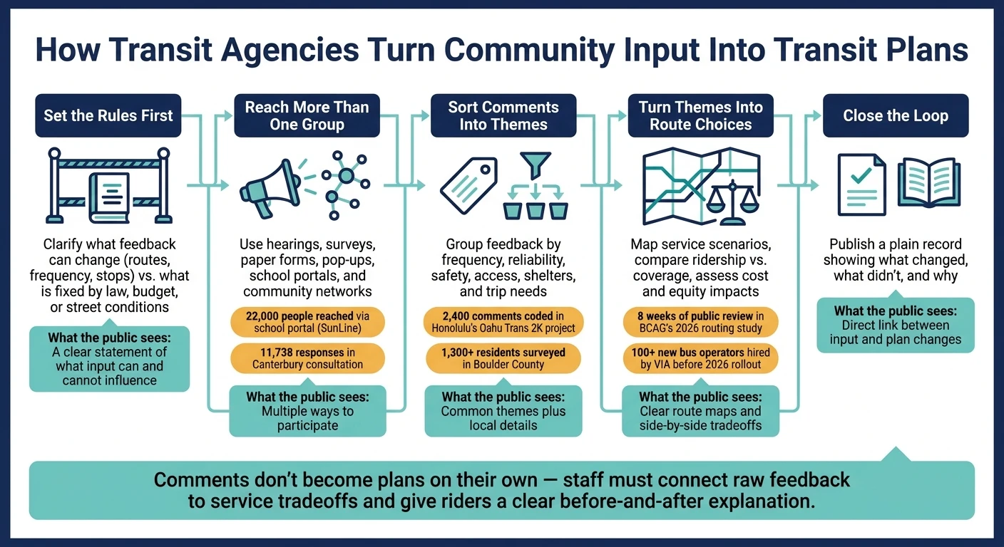
Public input matters only when people can see what changed. From Boulder County’s 2,000+ residents to SunLine’s 22,000-person reach and Honolulu’s 2,400 coded comments, the pattern is simple: agencies set limits, gather input in many ways, sort comments into themes, test service options, and then show the public what changed.
If I had to sum up the process in plain English, it looks like this:
Set the rules first: say what feedback can change and what law, budget, or street limits do not allow.
Reach more than one group: use hearings, surveys, paper forms, pop-ups, and school or community networks.
Check who responded: compare comments with rider data and area demographics so missing groups stand out.
Sort comments into themes: frequency, reliability, safety, access, shelters, and trip needs.
Turn themes into route choices: map options, test tradeoffs, and compare ridership, coverage, cost, and equity effects.
Close the loop: publish a plain record showing what the agency changed, what it did not, and why.
A few numbers make the point fast:
22,000 people reached through a school district portal in SunLine’s outreach
11,738 responses in Canterbury’s transit consultation, with 75% from the central city
8 weeks of public review in BCAG’s 2026 routing study
100+ new bus operators hired by VIA before its 2026 service package rolled out
Here’s the core idea: comments do not become plans on their own. Staff have to turn raw feedback into a usable record, connect it to service tradeoffs, and give riders a clear before-and-after explanation. That is how public input moves from meetings and surveys into actual transit decisions.
Step | What agencies do | What the public should see |
|---|---|---|
1 | Define decision limits | Clear statement of what feedback can change |
2 | Gather input across channels | More than one way to take part |
3 | Code and group comments | Common themes plus local details |
4 | Test service options | Clear route maps and tradeoffs |
5 | Publish final decisions | Direct link between input and plan changes |
If you want the short version, that’s it: set boundaries, gather broad input, code it, test options, and show the result in plain language.
How Transit Agencies Turn Community Input Into Transit Plans: A 5-Step Process
CARTA gathers community input for short and long term transit plans
1. Define how community input will shape decisions
Start by drawing a clear line: what can public input change, and what is already locked in by law, budget, or street conditions? That line makes the rest of the process much easier. It tells you who you need to hear from, how to reach them, and how comments will feed into actual decisions.
Clarify which decisions the public can influence
Public input can help shape route alignments, service frequency, service hours, and stop features like shelters or shade structures.
Some choices are much harder to move because law, funding, or street design sets the limits. In California, for example, the Transportation Development Act requires urban transit services to recover 20% of operating costs through fares, and rural services to recover 10% [3]. That ratio is not something a public survey can change. It is a state mandate. In the same way, shelter placement often depends on whether a concrete pad and a safe sidewalk are already in place [2].
When BCAG and B Line launched their systemwide routing study in Chico and Oroville in June 2026, BCAG put the main tradeoff in plain terms: geographic coverage versus ridership concentration [3]. That kind of framing helps a lot. It turns public comments into direct choices about routes instead of vague, open-ended feedback. The study also included an eight-week public review of draft maps before recommendations went to the BCAG Board of Directors [3].
"geographic coverage versus ridership concentration"
Set participation goals for equity and compliance
Deciding who needs to be heard matters just as much as deciding what they can influence. The aim is not to pile up more comments. The aim is to build a comment set that matches the full service area.
Boulder County, for instance, created separate 15-member English and Spanish community advisory committees for the Linking Boulder County plan [1]. That choice gave each group its own space to weigh in. VIA Metropolitan Transit took a different path and used time-based outreach to reach riders with different work and family schedules. For its February 2026 comment period on 21 routes, VIA scheduled three hearings and 10 information sessions at 7–9 a.m. and 4–6 p.m. [6].
Those targets set up the next step: gathering input through more than one channel.
2. Collect input across multiple channels
After defining who needs to be heard, agencies need more than one way to reach them. A single outreach method usually misses people. Schedules differ, internet access is uneven, and not everyone feels at ease speaking in the same setting.
Use multiple outreach methods to hear from riders and non-riders
A mix of outreach channels helps agencies hear from both riders and non-riders, not just the people who already show up.
In February 2026, VIA Metropolitan Transit in San Antonio held 10 informational sessions scheduled from 7–9 a.m. and 4–6 p.m., along with three public hearings at sites including the Mexican American Unity Council and the Stone Oak Park & Ride, to gather input on service improvements for 21 routes [6]. Those time slots and locations made it easier to hear from people with different routines.
Online surveys can pull in a broader group, especially when there’s a small incentive. In June 2026, Sonoma County Transit launched a five-year Strategic Transit Plan survey and offered participants a chance to win a $100 Visa gift card to boost response rates [7]. The agency also made a point of asking for feedback from non-riders, not only current riders.
Paper surveys and face-to-face outreach still matter, especially for residents without steady internet access. In February 2026, SunLine Transit Agency's "Rides Reimagined" outreach handed out paper surveys at bus stops, senior centers, and a city navigation center for unhoused residents in the Coachella Valley. The agency also shared the survey through the Palm Springs Unified School District's parent portal, reaching 22,000 people [2].
Good outreach works like a wide net. If you only use one channel, you usually hear from the easiest group to reach.
Once responses come in from different channels, planners can step back and check who took part against the communities they need to represent.
Check whether participation reflects the service area
A high response total can look good on paper, but volume alone doesn’t tell the whole story. Planners need to compare respondents with ridership data, population growth projections, and equity maps to spot who is missing.
Environment Canterbury's 2026 consultation on its Metro bus and ferry services collected feedback from 11,738 people and organizations over six weeks, but about 75% of those responses came from the central city [8]. That split made underrepresented communities easier to spot and helped shape follow-up outreach.
This review gives planners a stronger input set before they move into coding and theme analysis.
3. Code comments and sort them into planning themes
Once responses are in, planners need to turn them into something they can actually use. That means coding comments into one dataset, then sorting them by theme, geography, and rider type. Done well, this gives agencies a clearer read on route frequency, corridor coverage, stop amenities, and access changes.
Build a usable comment database
Every comment needs to land in one place. If input is scattered across inboxes, spreadsheets, and workshop notes, the signal gets muddy fast. Patterns are harder to spot, and smaller but still urgent concerns can slip through the cracks.
The Oahu Trans 2K project shows why this matters. Planners entered 2,400 comments into a single database and used that input to shift the study from light rail to bus rapid transit after riders flagged cost and view concerns [5].
Standardized intake forms can make this much easier. These short templates, filled out during workshops or interviews, help staff log comments the same way every time. Digital tools such as ESRI Storymaps also let teams code comments by topic and location as they collect them, with map-based feedback fed straight into the planning dataset [5][4].
Find patterns without losing local detail
After comments are stored in one database, planners can group them into themes that come up again and again. The best codes line up with the choices agencies already need to make.
Coding Category | Example Tags |
|---|---|
Service Topic | Frequency, Reliability, Crowding, Cost/Fares, Safety, Comfort |
Infrastructure | Lighting, Crosswalks, Curb Ramps, Bike Lanes, Shelters, Signage |
Geography | Urban, Rural, Mountain, Specific Corridor, Neighborhood Name |
Rider Type | Senior, Student, Low-income, Disability, Essential Worker, Non-rider |
Trip Purpose | Work (Shift), Work (9-5), Medical, Education, Grocery, Recreation |
Access Mode | Walking, Biking, Wheelchair/Mobility Device, First/Last-Mile |
Boulder County offers a good example of how this works on the ground. In Fall 2025, Boulder County's Linking Boulder County project gathered feedback from more than 1,300 residents through surveys, pop-up events, and virtual open houses [1]. The team found four themes showing up across very different communities: frequency, reliability, comfort, and safety. At the same time, they kept track of place-specific requests, including service to mountain trails, the airport, and certain job centers, by leaving those details in the dataset alongside the larger patterns [1].
That local detail matters. The specific stories behind comments often explain why a theme shows up and where it hits hardest. Raw notes and location-based comments should stay available in a detailed appendix so that context is not stripped out during analysis [4]. Those coded themes then feed directly into route concepts and service tradeoffs.
4. Turn themes into route options and compare tradeoffs
Build service concepts from repeated rider concerns
Once themes are coded, planners turn them into route options they can actually test: options that can be scheduled, staffed, and priced out. Public input matters, but it has to land in a format an agency can run in the field. If riders keep bringing up long waits, that can turn into a plain service change, like moving a trunk route to 15-minute frequency.
That was the logic behind a routing study launched by the Butte County Association of Governments in June 2026 with Jarrett Walker and Associates. The goal was to respond to population shifts since the 2018 Camp Fire by turning coded feedback into reroute options, then checking those options against a state-approved blended farebox recovery ratio of 15.6% that actual revenues were not yet meeting [3].
Test route concepts with riders before finalizing them
Draft concepts need public reaction before they harden into plans. The best way to get useful feedback is to show people clear options on a map, not ask broad questions that lead to broad answers. Riders tend to respond better when they can point to a route, a stop, or a transfer and say, “This works” or “This doesn’t.”
SunLine Transit Agency’s SunLine Rides Reimagined review took that route. The agency developed two separate service scenarios - one ridership-focused and one coverage-focused - and put both in front of the public before making a final recommendation. That work used boarding and alighting data along with a bilingual survey [2].
Workshops can push this even further. Dot voting and blueprint-sized workbooks with page-by-page questions help agencies sort out what riders care about most, instead of collecting a pile of general frustration [5]. Online mapping tools and virtual open houses widen that same process to people who can’t show up in person.
Weigh equity, access, and operating constraints together
Ridership and equity do not always pull in the same direction. A ridership-focused concept usually improves efficiency, but it can cut off access for rural riders, seniors, and households that depend on transit. A coverage-focused concept reaches more places, but that often means less frequent service and a higher cost per rider.
This is where Title VI and environmental justice analysis matter. They make the tradeoffs visible on paper instead of burying them in the final map.
Concept Scenario | Rider Concerns / Service Impact | Key Benefit | Cost Change | Who Benefits / Who Is Disadvantaged |
|---|---|---|---|---|
High-Frequency Ridership | Long waits; unreliable transfers; longer walks for low-density residents | 15-minute service on main corridors | Lower cost per boarding; better farebox recovery | Benefit: Dense-corridor commuters. Disadvantaged: Rural/suburban riders. |
Expanded Geographic Coverage | No service in new housing; rural isolation; lower frequency (30–60 min) | Transit access across more neighborhoods | Higher operating cost per rider | Benefit: Rural, elderly, transit-dependent residents. Disadvantaged: Choice riders and commuters. |
Targeted Realignment | No weekend service; late-shift gaps; removal of lowest-performing stops | Better access for retail and service workers | Roughly neutral cost; reallocates existing hours | Benefit: Non-traditional-schedule workers. Disadvantaged: Riders at discontinued stops. |
Operating limits are just as hard as the equity tradeoffs. Labor and fleet capacity can kill a good concept if they are ignored too late in the process. VIA Metropolitan Transit’s largest service improvement package in its history, rolled out in early 2026, only happened after the agency hired more than 100 new bus operators [6]. That detail says a lot: a route plan is only as feasible as the people and vehicles available to run it.
Those side-by-side comparisons shape the final recommendation and the written response to public input. The tested options then become the basis for the final plan and the public decision record.
5. Document final choices and show how input changed the plan
After agencies test route options and weigh tradeoffs, the last step is simple: show people what changed. If public input shaped the adopted plan, say where and how. If it did not, explain that too.
Explain accepted recommendations and unmet requests
Once a final plan is chosen, agencies should explain the decision and the reasons behind it. The key is to connect feedback to action in plain language. People should not have to hunt through board files to figure out whether their comments mattered.
When a request cannot be adopted because of budget limits or a state-required farebox recovery target, it helps to say that directly. A clear answer lands better than silence.
Side-by-side before-and-after examples also make the decision easier to follow.
Community Concern | Original Condition | Final Decision | Rationale |
|---|---|---|---|
High cost and blocked views of proposed rail [5] | Light Rail Transit (LRT) study | Shifted to Bus Rapid Transit (BRT) | Community concerns over cost and preserving sightlines [5] |
Lack of transit for low-income housing on Highway 32 [3] | No convenient transit access | No final decision yet; access gap remains | Access gap identified; no route change adopted in this cycle [3] |
Need for Sunday access to shopping [3] | No or limited weekend service | Evaluating expanded weekend service | Shift in travel patterns; more residents rely on transit for non-work daily activities [3] |
That kind of table does two jobs at once. It shows the public what the agency heard, and it gives staff and board members a clean record of why the final plan looks the way it does.
Publish a clear input-to-decision record
The same decision logic should appear in the public summary, board memo, and final report. If those documents tell different stories, trust slips fast.
The record should also be easy to scan. Short engagement summaries, Briefing Books, and an Action Agenda can help by turning a long comment history into something riders and decision-makers can read in minutes. An Action Agenda, in particular, works like a running list of ideas the agency adopted since the last outreach round [1][5].
The Thomas Jefferson Planning District Commission used workbooks customized by county to show residents a draft plan shaped by earlier input before the plan was adopted by the MPO [5].
Conclusion: Close the loop and improve the next planning cycle
The final record should show what changed, what did not, and why. That closes the loop and gives the next planning cycle a better starting point.
FAQs
How do agencies decide which comments can change a transit plan?
Agencies start by logging all feedback in one central database, then grouping comments by theme. From there, they compare what people said with technical data like ridership, population growth projections, and service modeling.
Advisory groups and agency staff then weigh that input against project goals and day-to-day operating limits. Agencies also keep a record of how public feedback influenced the final recommendations, while spelling out any regulatory or budget constraints that shaped the outcome.
What happens after public comments are grouped into themes?
After comments are grouped into themes, transit agencies line them up with technical data such as ridership, population growth, and service modeling. That side-by-side view helps teams spot network gaps, tighten draft proposals, and set project priorities with more confidence.
Those same themes also help agencies test improvement options, document trade-offs, and show exactly how public input shaped policy choices and the final plan.
How can riders tell whether public input changed the final plan?
Riders can review the project’s final documentation, including official reports and planning appendices. In many cases, agencies also pull out the main takeaways and show how public feedback influenced the final decision.
Some projects go a step further and post a comment database, or at least a summary of comments and agency responses. You may also find reports that track which suggestions made it into the final plan as it moved from draft to final.
Related Blog Posts
Latest Articles
©2026

Narrative Change and Power Building: The Missing Half of Advocacy
Narrative change is the process of disrupting dominant narratives that normalize inequity and advancing new narratives from historically marginalized communities.

Funding Resilience Without Federal Grants
BRIC is unreliable and FEMA is shrinking. Here's how cities fund climate resilience with dedicated revenue, blended finance, and a coordinating authority.

The ESG Blind Spot: How AI Is Finding Risks in Companies Nobody Else Is Watching
Norway's sovereign wealth fund uses AI to screen 7,200 portfolio companies for forced labor and corruption within 24 hours. The real story is the emerging-market coverage gap that traditional ESG data vendors miss — and what it means for any company with a global supply chain.
Narrative Change and Power Building: The Missing Half of Advocacy
Narrative change is the process of disrupting dominant narratives that normalize inequity and advancing new narratives from historically marginalized communities.
Funding Resilience Without Federal Grants
BRIC is unreliable and FEMA is shrinking. Here's how cities fund climate resilience with dedicated revenue, blended finance, and a coordinating authority.
The ESG Blind Spot: How AI Is Finding Risks in Companies Nobody Else Is Watching
Norway's sovereign wealth fund uses AI to screen 7,200 portfolio companies for forced labor and corruption within 24 hours. The real story is the emerging-market coverage gap that traditional ESG data vendors miss — and what it means for any company with a global supply chain.
FAQ
01
What does it really mean to “redefine profit”?
02
What makes Council Fire different?
03
Who does Council Fire work with?
04
What does working with Council Fire actually look like?
05
How does Council Fire help organizations turn big goals into action?
06
How does Council Fire define and measure success?
07
How does technology fit into Council Fire’s work?
Aug 27, 2026
How Transit Agencies Turn Community Input Into Plans
Governance
In This Article
How transit agencies set rules, collect and code public feedback, test route options, and show how input shaped final plans.
How Transit Agencies Turn Community Input Into Plans
Public input matters only when people can see what changed. From Boulder County’s 2,000+ residents to SunLine’s 22,000-person reach and Honolulu’s 2,400 coded comments, the pattern is simple: agencies set limits, gather input in many ways, sort comments into themes, test service options, and then show the public what changed.
If I had to sum up the process in plain English, it looks like this:
Set the rules first: say what feedback can change and what law, budget, or street limits do not allow.
Reach more than one group: use hearings, surveys, paper forms, pop-ups, and school or community networks.
Check who responded: compare comments with rider data and area demographics so missing groups stand out.
Sort comments into themes: frequency, reliability, safety, access, shelters, and trip needs.
Turn themes into route choices: map options, test tradeoffs, and compare ridership, coverage, cost, and equity effects.
Close the loop: publish a plain record showing what the agency changed, what it did not, and why.
A few numbers make the point fast:
22,000 people reached through a school district portal in SunLine’s outreach
11,738 responses in Canterbury’s transit consultation, with 75% from the central city
8 weeks of public review in BCAG’s 2026 routing study
100+ new bus operators hired by VIA before its 2026 service package rolled out
Here’s the core idea: comments do not become plans on their own. Staff have to turn raw feedback into a usable record, connect it to service tradeoffs, and give riders a clear before-and-after explanation. That is how public input moves from meetings and surveys into actual transit decisions.
Step | What agencies do | What the public should see |
|---|---|---|
1 | Define decision limits | Clear statement of what feedback can change |
2 | Gather input across channels | More than one way to take part |
3 | Code and group comments | Common themes plus local details |
4 | Test service options | Clear route maps and tradeoffs |
5 | Publish final decisions | Direct link between input and plan changes |
If you want the short version, that’s it: set boundaries, gather broad input, code it, test options, and show the result in plain language.
How Transit Agencies Turn Community Input Into Transit Plans: A 5-Step Process
CARTA gathers community input for short and long term transit plans
1. Define how community input will shape decisions
Start by drawing a clear line: what can public input change, and what is already locked in by law, budget, or street conditions? That line makes the rest of the process much easier. It tells you who you need to hear from, how to reach them, and how comments will feed into actual decisions.
Clarify which decisions the public can influence
Public input can help shape route alignments, service frequency, service hours, and stop features like shelters or shade structures.
Some choices are much harder to move because law, funding, or street design sets the limits. In California, for example, the Transportation Development Act requires urban transit services to recover 20% of operating costs through fares, and rural services to recover 10% [3]. That ratio is not something a public survey can change. It is a state mandate. In the same way, shelter placement often depends on whether a concrete pad and a safe sidewalk are already in place [2].
When BCAG and B Line launched their systemwide routing study in Chico and Oroville in June 2026, BCAG put the main tradeoff in plain terms: geographic coverage versus ridership concentration [3]. That kind of framing helps a lot. It turns public comments into direct choices about routes instead of vague, open-ended feedback. The study also included an eight-week public review of draft maps before recommendations went to the BCAG Board of Directors [3].
"geographic coverage versus ridership concentration"
Set participation goals for equity and compliance
Deciding who needs to be heard matters just as much as deciding what they can influence. The aim is not to pile up more comments. The aim is to build a comment set that matches the full service area.
Boulder County, for instance, created separate 15-member English and Spanish community advisory committees for the Linking Boulder County plan [1]. That choice gave each group its own space to weigh in. VIA Metropolitan Transit took a different path and used time-based outreach to reach riders with different work and family schedules. For its February 2026 comment period on 21 routes, VIA scheduled three hearings and 10 information sessions at 7–9 a.m. and 4–6 p.m. [6].
Those targets set up the next step: gathering input through more than one channel.
2. Collect input across multiple channels
After defining who needs to be heard, agencies need more than one way to reach them. A single outreach method usually misses people. Schedules differ, internet access is uneven, and not everyone feels at ease speaking in the same setting.
Use multiple outreach methods to hear from riders and non-riders
A mix of outreach channels helps agencies hear from both riders and non-riders, not just the people who already show up.
In February 2026, VIA Metropolitan Transit in San Antonio held 10 informational sessions scheduled from 7–9 a.m. and 4–6 p.m., along with three public hearings at sites including the Mexican American Unity Council and the Stone Oak Park & Ride, to gather input on service improvements for 21 routes [6]. Those time slots and locations made it easier to hear from people with different routines.
Online surveys can pull in a broader group, especially when there’s a small incentive. In June 2026, Sonoma County Transit launched a five-year Strategic Transit Plan survey and offered participants a chance to win a $100 Visa gift card to boost response rates [7]. The agency also made a point of asking for feedback from non-riders, not only current riders.
Paper surveys and face-to-face outreach still matter, especially for residents without steady internet access. In February 2026, SunLine Transit Agency's "Rides Reimagined" outreach handed out paper surveys at bus stops, senior centers, and a city navigation center for unhoused residents in the Coachella Valley. The agency also shared the survey through the Palm Springs Unified School District's parent portal, reaching 22,000 people [2].
Good outreach works like a wide net. If you only use one channel, you usually hear from the easiest group to reach.
Once responses come in from different channels, planners can step back and check who took part against the communities they need to represent.
Check whether participation reflects the service area
A high response total can look good on paper, but volume alone doesn’t tell the whole story. Planners need to compare respondents with ridership data, population growth projections, and equity maps to spot who is missing.
Environment Canterbury's 2026 consultation on its Metro bus and ferry services collected feedback from 11,738 people and organizations over six weeks, but about 75% of those responses came from the central city [8]. That split made underrepresented communities easier to spot and helped shape follow-up outreach.
This review gives planners a stronger input set before they move into coding and theme analysis.
3. Code comments and sort them into planning themes
Once responses are in, planners need to turn them into something they can actually use. That means coding comments into one dataset, then sorting them by theme, geography, and rider type. Done well, this gives agencies a clearer read on route frequency, corridor coverage, stop amenities, and access changes.
Build a usable comment database
Every comment needs to land in one place. If input is scattered across inboxes, spreadsheets, and workshop notes, the signal gets muddy fast. Patterns are harder to spot, and smaller but still urgent concerns can slip through the cracks.
The Oahu Trans 2K project shows why this matters. Planners entered 2,400 comments into a single database and used that input to shift the study from light rail to bus rapid transit after riders flagged cost and view concerns [5].
Standardized intake forms can make this much easier. These short templates, filled out during workshops or interviews, help staff log comments the same way every time. Digital tools such as ESRI Storymaps also let teams code comments by topic and location as they collect them, with map-based feedback fed straight into the planning dataset [5][4].
Find patterns without losing local detail
After comments are stored in one database, planners can group them into themes that come up again and again. The best codes line up with the choices agencies already need to make.
Coding Category | Example Tags |
|---|---|
Service Topic | Frequency, Reliability, Crowding, Cost/Fares, Safety, Comfort |
Infrastructure | Lighting, Crosswalks, Curb Ramps, Bike Lanes, Shelters, Signage |
Geography | Urban, Rural, Mountain, Specific Corridor, Neighborhood Name |
Rider Type | Senior, Student, Low-income, Disability, Essential Worker, Non-rider |
Trip Purpose | Work (Shift), Work (9-5), Medical, Education, Grocery, Recreation |
Access Mode | Walking, Biking, Wheelchair/Mobility Device, First/Last-Mile |
Boulder County offers a good example of how this works on the ground. In Fall 2025, Boulder County's Linking Boulder County project gathered feedback from more than 1,300 residents through surveys, pop-up events, and virtual open houses [1]. The team found four themes showing up across very different communities: frequency, reliability, comfort, and safety. At the same time, they kept track of place-specific requests, including service to mountain trails, the airport, and certain job centers, by leaving those details in the dataset alongside the larger patterns [1].
That local detail matters. The specific stories behind comments often explain why a theme shows up and where it hits hardest. Raw notes and location-based comments should stay available in a detailed appendix so that context is not stripped out during analysis [4]. Those coded themes then feed directly into route concepts and service tradeoffs.
4. Turn themes into route options and compare tradeoffs
Build service concepts from repeated rider concerns
Once themes are coded, planners turn them into route options they can actually test: options that can be scheduled, staffed, and priced out. Public input matters, but it has to land in a format an agency can run in the field. If riders keep bringing up long waits, that can turn into a plain service change, like moving a trunk route to 15-minute frequency.
That was the logic behind a routing study launched by the Butte County Association of Governments in June 2026 with Jarrett Walker and Associates. The goal was to respond to population shifts since the 2018 Camp Fire by turning coded feedback into reroute options, then checking those options against a state-approved blended farebox recovery ratio of 15.6% that actual revenues were not yet meeting [3].
Test route concepts with riders before finalizing them
Draft concepts need public reaction before they harden into plans. The best way to get useful feedback is to show people clear options on a map, not ask broad questions that lead to broad answers. Riders tend to respond better when they can point to a route, a stop, or a transfer and say, “This works” or “This doesn’t.”
SunLine Transit Agency’s SunLine Rides Reimagined review took that route. The agency developed two separate service scenarios - one ridership-focused and one coverage-focused - and put both in front of the public before making a final recommendation. That work used boarding and alighting data along with a bilingual survey [2].
Workshops can push this even further. Dot voting and blueprint-sized workbooks with page-by-page questions help agencies sort out what riders care about most, instead of collecting a pile of general frustration [5]. Online mapping tools and virtual open houses widen that same process to people who can’t show up in person.
Weigh equity, access, and operating constraints together
Ridership and equity do not always pull in the same direction. A ridership-focused concept usually improves efficiency, but it can cut off access for rural riders, seniors, and households that depend on transit. A coverage-focused concept reaches more places, but that often means less frequent service and a higher cost per rider.
This is where Title VI and environmental justice analysis matter. They make the tradeoffs visible on paper instead of burying them in the final map.
Concept Scenario | Rider Concerns / Service Impact | Key Benefit | Cost Change | Who Benefits / Who Is Disadvantaged |
|---|---|---|---|---|
High-Frequency Ridership | Long waits; unreliable transfers; longer walks for low-density residents | 15-minute service on main corridors | Lower cost per boarding; better farebox recovery | Benefit: Dense-corridor commuters. Disadvantaged: Rural/suburban riders. |
Expanded Geographic Coverage | No service in new housing; rural isolation; lower frequency (30–60 min) | Transit access across more neighborhoods | Higher operating cost per rider | Benefit: Rural, elderly, transit-dependent residents. Disadvantaged: Choice riders and commuters. |
Targeted Realignment | No weekend service; late-shift gaps; removal of lowest-performing stops | Better access for retail and service workers | Roughly neutral cost; reallocates existing hours | Benefit: Non-traditional-schedule workers. Disadvantaged: Riders at discontinued stops. |
Operating limits are just as hard as the equity tradeoffs. Labor and fleet capacity can kill a good concept if they are ignored too late in the process. VIA Metropolitan Transit’s largest service improvement package in its history, rolled out in early 2026, only happened after the agency hired more than 100 new bus operators [6]. That detail says a lot: a route plan is only as feasible as the people and vehicles available to run it.
Those side-by-side comparisons shape the final recommendation and the written response to public input. The tested options then become the basis for the final plan and the public decision record.
5. Document final choices and show how input changed the plan
After agencies test route options and weigh tradeoffs, the last step is simple: show people what changed. If public input shaped the adopted plan, say where and how. If it did not, explain that too.
Explain accepted recommendations and unmet requests
Once a final plan is chosen, agencies should explain the decision and the reasons behind it. The key is to connect feedback to action in plain language. People should not have to hunt through board files to figure out whether their comments mattered.
When a request cannot be adopted because of budget limits or a state-required farebox recovery target, it helps to say that directly. A clear answer lands better than silence.
Side-by-side before-and-after examples also make the decision easier to follow.
Community Concern | Original Condition | Final Decision | Rationale |
|---|---|---|---|
High cost and blocked views of proposed rail [5] | Light Rail Transit (LRT) study | Shifted to Bus Rapid Transit (BRT) | Community concerns over cost and preserving sightlines [5] |
Lack of transit for low-income housing on Highway 32 [3] | No convenient transit access | No final decision yet; access gap remains | Access gap identified; no route change adopted in this cycle [3] |
Need for Sunday access to shopping [3] | No or limited weekend service | Evaluating expanded weekend service | Shift in travel patterns; more residents rely on transit for non-work daily activities [3] |
That kind of table does two jobs at once. It shows the public what the agency heard, and it gives staff and board members a clean record of why the final plan looks the way it does.
Publish a clear input-to-decision record
The same decision logic should appear in the public summary, board memo, and final report. If those documents tell different stories, trust slips fast.
The record should also be easy to scan. Short engagement summaries, Briefing Books, and an Action Agenda can help by turning a long comment history into something riders and decision-makers can read in minutes. An Action Agenda, in particular, works like a running list of ideas the agency adopted since the last outreach round [1][5].
The Thomas Jefferson Planning District Commission used workbooks customized by county to show residents a draft plan shaped by earlier input before the plan was adopted by the MPO [5].
Conclusion: Close the loop and improve the next planning cycle
The final record should show what changed, what did not, and why. That closes the loop and gives the next planning cycle a better starting point.
FAQs
How do agencies decide which comments can change a transit plan?
Agencies start by logging all feedback in one central database, then grouping comments by theme. From there, they compare what people said with technical data like ridership, population growth projections, and service modeling.
Advisory groups and agency staff then weigh that input against project goals and day-to-day operating limits. Agencies also keep a record of how public feedback influenced the final recommendations, while spelling out any regulatory or budget constraints that shaped the outcome.
What happens after public comments are grouped into themes?
After comments are grouped into themes, transit agencies line them up with technical data such as ridership, population growth, and service modeling. That side-by-side view helps teams spot network gaps, tighten draft proposals, and set project priorities with more confidence.
Those same themes also help agencies test improvement options, document trade-offs, and show exactly how public input shaped policy choices and the final plan.
How can riders tell whether public input changed the final plan?
Riders can review the project’s final documentation, including official reports and planning appendices. In many cases, agencies also pull out the main takeaways and show how public feedback influenced the final decision.
Some projects go a step further and post a comment database, or at least a summary of comments and agency responses. You may also find reports that track which suggestions made it into the final plan as it moved from draft to final.
Related Blog Posts
Latest Articles
©2026
Narrative Change and Power Building: The Missing Half of Advocacy
Narrative change is the process of disrupting dominant narratives that normalize inequity and advancing new narratives from historically marginalized communities.
Funding Resilience Without Federal Grants
BRIC is unreliable and FEMA is shrinking. Here's how cities fund climate resilience with dedicated revenue, blended finance, and a coordinating authority.
The ESG Blind Spot: How AI Is Finding Risks in Companies Nobody Else Is Watching
Norway's sovereign wealth fund uses AI to screen 7,200 portfolio companies for forced labor and corruption within 24 hours. The real story is the emerging-market coverage gap that traditional ESG data vendors miss — and what it means for any company with a global supply chain.
FAQ
01
What does it really mean to “redefine profit”?
02
What makes Council Fire different?
03
Who does Council Fire work with?
04
What does working with Council Fire actually look like?
05
How does Council Fire help organizations turn big goals into action?
06
How does Council Fire define and measure success?
07
How does technology fit into Council Fire’s work?
Aug 27, 2026
How Transit Agencies Turn Community Input Into Plans
Governance
In This Article
How transit agencies set rules, collect and code public feedback, test route options, and show how input shaped final plans.
How Transit Agencies Turn Community Input Into Plans
Public input matters only when people can see what changed. From Boulder County’s 2,000+ residents to SunLine’s 22,000-person reach and Honolulu’s 2,400 coded comments, the pattern is simple: agencies set limits, gather input in many ways, sort comments into themes, test service options, and then show the public what changed.
If I had to sum up the process in plain English, it looks like this:
Set the rules first: say what feedback can change and what law, budget, or street limits do not allow.
Reach more than one group: use hearings, surveys, paper forms, pop-ups, and school or community networks.
Check who responded: compare comments with rider data and area demographics so missing groups stand out.
Sort comments into themes: frequency, reliability, safety, access, shelters, and trip needs.
Turn themes into route choices: map options, test tradeoffs, and compare ridership, coverage, cost, and equity effects.
Close the loop: publish a plain record showing what the agency changed, what it did not, and why.
A few numbers make the point fast:
22,000 people reached through a school district portal in SunLine’s outreach
11,738 responses in Canterbury’s transit consultation, with 75% from the central city
8 weeks of public review in BCAG’s 2026 routing study
100+ new bus operators hired by VIA before its 2026 service package rolled out
Here’s the core idea: comments do not become plans on their own. Staff have to turn raw feedback into a usable record, connect it to service tradeoffs, and give riders a clear before-and-after explanation. That is how public input moves from meetings and surveys into actual transit decisions.
Step | What agencies do | What the public should see |
|---|---|---|
1 | Define decision limits | Clear statement of what feedback can change |
2 | Gather input across channels | More than one way to take part |
3 | Code and group comments | Common themes plus local details |
4 | Test service options | Clear route maps and tradeoffs |
5 | Publish final decisions | Direct link between input and plan changes |
If you want the short version, that’s it: set boundaries, gather broad input, code it, test options, and show the result in plain language.
How Transit Agencies Turn Community Input Into Transit Plans: A 5-Step Process
CARTA gathers community input for short and long term transit plans
1. Define how community input will shape decisions
Start by drawing a clear line: what can public input change, and what is already locked in by law, budget, or street conditions? That line makes the rest of the process much easier. It tells you who you need to hear from, how to reach them, and how comments will feed into actual decisions.
Clarify which decisions the public can influence
Public input can help shape route alignments, service frequency, service hours, and stop features like shelters or shade structures.
Some choices are much harder to move because law, funding, or street design sets the limits. In California, for example, the Transportation Development Act requires urban transit services to recover 20% of operating costs through fares, and rural services to recover 10% [3]. That ratio is not something a public survey can change. It is a state mandate. In the same way, shelter placement often depends on whether a concrete pad and a safe sidewalk are already in place [2].
When BCAG and B Line launched their systemwide routing study in Chico and Oroville in June 2026, BCAG put the main tradeoff in plain terms: geographic coverage versus ridership concentration [3]. That kind of framing helps a lot. It turns public comments into direct choices about routes instead of vague, open-ended feedback. The study also included an eight-week public review of draft maps before recommendations went to the BCAG Board of Directors [3].
"geographic coverage versus ridership concentration"
Set participation goals for equity and compliance
Deciding who needs to be heard matters just as much as deciding what they can influence. The aim is not to pile up more comments. The aim is to build a comment set that matches the full service area.
Boulder County, for instance, created separate 15-member English and Spanish community advisory committees for the Linking Boulder County plan [1]. That choice gave each group its own space to weigh in. VIA Metropolitan Transit took a different path and used time-based outreach to reach riders with different work and family schedules. For its February 2026 comment period on 21 routes, VIA scheduled three hearings and 10 information sessions at 7–9 a.m. and 4–6 p.m. [6].
Those targets set up the next step: gathering input through more than one channel.
2. Collect input across multiple channels
After defining who needs to be heard, agencies need more than one way to reach them. A single outreach method usually misses people. Schedules differ, internet access is uneven, and not everyone feels at ease speaking in the same setting.
Use multiple outreach methods to hear from riders and non-riders
A mix of outreach channels helps agencies hear from both riders and non-riders, not just the people who already show up.
In February 2026, VIA Metropolitan Transit in San Antonio held 10 informational sessions scheduled from 7–9 a.m. and 4–6 p.m., along with three public hearings at sites including the Mexican American Unity Council and the Stone Oak Park & Ride, to gather input on service improvements for 21 routes [6]. Those time slots and locations made it easier to hear from people with different routines.
Online surveys can pull in a broader group, especially when there’s a small incentive. In June 2026, Sonoma County Transit launched a five-year Strategic Transit Plan survey and offered participants a chance to win a $100 Visa gift card to boost response rates [7]. The agency also made a point of asking for feedback from non-riders, not only current riders.
Paper surveys and face-to-face outreach still matter, especially for residents without steady internet access. In February 2026, SunLine Transit Agency's "Rides Reimagined" outreach handed out paper surveys at bus stops, senior centers, and a city navigation center for unhoused residents in the Coachella Valley. The agency also shared the survey through the Palm Springs Unified School District's parent portal, reaching 22,000 people [2].
Good outreach works like a wide net. If you only use one channel, you usually hear from the easiest group to reach.
Once responses come in from different channels, planners can step back and check who took part against the communities they need to represent.
Check whether participation reflects the service area
A high response total can look good on paper, but volume alone doesn’t tell the whole story. Planners need to compare respondents with ridership data, population growth projections, and equity maps to spot who is missing.
Environment Canterbury's 2026 consultation on its Metro bus and ferry services collected feedback from 11,738 people and organizations over six weeks, but about 75% of those responses came from the central city [8]. That split made underrepresented communities easier to spot and helped shape follow-up outreach.
This review gives planners a stronger input set before they move into coding and theme analysis.
3. Code comments and sort them into planning themes
Once responses are in, planners need to turn them into something they can actually use. That means coding comments into one dataset, then sorting them by theme, geography, and rider type. Done well, this gives agencies a clearer read on route frequency, corridor coverage, stop amenities, and access changes.
Build a usable comment database
Every comment needs to land in one place. If input is scattered across inboxes, spreadsheets, and workshop notes, the signal gets muddy fast. Patterns are harder to spot, and smaller but still urgent concerns can slip through the cracks.
The Oahu Trans 2K project shows why this matters. Planners entered 2,400 comments into a single database and used that input to shift the study from light rail to bus rapid transit after riders flagged cost and view concerns [5].
Standardized intake forms can make this much easier. These short templates, filled out during workshops or interviews, help staff log comments the same way every time. Digital tools such as ESRI Storymaps also let teams code comments by topic and location as they collect them, with map-based feedback fed straight into the planning dataset [5][4].
Find patterns without losing local detail
After comments are stored in one database, planners can group them into themes that come up again and again. The best codes line up with the choices agencies already need to make.
Coding Category | Example Tags |
|---|---|
Service Topic | Frequency, Reliability, Crowding, Cost/Fares, Safety, Comfort |
Infrastructure | Lighting, Crosswalks, Curb Ramps, Bike Lanes, Shelters, Signage |
Geography | Urban, Rural, Mountain, Specific Corridor, Neighborhood Name |
Rider Type | Senior, Student, Low-income, Disability, Essential Worker, Non-rider |
Trip Purpose | Work (Shift), Work (9-5), Medical, Education, Grocery, Recreation |
Access Mode | Walking, Biking, Wheelchair/Mobility Device, First/Last-Mile |
Boulder County offers a good example of how this works on the ground. In Fall 2025, Boulder County's Linking Boulder County project gathered feedback from more than 1,300 residents through surveys, pop-up events, and virtual open houses [1]. The team found four themes showing up across very different communities: frequency, reliability, comfort, and safety. At the same time, they kept track of place-specific requests, including service to mountain trails, the airport, and certain job centers, by leaving those details in the dataset alongside the larger patterns [1].
That local detail matters. The specific stories behind comments often explain why a theme shows up and where it hits hardest. Raw notes and location-based comments should stay available in a detailed appendix so that context is not stripped out during analysis [4]. Those coded themes then feed directly into route concepts and service tradeoffs.
4. Turn themes into route options and compare tradeoffs
Build service concepts from repeated rider concerns
Once themes are coded, planners turn them into route options they can actually test: options that can be scheduled, staffed, and priced out. Public input matters, but it has to land in a format an agency can run in the field. If riders keep bringing up long waits, that can turn into a plain service change, like moving a trunk route to 15-minute frequency.
That was the logic behind a routing study launched by the Butte County Association of Governments in June 2026 with Jarrett Walker and Associates. The goal was to respond to population shifts since the 2018 Camp Fire by turning coded feedback into reroute options, then checking those options against a state-approved blended farebox recovery ratio of 15.6% that actual revenues were not yet meeting [3].
Test route concepts with riders before finalizing them
Draft concepts need public reaction before they harden into plans. The best way to get useful feedback is to show people clear options on a map, not ask broad questions that lead to broad answers. Riders tend to respond better when they can point to a route, a stop, or a transfer and say, “This works” or “This doesn’t.”
SunLine Transit Agency’s SunLine Rides Reimagined review took that route. The agency developed two separate service scenarios - one ridership-focused and one coverage-focused - and put both in front of the public before making a final recommendation. That work used boarding and alighting data along with a bilingual survey [2].
Workshops can push this even further. Dot voting and blueprint-sized workbooks with page-by-page questions help agencies sort out what riders care about most, instead of collecting a pile of general frustration [5]. Online mapping tools and virtual open houses widen that same process to people who can’t show up in person.
Weigh equity, access, and operating constraints together
Ridership and equity do not always pull in the same direction. A ridership-focused concept usually improves efficiency, but it can cut off access for rural riders, seniors, and households that depend on transit. A coverage-focused concept reaches more places, but that often means less frequent service and a higher cost per rider.
This is where Title VI and environmental justice analysis matter. They make the tradeoffs visible on paper instead of burying them in the final map.
Concept Scenario | Rider Concerns / Service Impact | Key Benefit | Cost Change | Who Benefits / Who Is Disadvantaged |
|---|---|---|---|---|
High-Frequency Ridership | Long waits; unreliable transfers; longer walks for low-density residents | 15-minute service on main corridors | Lower cost per boarding; better farebox recovery | Benefit: Dense-corridor commuters. Disadvantaged: Rural/suburban riders. |
Expanded Geographic Coverage | No service in new housing; rural isolation; lower frequency (30–60 min) | Transit access across more neighborhoods | Higher operating cost per rider | Benefit: Rural, elderly, transit-dependent residents. Disadvantaged: Choice riders and commuters. |
Targeted Realignment | No weekend service; late-shift gaps; removal of lowest-performing stops | Better access for retail and service workers | Roughly neutral cost; reallocates existing hours | Benefit: Non-traditional-schedule workers. Disadvantaged: Riders at discontinued stops. |
Operating limits are just as hard as the equity tradeoffs. Labor and fleet capacity can kill a good concept if they are ignored too late in the process. VIA Metropolitan Transit’s largest service improvement package in its history, rolled out in early 2026, only happened after the agency hired more than 100 new bus operators [6]. That detail says a lot: a route plan is only as feasible as the people and vehicles available to run it.
Those side-by-side comparisons shape the final recommendation and the written response to public input. The tested options then become the basis for the final plan and the public decision record.
5. Document final choices and show how input changed the plan
After agencies test route options and weigh tradeoffs, the last step is simple: show people what changed. If public input shaped the adopted plan, say where and how. If it did not, explain that too.
Explain accepted recommendations and unmet requests
Once a final plan is chosen, agencies should explain the decision and the reasons behind it. The key is to connect feedback to action in plain language. People should not have to hunt through board files to figure out whether their comments mattered.
When a request cannot be adopted because of budget limits or a state-required farebox recovery target, it helps to say that directly. A clear answer lands better than silence.
Side-by-side before-and-after examples also make the decision easier to follow.
Community Concern | Original Condition | Final Decision | Rationale |
|---|---|---|---|
High cost and blocked views of proposed rail [5] | Light Rail Transit (LRT) study | Shifted to Bus Rapid Transit (BRT) | Community concerns over cost and preserving sightlines [5] |
Lack of transit for low-income housing on Highway 32 [3] | No convenient transit access | No final decision yet; access gap remains | Access gap identified; no route change adopted in this cycle [3] |
Need for Sunday access to shopping [3] | No or limited weekend service | Evaluating expanded weekend service | Shift in travel patterns; more residents rely on transit for non-work daily activities [3] |
That kind of table does two jobs at once. It shows the public what the agency heard, and it gives staff and board members a clean record of why the final plan looks the way it does.
Publish a clear input-to-decision record
The same decision logic should appear in the public summary, board memo, and final report. If those documents tell different stories, trust slips fast.
The record should also be easy to scan. Short engagement summaries, Briefing Books, and an Action Agenda can help by turning a long comment history into something riders and decision-makers can read in minutes. An Action Agenda, in particular, works like a running list of ideas the agency adopted since the last outreach round [1][5].
The Thomas Jefferson Planning District Commission used workbooks customized by county to show residents a draft plan shaped by earlier input before the plan was adopted by the MPO [5].
Conclusion: Close the loop and improve the next planning cycle
The final record should show what changed, what did not, and why. That closes the loop and gives the next planning cycle a better starting point.
FAQs
How do agencies decide which comments can change a transit plan?
Agencies start by logging all feedback in one central database, then grouping comments by theme. From there, they compare what people said with technical data like ridership, population growth projections, and service modeling.
Advisory groups and agency staff then weigh that input against project goals and day-to-day operating limits. Agencies also keep a record of how public feedback influenced the final recommendations, while spelling out any regulatory or budget constraints that shaped the outcome.
What happens after public comments are grouped into themes?
After comments are grouped into themes, transit agencies line them up with technical data such as ridership, population growth, and service modeling. That side-by-side view helps teams spot network gaps, tighten draft proposals, and set project priorities with more confidence.
Those same themes also help agencies test improvement options, document trade-offs, and show exactly how public input shaped policy choices and the final plan.
How can riders tell whether public input changed the final plan?
Riders can review the project’s final documentation, including official reports and planning appendices. In many cases, agencies also pull out the main takeaways and show how public feedback influenced the final decision.
Some projects go a step further and post a comment database, or at least a summary of comments and agency responses. You may also find reports that track which suggestions made it into the final plan as it moved from draft to final.
Related Blog Posts
Latest Articles
©2026
Narrative Change and Power Building: The Missing Half of Advocacy
Narrative change is the process of disrupting dominant narratives that normalize inequity and advancing new narratives from historically marginalized communities.
Funding Resilience Without Federal Grants
BRIC is unreliable and FEMA is shrinking. Here's how cities fund climate resilience with dedicated revenue, blended finance, and a coordinating authority.
The ESG Blind Spot: How AI Is Finding Risks in Companies Nobody Else Is Watching
Norway's sovereign wealth fund uses AI to screen 7,200 portfolio companies for forced labor and corruption within 24 hours. The real story is the emerging-market coverage gap that traditional ESG data vendors miss — and what it means for any company with a global supply chain.
FAQ
What does it really mean to “redefine profit”?
What makes Council Fire different?
Who does Council Fire work with?
What does working with Council Fire actually look like?
How does Council Fire help organizations turn big goals into action?
How does Council Fire define and measure success?
How does technology fit into Council Fire’s work?