
Jul 11, 2026
Common Challenges in Sharing Sustainability Data
ESG Strategy
In This Article
Why ESG trendlines break and how to fix them: governance, consistent KPIs, supplier data, and decision-linked reporting.
Common Challenges in Sharing Sustainability Data
If your year-over-year ESG numbers shift, people may question the data before they credit the progress. I see the same five problems come up again and again: weak data controls, changing KPI definitions, poor explanation of methods, missing supplier data, and reports that never shape business decisions.
In plain terms, multi-year reporting breaks when the numbers are not gathered the same way, the rules change midstream, or gaps are left unexplained. That matters because investors, regulators, boards, employees, and community groups want trend data they can follow over time. The article points to this pressure with figures like 41% of investors citing data quality issues, 40% citing inconsistencies, and 47% citing coverage gaps.
If I had to reduce the article to a short checklist, it would be this:
Lock definitions and units so one year matches the next
Assign one owner per KPI so no metric drifts without notice
Log every method or boundary change and restate old years when needed
Show setbacks as well as wins to cut greenwashing risk
Improve supplier reporting step by step instead of chasing perfect Scope 3 data at once
Tie KPIs to decisions so the report does more than sit on a shelf
What stood out to me is that the problem is usually not one bad number. It is a broken chain: data sits in many systems, teams use different rules, supplier inputs are patchy, and the final report hides too much context. Even accurate figures can mislead if the boundary changed, the unit changed, or the denominator changed.
A few facts from the article make the point fast:
Supply-chain emissions can be 26 times direct emissions
About 90% of suppliers lack solid emissions data
95% of supply chain leaders see Tier 1 risks, but only 42% see Tier 2 and deeper
51% of respondents in a 2024 Deloitte survey linked reporting and action to efficiency, lower risk, and stakeholder trust
Challenge | What goes wrong | What I’d do first |
|---|---|---|
Data governance | Missing months, mixed units, spreadsheet errors | Set one rulebook, one owner, and review checks |
Comparability | KPI definitions or boundaries change | Restate prior years and explain the change |
Trust | Good news is shown, bad news is buried | Report gains and misses side by side |
Supplier data | Tier 2 and Tier 3 data is thin or uneven | Start with a small core supplier dataset |
Action | Reports are read once, then ignored | Link KPIs to sourcing, budget, and risk reviews |
The bottom line: I’d treat data sharing as a business system issue, not a writing issue. When the data stays consistent, explained, and tied to decisions, the trend line starts to mean something.
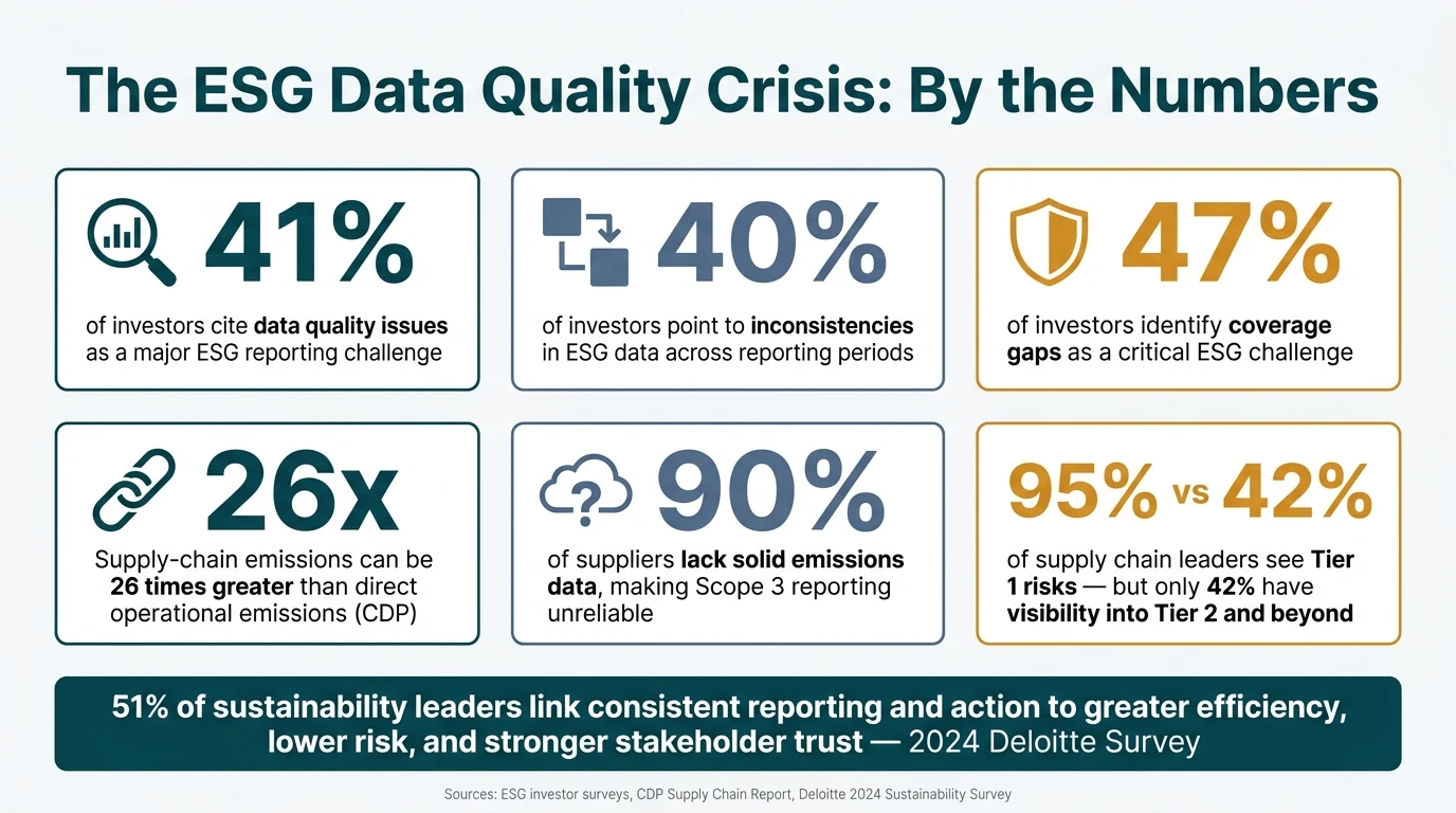
ESG Data Quality Crisis: Key Statistics Every Sustainability Leader Must Know
The ESG Reporting Challenge | Greenwashing Risks Explained
Data Quality and Governance Problems
When year-over-year numbers look off, the problem often sits inside the reporting process, not in day-to-day operations. In many cases, sustainability reporting breaks down because data is scattered, ownership is fuzzy, and review steps are too loose. A 2026 compilation of ESG statistics found that 41% of investors cite data quality issues, 40% point to inconsistencies, and 47% identify coverage gaps as a major challenge.[1] That kind of weak governance tends to show up in the same ways: poor data quality, mixed methods, and holes in coverage.
The pattern is familiar. Energy data lives in a utility portal. Waste data sits in a facility manager's local spreadsheet. Procurement figures are buried in an ERP system. Finance records utility spend monthly at one site and annually at another. No one handles the reconciliation. Once collection methods start to differ by site or by year, trend data stops being comparable.
How Inconsistent Collection Methods Distort Multi-Year Comparisons
Small process changes can throw off an entire multi-year trend. A site switches units. A new manager uses different emissions factors. A reporting boundary changes, but prior years are not restated. Any one of those can break year-over-year comparability.
Emissions factor version control is one of the most common blind spots. Factor databases need to be locked for each reporting period and used the same way across the dataset. But teams sometimes move to a new IPCC Assessment Report or change factor sources without adjusting earlier data. That makes the trend line look like performance changed when the method changed instead.
Manual entry adds another layer of risk. A misplaced decimal in a monthly fuel log or one missing month of electricity data from a meter can skew annual totals and intensity metrics in a material way. These are not rare mishaps. They are routine risks in any organization still leaning on spreadsheets and ad-hoc year-end data calls. Keeping that drift in check means locked definitions, version control, and clear owners.
Building Data Governance That Keeps Reporting Credible Over Time
Each material KPI needs a named owner who is accountable for the definition, source data, and quality of that metric. That person also needs documented collection protocols to work from: standard units, required fields, approved emission factors, and clear boundaries used the same way across all sites. When staff leave or systems change, those protocols keep the data series from drifting. They preserve baselines, definitions, and audit trails from one reporting cycle to the next.
Validation controls matter just as much as collection standards. Automated range checks can flag energy values that fall outside normal limits. Completeness checks can catch missing months or meters before the data rolls up into annual totals. A tiered review process adds another layer of protection:
Local contributors check data against source documents
Data stewards review consistency across sites
A central sustainability team reviews consolidated metrics
That structure lowers the odds that errors make it into external disclosures. Every adjustment should also be logged with a clear reason, so the audit trail stays intact.
Issue | Consequence | Fix |
|---|---|---|
Fragmented data systems | Varied formats and units make year-over-year totals hard to reconcile | Centralize ESG data; standardize templates and fields |
Inconsistent collection methods | Non-comparable energy, water, or waste data across sites | Standardize protocols and frequency; document equipment changes |
Missing historical records | Gaps undermine baselines and long-term targets | Enforce retention policies; reconstruct baselines with documented assumptions |
Unclear metric ownership | Conflicting methodologies accumulate without accountability | Assign named data owners and stewards per KPI |
Weak review controls | Errors reach external disclosures unchecked | Implement tiered reviews, automated validation, and change logs |
Governance starts to slip when staffing, training, and budget do not keep up with rising reporting demands. Controls on paper are not enough. They only hold if definitions, units, and review steps stay fixed across reporting cycles.
Standardization, Comparability, and Reporting Framework Gaps
Clean data is only part of the job. If the KPI changes underneath the data, year-over-year analysis starts to fall apart. Definitions shift. Units drift. Boundaries move. At that point, the numbers may still be correct, but the story they tell is not.
Once collection is steady, the next problem is comparability. That’s where many teams get tripped up: they assume accurate numbers automatically produce a trustworthy trend. They don’t. A KPI that changes over time no longer supports a fair comparison.
How KPI Changes and Unit Mismatches Confuse Stakeholders
One of the most common issues is an undisclosed definition change. A company may first report total energy use across all fuel types plus purchased electricity, then later narrow that KPI to purchased electricity only. If prior years are not restated, the drop can look like an efficiency gain when it is simply a change in measurement. For investors and boards, that kind of moving target makes trend lines hard to trust.
Unit mismatches create the same kind of noise. Water use reported in gallons at U.S. sites and cubic meters at overseas locations leads to shaky portfolio totals unless the units are standardized. Intensity metrics can also break down fast when the denominator changes in the middle of the series. In that case, the trend reflects the denominator shift, not what the business actually did.
Boundary changes add another layer of confusion. A company that divests a high-emission facility may show a steep decline in Scope 1 emissions. On paper, it looks like progress. In practice, it may just reflect a different reporting perimeter. When a structural or method change has a material effect on the time series, prior years should be restated and the change should be disclosed.
That’s the key point: consistency by itself is not enough. Teams also need definitions tied to recognized frameworks so trend lines stay intact.
How Framework-Aligned Reporting Improves Consistency
Recognized frameworks were built to address exactly these problems. GRI gives standard definitions for emissions, water, waste, and social indicators, with comparability across years and organizations built into the model. [3] SASB’s 77 industry-specific standards help peers in the same sector measure the same issues in the same way. [2][4] TCFD’s structure has now been fully folded into IFRS S2, so organizations using ISSB standards generally do not need a separate TCFD report. [5][6]
A practical place to start is a gap analysis. Map internal KPIs against GRI and SASB/ISSB requirements. Flag what is missing, where definitions differ, and which gaps matter most for your sector and stakeholders. Then set standard unit rules and stick to them: kWh for electricity, gallons for water, metric tons CO₂e for emissions, and U.S. dollars for cost metrics. That only works if operations, finance, and sustainability teams all use the same definitions, so training matters here.
Any method change should be logged, explained in the report, and tied to restated historical figures when the impact is material. The aim is simple: give stakeholders fewer chances to misread the trend.
Aspect | Ad hoc | Framework-aligned |
|---|---|---|
KPI definitions | Vary by business unit and year; limited documentation | Standardized, documented definitions aligned with recognized frameworks |
Units and formats | Mixed units, inconsistent currencies | Consistent units, U.S. dollar reporting, clear conversion rules |
Organizational boundaries | Unclear or frequently changing with minimal explanation | Defined (e.g., operational control); changes explained and restated |
Historical data treatment | Trends broken by KPI and boundary changes | Prior years restated when material; trend lines preserved and explained |
Stakeholder understanding | Confusion over year-to-year changes; difficult peer comparisons | Clear, comparable data across years and peers |
Business value | Weak basis for strategic planning and capital allocation | Strong basis for scenario analysis, risk management, and operational decisions |
Framework-aligned reporting turns sustainability data into a consistent basis for comparison, investor review, and operational decision-making.
Trust, Greenwashing Risk, and Stakeholder Communication
Once the data is consistent, the next hurdle is simpler and harder at the same time: is the disclosure complete, clear, and easy to follow? Data can line up with reporting frameworks and still miss the mark if the write-up is selective, vague, or out of step with what stakeholders care about.
Why Selective Reporting Damages Trust
The biggest trust issue usually isn't fake numbers. It's selective disclosure. When a company spotlights one good trend and leaves out a metric that got worse, readers don't see balance. They see risk.
Regulators look closely at material completeness. In the U.S., leaving out known risks - like worsening water stress at a key facility or a safety metric moving in the wrong direction - can look like greenwashing even if every reported figure is accurate.
Employees and local communities often compare company reports with public records and what they see on the ground. If something obvious is missing, trust can drop fast.
A 2024 Deloitte sustainability survey found that 51% of respondents viewed greater efficiencies, lower risk, and enhanced trust with stakeholders as top benefits of sustainability action and reporting.[7]
That kind of trust depends on people seeing the whole picture, not just the good news.
How To Communicate Sustainability Data Clearly and Honestly
Clear reporting starts with three basics for each major metric: baseline, change, and cause. Instead of saying, "Scope 1 and 2 emissions decreased by 8%", say, "Our direct and purchased-energy emissions fell from 120,000 to 110,000 metric tons of CO₂-equivalent between 2023 and 2024, primarily due to efficiency upgrades at U.S. facilities and increased renewable electricity procurement." That level of detail leaves less room for confusion and gives readers something concrete to assess.
Materiality matters just as much. Focus first on the metrics that carry the most financial and operating weight for your sector. For energy-intensive operations, that may be climate risk. Addressing these vulnerabilities is a core component of climate resilience strategies. For sites in drought-prone areas, water stress may be the main issue. For labor-intensive operations, safety metrics may deserve top billing. Once those priorities are clear, use concise visuals - year-over-year bar charts or line graphs with labeled axes, steady units, and short notes that explain what changed and why.
Third-party assurance can strengthen confidence, especially for claims tied to investor materials or public targets. If assurance is used, say so plainly. State the scope, the standard applied - such as ISAE 3000 or AA1000 - and any limits right next to the data, not hidden in an appendix footnote.
Consistency matters too. Use the same KPI definitions across annual reports, websites, and meetings so year-over-year trends stay comparable wherever stakeholders see them.
The strongest signal, though, is when the data clearly shapes decisions. That means showing how a metric led to action: rising energy intensity at a U.S. facility triggered a retrofit investment, or water use data led to a process redesign. When people can follow the chain from number to decision to outcome, reporting feels like accountability rather than marketing copy.
Even strong communication can break down when supplier data is patchy, which leads to the next barrier.
Communication practice | High-risk (greenwashing exposure) | Trust-building |
|---|---|---|
Data selection | Highlights wins; omits missed targets or adverse trends | Reports progress and setbacks with equal visibility |
Language | Vague claims ("sustainable", "eco-friendly") without evidence | Measurable KPIs with defined baselines and units |
Narrative context | Raw numbers without explanation of what drove the change | Plain-language explanation linking trends to decisions |
Verification | Self-reported, unaudited claims | Third-party assurance with clearly stated scope and standards |
Audience tailoring | One-size-fits-all annual report | Consistent KPI definitions across reports, websites, and meetings |
Accountability evidence | ESG treated as a marketing function | Metrics tied to board oversight and operational decisions |
Supply Chain Data Gaps and Turning Data Into Action
Even when internal reporting is solid, the picture can fall apart once supplier data starts coming in half-finished, inconsistent, or missing.
Why Supplier Data Remains Incomplete
CDP finds that supply-chain emissions are 26 times direct operational emissions[9], yet about 90% of suppliers do not have solid emissions data[10]. That mix makes Scope 3 one of the least dependable parts of a sustainability report - and one of the toughest parts to improve over time.
Most companies can see Tier 1 fairly well. After that, visibility drops fast. A global survey found that 95% of supply chain leaders had visibility into Tier 1 risks, but only 42% could see Tier 2 or deeper[8]. That gap matters because Tier 2 and Tier 3 suppliers are often handled through intermediaries, which makes direct data collection slow and messy.
The reporting process itself adds friction. When questionnaires shift every year, instructions are vague, and responses arrive in a mix of spreadsheets, PDFs, and portal exports, comparing one year to the next becomes a headache. Smaller suppliers often do not have the staff, systems, or time to report the same way every cycle. So they leave fields blank or send rough estimates instead. Some also worry that sharing process data could expose how they work or weaken their position in pricing talks.
Here’s how the main barriers line up with practical responses:
Supplier Data Barrier | Engagement Strategy |
|---|---|
Low visibility into Tier 2 and Tier 3 suppliers | Cascade requirements through Tier 1 contracts; use supply chain mapping to identify key sub-suppliers |
Confidentiality concerns about process or proprietary data | Use NDA-backed data-sharing agreements; clarify data will be used for risk management, not supplier bypass |
Inconsistent questionnaire responses across years | Standardize templates aligned with the GHG Protocol; keep core questions stable year over year |
Limited capacity among small and mid-size suppliers | Offer training, calculation templates, and technical assistance; upskilling can make suppliers 1.7 times more likely to complete climate assessments[11] |
High reporting burden from multiple customer requests | Harmonize questionnaires across business units; use shared platforms and pre-populated fields |
A better starting point is a short core data set: total energy use and a few basic policy questions. Then build from there as supplier capacity improves. If supplier coverage is uneven, the problem is not just weaker Scope 3 totals. It also throws off year-over-year comparisons, which makes trend tracking far less useful.
How To Make Sustainability Data Useful for Strategy and Operations
Once supplier data is usable, the next question is simple: does it change decisions?
In many companies, sustainability reporting sits in its own silo. A team puts it together, leadership reviews it once a year, and then procurement, finance, and operations move on with business as usual. That is the reporting-only trap.
Supplier data matters most when it does more than fill out a disclosure. The point is to track movement over time and use that information to guide sourcing, capital planning, and risk decisions. In capital planning, that means asking investment proposals to show quantified emissions impacts and using multi-year trend data to model how each option affects progress toward targets. In risk management, it means bringing supplier emissions, water stress, and social risk indicators into enterprise risk registers as live inputs that point to where mitigation or supplier diversification may be needed.
The practical link is decision-linked KPIs. These are metrics tied to a clear next step, not just a score on a dashboard. If a supplier’s emissions pass a set threshold, that kicks off an engagement process or a sourcing review. If a facility’s energy intensity moves above a set level, that triggers a capital review for efficiency upgrades. When procurement, finance, operations, and sustainability teams look at longitudinal data together on a steady cadence, the odds go up that the data will shape contract terms, supplier choices, and capital decisions.
Disclosure-Only | Action-Oriented |
|---|---|
Detailed ESG reports produced annually but rarely accessed by finance or operations | Sustainability KPIs embedded in executive scorecards and business unit dashboards |
Scope 3 inventory calculated but not linked to procurement criteria | Supplier emissions data tied to sourcing decisions and contract terms |
Sustainability team reviews data; other functions don't | Cross-functional steering group reviews longitudinal data on a regular cadence |
Capital proposals evaluated without climate or resource efficiency inputs | Investment proposals require quantified emissions and resource impact assessments |
KPIs used for disclosure only | KPIs have defined trigger points that initiate specific operational or procurement actions |
Conclusion: What Strong Sustainability Data Sharing Requires
These problems feed into each other. Weak governance leads to shaky numbers. Shaky numbers chip away at trust. And once trust slips, sustainability data gets pushed to the sidelines instead of shaping business decisions.
The answer is a connected system built on five basics: strong data governance, standardized metrics and methodologies, trust-focused disclosure practices, supplier visibility, and systems that tie data to action.
Consistency matters more than most teams think. Shared standards and restatements help protect comparability over time. That comparability is what makes trends believable. And when disclosures are clear and can be checked, the data can do more than fill out a report - it can guide choices.
Strong sustainability data sharing is an operating-model issue, not a messaging issue. Longitudinal sustainability data creates value only when it remains comparable, credible, and useful for decisions over time. That takes reporting, governance, and day-to-day operations working as one system.
FAQs
How can we keep ESG data comparable year over year?
Set up a control framework that mirrors financial reporting. Use standard data-entry rules, shared metric definitions, and the same measurement units across teams.
For each material data point, document the data source, collection process, validation rules, and approval path. Regular reconciliation, paired with automated year-over-year variance analysis, helps spot discrepancies early. Audit trails then make each reported figure traceable back to its source documents.
When should prior sustainability data be restated?
Prior sustainability data should be restated when needed to keep reporting complete, accurate, consistent, and easy to trace - especially as teams prepare for assurance.
This makes sense when past data can’t be trusted or doesn’t line up from one period to the next. Common reasons include errors, changes in methodology, or updated emission factors that can shift year-over-year trend analysis or progress tracking against science-based targets.
What’s the best way to improve weak supplier data?
Focus first on primary data from the suppliers that account for the biggest share of procurement spend or emissions. That’s usually where the biggest gains show up. Use clear templates, simple validation rules, and standardized questionnaires so everyone is working from the same playbook and the data is easier to compare.
As that supplier data starts coming in, keep spend-based methods in place as a fallback. Don’t wait for perfect inputs before moving forward. It’s normal for data quality to get better over time, so build for that from the start. Just make sure you document your methods, assumptions, and source files carefully, so the dataset is audit-ready when you need it.
Related Blog Posts
Latest Articles
©2026

Narrative Change and Power Building: The Missing Half of Advocacy
Narrative change is the process of disrupting dominant narratives that normalize inequity and advancing new narratives from historically marginalized communities.

Funding Resilience Without Federal Grants
BRIC is unreliable and FEMA is shrinking. Here's how cities fund climate resilience with dedicated revenue, blended finance, and a coordinating authority.

The ESG Blind Spot: How AI Is Finding Risks in Companies Nobody Else Is Watching
Norway's sovereign wealth fund uses AI to screen 7,200 portfolio companies for forced labor and corruption within 24 hours. The real story is the emerging-market coverage gap that traditional ESG data vendors miss — and what it means for any company with a global supply chain.
Narrative Change and Power Building: The Missing Half of Advocacy
Narrative change is the process of disrupting dominant narratives that normalize inequity and advancing new narratives from historically marginalized communities.
Funding Resilience Without Federal Grants
BRIC is unreliable and FEMA is shrinking. Here's how cities fund climate resilience with dedicated revenue, blended finance, and a coordinating authority.
The ESG Blind Spot: How AI Is Finding Risks in Companies Nobody Else Is Watching
Norway's sovereign wealth fund uses AI to screen 7,200 portfolio companies for forced labor and corruption within 24 hours. The real story is the emerging-market coverage gap that traditional ESG data vendors miss — and what it means for any company with a global supply chain.
FAQ
01
What does it really mean to “redefine profit”?
02
What makes Council Fire different?
03
Who does Council Fire work with?
04
What does working with Council Fire actually look like?
05
How does Council Fire help organizations turn big goals into action?
06
How does Council Fire define and measure success?
07
How does technology fit into Council Fire’s work?
Jul 11, 2026
Common Challenges in Sharing Sustainability Data
ESG Strategy
In This Article
Why ESG trendlines break and how to fix them: governance, consistent KPIs, supplier data, and decision-linked reporting.
Common Challenges in Sharing Sustainability Data
If your year-over-year ESG numbers shift, people may question the data before they credit the progress. I see the same five problems come up again and again: weak data controls, changing KPI definitions, poor explanation of methods, missing supplier data, and reports that never shape business decisions.
In plain terms, multi-year reporting breaks when the numbers are not gathered the same way, the rules change midstream, or gaps are left unexplained. That matters because investors, regulators, boards, employees, and community groups want trend data they can follow over time. The article points to this pressure with figures like 41% of investors citing data quality issues, 40% citing inconsistencies, and 47% citing coverage gaps.
If I had to reduce the article to a short checklist, it would be this:
Lock definitions and units so one year matches the next
Assign one owner per KPI so no metric drifts without notice
Log every method or boundary change and restate old years when needed
Show setbacks as well as wins to cut greenwashing risk
Improve supplier reporting step by step instead of chasing perfect Scope 3 data at once
Tie KPIs to decisions so the report does more than sit on a shelf
What stood out to me is that the problem is usually not one bad number. It is a broken chain: data sits in many systems, teams use different rules, supplier inputs are patchy, and the final report hides too much context. Even accurate figures can mislead if the boundary changed, the unit changed, or the denominator changed.
A few facts from the article make the point fast:
Supply-chain emissions can be 26 times direct emissions
About 90% of suppliers lack solid emissions data
95% of supply chain leaders see Tier 1 risks, but only 42% see Tier 2 and deeper
51% of respondents in a 2024 Deloitte survey linked reporting and action to efficiency, lower risk, and stakeholder trust
Challenge | What goes wrong | What I’d do first |
|---|---|---|
Data governance | Missing months, mixed units, spreadsheet errors | Set one rulebook, one owner, and review checks |
Comparability | KPI definitions or boundaries change | Restate prior years and explain the change |
Trust | Good news is shown, bad news is buried | Report gains and misses side by side |
Supplier data | Tier 2 and Tier 3 data is thin or uneven | Start with a small core supplier dataset |
Action | Reports are read once, then ignored | Link KPIs to sourcing, budget, and risk reviews |
The bottom line: I’d treat data sharing as a business system issue, not a writing issue. When the data stays consistent, explained, and tied to decisions, the trend line starts to mean something.
ESG Data Quality Crisis: Key Statistics Every Sustainability Leader Must Know
The ESG Reporting Challenge | Greenwashing Risks Explained
Data Quality and Governance Problems
When year-over-year numbers look off, the problem often sits inside the reporting process, not in day-to-day operations. In many cases, sustainability reporting breaks down because data is scattered, ownership is fuzzy, and review steps are too loose. A 2026 compilation of ESG statistics found that 41% of investors cite data quality issues, 40% point to inconsistencies, and 47% identify coverage gaps as a major challenge.[1] That kind of weak governance tends to show up in the same ways: poor data quality, mixed methods, and holes in coverage.
The pattern is familiar. Energy data lives in a utility portal. Waste data sits in a facility manager's local spreadsheet. Procurement figures are buried in an ERP system. Finance records utility spend monthly at one site and annually at another. No one handles the reconciliation. Once collection methods start to differ by site or by year, trend data stops being comparable.
How Inconsistent Collection Methods Distort Multi-Year Comparisons
Small process changes can throw off an entire multi-year trend. A site switches units. A new manager uses different emissions factors. A reporting boundary changes, but prior years are not restated. Any one of those can break year-over-year comparability.
Emissions factor version control is one of the most common blind spots. Factor databases need to be locked for each reporting period and used the same way across the dataset. But teams sometimes move to a new IPCC Assessment Report or change factor sources without adjusting earlier data. That makes the trend line look like performance changed when the method changed instead.
Manual entry adds another layer of risk. A misplaced decimal in a monthly fuel log or one missing month of electricity data from a meter can skew annual totals and intensity metrics in a material way. These are not rare mishaps. They are routine risks in any organization still leaning on spreadsheets and ad-hoc year-end data calls. Keeping that drift in check means locked definitions, version control, and clear owners.
Building Data Governance That Keeps Reporting Credible Over Time
Each material KPI needs a named owner who is accountable for the definition, source data, and quality of that metric. That person also needs documented collection protocols to work from: standard units, required fields, approved emission factors, and clear boundaries used the same way across all sites. When staff leave or systems change, those protocols keep the data series from drifting. They preserve baselines, definitions, and audit trails from one reporting cycle to the next.
Validation controls matter just as much as collection standards. Automated range checks can flag energy values that fall outside normal limits. Completeness checks can catch missing months or meters before the data rolls up into annual totals. A tiered review process adds another layer of protection:
Local contributors check data against source documents
Data stewards review consistency across sites
A central sustainability team reviews consolidated metrics
That structure lowers the odds that errors make it into external disclosures. Every adjustment should also be logged with a clear reason, so the audit trail stays intact.
Issue | Consequence | Fix |
|---|---|---|
Fragmented data systems | Varied formats and units make year-over-year totals hard to reconcile | Centralize ESG data; standardize templates and fields |
Inconsistent collection methods | Non-comparable energy, water, or waste data across sites | Standardize protocols and frequency; document equipment changes |
Missing historical records | Gaps undermine baselines and long-term targets | Enforce retention policies; reconstruct baselines with documented assumptions |
Unclear metric ownership | Conflicting methodologies accumulate without accountability | Assign named data owners and stewards per KPI |
Weak review controls | Errors reach external disclosures unchecked | Implement tiered reviews, automated validation, and change logs |
Governance starts to slip when staffing, training, and budget do not keep up with rising reporting demands. Controls on paper are not enough. They only hold if definitions, units, and review steps stay fixed across reporting cycles.
Standardization, Comparability, and Reporting Framework Gaps
Clean data is only part of the job. If the KPI changes underneath the data, year-over-year analysis starts to fall apart. Definitions shift. Units drift. Boundaries move. At that point, the numbers may still be correct, but the story they tell is not.
Once collection is steady, the next problem is comparability. That’s where many teams get tripped up: they assume accurate numbers automatically produce a trustworthy trend. They don’t. A KPI that changes over time no longer supports a fair comparison.
How KPI Changes and Unit Mismatches Confuse Stakeholders
One of the most common issues is an undisclosed definition change. A company may first report total energy use across all fuel types plus purchased electricity, then later narrow that KPI to purchased electricity only. If prior years are not restated, the drop can look like an efficiency gain when it is simply a change in measurement. For investors and boards, that kind of moving target makes trend lines hard to trust.
Unit mismatches create the same kind of noise. Water use reported in gallons at U.S. sites and cubic meters at overseas locations leads to shaky portfolio totals unless the units are standardized. Intensity metrics can also break down fast when the denominator changes in the middle of the series. In that case, the trend reflects the denominator shift, not what the business actually did.
Boundary changes add another layer of confusion. A company that divests a high-emission facility may show a steep decline in Scope 1 emissions. On paper, it looks like progress. In practice, it may just reflect a different reporting perimeter. When a structural or method change has a material effect on the time series, prior years should be restated and the change should be disclosed.
That’s the key point: consistency by itself is not enough. Teams also need definitions tied to recognized frameworks so trend lines stay intact.
How Framework-Aligned Reporting Improves Consistency
Recognized frameworks were built to address exactly these problems. GRI gives standard definitions for emissions, water, waste, and social indicators, with comparability across years and organizations built into the model. [3] SASB’s 77 industry-specific standards help peers in the same sector measure the same issues in the same way. [2][4] TCFD’s structure has now been fully folded into IFRS S2, so organizations using ISSB standards generally do not need a separate TCFD report. [5][6]
A practical place to start is a gap analysis. Map internal KPIs against GRI and SASB/ISSB requirements. Flag what is missing, where definitions differ, and which gaps matter most for your sector and stakeholders. Then set standard unit rules and stick to them: kWh for electricity, gallons for water, metric tons CO₂e for emissions, and U.S. dollars for cost metrics. That only works if operations, finance, and sustainability teams all use the same definitions, so training matters here.
Any method change should be logged, explained in the report, and tied to restated historical figures when the impact is material. The aim is simple: give stakeholders fewer chances to misread the trend.
Aspect | Ad hoc | Framework-aligned |
|---|---|---|
KPI definitions | Vary by business unit and year; limited documentation | Standardized, documented definitions aligned with recognized frameworks |
Units and formats | Mixed units, inconsistent currencies | Consistent units, U.S. dollar reporting, clear conversion rules |
Organizational boundaries | Unclear or frequently changing with minimal explanation | Defined (e.g., operational control); changes explained and restated |
Historical data treatment | Trends broken by KPI and boundary changes | Prior years restated when material; trend lines preserved and explained |
Stakeholder understanding | Confusion over year-to-year changes; difficult peer comparisons | Clear, comparable data across years and peers |
Business value | Weak basis for strategic planning and capital allocation | Strong basis for scenario analysis, risk management, and operational decisions |
Framework-aligned reporting turns sustainability data into a consistent basis for comparison, investor review, and operational decision-making.
Trust, Greenwashing Risk, and Stakeholder Communication
Once the data is consistent, the next hurdle is simpler and harder at the same time: is the disclosure complete, clear, and easy to follow? Data can line up with reporting frameworks and still miss the mark if the write-up is selective, vague, or out of step with what stakeholders care about.
Why Selective Reporting Damages Trust
The biggest trust issue usually isn't fake numbers. It's selective disclosure. When a company spotlights one good trend and leaves out a metric that got worse, readers don't see balance. They see risk.
Regulators look closely at material completeness. In the U.S., leaving out known risks - like worsening water stress at a key facility or a safety metric moving in the wrong direction - can look like greenwashing even if every reported figure is accurate.
Employees and local communities often compare company reports with public records and what they see on the ground. If something obvious is missing, trust can drop fast.
A 2024 Deloitte sustainability survey found that 51% of respondents viewed greater efficiencies, lower risk, and enhanced trust with stakeholders as top benefits of sustainability action and reporting.[7]
That kind of trust depends on people seeing the whole picture, not just the good news.
How To Communicate Sustainability Data Clearly and Honestly
Clear reporting starts with three basics for each major metric: baseline, change, and cause. Instead of saying, "Scope 1 and 2 emissions decreased by 8%", say, "Our direct and purchased-energy emissions fell from 120,000 to 110,000 metric tons of CO₂-equivalent between 2023 and 2024, primarily due to efficiency upgrades at U.S. facilities and increased renewable electricity procurement." That level of detail leaves less room for confusion and gives readers something concrete to assess.
Materiality matters just as much. Focus first on the metrics that carry the most financial and operating weight for your sector. For energy-intensive operations, that may be climate risk. Addressing these vulnerabilities is a core component of climate resilience strategies. For sites in drought-prone areas, water stress may be the main issue. For labor-intensive operations, safety metrics may deserve top billing. Once those priorities are clear, use concise visuals - year-over-year bar charts or line graphs with labeled axes, steady units, and short notes that explain what changed and why.
Third-party assurance can strengthen confidence, especially for claims tied to investor materials or public targets. If assurance is used, say so plainly. State the scope, the standard applied - such as ISAE 3000 or AA1000 - and any limits right next to the data, not hidden in an appendix footnote.
Consistency matters too. Use the same KPI definitions across annual reports, websites, and meetings so year-over-year trends stay comparable wherever stakeholders see them.
The strongest signal, though, is when the data clearly shapes decisions. That means showing how a metric led to action: rising energy intensity at a U.S. facility triggered a retrofit investment, or water use data led to a process redesign. When people can follow the chain from number to decision to outcome, reporting feels like accountability rather than marketing copy.
Even strong communication can break down when supplier data is patchy, which leads to the next barrier.
Communication practice | High-risk (greenwashing exposure) | Trust-building |
|---|---|---|
Data selection | Highlights wins; omits missed targets or adverse trends | Reports progress and setbacks with equal visibility |
Language | Vague claims ("sustainable", "eco-friendly") without evidence | Measurable KPIs with defined baselines and units |
Narrative context | Raw numbers without explanation of what drove the change | Plain-language explanation linking trends to decisions |
Verification | Self-reported, unaudited claims | Third-party assurance with clearly stated scope and standards |
Audience tailoring | One-size-fits-all annual report | Consistent KPI definitions across reports, websites, and meetings |
Accountability evidence | ESG treated as a marketing function | Metrics tied to board oversight and operational decisions |
Supply Chain Data Gaps and Turning Data Into Action
Even when internal reporting is solid, the picture can fall apart once supplier data starts coming in half-finished, inconsistent, or missing.
Why Supplier Data Remains Incomplete
CDP finds that supply-chain emissions are 26 times direct operational emissions[9], yet about 90% of suppliers do not have solid emissions data[10]. That mix makes Scope 3 one of the least dependable parts of a sustainability report - and one of the toughest parts to improve over time.
Most companies can see Tier 1 fairly well. After that, visibility drops fast. A global survey found that 95% of supply chain leaders had visibility into Tier 1 risks, but only 42% could see Tier 2 or deeper[8]. That gap matters because Tier 2 and Tier 3 suppliers are often handled through intermediaries, which makes direct data collection slow and messy.
The reporting process itself adds friction. When questionnaires shift every year, instructions are vague, and responses arrive in a mix of spreadsheets, PDFs, and portal exports, comparing one year to the next becomes a headache. Smaller suppliers often do not have the staff, systems, or time to report the same way every cycle. So they leave fields blank or send rough estimates instead. Some also worry that sharing process data could expose how they work or weaken their position in pricing talks.
Here’s how the main barriers line up with practical responses:
Supplier Data Barrier | Engagement Strategy |
|---|---|
Low visibility into Tier 2 and Tier 3 suppliers | Cascade requirements through Tier 1 contracts; use supply chain mapping to identify key sub-suppliers |
Confidentiality concerns about process or proprietary data | Use NDA-backed data-sharing agreements; clarify data will be used for risk management, not supplier bypass |
Inconsistent questionnaire responses across years | Standardize templates aligned with the GHG Protocol; keep core questions stable year over year |
Limited capacity among small and mid-size suppliers | Offer training, calculation templates, and technical assistance; upskilling can make suppliers 1.7 times more likely to complete climate assessments[11] |
High reporting burden from multiple customer requests | Harmonize questionnaires across business units; use shared platforms and pre-populated fields |
A better starting point is a short core data set: total energy use and a few basic policy questions. Then build from there as supplier capacity improves. If supplier coverage is uneven, the problem is not just weaker Scope 3 totals. It also throws off year-over-year comparisons, which makes trend tracking far less useful.
How To Make Sustainability Data Useful for Strategy and Operations
Once supplier data is usable, the next question is simple: does it change decisions?
In many companies, sustainability reporting sits in its own silo. A team puts it together, leadership reviews it once a year, and then procurement, finance, and operations move on with business as usual. That is the reporting-only trap.
Supplier data matters most when it does more than fill out a disclosure. The point is to track movement over time and use that information to guide sourcing, capital planning, and risk decisions. In capital planning, that means asking investment proposals to show quantified emissions impacts and using multi-year trend data to model how each option affects progress toward targets. In risk management, it means bringing supplier emissions, water stress, and social risk indicators into enterprise risk registers as live inputs that point to where mitigation or supplier diversification may be needed.
The practical link is decision-linked KPIs. These are metrics tied to a clear next step, not just a score on a dashboard. If a supplier’s emissions pass a set threshold, that kicks off an engagement process or a sourcing review. If a facility’s energy intensity moves above a set level, that triggers a capital review for efficiency upgrades. When procurement, finance, operations, and sustainability teams look at longitudinal data together on a steady cadence, the odds go up that the data will shape contract terms, supplier choices, and capital decisions.
Disclosure-Only | Action-Oriented |
|---|---|
Detailed ESG reports produced annually but rarely accessed by finance or operations | Sustainability KPIs embedded in executive scorecards and business unit dashboards |
Scope 3 inventory calculated but not linked to procurement criteria | Supplier emissions data tied to sourcing decisions and contract terms |
Sustainability team reviews data; other functions don't | Cross-functional steering group reviews longitudinal data on a regular cadence |
Capital proposals evaluated without climate or resource efficiency inputs | Investment proposals require quantified emissions and resource impact assessments |
KPIs used for disclosure only | KPIs have defined trigger points that initiate specific operational or procurement actions |
Conclusion: What Strong Sustainability Data Sharing Requires
These problems feed into each other. Weak governance leads to shaky numbers. Shaky numbers chip away at trust. And once trust slips, sustainability data gets pushed to the sidelines instead of shaping business decisions.
The answer is a connected system built on five basics: strong data governance, standardized metrics and methodologies, trust-focused disclosure practices, supplier visibility, and systems that tie data to action.
Consistency matters more than most teams think. Shared standards and restatements help protect comparability over time. That comparability is what makes trends believable. And when disclosures are clear and can be checked, the data can do more than fill out a report - it can guide choices.
Strong sustainability data sharing is an operating-model issue, not a messaging issue. Longitudinal sustainability data creates value only when it remains comparable, credible, and useful for decisions over time. That takes reporting, governance, and day-to-day operations working as one system.
FAQs
How can we keep ESG data comparable year over year?
Set up a control framework that mirrors financial reporting. Use standard data-entry rules, shared metric definitions, and the same measurement units across teams.
For each material data point, document the data source, collection process, validation rules, and approval path. Regular reconciliation, paired with automated year-over-year variance analysis, helps spot discrepancies early. Audit trails then make each reported figure traceable back to its source documents.
When should prior sustainability data be restated?
Prior sustainability data should be restated when needed to keep reporting complete, accurate, consistent, and easy to trace - especially as teams prepare for assurance.
This makes sense when past data can’t be trusted or doesn’t line up from one period to the next. Common reasons include errors, changes in methodology, or updated emission factors that can shift year-over-year trend analysis or progress tracking against science-based targets.
What’s the best way to improve weak supplier data?
Focus first on primary data from the suppliers that account for the biggest share of procurement spend or emissions. That’s usually where the biggest gains show up. Use clear templates, simple validation rules, and standardized questionnaires so everyone is working from the same playbook and the data is easier to compare.
As that supplier data starts coming in, keep spend-based methods in place as a fallback. Don’t wait for perfect inputs before moving forward. It’s normal for data quality to get better over time, so build for that from the start. Just make sure you document your methods, assumptions, and source files carefully, so the dataset is audit-ready when you need it.
Related Blog Posts
Latest Articles
©2026
Narrative Change and Power Building: The Missing Half of Advocacy
Narrative change is the process of disrupting dominant narratives that normalize inequity and advancing new narratives from historically marginalized communities.
Funding Resilience Without Federal Grants
BRIC is unreliable and FEMA is shrinking. Here's how cities fund climate resilience with dedicated revenue, blended finance, and a coordinating authority.
The ESG Blind Spot: How AI Is Finding Risks in Companies Nobody Else Is Watching
Norway's sovereign wealth fund uses AI to screen 7,200 portfolio companies for forced labor and corruption within 24 hours. The real story is the emerging-market coverage gap that traditional ESG data vendors miss — and what it means for any company with a global supply chain.
FAQ
01
What does it really mean to “redefine profit”?
02
What makes Council Fire different?
03
Who does Council Fire work with?
04
What does working with Council Fire actually look like?
05
How does Council Fire help organizations turn big goals into action?
06
How does Council Fire define and measure success?
07
How does technology fit into Council Fire’s work?
Jul 11, 2026
Common Challenges in Sharing Sustainability Data
ESG Strategy
In This Article
Why ESG trendlines break and how to fix them: governance, consistent KPIs, supplier data, and decision-linked reporting.
Common Challenges in Sharing Sustainability Data
If your year-over-year ESG numbers shift, people may question the data before they credit the progress. I see the same five problems come up again and again: weak data controls, changing KPI definitions, poor explanation of methods, missing supplier data, and reports that never shape business decisions.
In plain terms, multi-year reporting breaks when the numbers are not gathered the same way, the rules change midstream, or gaps are left unexplained. That matters because investors, regulators, boards, employees, and community groups want trend data they can follow over time. The article points to this pressure with figures like 41% of investors citing data quality issues, 40% citing inconsistencies, and 47% citing coverage gaps.
If I had to reduce the article to a short checklist, it would be this:
Lock definitions and units so one year matches the next
Assign one owner per KPI so no metric drifts without notice
Log every method or boundary change and restate old years when needed
Show setbacks as well as wins to cut greenwashing risk
Improve supplier reporting step by step instead of chasing perfect Scope 3 data at once
Tie KPIs to decisions so the report does more than sit on a shelf
What stood out to me is that the problem is usually not one bad number. It is a broken chain: data sits in many systems, teams use different rules, supplier inputs are patchy, and the final report hides too much context. Even accurate figures can mislead if the boundary changed, the unit changed, or the denominator changed.
A few facts from the article make the point fast:
Supply-chain emissions can be 26 times direct emissions
About 90% of suppliers lack solid emissions data
95% of supply chain leaders see Tier 1 risks, but only 42% see Tier 2 and deeper
51% of respondents in a 2024 Deloitte survey linked reporting and action to efficiency, lower risk, and stakeholder trust
Challenge | What goes wrong | What I’d do first |
|---|---|---|
Data governance | Missing months, mixed units, spreadsheet errors | Set one rulebook, one owner, and review checks |
Comparability | KPI definitions or boundaries change | Restate prior years and explain the change |
Trust | Good news is shown, bad news is buried | Report gains and misses side by side |
Supplier data | Tier 2 and Tier 3 data is thin or uneven | Start with a small core supplier dataset |
Action | Reports are read once, then ignored | Link KPIs to sourcing, budget, and risk reviews |
The bottom line: I’d treat data sharing as a business system issue, not a writing issue. When the data stays consistent, explained, and tied to decisions, the trend line starts to mean something.
ESG Data Quality Crisis: Key Statistics Every Sustainability Leader Must Know
The ESG Reporting Challenge | Greenwashing Risks Explained
Data Quality and Governance Problems
When year-over-year numbers look off, the problem often sits inside the reporting process, not in day-to-day operations. In many cases, sustainability reporting breaks down because data is scattered, ownership is fuzzy, and review steps are too loose. A 2026 compilation of ESG statistics found that 41% of investors cite data quality issues, 40% point to inconsistencies, and 47% identify coverage gaps as a major challenge.[1] That kind of weak governance tends to show up in the same ways: poor data quality, mixed methods, and holes in coverage.
The pattern is familiar. Energy data lives in a utility portal. Waste data sits in a facility manager's local spreadsheet. Procurement figures are buried in an ERP system. Finance records utility spend monthly at one site and annually at another. No one handles the reconciliation. Once collection methods start to differ by site or by year, trend data stops being comparable.
How Inconsistent Collection Methods Distort Multi-Year Comparisons
Small process changes can throw off an entire multi-year trend. A site switches units. A new manager uses different emissions factors. A reporting boundary changes, but prior years are not restated. Any one of those can break year-over-year comparability.
Emissions factor version control is one of the most common blind spots. Factor databases need to be locked for each reporting period and used the same way across the dataset. But teams sometimes move to a new IPCC Assessment Report or change factor sources without adjusting earlier data. That makes the trend line look like performance changed when the method changed instead.
Manual entry adds another layer of risk. A misplaced decimal in a monthly fuel log or one missing month of electricity data from a meter can skew annual totals and intensity metrics in a material way. These are not rare mishaps. They are routine risks in any organization still leaning on spreadsheets and ad-hoc year-end data calls. Keeping that drift in check means locked definitions, version control, and clear owners.
Building Data Governance That Keeps Reporting Credible Over Time
Each material KPI needs a named owner who is accountable for the definition, source data, and quality of that metric. That person also needs documented collection protocols to work from: standard units, required fields, approved emission factors, and clear boundaries used the same way across all sites. When staff leave or systems change, those protocols keep the data series from drifting. They preserve baselines, definitions, and audit trails from one reporting cycle to the next.
Validation controls matter just as much as collection standards. Automated range checks can flag energy values that fall outside normal limits. Completeness checks can catch missing months or meters before the data rolls up into annual totals. A tiered review process adds another layer of protection:
Local contributors check data against source documents
Data stewards review consistency across sites
A central sustainability team reviews consolidated metrics
That structure lowers the odds that errors make it into external disclosures. Every adjustment should also be logged with a clear reason, so the audit trail stays intact.
Issue | Consequence | Fix |
|---|---|---|
Fragmented data systems | Varied formats and units make year-over-year totals hard to reconcile | Centralize ESG data; standardize templates and fields |
Inconsistent collection methods | Non-comparable energy, water, or waste data across sites | Standardize protocols and frequency; document equipment changes |
Missing historical records | Gaps undermine baselines and long-term targets | Enforce retention policies; reconstruct baselines with documented assumptions |
Unclear metric ownership | Conflicting methodologies accumulate without accountability | Assign named data owners and stewards per KPI |
Weak review controls | Errors reach external disclosures unchecked | Implement tiered reviews, automated validation, and change logs |
Governance starts to slip when staffing, training, and budget do not keep up with rising reporting demands. Controls on paper are not enough. They only hold if definitions, units, and review steps stay fixed across reporting cycles.
Standardization, Comparability, and Reporting Framework Gaps
Clean data is only part of the job. If the KPI changes underneath the data, year-over-year analysis starts to fall apart. Definitions shift. Units drift. Boundaries move. At that point, the numbers may still be correct, but the story they tell is not.
Once collection is steady, the next problem is comparability. That’s where many teams get tripped up: they assume accurate numbers automatically produce a trustworthy trend. They don’t. A KPI that changes over time no longer supports a fair comparison.
How KPI Changes and Unit Mismatches Confuse Stakeholders
One of the most common issues is an undisclosed definition change. A company may first report total energy use across all fuel types plus purchased electricity, then later narrow that KPI to purchased electricity only. If prior years are not restated, the drop can look like an efficiency gain when it is simply a change in measurement. For investors and boards, that kind of moving target makes trend lines hard to trust.
Unit mismatches create the same kind of noise. Water use reported in gallons at U.S. sites and cubic meters at overseas locations leads to shaky portfolio totals unless the units are standardized. Intensity metrics can also break down fast when the denominator changes in the middle of the series. In that case, the trend reflects the denominator shift, not what the business actually did.
Boundary changes add another layer of confusion. A company that divests a high-emission facility may show a steep decline in Scope 1 emissions. On paper, it looks like progress. In practice, it may just reflect a different reporting perimeter. When a structural or method change has a material effect on the time series, prior years should be restated and the change should be disclosed.
That’s the key point: consistency by itself is not enough. Teams also need definitions tied to recognized frameworks so trend lines stay intact.
How Framework-Aligned Reporting Improves Consistency
Recognized frameworks were built to address exactly these problems. GRI gives standard definitions for emissions, water, waste, and social indicators, with comparability across years and organizations built into the model. [3] SASB’s 77 industry-specific standards help peers in the same sector measure the same issues in the same way. [2][4] TCFD’s structure has now been fully folded into IFRS S2, so organizations using ISSB standards generally do not need a separate TCFD report. [5][6]
A practical place to start is a gap analysis. Map internal KPIs against GRI and SASB/ISSB requirements. Flag what is missing, where definitions differ, and which gaps matter most for your sector and stakeholders. Then set standard unit rules and stick to them: kWh for electricity, gallons for water, metric tons CO₂e for emissions, and U.S. dollars for cost metrics. That only works if operations, finance, and sustainability teams all use the same definitions, so training matters here.
Any method change should be logged, explained in the report, and tied to restated historical figures when the impact is material. The aim is simple: give stakeholders fewer chances to misread the trend.
Aspect | Ad hoc | Framework-aligned |
|---|---|---|
KPI definitions | Vary by business unit and year; limited documentation | Standardized, documented definitions aligned with recognized frameworks |
Units and formats | Mixed units, inconsistent currencies | Consistent units, U.S. dollar reporting, clear conversion rules |
Organizational boundaries | Unclear or frequently changing with minimal explanation | Defined (e.g., operational control); changes explained and restated |
Historical data treatment | Trends broken by KPI and boundary changes | Prior years restated when material; trend lines preserved and explained |
Stakeholder understanding | Confusion over year-to-year changes; difficult peer comparisons | Clear, comparable data across years and peers |
Business value | Weak basis for strategic planning and capital allocation | Strong basis for scenario analysis, risk management, and operational decisions |
Framework-aligned reporting turns sustainability data into a consistent basis for comparison, investor review, and operational decision-making.
Trust, Greenwashing Risk, and Stakeholder Communication
Once the data is consistent, the next hurdle is simpler and harder at the same time: is the disclosure complete, clear, and easy to follow? Data can line up with reporting frameworks and still miss the mark if the write-up is selective, vague, or out of step with what stakeholders care about.
Why Selective Reporting Damages Trust
The biggest trust issue usually isn't fake numbers. It's selective disclosure. When a company spotlights one good trend and leaves out a metric that got worse, readers don't see balance. They see risk.
Regulators look closely at material completeness. In the U.S., leaving out known risks - like worsening water stress at a key facility or a safety metric moving in the wrong direction - can look like greenwashing even if every reported figure is accurate.
Employees and local communities often compare company reports with public records and what they see on the ground. If something obvious is missing, trust can drop fast.
A 2024 Deloitte sustainability survey found that 51% of respondents viewed greater efficiencies, lower risk, and enhanced trust with stakeholders as top benefits of sustainability action and reporting.[7]
That kind of trust depends on people seeing the whole picture, not just the good news.
How To Communicate Sustainability Data Clearly and Honestly
Clear reporting starts with three basics for each major metric: baseline, change, and cause. Instead of saying, "Scope 1 and 2 emissions decreased by 8%", say, "Our direct and purchased-energy emissions fell from 120,000 to 110,000 metric tons of CO₂-equivalent between 2023 and 2024, primarily due to efficiency upgrades at U.S. facilities and increased renewable electricity procurement." That level of detail leaves less room for confusion and gives readers something concrete to assess.
Materiality matters just as much. Focus first on the metrics that carry the most financial and operating weight for your sector. For energy-intensive operations, that may be climate risk. Addressing these vulnerabilities is a core component of climate resilience strategies. For sites in drought-prone areas, water stress may be the main issue. For labor-intensive operations, safety metrics may deserve top billing. Once those priorities are clear, use concise visuals - year-over-year bar charts or line graphs with labeled axes, steady units, and short notes that explain what changed and why.
Third-party assurance can strengthen confidence, especially for claims tied to investor materials or public targets. If assurance is used, say so plainly. State the scope, the standard applied - such as ISAE 3000 or AA1000 - and any limits right next to the data, not hidden in an appendix footnote.
Consistency matters too. Use the same KPI definitions across annual reports, websites, and meetings so year-over-year trends stay comparable wherever stakeholders see them.
The strongest signal, though, is when the data clearly shapes decisions. That means showing how a metric led to action: rising energy intensity at a U.S. facility triggered a retrofit investment, or water use data led to a process redesign. When people can follow the chain from number to decision to outcome, reporting feels like accountability rather than marketing copy.
Even strong communication can break down when supplier data is patchy, which leads to the next barrier.
Communication practice | High-risk (greenwashing exposure) | Trust-building |
|---|---|---|
Data selection | Highlights wins; omits missed targets or adverse trends | Reports progress and setbacks with equal visibility |
Language | Vague claims ("sustainable", "eco-friendly") without evidence | Measurable KPIs with defined baselines and units |
Narrative context | Raw numbers without explanation of what drove the change | Plain-language explanation linking trends to decisions |
Verification | Self-reported, unaudited claims | Third-party assurance with clearly stated scope and standards |
Audience tailoring | One-size-fits-all annual report | Consistent KPI definitions across reports, websites, and meetings |
Accountability evidence | ESG treated as a marketing function | Metrics tied to board oversight and operational decisions |
Supply Chain Data Gaps and Turning Data Into Action
Even when internal reporting is solid, the picture can fall apart once supplier data starts coming in half-finished, inconsistent, or missing.
Why Supplier Data Remains Incomplete
CDP finds that supply-chain emissions are 26 times direct operational emissions[9], yet about 90% of suppliers do not have solid emissions data[10]. That mix makes Scope 3 one of the least dependable parts of a sustainability report - and one of the toughest parts to improve over time.
Most companies can see Tier 1 fairly well. After that, visibility drops fast. A global survey found that 95% of supply chain leaders had visibility into Tier 1 risks, but only 42% could see Tier 2 or deeper[8]. That gap matters because Tier 2 and Tier 3 suppliers are often handled through intermediaries, which makes direct data collection slow and messy.
The reporting process itself adds friction. When questionnaires shift every year, instructions are vague, and responses arrive in a mix of spreadsheets, PDFs, and portal exports, comparing one year to the next becomes a headache. Smaller suppliers often do not have the staff, systems, or time to report the same way every cycle. So they leave fields blank or send rough estimates instead. Some also worry that sharing process data could expose how they work or weaken their position in pricing talks.
Here’s how the main barriers line up with practical responses:
Supplier Data Barrier | Engagement Strategy |
|---|---|
Low visibility into Tier 2 and Tier 3 suppliers | Cascade requirements through Tier 1 contracts; use supply chain mapping to identify key sub-suppliers |
Confidentiality concerns about process or proprietary data | Use NDA-backed data-sharing agreements; clarify data will be used for risk management, not supplier bypass |
Inconsistent questionnaire responses across years | Standardize templates aligned with the GHG Protocol; keep core questions stable year over year |
Limited capacity among small and mid-size suppliers | Offer training, calculation templates, and technical assistance; upskilling can make suppliers 1.7 times more likely to complete climate assessments[11] |
High reporting burden from multiple customer requests | Harmonize questionnaires across business units; use shared platforms and pre-populated fields |
A better starting point is a short core data set: total energy use and a few basic policy questions. Then build from there as supplier capacity improves. If supplier coverage is uneven, the problem is not just weaker Scope 3 totals. It also throws off year-over-year comparisons, which makes trend tracking far less useful.
How To Make Sustainability Data Useful for Strategy and Operations
Once supplier data is usable, the next question is simple: does it change decisions?
In many companies, sustainability reporting sits in its own silo. A team puts it together, leadership reviews it once a year, and then procurement, finance, and operations move on with business as usual. That is the reporting-only trap.
Supplier data matters most when it does more than fill out a disclosure. The point is to track movement over time and use that information to guide sourcing, capital planning, and risk decisions. In capital planning, that means asking investment proposals to show quantified emissions impacts and using multi-year trend data to model how each option affects progress toward targets. In risk management, it means bringing supplier emissions, water stress, and social risk indicators into enterprise risk registers as live inputs that point to where mitigation or supplier diversification may be needed.
The practical link is decision-linked KPIs. These are metrics tied to a clear next step, not just a score on a dashboard. If a supplier’s emissions pass a set threshold, that kicks off an engagement process or a sourcing review. If a facility’s energy intensity moves above a set level, that triggers a capital review for efficiency upgrades. When procurement, finance, operations, and sustainability teams look at longitudinal data together on a steady cadence, the odds go up that the data will shape contract terms, supplier choices, and capital decisions.
Disclosure-Only | Action-Oriented |
|---|---|
Detailed ESG reports produced annually but rarely accessed by finance or operations | Sustainability KPIs embedded in executive scorecards and business unit dashboards |
Scope 3 inventory calculated but not linked to procurement criteria | Supplier emissions data tied to sourcing decisions and contract terms |
Sustainability team reviews data; other functions don't | Cross-functional steering group reviews longitudinal data on a regular cadence |
Capital proposals evaluated without climate or resource efficiency inputs | Investment proposals require quantified emissions and resource impact assessments |
KPIs used for disclosure only | KPIs have defined trigger points that initiate specific operational or procurement actions |
Conclusion: What Strong Sustainability Data Sharing Requires
These problems feed into each other. Weak governance leads to shaky numbers. Shaky numbers chip away at trust. And once trust slips, sustainability data gets pushed to the sidelines instead of shaping business decisions.
The answer is a connected system built on five basics: strong data governance, standardized metrics and methodologies, trust-focused disclosure practices, supplier visibility, and systems that tie data to action.
Consistency matters more than most teams think. Shared standards and restatements help protect comparability over time. That comparability is what makes trends believable. And when disclosures are clear and can be checked, the data can do more than fill out a report - it can guide choices.
Strong sustainability data sharing is an operating-model issue, not a messaging issue. Longitudinal sustainability data creates value only when it remains comparable, credible, and useful for decisions over time. That takes reporting, governance, and day-to-day operations working as one system.
FAQs
How can we keep ESG data comparable year over year?
Set up a control framework that mirrors financial reporting. Use standard data-entry rules, shared metric definitions, and the same measurement units across teams.
For each material data point, document the data source, collection process, validation rules, and approval path. Regular reconciliation, paired with automated year-over-year variance analysis, helps spot discrepancies early. Audit trails then make each reported figure traceable back to its source documents.
When should prior sustainability data be restated?
Prior sustainability data should be restated when needed to keep reporting complete, accurate, consistent, and easy to trace - especially as teams prepare for assurance.
This makes sense when past data can’t be trusted or doesn’t line up from one period to the next. Common reasons include errors, changes in methodology, or updated emission factors that can shift year-over-year trend analysis or progress tracking against science-based targets.
What’s the best way to improve weak supplier data?
Focus first on primary data from the suppliers that account for the biggest share of procurement spend or emissions. That’s usually where the biggest gains show up. Use clear templates, simple validation rules, and standardized questionnaires so everyone is working from the same playbook and the data is easier to compare.
As that supplier data starts coming in, keep spend-based methods in place as a fallback. Don’t wait for perfect inputs before moving forward. It’s normal for data quality to get better over time, so build for that from the start. Just make sure you document your methods, assumptions, and source files carefully, so the dataset is audit-ready when you need it.
Related Blog Posts
Latest Articles
©2026
Narrative Change and Power Building: The Missing Half of Advocacy
Narrative change is the process of disrupting dominant narratives that normalize inequity and advancing new narratives from historically marginalized communities.
Funding Resilience Without Federal Grants
BRIC is unreliable and FEMA is shrinking. Here's how cities fund climate resilience with dedicated revenue, blended finance, and a coordinating authority.
The ESG Blind Spot: How AI Is Finding Risks in Companies Nobody Else Is Watching
Norway's sovereign wealth fund uses AI to screen 7,200 portfolio companies for forced labor and corruption within 24 hours. The real story is the emerging-market coverage gap that traditional ESG data vendors miss — and what it means for any company with a global supply chain.
FAQ
What does it really mean to “redefine profit”?
What makes Council Fire different?
Who does Council Fire work with?
What does working with Council Fire actually look like?
How does Council Fire help organizations turn big goals into action?
How does Council Fire define and measure success?
How does technology fit into Council Fire’s work?