
Sep 15, 2026
Why ESG Reporting Needs Live Data Dashboards
ESG Strategy
In This Article
Live ESG dashboards provide near-real-time metrics, metric-level traceability, alerts, and audit trails to strengthen board decisions.
Why ESG Reporting Needs Live Data Dashboards
If ESG data is months old, leaders are making calls with the wrong picture. I’d sum it up this way: live dashboards help boards and executives see risk sooner, trace each number to its source, and act before small issues turn into bigger ones.
Here’s the short version:
Static reports lag behind events. Emissions, safety issues, supplier problems, and governance gaps can shift in days, not just at year-end.
Averages hide trouble. A company-wide total can mask a spike at one site or in one business unit.
Manual reporting creates errors.Spreadsheets still dominate ESG reporting - 87% of companies use them, and research says 94% of business spreadsheets contain errors.
Slow updates weaken confidence.Bloomberg found 41% of respondents see continuous ESG data updates as a main data problem, while 63% say data coverage and quality may be too weak.
Live dashboards improve oversight. They show timestamps, source systems, submitters, approval status, alerts, and drill-down views in one place.
Automation helps boards move faster. One analysis found ESG data automation cut time-to-report by 21% and improved board confidence by 10%.
What stands out to me is simple: a PDF can document the past, but it cannot help much with what changed this week. For board review, you need current data, clear ownership, and a way to spot outliers fast.
Quick comparison
Area | Static reports | Live dashboards |
|---|---|---|
Update timing | Annual or quarterly | Near real-time |
Visibility into issues | Often delayed | Alerts show issues right away |
Source tracking | Limited | Metric-level source, timestamp, and owner |
Review status | Hard to track | Draft, checked, and approved states visible |
Board use | Mostly backward-looking | Supports current review and action |
My takeaway: if you want ESG reporting to support decisions instead of just disclosures, live dashboards do the job better than static files.
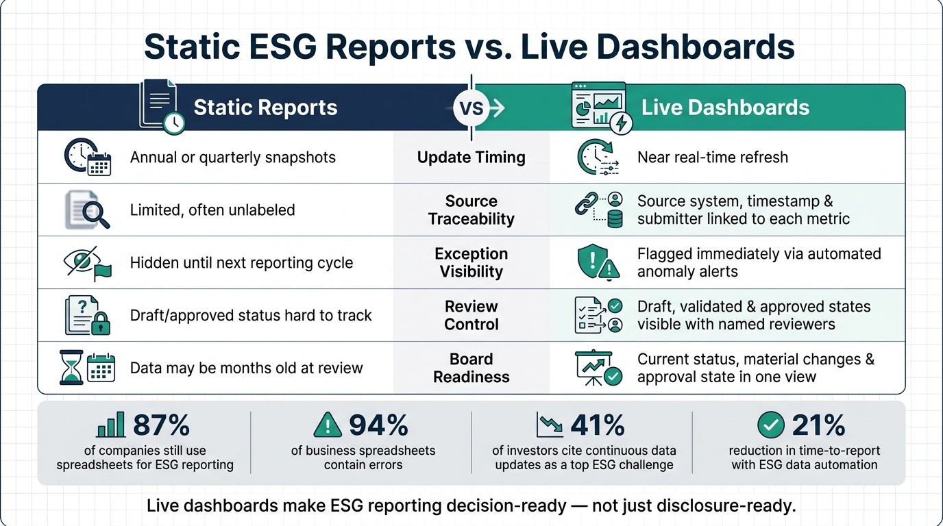
Static ESG Reports vs. Live Dashboards: Key Differences at a Glance
Live energy & ESG data dashboard walkthrough | Real-time asset monitoring platform.
Why static ESG reports fall behind
Static ESG reports don’t keep up with fast-moving events. ESG issues unfold all the time - an emissions exceedance, a labor violation, a safety cluster - while leadership is often looking at data that’s already months old. By the time a report reaches decision-makers, they’re no longer looking at current risk. They’re looking at yesterday’s version of it. That lag shows up most clearly in annual and quarterly reporting cycles.
Annual and quarterly cycles create blind spots
Environmental metrics can change day by day based on production levels, equipment performance, and weather. A facility may exceed emissions thresholds several times during a quarter, yet the annual report shows only the average.[2][3] The board sees a neat summary, but the window to respond may already be gone.
The same problem shows up in social and governance risk. These issues don’t wait for reporting calendars. They surface without warning. If a company relies on annual supplier surveys, it may not find out that a Tier 2 vendor has been cited for labor or compliance violations until months later - after public scrutiny has already taken shape.[4][5] Fixed cycles don’t just slow the flow of information; they slow the response too.
Static summaries hide exceptions and trend shifts
Slide decks and PDFs flatten the story. Corporate averages may look steady even when one site is getting worse. A consolidated chart of annual injuries can hide a sharp rise at a single facility in the most recent quarter[1], and a stable Scope 2 emissions line can mask a major jump in electricity intensity at one plant.[2][3]
That’s the core issue: static reports lean on averages, and averages smooth over trouble. Without the ability to filter by site, business unit, or time period, boards can’t tell what changed, where it changed, or when the shift began. They need site-level and time-based visibility to see where performance is slipping. Static reports don’t just lag behind events; they bury the signals leaders need in order to act. The result is familiar to many teams: manual reconciliation, manual checks, and extra time spent trying to confirm what’s already happened.
Where manual ESG reporting breaks down
The lag becomes a real risk when teams build ESG reports by hand. Manual reporting opens the door to errors that are hard to spot and even harder to trace back. A PwC survey found that 87% of companies still use spreadsheets for sustainability reporting[9], and a KPMG US survey found that almost half of large companies still rely on them even while believing they're ahead of peers in reporting maturity[8]. That dependence leads to the same weak spots again and again.
Duplicate entries, inconsistent definitions, and version confusion
Duplicate data shows up all the time. A site operations team might record monthly natural gas use in one spreadsheet, while corporate finance pulls annual utility summaries from a different system. If both land in the final file, Scope 1 totals can be counted twice.
The trouble doesn't stop there. Definitions often shift from one business unit to another. One team may report all employees, including contractors and temporary staff. Another may count only full-time equivalents. Each team may be following its own rules, but the end result is a set of numbers that can't be compared cleanly. And if the numbers don't measure the same thing, boards can't rely on them for decision-making.
Version drift adds another layer of confusion. Files move through email, get edited on local machines, and come back changed in ways that aren't always clear. Research suggests that 94% of spreadsheets used for business decision-making contain errors, most caused by human mistakes[7][10]. In ESG reporting, that can throw off carbon footprint calculations, distort recycling rates, or produce injury rate figures based on old headcount data.
Slow consolidation across teams weakens accountability
ESG teams often have to chase data from dozens of facilities, suppliers, and program leads. The files arrive at different times and in different formats, so teams end up cleaning, mapping, and merging everything by hand before they can pull the report together. That work usually gets squeezed into a short reporting window, and delays of several weeks are common.
This also makes ownership fuzzy. If teams can't see what changed, when it changed, or who changed it, leaders can't stand behind the final number with much confidence. Forty-one percent of investors cite data quality issues as a major challenge in ESG reporting, and 40% point to inconsistencies in the data itself[6]. Instead of reviewing results and making decisions, boards get stuck trying to reconcile numbers that don't match.
Without timestamps and a clear audit trail, trust erodes as fast as the data changes.
Why delayed updates weaken data trust
Once teams lose faith in the consolidation process, the numbers start to lose weight too. If ESG data reaches the board weeks or months late, people can’t tell whether it still reflects what’s happening now. A 2024 Bloomberg ESG Data Survey found that 41% of respondents identify continuous updating of ESG data as a primary data management challenge, and 63% say ESG data coverage and quality may be insufficient.[14] That gap leaves people unsure whether the figures still hold.
Static reports often leave out the details that matter in review: refresh date, approver, and any open exceptions. When that information is missing, disclosure reviews can drag, auditors may come back with extra questions, and board members can end up defending numbers they can’t fully trace. That’s why timestamped, traceable data matters more than a polished PDF.
Time-stamped data builds confidence in the numbers
The answer is metric-level traceability. When a dashboard shows the refresh date, source system, submitter, and status, leaders have something concrete they can point to.[11][12][13] A water figure tied to a recent meter read carries more weight than one pulled from an unlabeled quarterly summary.
Companies that shifted to automated, governed ESG platforms have seen clear gains. A corporate governance analysis found that companies implementing ESG data automation saw a 21% reduction in time-to-report and a 10% increase in board reporting confidence.[15] That confidence comes from being able to see three things right away: freshness, source, and correction status.
Static reports versus live dashboards: a direct comparison
The table below compares static reports with live dashboards.
Live dashboards fix a basic trust problem by showing freshness and approval status at a glance.
Feature | Static Reporting | Live Dashboard Reporting |
|---|---|---|
Update speed | Annual or quarterly snapshots | Near real-time refresh |
Source traceability | Source linked to each metric | Source system, timestamp, and submitter linked to each metric |
Exception visibility | Hidden until the next reporting cycle | Flagged immediately through automated anomaly alerts |
Review control | Draft and approved status visible | Draft, validated, and approved states visible with named reviewers |
Board readiness | Data may be months old at time of review | Current status, material changes, and approval state visible in one view |
That level of control matters most when boards need current performance and open issues in the same place. With freshness and traceability in place, boards can review ESG performance in one current view.
How live dashboards improve ESG oversight and board review
One current view of ESG performance
When ESG data is current and traceable, leaders need a single operational view they can trust. A live ESG dashboard brings Scope 1, Scope 2, and tracked Scope 3 emissions, energy use by facility, water withdrawal, workforce safety rates, supplier audit results, and governance indicators into one shared screen. Instead of hunting through spreadsheets, emails, and slide decks, teams can see what’s happening now.
That shared view matters even more when each KPI is tied to a responsible team, a source system, and a set update cadence. Accountability stops being vague. A safety metric sits next to a diversity figure, and both show a clear owner and update status. You can see who owns the number, where it came from, and whether it’s current.
The Port of Brisbane offers a clear example. The port centralized solar energy usage, water quality, and waste data in a real-time dashboard to improve transparency and support KPI tracking tied to a $500 million sustainability-linked loan. [16] That kind of visibility is tough to get from a static quarterly report.
Alerts and drill-downs help teams catch issues sooner
The biggest gain from live dashboards often comes between reporting cycles. Configurable threshold alerts tell the right people as soon as a metric moves outside an accepted range, whether that’s an emissions intensity spike at one plant or a cluster of failed supplier audits in one region. That gives teams a chance to step in while the issue is still limited, instead of finding it months later in an annual summary.
Drill-down views matter just as much. When a board-level KPI starts trending the wrong way, executives can click through and see the breakdown by site, business unit, supplier, or time period. That shifts the discussion from the headline number to the reasons behind it.
Sometimes the cause is production volume. Sometimes it’s fuel mix, technology performance, staffing levels, or supplier practices. Without that deeper view, board review can stall at “what happened?” With it, the conversation moves to “what’s driving this, and what do we do next?”
Conclusion: Better visibility leads to better governance
For boards, the value is straightforward: live dashboards make ESG reporting decision-ready, not just disclosure-ready. Council Fire helps organizations turn ESG data into accountable action.
FAQs
What ESG metrics should be live first?
Start with the metrics tied to regulatory compliance. They form the base of solid reporting: greenhouse gas emissions, energy use, water consumption, and waste management.
From there, widen the scope to include sector-specific financial and day-to-day risks. That can mean supply chain labor audits, board composition, and safety incidents. These measures do more than fill out a report. They show where pressure is building inside the business.
The most useful live metrics are decision-linked KPIs. In plain terms, these are numbers tied to a clear response. When a metric crosses a set threshold, someone acts. That might mean launching a review, flagging a supplier, or stepping in before a safety issue gets worse.
How do live dashboards improve board decisions?
Live dashboards give boards a much stronger handle on ESG performance. Instead of relying on static reports that are often out of date by the time they reach the boardroom, directors can see real-time metrics backed by clear audit trails.
That shift matters. Boards get a verified view of performance, not a delayed snapshot. They can track progress as it happens, spot risks or odd patterns early, and make sharper strategic calls with more confidence. Just as important, live dashboards make sustainability data more transparent, consistent, and easier to defend when questions come up.
What makes ESG dashboard data trustworthy?
ESG dashboard data earns trust when the basics are done well: each metric has a clear owner, data is collected on a set schedule, checks are in place to catch errors, and the methodology is written down so anyone reviewing the number can see how it was produced.
Good governance matters just as much. That means keeping audit trails and data lineage that show the source of each figure, how calculations were made, who approved them, and what changed over time. It also means watching the data on a regular basis and updating it on time, so teams can spot issues early and stakeholders can rely on figures that are current and verifiable.
Related Blog Posts
Latest Articles
©2025

Narrative Change and Power Building: The Missing Half of Advocacy
Narrative change is the process of disrupting dominant narratives that normalize inequity and advancing new narratives from historically marginalized communities.

Funding Resilience Without Federal Grants
BRIC is unreliable and FEMA is shrinking. Here's how cities fund climate resilience with dedicated revenue, blended finance, and a coordinating authority.

The ESG Blind Spot: How AI Is Finding Risks in Companies Nobody Else Is Watching
Norway's sovereign wealth fund uses AI to screen 7,200 portfolio companies for forced labor and corruption within 24 hours. The real story is the emerging-market coverage gap that traditional ESG data vendors miss — and what it means for any company with a global supply chain.
Narrative Change and Power Building: The Missing Half of Advocacy
Narrative change is the process of disrupting dominant narratives that normalize inequity and advancing new narratives from historically marginalized communities.
Funding Resilience Without Federal Grants
BRIC is unreliable and FEMA is shrinking. Here's how cities fund climate resilience with dedicated revenue, blended finance, and a coordinating authority.
The ESG Blind Spot: How AI Is Finding Risks in Companies Nobody Else Is Watching
Norway's sovereign wealth fund uses AI to screen 7,200 portfolio companies for forced labor and corruption within 24 hours. The real story is the emerging-market coverage gap that traditional ESG data vendors miss — and what it means for any company with a global supply chain.
FAQ
01
What does it really mean to “redefine profit”?
02
What makes Council Fire different?
03
Who does Council Fire work with?
04
What does working with Council Fire actually look like?
05
How does Council Fire help organizations turn big goals into action?
06
How does Council Fire define and measure success?
Sep 15, 2026
Why ESG Reporting Needs Live Data Dashboards
ESG Strategy
In This Article
Live ESG dashboards provide near-real-time metrics, metric-level traceability, alerts, and audit trails to strengthen board decisions.
Why ESG Reporting Needs Live Data Dashboards
If ESG data is months old, leaders are making calls with the wrong picture. I’d sum it up this way: live dashboards help boards and executives see risk sooner, trace each number to its source, and act before small issues turn into bigger ones.
Here’s the short version:
Static reports lag behind events. Emissions, safety issues, supplier problems, and governance gaps can shift in days, not just at year-end.
Averages hide trouble. A company-wide total can mask a spike at one site or in one business unit.
Manual reporting creates errors.Spreadsheets still dominate ESG reporting - 87% of companies use them, and research says 94% of business spreadsheets contain errors.
Slow updates weaken confidence.Bloomberg found 41% of respondents see continuous ESG data updates as a main data problem, while 63% say data coverage and quality may be too weak.
Live dashboards improve oversight. They show timestamps, source systems, submitters, approval status, alerts, and drill-down views in one place.
Automation helps boards move faster. One analysis found ESG data automation cut time-to-report by 21% and improved board confidence by 10%.
What stands out to me is simple: a PDF can document the past, but it cannot help much with what changed this week. For board review, you need current data, clear ownership, and a way to spot outliers fast.
Quick comparison
Area | Static reports | Live dashboards |
|---|---|---|
Update timing | Annual or quarterly | Near real-time |
Visibility into issues | Often delayed | Alerts show issues right away |
Source tracking | Limited | Metric-level source, timestamp, and owner |
Review status | Hard to track | Draft, checked, and approved states visible |
Board use | Mostly backward-looking | Supports current review and action |
My takeaway: if you want ESG reporting to support decisions instead of just disclosures, live dashboards do the job better than static files.
Static ESG Reports vs. Live Dashboards: Key Differences at a Glance
Live energy & ESG data dashboard walkthrough | Real-time asset monitoring platform.
Why static ESG reports fall behind
Static ESG reports don’t keep up with fast-moving events. ESG issues unfold all the time - an emissions exceedance, a labor violation, a safety cluster - while leadership is often looking at data that’s already months old. By the time a report reaches decision-makers, they’re no longer looking at current risk. They’re looking at yesterday’s version of it. That lag shows up most clearly in annual and quarterly reporting cycles.
Annual and quarterly cycles create blind spots
Environmental metrics can change day by day based on production levels, equipment performance, and weather. A facility may exceed emissions thresholds several times during a quarter, yet the annual report shows only the average.[2][3] The board sees a neat summary, but the window to respond may already be gone.
The same problem shows up in social and governance risk. These issues don’t wait for reporting calendars. They surface without warning. If a company relies on annual supplier surveys, it may not find out that a Tier 2 vendor has been cited for labor or compliance violations until months later - after public scrutiny has already taken shape.[4][5] Fixed cycles don’t just slow the flow of information; they slow the response too.
Static summaries hide exceptions and trend shifts
Slide decks and PDFs flatten the story. Corporate averages may look steady even when one site is getting worse. A consolidated chart of annual injuries can hide a sharp rise at a single facility in the most recent quarter[1], and a stable Scope 2 emissions line can mask a major jump in electricity intensity at one plant.[2][3]
That’s the core issue: static reports lean on averages, and averages smooth over trouble. Without the ability to filter by site, business unit, or time period, boards can’t tell what changed, where it changed, or when the shift began. They need site-level and time-based visibility to see where performance is slipping. Static reports don’t just lag behind events; they bury the signals leaders need in order to act. The result is familiar to many teams: manual reconciliation, manual checks, and extra time spent trying to confirm what’s already happened.
Where manual ESG reporting breaks down
The lag becomes a real risk when teams build ESG reports by hand. Manual reporting opens the door to errors that are hard to spot and even harder to trace back. A PwC survey found that 87% of companies still use spreadsheets for sustainability reporting[9], and a KPMG US survey found that almost half of large companies still rely on them even while believing they're ahead of peers in reporting maturity[8]. That dependence leads to the same weak spots again and again.
Duplicate entries, inconsistent definitions, and version confusion
Duplicate data shows up all the time. A site operations team might record monthly natural gas use in one spreadsheet, while corporate finance pulls annual utility summaries from a different system. If both land in the final file, Scope 1 totals can be counted twice.
The trouble doesn't stop there. Definitions often shift from one business unit to another. One team may report all employees, including contractors and temporary staff. Another may count only full-time equivalents. Each team may be following its own rules, but the end result is a set of numbers that can't be compared cleanly. And if the numbers don't measure the same thing, boards can't rely on them for decision-making.
Version drift adds another layer of confusion. Files move through email, get edited on local machines, and come back changed in ways that aren't always clear. Research suggests that 94% of spreadsheets used for business decision-making contain errors, most caused by human mistakes[7][10]. In ESG reporting, that can throw off carbon footprint calculations, distort recycling rates, or produce injury rate figures based on old headcount data.
Slow consolidation across teams weakens accountability
ESG teams often have to chase data from dozens of facilities, suppliers, and program leads. The files arrive at different times and in different formats, so teams end up cleaning, mapping, and merging everything by hand before they can pull the report together. That work usually gets squeezed into a short reporting window, and delays of several weeks are common.
This also makes ownership fuzzy. If teams can't see what changed, when it changed, or who changed it, leaders can't stand behind the final number with much confidence. Forty-one percent of investors cite data quality issues as a major challenge in ESG reporting, and 40% point to inconsistencies in the data itself[6]. Instead of reviewing results and making decisions, boards get stuck trying to reconcile numbers that don't match.
Without timestamps and a clear audit trail, trust erodes as fast as the data changes.
Why delayed updates weaken data trust
Once teams lose faith in the consolidation process, the numbers start to lose weight too. If ESG data reaches the board weeks or months late, people can’t tell whether it still reflects what’s happening now. A 2024 Bloomberg ESG Data Survey found that 41% of respondents identify continuous updating of ESG data as a primary data management challenge, and 63% say ESG data coverage and quality may be insufficient.[14] That gap leaves people unsure whether the figures still hold.
Static reports often leave out the details that matter in review: refresh date, approver, and any open exceptions. When that information is missing, disclosure reviews can drag, auditors may come back with extra questions, and board members can end up defending numbers they can’t fully trace. That’s why timestamped, traceable data matters more than a polished PDF.
Time-stamped data builds confidence in the numbers
The answer is metric-level traceability. When a dashboard shows the refresh date, source system, submitter, and status, leaders have something concrete they can point to.[11][12][13] A water figure tied to a recent meter read carries more weight than one pulled from an unlabeled quarterly summary.
Companies that shifted to automated, governed ESG platforms have seen clear gains. A corporate governance analysis found that companies implementing ESG data automation saw a 21% reduction in time-to-report and a 10% increase in board reporting confidence.[15] That confidence comes from being able to see three things right away: freshness, source, and correction status.
Static reports versus live dashboards: a direct comparison
The table below compares static reports with live dashboards.
Live dashboards fix a basic trust problem by showing freshness and approval status at a glance.
Feature | Static Reporting | Live Dashboard Reporting |
|---|---|---|
Update speed | Annual or quarterly snapshots | Near real-time refresh |
Source traceability | Source linked to each metric | Source system, timestamp, and submitter linked to each metric |
Exception visibility | Hidden until the next reporting cycle | Flagged immediately through automated anomaly alerts |
Review control | Draft and approved status visible | Draft, validated, and approved states visible with named reviewers |
Board readiness | Data may be months old at time of review | Current status, material changes, and approval state visible in one view |
That level of control matters most when boards need current performance and open issues in the same place. With freshness and traceability in place, boards can review ESG performance in one current view.
How live dashboards improve ESG oversight and board review
One current view of ESG performance
When ESG data is current and traceable, leaders need a single operational view they can trust. A live ESG dashboard brings Scope 1, Scope 2, and tracked Scope 3 emissions, energy use by facility, water withdrawal, workforce safety rates, supplier audit results, and governance indicators into one shared screen. Instead of hunting through spreadsheets, emails, and slide decks, teams can see what’s happening now.
That shared view matters even more when each KPI is tied to a responsible team, a source system, and a set update cadence. Accountability stops being vague. A safety metric sits next to a diversity figure, and both show a clear owner and update status. You can see who owns the number, where it came from, and whether it’s current.
The Port of Brisbane offers a clear example. The port centralized solar energy usage, water quality, and waste data in a real-time dashboard to improve transparency and support KPI tracking tied to a $500 million sustainability-linked loan. [16] That kind of visibility is tough to get from a static quarterly report.
Alerts and drill-downs help teams catch issues sooner
The biggest gain from live dashboards often comes between reporting cycles. Configurable threshold alerts tell the right people as soon as a metric moves outside an accepted range, whether that’s an emissions intensity spike at one plant or a cluster of failed supplier audits in one region. That gives teams a chance to step in while the issue is still limited, instead of finding it months later in an annual summary.
Drill-down views matter just as much. When a board-level KPI starts trending the wrong way, executives can click through and see the breakdown by site, business unit, supplier, or time period. That shifts the discussion from the headline number to the reasons behind it.
Sometimes the cause is production volume. Sometimes it’s fuel mix, technology performance, staffing levels, or supplier practices. Without that deeper view, board review can stall at “what happened?” With it, the conversation moves to “what’s driving this, and what do we do next?”
Conclusion: Better visibility leads to better governance
For boards, the value is straightforward: live dashboards make ESG reporting decision-ready, not just disclosure-ready. Council Fire helps organizations turn ESG data into accountable action.
FAQs
What ESG metrics should be live first?
Start with the metrics tied to regulatory compliance. They form the base of solid reporting: greenhouse gas emissions, energy use, water consumption, and waste management.
From there, widen the scope to include sector-specific financial and day-to-day risks. That can mean supply chain labor audits, board composition, and safety incidents. These measures do more than fill out a report. They show where pressure is building inside the business.
The most useful live metrics are decision-linked KPIs. In plain terms, these are numbers tied to a clear response. When a metric crosses a set threshold, someone acts. That might mean launching a review, flagging a supplier, or stepping in before a safety issue gets worse.
How do live dashboards improve board decisions?
Live dashboards give boards a much stronger handle on ESG performance. Instead of relying on static reports that are often out of date by the time they reach the boardroom, directors can see real-time metrics backed by clear audit trails.
That shift matters. Boards get a verified view of performance, not a delayed snapshot. They can track progress as it happens, spot risks or odd patterns early, and make sharper strategic calls with more confidence. Just as important, live dashboards make sustainability data more transparent, consistent, and easier to defend when questions come up.
What makes ESG dashboard data trustworthy?
ESG dashboard data earns trust when the basics are done well: each metric has a clear owner, data is collected on a set schedule, checks are in place to catch errors, and the methodology is written down so anyone reviewing the number can see how it was produced.
Good governance matters just as much. That means keeping audit trails and data lineage that show the source of each figure, how calculations were made, who approved them, and what changed over time. It also means watching the data on a regular basis and updating it on time, so teams can spot issues early and stakeholders can rely on figures that are current and verifiable.
Related Blog Posts
Latest Articles
©2025
Narrative Change and Power Building: The Missing Half of Advocacy
Narrative change is the process of disrupting dominant narratives that normalize inequity and advancing new narratives from historically marginalized communities.
Funding Resilience Without Federal Grants
BRIC is unreliable and FEMA is shrinking. Here's how cities fund climate resilience with dedicated revenue, blended finance, and a coordinating authority.
The ESG Blind Spot: How AI Is Finding Risks in Companies Nobody Else Is Watching
Norway's sovereign wealth fund uses AI to screen 7,200 portfolio companies for forced labor and corruption within 24 hours. The real story is the emerging-market coverage gap that traditional ESG data vendors miss — and what it means for any company with a global supply chain.
FAQ
01
What does it really mean to “redefine profit”?
02
What makes Council Fire different?
03
Who does Council Fire work with?
04
What does working with Council Fire actually look like?
05
How does Council Fire help organizations turn big goals into action?
06
How does Council Fire define and measure success?
Sep 15, 2026
Why ESG Reporting Needs Live Data Dashboards
ESG Strategy
In This Article
Live ESG dashboards provide near-real-time metrics, metric-level traceability, alerts, and audit trails to strengthen board decisions.
Why ESG Reporting Needs Live Data Dashboards
If ESG data is months old, leaders are making calls with the wrong picture. I’d sum it up this way: live dashboards help boards and executives see risk sooner, trace each number to its source, and act before small issues turn into bigger ones.
Here’s the short version:
Static reports lag behind events. Emissions, safety issues, supplier problems, and governance gaps can shift in days, not just at year-end.
Averages hide trouble. A company-wide total can mask a spike at one site or in one business unit.
Manual reporting creates errors.Spreadsheets still dominate ESG reporting - 87% of companies use them, and research says 94% of business spreadsheets contain errors.
Slow updates weaken confidence.Bloomberg found 41% of respondents see continuous ESG data updates as a main data problem, while 63% say data coverage and quality may be too weak.
Live dashboards improve oversight. They show timestamps, source systems, submitters, approval status, alerts, and drill-down views in one place.
Automation helps boards move faster. One analysis found ESG data automation cut time-to-report by 21% and improved board confidence by 10%.
What stands out to me is simple: a PDF can document the past, but it cannot help much with what changed this week. For board review, you need current data, clear ownership, and a way to spot outliers fast.
Quick comparison
Area | Static reports | Live dashboards |
|---|---|---|
Update timing | Annual or quarterly | Near real-time |
Visibility into issues | Often delayed | Alerts show issues right away |
Source tracking | Limited | Metric-level source, timestamp, and owner |
Review status | Hard to track | Draft, checked, and approved states visible |
Board use | Mostly backward-looking | Supports current review and action |
My takeaway: if you want ESG reporting to support decisions instead of just disclosures, live dashboards do the job better than static files.
Static ESG Reports vs. Live Dashboards: Key Differences at a Glance
Live energy & ESG data dashboard walkthrough | Real-time asset monitoring platform.
Why static ESG reports fall behind
Static ESG reports don’t keep up with fast-moving events. ESG issues unfold all the time - an emissions exceedance, a labor violation, a safety cluster - while leadership is often looking at data that’s already months old. By the time a report reaches decision-makers, they’re no longer looking at current risk. They’re looking at yesterday’s version of it. That lag shows up most clearly in annual and quarterly reporting cycles.
Annual and quarterly cycles create blind spots
Environmental metrics can change day by day based on production levels, equipment performance, and weather. A facility may exceed emissions thresholds several times during a quarter, yet the annual report shows only the average.[2][3] The board sees a neat summary, but the window to respond may already be gone.
The same problem shows up in social and governance risk. These issues don’t wait for reporting calendars. They surface without warning. If a company relies on annual supplier surveys, it may not find out that a Tier 2 vendor has been cited for labor or compliance violations until months later - after public scrutiny has already taken shape.[4][5] Fixed cycles don’t just slow the flow of information; they slow the response too.
Static summaries hide exceptions and trend shifts
Slide decks and PDFs flatten the story. Corporate averages may look steady even when one site is getting worse. A consolidated chart of annual injuries can hide a sharp rise at a single facility in the most recent quarter[1], and a stable Scope 2 emissions line can mask a major jump in electricity intensity at one plant.[2][3]
That’s the core issue: static reports lean on averages, and averages smooth over trouble. Without the ability to filter by site, business unit, or time period, boards can’t tell what changed, where it changed, or when the shift began. They need site-level and time-based visibility to see where performance is slipping. Static reports don’t just lag behind events; they bury the signals leaders need in order to act. The result is familiar to many teams: manual reconciliation, manual checks, and extra time spent trying to confirm what’s already happened.
Where manual ESG reporting breaks down
The lag becomes a real risk when teams build ESG reports by hand. Manual reporting opens the door to errors that are hard to spot and even harder to trace back. A PwC survey found that 87% of companies still use spreadsheets for sustainability reporting[9], and a KPMG US survey found that almost half of large companies still rely on them even while believing they're ahead of peers in reporting maturity[8]. That dependence leads to the same weak spots again and again.
Duplicate entries, inconsistent definitions, and version confusion
Duplicate data shows up all the time. A site operations team might record monthly natural gas use in one spreadsheet, while corporate finance pulls annual utility summaries from a different system. If both land in the final file, Scope 1 totals can be counted twice.
The trouble doesn't stop there. Definitions often shift from one business unit to another. One team may report all employees, including contractors and temporary staff. Another may count only full-time equivalents. Each team may be following its own rules, but the end result is a set of numbers that can't be compared cleanly. And if the numbers don't measure the same thing, boards can't rely on them for decision-making.
Version drift adds another layer of confusion. Files move through email, get edited on local machines, and come back changed in ways that aren't always clear. Research suggests that 94% of spreadsheets used for business decision-making contain errors, most caused by human mistakes[7][10]. In ESG reporting, that can throw off carbon footprint calculations, distort recycling rates, or produce injury rate figures based on old headcount data.
Slow consolidation across teams weakens accountability
ESG teams often have to chase data from dozens of facilities, suppliers, and program leads. The files arrive at different times and in different formats, so teams end up cleaning, mapping, and merging everything by hand before they can pull the report together. That work usually gets squeezed into a short reporting window, and delays of several weeks are common.
This also makes ownership fuzzy. If teams can't see what changed, when it changed, or who changed it, leaders can't stand behind the final number with much confidence. Forty-one percent of investors cite data quality issues as a major challenge in ESG reporting, and 40% point to inconsistencies in the data itself[6]. Instead of reviewing results and making decisions, boards get stuck trying to reconcile numbers that don't match.
Without timestamps and a clear audit trail, trust erodes as fast as the data changes.
Why delayed updates weaken data trust
Once teams lose faith in the consolidation process, the numbers start to lose weight too. If ESG data reaches the board weeks or months late, people can’t tell whether it still reflects what’s happening now. A 2024 Bloomberg ESG Data Survey found that 41% of respondents identify continuous updating of ESG data as a primary data management challenge, and 63% say ESG data coverage and quality may be insufficient.[14] That gap leaves people unsure whether the figures still hold.
Static reports often leave out the details that matter in review: refresh date, approver, and any open exceptions. When that information is missing, disclosure reviews can drag, auditors may come back with extra questions, and board members can end up defending numbers they can’t fully trace. That’s why timestamped, traceable data matters more than a polished PDF.
Time-stamped data builds confidence in the numbers
The answer is metric-level traceability. When a dashboard shows the refresh date, source system, submitter, and status, leaders have something concrete they can point to.[11][12][13] A water figure tied to a recent meter read carries more weight than one pulled from an unlabeled quarterly summary.
Companies that shifted to automated, governed ESG platforms have seen clear gains. A corporate governance analysis found that companies implementing ESG data automation saw a 21% reduction in time-to-report and a 10% increase in board reporting confidence.[15] That confidence comes from being able to see three things right away: freshness, source, and correction status.
Static reports versus live dashboards: a direct comparison
The table below compares static reports with live dashboards.
Live dashboards fix a basic trust problem by showing freshness and approval status at a glance.
Feature | Static Reporting | Live Dashboard Reporting |
|---|---|---|
Update speed | Annual or quarterly snapshots | Near real-time refresh |
Source traceability | Source linked to each metric | Source system, timestamp, and submitter linked to each metric |
Exception visibility | Hidden until the next reporting cycle | Flagged immediately through automated anomaly alerts |
Review control | Draft and approved status visible | Draft, validated, and approved states visible with named reviewers |
Board readiness | Data may be months old at time of review | Current status, material changes, and approval state visible in one view |
That level of control matters most when boards need current performance and open issues in the same place. With freshness and traceability in place, boards can review ESG performance in one current view.
How live dashboards improve ESG oversight and board review
One current view of ESG performance
When ESG data is current and traceable, leaders need a single operational view they can trust. A live ESG dashboard brings Scope 1, Scope 2, and tracked Scope 3 emissions, energy use by facility, water withdrawal, workforce safety rates, supplier audit results, and governance indicators into one shared screen. Instead of hunting through spreadsheets, emails, and slide decks, teams can see what’s happening now.
That shared view matters even more when each KPI is tied to a responsible team, a source system, and a set update cadence. Accountability stops being vague. A safety metric sits next to a diversity figure, and both show a clear owner and update status. You can see who owns the number, where it came from, and whether it’s current.
The Port of Brisbane offers a clear example. The port centralized solar energy usage, water quality, and waste data in a real-time dashboard to improve transparency and support KPI tracking tied to a $500 million sustainability-linked loan. [16] That kind of visibility is tough to get from a static quarterly report.
Alerts and drill-downs help teams catch issues sooner
The biggest gain from live dashboards often comes between reporting cycles. Configurable threshold alerts tell the right people as soon as a metric moves outside an accepted range, whether that’s an emissions intensity spike at one plant or a cluster of failed supplier audits in one region. That gives teams a chance to step in while the issue is still limited, instead of finding it months later in an annual summary.
Drill-down views matter just as much. When a board-level KPI starts trending the wrong way, executives can click through and see the breakdown by site, business unit, supplier, or time period. That shifts the discussion from the headline number to the reasons behind it.
Sometimes the cause is production volume. Sometimes it’s fuel mix, technology performance, staffing levels, or supplier practices. Without that deeper view, board review can stall at “what happened?” With it, the conversation moves to “what’s driving this, and what do we do next?”
Conclusion: Better visibility leads to better governance
For boards, the value is straightforward: live dashboards make ESG reporting decision-ready, not just disclosure-ready. Council Fire helps organizations turn ESG data into accountable action.
FAQs
What ESG metrics should be live first?
Start with the metrics tied to regulatory compliance. They form the base of solid reporting: greenhouse gas emissions, energy use, water consumption, and waste management.
From there, widen the scope to include sector-specific financial and day-to-day risks. That can mean supply chain labor audits, board composition, and safety incidents. These measures do more than fill out a report. They show where pressure is building inside the business.
The most useful live metrics are decision-linked KPIs. In plain terms, these are numbers tied to a clear response. When a metric crosses a set threshold, someone acts. That might mean launching a review, flagging a supplier, or stepping in before a safety issue gets worse.
How do live dashboards improve board decisions?
Live dashboards give boards a much stronger handle on ESG performance. Instead of relying on static reports that are often out of date by the time they reach the boardroom, directors can see real-time metrics backed by clear audit trails.
That shift matters. Boards get a verified view of performance, not a delayed snapshot. They can track progress as it happens, spot risks or odd patterns early, and make sharper strategic calls with more confidence. Just as important, live dashboards make sustainability data more transparent, consistent, and easier to defend when questions come up.
What makes ESG dashboard data trustworthy?
ESG dashboard data earns trust when the basics are done well: each metric has a clear owner, data is collected on a set schedule, checks are in place to catch errors, and the methodology is written down so anyone reviewing the number can see how it was produced.
Good governance matters just as much. That means keeping audit trails and data lineage that show the source of each figure, how calculations were made, who approved them, and what changed over time. It also means watching the data on a regular basis and updating it on time, so teams can spot issues early and stakeholders can rely on figures that are current and verifiable.
Related Blog Posts
Latest Articles
©2025
Narrative Change and Power Building: The Missing Half of Advocacy
Narrative change is the process of disrupting dominant narratives that normalize inequity and advancing new narratives from historically marginalized communities.
Funding Resilience Without Federal Grants
BRIC is unreliable and FEMA is shrinking. Here's how cities fund climate resilience with dedicated revenue, blended finance, and a coordinating authority.
The ESG Blind Spot: How AI Is Finding Risks in Companies Nobody Else Is Watching
Norway's sovereign wealth fund uses AI to screen 7,200 portfolio companies for forced labor and corruption within 24 hours. The real story is the emerging-market coverage gap that traditional ESG data vendors miss — and what it means for any company with a global supply chain.
FAQ
What does it really mean to “redefine profit”?
What makes Council Fire different?
Who does Council Fire work with?
What does working with Council Fire actually look like?
How does Council Fire help organizations turn big goals into action?
How does Council Fire define and measure success?