
May 11, 2026
How to Communicate Sustainability to Non-Technical Audiences for Universities & Research Institutions
Sustainability Strategy
In This Article
Practical tactics to explain campus sustainability to non‑technical audiences using plain language, analogies, visuals, stories and dashboards.
How to Communicate Sustainability to Non-Technical Audiences for Universities & Research Institutions
Universities often face challenges when explaining sustainability efforts to non-technical audiences. Complex data, technical jargon, and abstract concepts can alienate stakeholders, making it harder to gain support for initiatives. To bridge this gap, the key is to simplify without oversimplifying. Here's how:
Use Plain Language: Replace technical terms with relatable phrases. For example, describe a "90% increase" as "nearly doubled."
Leverage Analogies: Compare abstract ideas to everyday examples, like explaining CO₂ emissions with a "bathtub analogy" where the faucet represents emissions and the drain symbolizes natural absorption.
Visualize Data: Create clear charts and infographics. Use accessible formats like "1 in 10" instead of percentages and test visuals for clarity.
Tell Stories: Share personal and campus-specific narratives that connect emotionally with audiences, making data memorable.
Interactive Tools: Develop dashboards that allow users to explore sustainability metrics and progress interactively, fostering engagement.
These strategies ensure sustainability efforts are not only understood but also resonate with diverse campus communities, inspiring action and collaboration.
Communicating Climate Research to Policy and the Public - Live from Loyola Campus
Breaking Down Complex Sustainability Concepts
To connect with non-technical audiences, it’s crucial to swap out jargon for plain language. The goal isn’t to oversimplify but to explain scientific ideas in ways that resonate. For instance, instead of reporting a "90% increase" in a metric, framing it as "nearly doubled" makes the concept much easier to grasp [3].
"Using shared language is not dumbing down your research; it's explaining it in terms that others outside your field can understand to bring clarity to a complex topic."
– Michigan State University [3]
The impact of accessible language is real. Between June 1 and August 31, 2023, researchers from MIT Sloan School of Management, including Professor Catherine Tucker, ran a field experiment with 380,000 households in China. They replaced CO₂ emission metrics with a relatable comparison - "miles of reduced driving." This simple shift increased engagement, boosting recyclables by 2.2%, compared to 1.9% when monetary rewards were used [4].
Using Analogies and Everyday Examples
Analogies work wonders for making abstract ideas more relatable. Professor Nathanael Fortune at Smith College uses the "Bathtub Analogy" to explain climate change. He compares CO₂ entering the atmosphere to water filling a tub faster than the drain (nature) can empty it. If the faucet runs too fast - or the drain gets "clogged" by greenhouse gases - the tub overflows, symbolizing global warming [6]. This vivid imagery simplifies a complex process into something anyone can picture.
When presenting data to stakeholders, translate technical terms into everyday comparisons. For example, instead of using raw technical units, convert them into relatable alternatives, as shown in the table below:
Technical Term | Relatable Alternative |
|---|---|
90% increase in population | The population nearly doubled [3] |
0.46% lifetime probability | Fewer than five out of every 1,000 people [3] |
260,000 square miles | An area the size of Texas [3] |
Kilograms of CO₂ emissions | Equivalent miles of reduced driving [4] |
These kinds of comparisons not only clarify the data but make it stick in people’s minds.
Creating Clear Visual Explanations
Building on analogies, visual aids like infographics, charts, and diagrams can make sustainability data more digestible. However, these visuals must be designed with accessibility in mind. Bruce Walker, Director of the Center for Inclusive Climate Communication at Georgia Tech, stresses the importance of overcoming barriers related to language, education, and physical ability [7].
"Weather and climate affect every single person on Earth, so no one can be left behind when it comes to these critical communications."
– Bruce Walker, Director of the Center for Inclusive Climate Communication (CICC) at Georgia Tech [7]
Effective visuals often use frequencies instead of percentages (e.g., "1 in 10" rather than "10%") and include interpretive guidance to help readers understand the data. For stakeholders with vision impairments, adding audio layers (sonification) can make information more accessible [7]. Before releasing a visual, test it with someone outside your field to ensure clarity. Tools like the De-Jargonizer, Hemingway App, or The Writer's Diet can also help identify overly complex language [5].
Using Stories to Engage Stakeholders
Storytelling does more than simplify data - it makes sustainability resonate on a personal level. Numbers alone often fail to leave a lasting impression. Research from the University of Minnesota reveals that statistics lose 73% of their impact within a day, while stories retain 68% of their influence over the same period [9]. This stark contrast highlights why narratives are indispensable in sustainability communication - they forge emotional connections that endure.
Effective storytelling begins by answering the question, "Why should I care?" A compelling example comes from Appalachian State University's Climate Stories Collaborative, which used dance and visual arts between 2019 and 2021 to make climate change relatable. Faculty member Beverly Moser even integrated these "Climate Stories" into the German program's curriculum, connecting sustainability themes to general education [8].
"Stories allow us to better understand climate change by making this enormous and complex problem more people-sized, relatable and accessible."
– Climate Stories Collaborative, Appalachian State University [8]
Such approaches transform abstract research into shared experiences that inspire action within campus communities.
Building Campus-Specific Sustainability Stories
The most impactful campus sustainability narratives are rooted in local relevance. Using the "Hero's Journey" framework - featuring a call to action, overcoming obstacles, and achieving results - helps create relatable and engaging stories [9]. Sharing both victories and challenges adds authenticity and fosters trust [10]. For instance, Olivia Wang, a Master of Environmental Studies student at the University of Pennsylvania, collaborated with the Willistown Conservation Trust between 2016 and 2023. Her project, "Conservation on the Fly", used drone technology and scientist interviews to turn environmental goals into tangible, relatable outcomes for her campus community [2].
Adding Personal Narratives
Individual experiences bring sustainability efforts to life in a way that broad campus initiatives cannot. Personal stories from students and staff make complex ideas accessible and relatable. A global example of this principle is the partnership between the United Nations and South Korean band BTS, which encouraged 56% of fans to sign a sustainability petition and shifted 65% of participants' attitudes positively toward the UN's goals [1]. The takeaway? Personal voices create genuine connections.
Rather than overwhelming audiences with numerous examples, focus on a single, well-crafted narrative. A specific and relatable story can have more impact than a collection of generalized accounts [10]. When highlighting campus initiatives, clearly outline how the outcomes benefit everyday people and the potential consequences of inaction [9]. This approach bridges the gap between specialized research and public interest, turning passive observers into active participants.
Using Interactive Tools for Engagement
Interactive dashboards have redefined how complex data is shared, turning it into an engaging experience. Take Yale University’s Sustainability Data Hub, launched in 2024 using Microsoft Power BI. This platform allows users to explore categories like greenhouse gas emissions and materials management through intuitive navigation panes. By doing so, Yale effectively communicated a 28% reduction in Scope 1 and 2 emissions from 2015 levels in a way that resonated with students, faculty, and administrators alike [11].
Moving from static PDF reports to web-based interactive tools addresses a key challenge: presenting extensive data in a way that’s both manageable and meaningful. Cornell University exemplified this shift in September 2020 when their Campus Sustainability Office transformed their STARS Platinum achievement into an interactive online report. The report distilled complex metrics into key categories and included "fast facts" tailored for social media, effectively engaging younger audiences [13]. These dynamic dashboards invite users to interact with the data, fostering a deeper understanding of sustainability efforts.
Building Dashboards for Data Exploration
The best dashboards empower users to control what they see and explore data at their own pace. For instance, the University of British Columbia’s CAP2030 Dashboard uses a color-coded system - green for "on track", yellow for "monitor", and red for "attention required." This system simplifies technical metrics into relatable visuals, like describing their 13 GWh annual energy reduction since 2011 as "equivalent to shutting down campus for 2.5 weeks" [12].
Dashboards with multi-level filtering options cater to diverse audiences. The University of Maryland’s Tableau dashboards, for example, feature interactive legends and sliders that allow users to filter data by year. Hovering over graphs reveals detailed tooltips, offering granular insights without overwhelming the main display [14]. Yale’s Data Hub takes it a step further with "Crosstab" download options, giving users access to raw data for in-depth analysis [11]. These features ensure that both casual viewers and researchers can quickly and effectively engage with the information.
Setting Up Feedback Mechanisms
Interactive dashboards become even more impactful when paired with feedback mechanisms. These tools invite users to participate, creating a two-way conversation about sustainability. For example, Yale University’s 2022 biennial Sustainability Survey assessed campus-wide knowledge, behaviors, and interests. The results were presented in an interactive Power BI dashboard, pinpointing areas for improvement, such as raising awareness about powering down electronics [11].
Real-time feedback tools, like embedded chat features, encourage ongoing dialogue. Research highlights that two-way communication outperforms one-sided announcements [15]. Cornell University complemented their interactive report with a social media campaign and monthly newsletters, gathering responses from various campus groups [13]. Tailoring feedback channels to specific audiences is key - email newsletters work well for staff and faculty, while social media platforms like Instagram and Facebook are ideal for students, who make up nearly 80% of adults aged 18-29 active on these platforms [13]. This continuous dialogue ensures that communication strategies remain responsive to campus needs.
Council Fire's Communication Methods
Standard vs Council Fire Sustainability Communication Approaches for Universities
Council Fire has developed a way to simplify complex decarbonization strategies, making them relatable by tying them to clear financial and operational outcomes.
One standout example is their work with a major public research university between 2025 and 2026. This university, with a sprawling 450-acre campus and 35,000 students, aimed to achieve carbon neutrality. Council Fire mapped out four pathways and successfully moved the target date from 2040 to 2035. They focused on a central solution: the campus heating plant, responsible for 42% of emissions. Instead of scattered measures like recycling programs or LED upgrades, they implemented a phased transition to an 800-well ground-source heat pump system. This was paired with a 15 MW solar array on parking structures and a 50 MW off-site wind power purchase at $32/MWh. With a $340 million investment, the project delivered $410 million in energy cost savings and avoided maintenance over 25 years, yielding a positive net present value [16].
Case Study: Decarbonization Messaging
Council Fire's communication approach emphasized transparency and inclusivity. They used open data dashboards to share the university's 185,000 metric-ton CO₂e model, ensuring stakeholders like students and faculty remained engaged. This openness was critical when addressing sensitive trade-offs such as construction disruptions or fee increases. To further involve the community, a student advisory committee was formed, and open forums were held with key groups like facilities teams, trustees, and state offices [16].
To build trust and momentum, they sequenced investments strategically. Initial focus was placed on visible efficiency upgrades that produced immediate savings. These “quick wins” funded larger projects and proved feasibility to skeptics. For example, a $25 per ton internal carbon fee on university air travel generated $1.2 million annually for a green revolving fund. This fee helped departments understand the tangible cost of carbon emissions [16].
"Setting a cap on offset use (10% or less) forces the institution to invest in real operational change,"
Council Fire emphasized, limiting the university’s reliance on offsets to just 8% of baseline emissions - well below the 10% cap they recommend [16].
These thoughtful communication tactics allowed Council Fire to showcase how their methods outperformed traditional approaches.
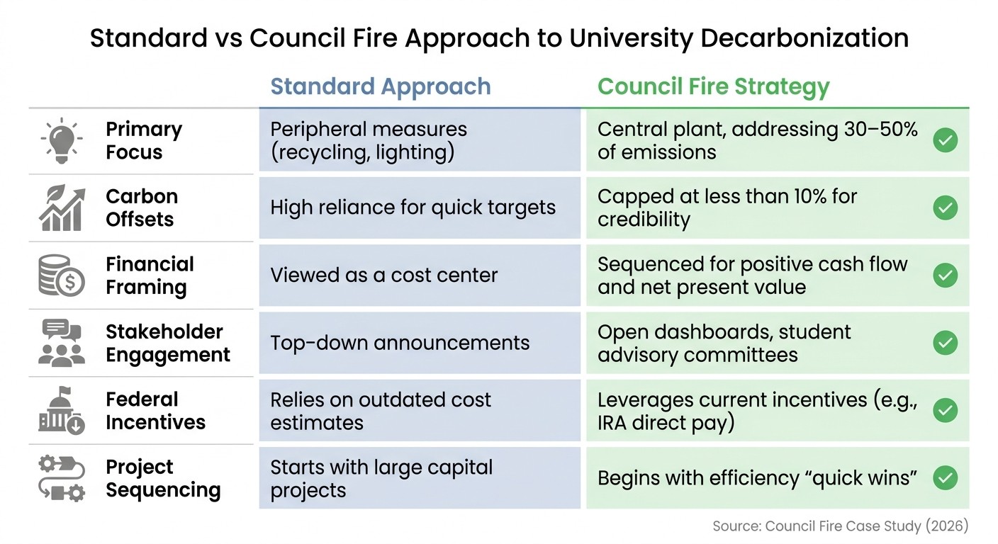
Comparing Standard and Council Fire Approaches
Feature | Standard Approach | Council Fire Strategy |
|---|---|---|
Primary Focus | Peripheral measures (e.g., recycling, lighting) | Central plant, addressing 30–50% of emissions |
Carbon Offsets | High reliance for quick targets | Capped at less than 10% for credibility |
Financial Framing | Viewed as a cost center | Sequenced for positive cash flow and net present value |
Stakeholder Engagement | Top–down announcements | Open dashboards, student advisory committees |
Federal Incentives | Relies on outdated cost estimates | Leverages current incentives (e.g., IRA direct pay) |
Project Sequencing | Starts with large capital projects | Begins with efficiency “quick wins” |
Source: Council Fire Case Study (2026) [16]
This comparison highlights how effective communication and strategic planning can turn sustainability challenges into practical, financially rewarding solutions.
Implementation Checklist
To put the strategies into practice, here’s a focused checklist to guide effective sustainability communication.
Start by defining your core message in a single, clear, and jargon-free sentence. As Michigan State University points out, "using shared language is not dumbing down your research; it's explaining it in terms that others outside your field can understand to bring clarity to a complex topic" [3]. This clarity ensures that everyone - students, administrators, and other stakeholders - can easily understand your sustainability goals without needing to decipher technical terms.
Next, assemble a multidisciplinary team that includes faculty, staff, and students to develop your communication strategy [17]. This ensures a range of perspectives contributes to shaping messages that resonate with different audiences. Break down your target groups into categories, such as policymakers, journalists, industry leaders, and K–12 educators, and customize feedback channels for each [17].
When presenting data, focus on making it relatable. Translate statistics into everyday terms or comparisons that are easy to visualize and remember. This approach helps turn abstract numbers into something tangible and meaningful for your audience.
Finally, create open dashboards to track sustainability metrics and establish regular feedback loops. Involve student committees and host open forums where facilities teams and trustees can engage directly. Include a "Broader Impacts" plan that outlines specific strategies for public engagement, using existing outreach materials and evidence-based resources to guide your efforts [17].
Conclusion
Effective sustainability communication transforms how campus communities engage with and act on environmental initiatives. By replacing technical jargon with relatable language, translating complex data into understandable insights, and sharing genuine campus stories, universities can connect with stakeholders on a deeper level.
"Using shared language is not dumbing down your research; it's explaining it in terms that others outside your field can understand to bring clarity to a complex topic."
– Michigan State University [3]
This approach isn't about oversimplifying - it’s about making ideas accessible. Research highlights that 4 in 10 employees might consider leaving their jobs if their organization fails to adopt sustainable practices [18]. For universities, this statistic emphasizes how clear and relatable messaging builds trust and fosters engagement. When people understand the mission, they’re more likely to support it.
Creating opportunities for two-way communication is equally crucial. Feedback sessions, open forums, and collaborative planning encourage meaningful participation and spark innovation. As Sustenuto points out, "Communication can be a transformative act that powers improvement and innovation through participation" [18]. Through this inclusive dialogue, universities can turn research into action, making sustainability efforts both impactful and relatable for everyone on campus.
FAQs
How do I simplify sustainability data without losing accuracy?
To make sustainability data easier to grasp without sacrificing accuracy, prioritize clear and relatable communication. Incorporate visual aids like charts or infographics to break down complex information. Use comparisons and metaphors to frame data in familiar terms, helping audiences connect with the message. A technique such as social math - translating statistics into everyday examples - can highlight the importance of the data while keeping the details intact. Combine these approaches with engaging storytelling to ensure complex ideas resonate and remain meaningful, all without oversimplifying the core message.
What’s the best way to tailor messages for students vs. faculty vs. trustees?
To communicate effectively, it's essential to adjust the complexity and focus of your messages based on the audience:
Students: Keep the language straightforward and relatable. Incorporate storytelling and visuals to make sustainability topics more engaging and easier to connect with.
Faculty: Aim for clear communication that respects their expertise. Avoid unnecessary jargon and tie the message to their academic interests to spark genuine engagement.
Trustees: Focus on delivering concise, high-level insights. Highlight strategic impacts and align the message with the organization's overarching goals.
By tailoring the tone and content, you can engage each group meaningfully in sustainability efforts.
What should a campus sustainability dashboard include to be useful?
A campus sustainability dashboard is most effective when it presents data in a way that’s easy for all stakeholders to understand and use. It should feature key metrics such as greenhouse gas emissions, waste management statistics, and resource usage trends. Interactive visual tools - like charts and graphs - are essential for simplifying complex information. To further enhance usability, the dashboard should allow users to download data, track progress over time, and pinpoint areas where improvements can be made.
Related Blog Posts
Latest Articles
©2025


FAQ
01
What does it really mean to “redefine profit”?
02
What makes Council Fire different?
03
Who does Council Fire you work with?
04
What does working with Council Fire actually look like?
05
How does Council Fire help organizations turn big goals into action?
06
How does Council Fire define and measure success?
May 11, 2026
How to Communicate Sustainability to Non-Technical Audiences for Universities & Research Institutions
Sustainability Strategy
In This Article
Practical tactics to explain campus sustainability to non‑technical audiences using plain language, analogies, visuals, stories and dashboards.
How to Communicate Sustainability to Non-Technical Audiences for Universities & Research Institutions
Universities often face challenges when explaining sustainability efforts to non-technical audiences. Complex data, technical jargon, and abstract concepts can alienate stakeholders, making it harder to gain support for initiatives. To bridge this gap, the key is to simplify without oversimplifying. Here's how:
Use Plain Language: Replace technical terms with relatable phrases. For example, describe a "90% increase" as "nearly doubled."
Leverage Analogies: Compare abstract ideas to everyday examples, like explaining CO₂ emissions with a "bathtub analogy" where the faucet represents emissions and the drain symbolizes natural absorption.
Visualize Data: Create clear charts and infographics. Use accessible formats like "1 in 10" instead of percentages and test visuals for clarity.
Tell Stories: Share personal and campus-specific narratives that connect emotionally with audiences, making data memorable.
Interactive Tools: Develop dashboards that allow users to explore sustainability metrics and progress interactively, fostering engagement.
These strategies ensure sustainability efforts are not only understood but also resonate with diverse campus communities, inspiring action and collaboration.
Communicating Climate Research to Policy and the Public - Live from Loyola Campus
Breaking Down Complex Sustainability Concepts
To connect with non-technical audiences, it’s crucial to swap out jargon for plain language. The goal isn’t to oversimplify but to explain scientific ideas in ways that resonate. For instance, instead of reporting a "90% increase" in a metric, framing it as "nearly doubled" makes the concept much easier to grasp [3].
"Using shared language is not dumbing down your research; it's explaining it in terms that others outside your field can understand to bring clarity to a complex topic."
– Michigan State University [3]
The impact of accessible language is real. Between June 1 and August 31, 2023, researchers from MIT Sloan School of Management, including Professor Catherine Tucker, ran a field experiment with 380,000 households in China. They replaced CO₂ emission metrics with a relatable comparison - "miles of reduced driving." This simple shift increased engagement, boosting recyclables by 2.2%, compared to 1.9% when monetary rewards were used [4].
Using Analogies and Everyday Examples
Analogies work wonders for making abstract ideas more relatable. Professor Nathanael Fortune at Smith College uses the "Bathtub Analogy" to explain climate change. He compares CO₂ entering the atmosphere to water filling a tub faster than the drain (nature) can empty it. If the faucet runs too fast - or the drain gets "clogged" by greenhouse gases - the tub overflows, symbolizing global warming [6]. This vivid imagery simplifies a complex process into something anyone can picture.
When presenting data to stakeholders, translate technical terms into everyday comparisons. For example, instead of using raw technical units, convert them into relatable alternatives, as shown in the table below:
Technical Term | Relatable Alternative |
|---|---|
90% increase in population | The population nearly doubled [3] |
0.46% lifetime probability | Fewer than five out of every 1,000 people [3] |
260,000 square miles | An area the size of Texas [3] |
Kilograms of CO₂ emissions | Equivalent miles of reduced driving [4] |
These kinds of comparisons not only clarify the data but make it stick in people’s minds.
Creating Clear Visual Explanations
Building on analogies, visual aids like infographics, charts, and diagrams can make sustainability data more digestible. However, these visuals must be designed with accessibility in mind. Bruce Walker, Director of the Center for Inclusive Climate Communication at Georgia Tech, stresses the importance of overcoming barriers related to language, education, and physical ability [7].
"Weather and climate affect every single person on Earth, so no one can be left behind when it comes to these critical communications."
– Bruce Walker, Director of the Center for Inclusive Climate Communication (CICC) at Georgia Tech [7]
Effective visuals often use frequencies instead of percentages (e.g., "1 in 10" rather than "10%") and include interpretive guidance to help readers understand the data. For stakeholders with vision impairments, adding audio layers (sonification) can make information more accessible [7]. Before releasing a visual, test it with someone outside your field to ensure clarity. Tools like the De-Jargonizer, Hemingway App, or The Writer's Diet can also help identify overly complex language [5].
Using Stories to Engage Stakeholders
Storytelling does more than simplify data - it makes sustainability resonate on a personal level. Numbers alone often fail to leave a lasting impression. Research from the University of Minnesota reveals that statistics lose 73% of their impact within a day, while stories retain 68% of their influence over the same period [9]. This stark contrast highlights why narratives are indispensable in sustainability communication - they forge emotional connections that endure.
Effective storytelling begins by answering the question, "Why should I care?" A compelling example comes from Appalachian State University's Climate Stories Collaborative, which used dance and visual arts between 2019 and 2021 to make climate change relatable. Faculty member Beverly Moser even integrated these "Climate Stories" into the German program's curriculum, connecting sustainability themes to general education [8].
"Stories allow us to better understand climate change by making this enormous and complex problem more people-sized, relatable and accessible."
– Climate Stories Collaborative, Appalachian State University [8]
Such approaches transform abstract research into shared experiences that inspire action within campus communities.
Building Campus-Specific Sustainability Stories
The most impactful campus sustainability narratives are rooted in local relevance. Using the "Hero's Journey" framework - featuring a call to action, overcoming obstacles, and achieving results - helps create relatable and engaging stories [9]. Sharing both victories and challenges adds authenticity and fosters trust [10]. For instance, Olivia Wang, a Master of Environmental Studies student at the University of Pennsylvania, collaborated with the Willistown Conservation Trust between 2016 and 2023. Her project, "Conservation on the Fly", used drone technology and scientist interviews to turn environmental goals into tangible, relatable outcomes for her campus community [2].
Adding Personal Narratives
Individual experiences bring sustainability efforts to life in a way that broad campus initiatives cannot. Personal stories from students and staff make complex ideas accessible and relatable. A global example of this principle is the partnership between the United Nations and South Korean band BTS, which encouraged 56% of fans to sign a sustainability petition and shifted 65% of participants' attitudes positively toward the UN's goals [1]. The takeaway? Personal voices create genuine connections.
Rather than overwhelming audiences with numerous examples, focus on a single, well-crafted narrative. A specific and relatable story can have more impact than a collection of generalized accounts [10]. When highlighting campus initiatives, clearly outline how the outcomes benefit everyday people and the potential consequences of inaction [9]. This approach bridges the gap between specialized research and public interest, turning passive observers into active participants.
Using Interactive Tools for Engagement
Interactive dashboards have redefined how complex data is shared, turning it into an engaging experience. Take Yale University’s Sustainability Data Hub, launched in 2024 using Microsoft Power BI. This platform allows users to explore categories like greenhouse gas emissions and materials management through intuitive navigation panes. By doing so, Yale effectively communicated a 28% reduction in Scope 1 and 2 emissions from 2015 levels in a way that resonated with students, faculty, and administrators alike [11].
Moving from static PDF reports to web-based interactive tools addresses a key challenge: presenting extensive data in a way that’s both manageable and meaningful. Cornell University exemplified this shift in September 2020 when their Campus Sustainability Office transformed their STARS Platinum achievement into an interactive online report. The report distilled complex metrics into key categories and included "fast facts" tailored for social media, effectively engaging younger audiences [13]. These dynamic dashboards invite users to interact with the data, fostering a deeper understanding of sustainability efforts.
Building Dashboards for Data Exploration
The best dashboards empower users to control what they see and explore data at their own pace. For instance, the University of British Columbia’s CAP2030 Dashboard uses a color-coded system - green for "on track", yellow for "monitor", and red for "attention required." This system simplifies technical metrics into relatable visuals, like describing their 13 GWh annual energy reduction since 2011 as "equivalent to shutting down campus for 2.5 weeks" [12].
Dashboards with multi-level filtering options cater to diverse audiences. The University of Maryland’s Tableau dashboards, for example, feature interactive legends and sliders that allow users to filter data by year. Hovering over graphs reveals detailed tooltips, offering granular insights without overwhelming the main display [14]. Yale’s Data Hub takes it a step further with "Crosstab" download options, giving users access to raw data for in-depth analysis [11]. These features ensure that both casual viewers and researchers can quickly and effectively engage with the information.
Setting Up Feedback Mechanisms
Interactive dashboards become even more impactful when paired with feedback mechanisms. These tools invite users to participate, creating a two-way conversation about sustainability. For example, Yale University’s 2022 biennial Sustainability Survey assessed campus-wide knowledge, behaviors, and interests. The results were presented in an interactive Power BI dashboard, pinpointing areas for improvement, such as raising awareness about powering down electronics [11].
Real-time feedback tools, like embedded chat features, encourage ongoing dialogue. Research highlights that two-way communication outperforms one-sided announcements [15]. Cornell University complemented their interactive report with a social media campaign and monthly newsletters, gathering responses from various campus groups [13]. Tailoring feedback channels to specific audiences is key - email newsletters work well for staff and faculty, while social media platforms like Instagram and Facebook are ideal for students, who make up nearly 80% of adults aged 18-29 active on these platforms [13]. This continuous dialogue ensures that communication strategies remain responsive to campus needs.
Council Fire's Communication Methods
Standard vs Council Fire Sustainability Communication Approaches for Universities
Council Fire has developed a way to simplify complex decarbonization strategies, making them relatable by tying them to clear financial and operational outcomes.
One standout example is their work with a major public research university between 2025 and 2026. This university, with a sprawling 450-acre campus and 35,000 students, aimed to achieve carbon neutrality. Council Fire mapped out four pathways and successfully moved the target date from 2040 to 2035. They focused on a central solution: the campus heating plant, responsible for 42% of emissions. Instead of scattered measures like recycling programs or LED upgrades, they implemented a phased transition to an 800-well ground-source heat pump system. This was paired with a 15 MW solar array on parking structures and a 50 MW off-site wind power purchase at $32/MWh. With a $340 million investment, the project delivered $410 million in energy cost savings and avoided maintenance over 25 years, yielding a positive net present value [16].
Case Study: Decarbonization Messaging
Council Fire's communication approach emphasized transparency and inclusivity. They used open data dashboards to share the university's 185,000 metric-ton CO₂e model, ensuring stakeholders like students and faculty remained engaged. This openness was critical when addressing sensitive trade-offs such as construction disruptions or fee increases. To further involve the community, a student advisory committee was formed, and open forums were held with key groups like facilities teams, trustees, and state offices [16].
To build trust and momentum, they sequenced investments strategically. Initial focus was placed on visible efficiency upgrades that produced immediate savings. These “quick wins” funded larger projects and proved feasibility to skeptics. For example, a $25 per ton internal carbon fee on university air travel generated $1.2 million annually for a green revolving fund. This fee helped departments understand the tangible cost of carbon emissions [16].
"Setting a cap on offset use (10% or less) forces the institution to invest in real operational change,"
Council Fire emphasized, limiting the university’s reliance on offsets to just 8% of baseline emissions - well below the 10% cap they recommend [16].
These thoughtful communication tactics allowed Council Fire to showcase how their methods outperformed traditional approaches.
Comparing Standard and Council Fire Approaches
Feature | Standard Approach | Council Fire Strategy |
|---|---|---|
Primary Focus | Peripheral measures (e.g., recycling, lighting) | Central plant, addressing 30–50% of emissions |
Carbon Offsets | High reliance for quick targets | Capped at less than 10% for credibility |
Financial Framing | Viewed as a cost center | Sequenced for positive cash flow and net present value |
Stakeholder Engagement | Top–down announcements | Open dashboards, student advisory committees |
Federal Incentives | Relies on outdated cost estimates | Leverages current incentives (e.g., IRA direct pay) |
Project Sequencing | Starts with large capital projects | Begins with efficiency “quick wins” |
Source: Council Fire Case Study (2026) [16]
This comparison highlights how effective communication and strategic planning can turn sustainability challenges into practical, financially rewarding solutions.
Implementation Checklist
To put the strategies into practice, here’s a focused checklist to guide effective sustainability communication.
Start by defining your core message in a single, clear, and jargon-free sentence. As Michigan State University points out, "using shared language is not dumbing down your research; it's explaining it in terms that others outside your field can understand to bring clarity to a complex topic" [3]. This clarity ensures that everyone - students, administrators, and other stakeholders - can easily understand your sustainability goals without needing to decipher technical terms.
Next, assemble a multidisciplinary team that includes faculty, staff, and students to develop your communication strategy [17]. This ensures a range of perspectives contributes to shaping messages that resonate with different audiences. Break down your target groups into categories, such as policymakers, journalists, industry leaders, and K–12 educators, and customize feedback channels for each [17].
When presenting data, focus on making it relatable. Translate statistics into everyday terms or comparisons that are easy to visualize and remember. This approach helps turn abstract numbers into something tangible and meaningful for your audience.
Finally, create open dashboards to track sustainability metrics and establish regular feedback loops. Involve student committees and host open forums where facilities teams and trustees can engage directly. Include a "Broader Impacts" plan that outlines specific strategies for public engagement, using existing outreach materials and evidence-based resources to guide your efforts [17].
Conclusion
Effective sustainability communication transforms how campus communities engage with and act on environmental initiatives. By replacing technical jargon with relatable language, translating complex data into understandable insights, and sharing genuine campus stories, universities can connect with stakeholders on a deeper level.
"Using shared language is not dumbing down your research; it's explaining it in terms that others outside your field can understand to bring clarity to a complex topic."
– Michigan State University [3]
This approach isn't about oversimplifying - it’s about making ideas accessible. Research highlights that 4 in 10 employees might consider leaving their jobs if their organization fails to adopt sustainable practices [18]. For universities, this statistic emphasizes how clear and relatable messaging builds trust and fosters engagement. When people understand the mission, they’re more likely to support it.
Creating opportunities for two-way communication is equally crucial. Feedback sessions, open forums, and collaborative planning encourage meaningful participation and spark innovation. As Sustenuto points out, "Communication can be a transformative act that powers improvement and innovation through participation" [18]. Through this inclusive dialogue, universities can turn research into action, making sustainability efforts both impactful and relatable for everyone on campus.
FAQs
How do I simplify sustainability data without losing accuracy?
To make sustainability data easier to grasp without sacrificing accuracy, prioritize clear and relatable communication. Incorporate visual aids like charts or infographics to break down complex information. Use comparisons and metaphors to frame data in familiar terms, helping audiences connect with the message. A technique such as social math - translating statistics into everyday examples - can highlight the importance of the data while keeping the details intact. Combine these approaches with engaging storytelling to ensure complex ideas resonate and remain meaningful, all without oversimplifying the core message.
What’s the best way to tailor messages for students vs. faculty vs. trustees?
To communicate effectively, it's essential to adjust the complexity and focus of your messages based on the audience:
Students: Keep the language straightforward and relatable. Incorporate storytelling and visuals to make sustainability topics more engaging and easier to connect with.
Faculty: Aim for clear communication that respects their expertise. Avoid unnecessary jargon and tie the message to their academic interests to spark genuine engagement.
Trustees: Focus on delivering concise, high-level insights. Highlight strategic impacts and align the message with the organization's overarching goals.
By tailoring the tone and content, you can engage each group meaningfully in sustainability efforts.
What should a campus sustainability dashboard include to be useful?
A campus sustainability dashboard is most effective when it presents data in a way that’s easy for all stakeholders to understand and use. It should feature key metrics such as greenhouse gas emissions, waste management statistics, and resource usage trends. Interactive visual tools - like charts and graphs - are essential for simplifying complex information. To further enhance usability, the dashboard should allow users to download data, track progress over time, and pinpoint areas where improvements can be made.
Related Blog Posts
FAQ
What does it really mean to “redefine profit”?
What makes Council Fire different?
Who does Council Fire you work with?
What does working with Council Fire actually look like?
How does Council Fire help organizations turn big goals into action?
How does Council Fire define and measure success?