
Jul 3, 2026
Case Study: Visual Media for Sustainability Campaigns
Sustainability Strategy
In This Article
How simple, consistent visuals and channel-specific design turn abstract sustainability issues into action.
Case Study: Visual Media for Sustainability Campaigns
Good visual media can turn a hard topic into a clear action. In these cases, simple design choices helped move abstract climate, recycling, water, and wildfire messages into something people could follow fast - then act on.
I see four clear lessons from the examples:
Show the system, don’t just describe it.SCWC used 3D animation to explain recycled water, and the video reached 2.25 million views in two months.
Use one clear visual idea across channels.FSC built its campaign around owl characters, which helped drive 5,000,000+ views, a 12% engagement rate, and 30+ certification inquiries.
Match each format to one job. Film built attention, social kept the message in front of people, and reports or landing pages gave proof and detail.
Keep the story human.Sacramento County leaned on familiar home stories instead of data-heavy messaging, making recycling guidance easier to return to and use.
If you need people to understand a topic they cannot see, the lesson is simple: make it visible, make it plain, and repeat the same visual language across every format. That is what helped these campaigns move from awareness to response.
At a glance, the article shows that visual media works best when it simplifies dense topics, keeps one steady look across channels, and ties design to a clear action.
Campaign Background and Communication Challenge
These two campaigns tackled the same core problem: how do you make a hard-to-see sustainability issue feel immediate? FSC needed to frame forest certification as a climate move for companies and stand out in a crowded sustainability market ahead of COP28. Boulder County faced a similar hurdle with wildfire mitigation, where the task was to get homeowners to act before risk felt personal. In both cases, clear communication goals mattered just as much as the visual work.
The Sustainability Goal and Success Criteria
Each campaign worked from a specific target. For FSC, the aim was to drive direct interest in forest certification among corporate decision-makers. Success was tied to campaign results and certification inquiries. The Ambassadors of the Forest hero video went on to earn more than 5,000,000 views, beat internal benchmarks by 124%, and led more than 30 organizations to ask about FSC certification. [1]
The Boulder County case applies the same logic on a local level. Here, success meant getting homeowners to schedule assessments and finish certifications. The campaign also used a $500 rebate for home mitigation, giving residents a clear financial nudge to take part. [5]
The Audience Barrier the Campaign Needed to Overcome
For corporate leaders already buried in ESG messaging, forest certification could seem abstract. For homeowners, wildfire risk could feel far away right up until the moment it wasn’t.
Ngoc Vo, Global Marketing Manager at FSC, described the campaign this way:
"One of the most memorable campaigns in my career, not only because of its significance to FSC but also because of the innovative creative approach." [1]
That response points to what the campaign got right. When people are overloaded with data and technical language, plain visual signals can do more work than another stack of facts. The job is to make the issue visible, concrete, and hard to ignore.
Visual Approach and Design Principles
That challenge shaped the visual strategy: simplify, humanize, and make the message easy to read at a glance.
Design Choices That Made the Message Easy to Understand
When a sustainability issue feels abstract, the visuals have to do a lot of the heavy lifting. In both campaigns, imagery took the place of dense technical explanation and used cues people could grasp right away. For FSC's Ambassadors of the Forest, the team stepped away from certification language and corporate jargon. Instead, they built animated owl characters with forest-inspired armor and Indigenous textile patterns, giving the campaign warmth and emotional pull.
"The strategy was simple: stand out in a crowded field of stock forests and corporate jargon. We built characters with soul intentionally designed to stop thumbs on LinkedIn." - Ray Page, Global Creative Lead [2]
That character-led approach helped the campaign reach a 12% engagement rate - 120 times higher than FSC's previous campaigns [1][2]. The design didn’t just look different. It made the message feel more human and easier to connect with.
The same idea showed up in a very different setting. In wildfire mitigation messaging, teams avoided images of actual flames and skipped dense science terms. They used clear illustrations instead, which helped make the risk feel less overwhelming and more action-oriented [4].
How the Design Reduced Waste and Improved Asset Reuse
Reuse mattered too, not just the first impression. The FSC campaign was built as digital-first from day one, with LinkedIn as the main channel for reaching business leaders [1][2]. One core idea - the owl ambassadors - ran through the hero film and the social content, creating a shared visual system across formats [1][2].
Sacramento County's organics recycling campaign used a similar approach at the content level. Creative Director Jason Malmberg's team used a "Pop-Up Video" graphic style, pairing short on-screen tips with household stories that felt lived-in and familiar. That made the assets easier to reuse and easier for residents to come back to later [3]. As Malmberg put it:
"The success of these spots proved that the key to large-scale behavior change isn't more data - it's more empathy." [3]
Campaign Execution Across Media Formats
Those design principles matter only if they hold up across channels. A visual system earns its keep when it stays clear in every format, from a launch film to a boardroom deck. The examples below show how one campaign identity can stretch across media without losing its shape.
How Each Format Served a Different Communication Goal
For FSC's Ambassadors of the Forest, the owl characters carried the hero film, LinkedIn posts, and stakeholder presentations for decision-makers. Each format had a separate job. The hero film opened with emotion. LinkedIn posts kept people engaged over time. The stakeholder materials backed decision-making with a steady, familiar visual language [1][2].
One Acre Fund's COP28 campaign, Thriving Farmers, Thriving World, followed a similar layered model. The hero animation introduced the campaign, a custom "Global Croptake" infographic became the landing page's main data visual for investors and policymakers, and social asset templates made reuse across channels simple [6].
Sacramento County's #OrganicsCollectionMyWay campaign used the same idea at the content level. The same clips ran on CTV for reach and on social for on-demand reference [3].
Media Format Comparison
The chart below shows how each format handled a different job inside one visual system.
Media Format | Primary Audience | Purpose | Message Role | Design Approach |
|---|---|---|---|---|
Hero Film / Animation | Event attendees, investors | Awareness & Launch | High-level storytelling and data visualization | |
Social Media (LinkedIn) | Corporate leaders, general public | Awareness & Engagement | Thumb-stopping entry point | |
Connected TV (CTV) | General public | Behavior change | Clear, relatable storytelling | High-production with household stories [3] |
Landing Pages / Infographics | Investors, policymakers | Deep understanding | Data-driven evidence hub | Custom illustrations and data analysis [6] |
Reports & Presentations | Boardrooms, stakeholders | Alignment & Decision-Making | Credibility and evidence | Consistent visual system from hero campaign [2] |
Results, Lessons, and Key Takeaways
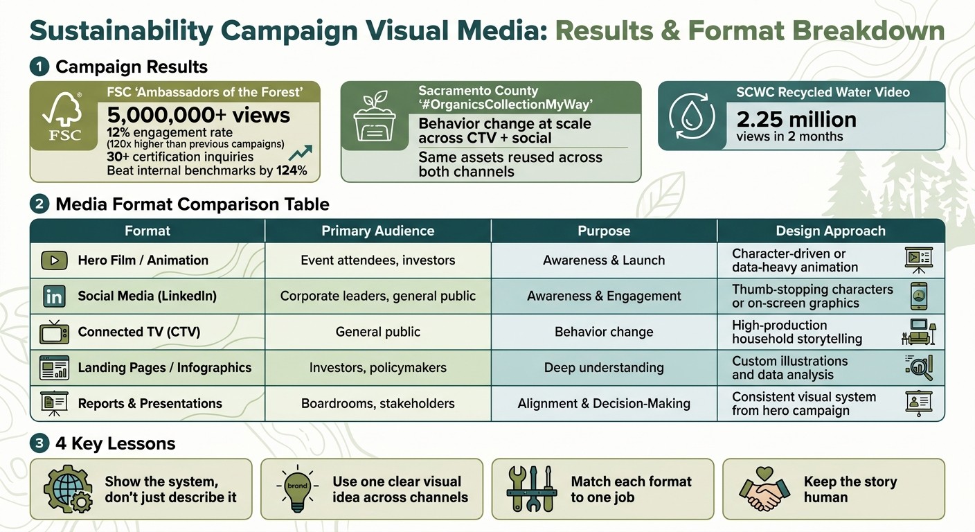
Sustainability Campaign Visual Media Results: Key Metrics & Format Breakdown
Measured Outcomes and Stakeholder Response
Those visual choices led to clear, measurable results. FSC's Ambassadors of the Forest earned more than 5 million views and sparked inquiries from 30+ global organizations about certification [1]. That kind of response matters. It shows that when a message is clear and easy to see, people don’t just watch - they act.
Sacramento County's #OrganicsCollectionMyWay campaign showed a similar pattern. Its empathy-led storytelling helped shift household behavior at scale, while the same assets worked across both CTV and social channels [3]. In plain terms, the campaign didn’t need one story for one platform and another for the next. The core message held up wherever people saw it.
What This Case Means for Future Campaigns
Across the cases, four patterns stood out. Visual clarity improved understanding when abstract sustainability goals turned into concrete images. Consistent design built trust. Channel-specific adaptation increased impact. Measurement gave teams a solid case for their creative choices.
That helps explain why the same visual system could work across launch films, social content, and stakeholder materials. The system wasn’t just good-looking. It gave people a steady frame for understanding the message, no matter where they encountered it.
FAQs
How do you choose the right visual format for a sustainability message?
Choose the format based on your audience, goal, and platform. Locally relevant visuals and people-centered images often drive stronger engagement, while story-led formats can make complex topics feel easier to connect with.
Match the visual to the message and the platform. Skip generic stock images, and add short, focused text or captions that give the viewer just enough context. It also helps to plan assets early so the campaign stays consistent and tied to its goals.
What makes a visual campaign drive action, not just awareness?
A campaign moves people when it does more than present technical data. It needs to connect on a human level and give people a clear path to act. Council Fire stresses that people make meaningful decisions based on identity and meaning, not alarming projections alone.
That shift matters. Data can explain the problem, but story gives it weight. When a campaign links the issue to who people are, what they care about, and the kind of community they want to build, the message starts to stick.
The strongest campaigns bring storytelling together with specific, measurable goals and simple next steps. That way, concern doesn’t just sit there - it turns into community-focused solutions that feel relevant, achievable, and hopeful.
How can teams measure whether visual storytelling is working?
Teams can track visual storytelling with a simple three-level framework:
Reach: total viewership, media impressions, and social media engagement
Engagement: screening attendance, petition signatures, and legislator contacts
Outcomes: policy votes, corporate commitments, or audience attitude shifts from surveys
This kind of measurement helps turn storytelling from a nice idea into something teams can assess, improve, and stand behind. Council Fire can help organizations apply these practices in sustainability initiatives.
Related Blog Posts
Latest Articles
©2025

Narrative Change and Power Building: The Missing Half of Advocacy
Narrative change is the process of disrupting dominant narratives that normalize inequity and advancing new narratives from historically marginalized communities.

Funding Resilience Without Federal Grants
BRIC is unreliable and FEMA is shrinking. Here's how cities fund climate resilience with dedicated revenue, blended finance, and a coordinating authority.

The ESG Blind Spot: How AI Is Finding Risks in Companies Nobody Else Is Watching
Norway's sovereign wealth fund uses AI to screen 7,200 portfolio companies for forced labor and corruption within 24 hours. The real story is the emerging-market coverage gap that traditional ESG data vendors miss — and what it means for any company with a global supply chain.
Narrative Change and Power Building: The Missing Half of Advocacy
Narrative change is the process of disrupting dominant narratives that normalize inequity and advancing new narratives from historically marginalized communities.
Funding Resilience Without Federal Grants
BRIC is unreliable and FEMA is shrinking. Here's how cities fund climate resilience with dedicated revenue, blended finance, and a coordinating authority.
The ESG Blind Spot: How AI Is Finding Risks in Companies Nobody Else Is Watching
Norway's sovereign wealth fund uses AI to screen 7,200 portfolio companies for forced labor and corruption within 24 hours. The real story is the emerging-market coverage gap that traditional ESG data vendors miss — and what it means for any company with a global supply chain.
FAQ
01
What does it really mean to “redefine profit”?
02
What makes Council Fire different?
03
Who does Council Fire work with?
04
What does working with Council Fire actually look like?
05
How does Council Fire help organizations turn big goals into action?
06
How does Council Fire define and measure success?
Jul 3, 2026
Case Study: Visual Media for Sustainability Campaigns
Sustainability Strategy
In This Article
How simple, consistent visuals and channel-specific design turn abstract sustainability issues into action.
Case Study: Visual Media for Sustainability Campaigns
Good visual media can turn a hard topic into a clear action. In these cases, simple design choices helped move abstract climate, recycling, water, and wildfire messages into something people could follow fast - then act on.
I see four clear lessons from the examples:
Show the system, don’t just describe it.SCWC used 3D animation to explain recycled water, and the video reached 2.25 million views in two months.
Use one clear visual idea across channels.FSC built its campaign around owl characters, which helped drive 5,000,000+ views, a 12% engagement rate, and 30+ certification inquiries.
Match each format to one job. Film built attention, social kept the message in front of people, and reports or landing pages gave proof and detail.
Keep the story human.Sacramento County leaned on familiar home stories instead of data-heavy messaging, making recycling guidance easier to return to and use.
If you need people to understand a topic they cannot see, the lesson is simple: make it visible, make it plain, and repeat the same visual language across every format. That is what helped these campaigns move from awareness to response.
At a glance, the article shows that visual media works best when it simplifies dense topics, keeps one steady look across channels, and ties design to a clear action.
Campaign Background and Communication Challenge
These two campaigns tackled the same core problem: how do you make a hard-to-see sustainability issue feel immediate? FSC needed to frame forest certification as a climate move for companies and stand out in a crowded sustainability market ahead of COP28. Boulder County faced a similar hurdle with wildfire mitigation, where the task was to get homeowners to act before risk felt personal. In both cases, clear communication goals mattered just as much as the visual work.
The Sustainability Goal and Success Criteria
Each campaign worked from a specific target. For FSC, the aim was to drive direct interest in forest certification among corporate decision-makers. Success was tied to campaign results and certification inquiries. The Ambassadors of the Forest hero video went on to earn more than 5,000,000 views, beat internal benchmarks by 124%, and led more than 30 organizations to ask about FSC certification. [1]
The Boulder County case applies the same logic on a local level. Here, success meant getting homeowners to schedule assessments and finish certifications. The campaign also used a $500 rebate for home mitigation, giving residents a clear financial nudge to take part. [5]
The Audience Barrier the Campaign Needed to Overcome
For corporate leaders already buried in ESG messaging, forest certification could seem abstract. For homeowners, wildfire risk could feel far away right up until the moment it wasn’t.
Ngoc Vo, Global Marketing Manager at FSC, described the campaign this way:
"One of the most memorable campaigns in my career, not only because of its significance to FSC but also because of the innovative creative approach." [1]
That response points to what the campaign got right. When people are overloaded with data and technical language, plain visual signals can do more work than another stack of facts. The job is to make the issue visible, concrete, and hard to ignore.
Visual Approach and Design Principles
That challenge shaped the visual strategy: simplify, humanize, and make the message easy to read at a glance.
Design Choices That Made the Message Easy to Understand
When a sustainability issue feels abstract, the visuals have to do a lot of the heavy lifting. In both campaigns, imagery took the place of dense technical explanation and used cues people could grasp right away. For FSC's Ambassadors of the Forest, the team stepped away from certification language and corporate jargon. Instead, they built animated owl characters with forest-inspired armor and Indigenous textile patterns, giving the campaign warmth and emotional pull.
"The strategy was simple: stand out in a crowded field of stock forests and corporate jargon. We built characters with soul intentionally designed to stop thumbs on LinkedIn." - Ray Page, Global Creative Lead [2]
That character-led approach helped the campaign reach a 12% engagement rate - 120 times higher than FSC's previous campaigns [1][2]. The design didn’t just look different. It made the message feel more human and easier to connect with.
The same idea showed up in a very different setting. In wildfire mitigation messaging, teams avoided images of actual flames and skipped dense science terms. They used clear illustrations instead, which helped make the risk feel less overwhelming and more action-oriented [4].
How the Design Reduced Waste and Improved Asset Reuse
Reuse mattered too, not just the first impression. The FSC campaign was built as digital-first from day one, with LinkedIn as the main channel for reaching business leaders [1][2]. One core idea - the owl ambassadors - ran through the hero film and the social content, creating a shared visual system across formats [1][2].
Sacramento County's organics recycling campaign used a similar approach at the content level. Creative Director Jason Malmberg's team used a "Pop-Up Video" graphic style, pairing short on-screen tips with household stories that felt lived-in and familiar. That made the assets easier to reuse and easier for residents to come back to later [3]. As Malmberg put it:
"The success of these spots proved that the key to large-scale behavior change isn't more data - it's more empathy." [3]
Campaign Execution Across Media Formats
Those design principles matter only if they hold up across channels. A visual system earns its keep when it stays clear in every format, from a launch film to a boardroom deck. The examples below show how one campaign identity can stretch across media without losing its shape.
How Each Format Served a Different Communication Goal
For FSC's Ambassadors of the Forest, the owl characters carried the hero film, LinkedIn posts, and stakeholder presentations for decision-makers. Each format had a separate job. The hero film opened with emotion. LinkedIn posts kept people engaged over time. The stakeholder materials backed decision-making with a steady, familiar visual language [1][2].
One Acre Fund's COP28 campaign, Thriving Farmers, Thriving World, followed a similar layered model. The hero animation introduced the campaign, a custom "Global Croptake" infographic became the landing page's main data visual for investors and policymakers, and social asset templates made reuse across channels simple [6].
Sacramento County's #OrganicsCollectionMyWay campaign used the same idea at the content level. The same clips ran on CTV for reach and on social for on-demand reference [3].
Media Format Comparison
The chart below shows how each format handled a different job inside one visual system.
Media Format | Primary Audience | Purpose | Message Role | Design Approach |
|---|---|---|---|---|
Hero Film / Animation | Event attendees, investors | Awareness & Launch | High-level storytelling and data visualization | |
Social Media (LinkedIn) | Corporate leaders, general public | Awareness & Engagement | Thumb-stopping entry point | |
Connected TV (CTV) | General public | Behavior change | Clear, relatable storytelling | High-production with household stories [3] |
Landing Pages / Infographics | Investors, policymakers | Deep understanding | Data-driven evidence hub | Custom illustrations and data analysis [6] |
Reports & Presentations | Boardrooms, stakeholders | Alignment & Decision-Making | Credibility and evidence | Consistent visual system from hero campaign [2] |
Results, Lessons, and Key Takeaways
Sustainability Campaign Visual Media Results: Key Metrics & Format Breakdown
Measured Outcomes and Stakeholder Response
Those visual choices led to clear, measurable results. FSC's Ambassadors of the Forest earned more than 5 million views and sparked inquiries from 30+ global organizations about certification [1]. That kind of response matters. It shows that when a message is clear and easy to see, people don’t just watch - they act.
Sacramento County's #OrganicsCollectionMyWay campaign showed a similar pattern. Its empathy-led storytelling helped shift household behavior at scale, while the same assets worked across both CTV and social channels [3]. In plain terms, the campaign didn’t need one story for one platform and another for the next. The core message held up wherever people saw it.
What This Case Means for Future Campaigns
Across the cases, four patterns stood out. Visual clarity improved understanding when abstract sustainability goals turned into concrete images. Consistent design built trust. Channel-specific adaptation increased impact. Measurement gave teams a solid case for their creative choices.
That helps explain why the same visual system could work across launch films, social content, and stakeholder materials. The system wasn’t just good-looking. It gave people a steady frame for understanding the message, no matter where they encountered it.
FAQs
How do you choose the right visual format for a sustainability message?
Choose the format based on your audience, goal, and platform. Locally relevant visuals and people-centered images often drive stronger engagement, while story-led formats can make complex topics feel easier to connect with.
Match the visual to the message and the platform. Skip generic stock images, and add short, focused text or captions that give the viewer just enough context. It also helps to plan assets early so the campaign stays consistent and tied to its goals.
What makes a visual campaign drive action, not just awareness?
A campaign moves people when it does more than present technical data. It needs to connect on a human level and give people a clear path to act. Council Fire stresses that people make meaningful decisions based on identity and meaning, not alarming projections alone.
That shift matters. Data can explain the problem, but story gives it weight. When a campaign links the issue to who people are, what they care about, and the kind of community they want to build, the message starts to stick.
The strongest campaigns bring storytelling together with specific, measurable goals and simple next steps. That way, concern doesn’t just sit there - it turns into community-focused solutions that feel relevant, achievable, and hopeful.
How can teams measure whether visual storytelling is working?
Teams can track visual storytelling with a simple three-level framework:
Reach: total viewership, media impressions, and social media engagement
Engagement: screening attendance, petition signatures, and legislator contacts
Outcomes: policy votes, corporate commitments, or audience attitude shifts from surveys
This kind of measurement helps turn storytelling from a nice idea into something teams can assess, improve, and stand behind. Council Fire can help organizations apply these practices in sustainability initiatives.
Related Blog Posts
Latest Articles
©2025
Narrative Change and Power Building: The Missing Half of Advocacy
Narrative change is the process of disrupting dominant narratives that normalize inequity and advancing new narratives from historically marginalized communities.
Funding Resilience Without Federal Grants
BRIC is unreliable and FEMA is shrinking. Here's how cities fund climate resilience with dedicated revenue, blended finance, and a coordinating authority.
The ESG Blind Spot: How AI Is Finding Risks in Companies Nobody Else Is Watching
Norway's sovereign wealth fund uses AI to screen 7,200 portfolio companies for forced labor and corruption within 24 hours. The real story is the emerging-market coverage gap that traditional ESG data vendors miss — and what it means for any company with a global supply chain.
FAQ
01
What does it really mean to “redefine profit”?
02
What makes Council Fire different?
03
Who does Council Fire work with?
04
What does working with Council Fire actually look like?
05
How does Council Fire help organizations turn big goals into action?
06
How does Council Fire define and measure success?
Jul 3, 2026
Case Study: Visual Media for Sustainability Campaigns
Sustainability Strategy
In This Article
How simple, consistent visuals and channel-specific design turn abstract sustainability issues into action.
Case Study: Visual Media for Sustainability Campaigns
Good visual media can turn a hard topic into a clear action. In these cases, simple design choices helped move abstract climate, recycling, water, and wildfire messages into something people could follow fast - then act on.
I see four clear lessons from the examples:
Show the system, don’t just describe it.SCWC used 3D animation to explain recycled water, and the video reached 2.25 million views in two months.
Use one clear visual idea across channels.FSC built its campaign around owl characters, which helped drive 5,000,000+ views, a 12% engagement rate, and 30+ certification inquiries.
Match each format to one job. Film built attention, social kept the message in front of people, and reports or landing pages gave proof and detail.
Keep the story human.Sacramento County leaned on familiar home stories instead of data-heavy messaging, making recycling guidance easier to return to and use.
If you need people to understand a topic they cannot see, the lesson is simple: make it visible, make it plain, and repeat the same visual language across every format. That is what helped these campaigns move from awareness to response.
At a glance, the article shows that visual media works best when it simplifies dense topics, keeps one steady look across channels, and ties design to a clear action.
Campaign Background and Communication Challenge
These two campaigns tackled the same core problem: how do you make a hard-to-see sustainability issue feel immediate? FSC needed to frame forest certification as a climate move for companies and stand out in a crowded sustainability market ahead of COP28. Boulder County faced a similar hurdle with wildfire mitigation, where the task was to get homeowners to act before risk felt personal. In both cases, clear communication goals mattered just as much as the visual work.
The Sustainability Goal and Success Criteria
Each campaign worked from a specific target. For FSC, the aim was to drive direct interest in forest certification among corporate decision-makers. Success was tied to campaign results and certification inquiries. The Ambassadors of the Forest hero video went on to earn more than 5,000,000 views, beat internal benchmarks by 124%, and led more than 30 organizations to ask about FSC certification. [1]
The Boulder County case applies the same logic on a local level. Here, success meant getting homeowners to schedule assessments and finish certifications. The campaign also used a $500 rebate for home mitigation, giving residents a clear financial nudge to take part. [5]
The Audience Barrier the Campaign Needed to Overcome
For corporate leaders already buried in ESG messaging, forest certification could seem abstract. For homeowners, wildfire risk could feel far away right up until the moment it wasn’t.
Ngoc Vo, Global Marketing Manager at FSC, described the campaign this way:
"One of the most memorable campaigns in my career, not only because of its significance to FSC but also because of the innovative creative approach." [1]
That response points to what the campaign got right. When people are overloaded with data and technical language, plain visual signals can do more work than another stack of facts. The job is to make the issue visible, concrete, and hard to ignore.
Visual Approach and Design Principles
That challenge shaped the visual strategy: simplify, humanize, and make the message easy to read at a glance.
Design Choices That Made the Message Easy to Understand
When a sustainability issue feels abstract, the visuals have to do a lot of the heavy lifting. In both campaigns, imagery took the place of dense technical explanation and used cues people could grasp right away. For FSC's Ambassadors of the Forest, the team stepped away from certification language and corporate jargon. Instead, they built animated owl characters with forest-inspired armor and Indigenous textile patterns, giving the campaign warmth and emotional pull.
"The strategy was simple: stand out in a crowded field of stock forests and corporate jargon. We built characters with soul intentionally designed to stop thumbs on LinkedIn." - Ray Page, Global Creative Lead [2]
That character-led approach helped the campaign reach a 12% engagement rate - 120 times higher than FSC's previous campaigns [1][2]. The design didn’t just look different. It made the message feel more human and easier to connect with.
The same idea showed up in a very different setting. In wildfire mitigation messaging, teams avoided images of actual flames and skipped dense science terms. They used clear illustrations instead, which helped make the risk feel less overwhelming and more action-oriented [4].
How the Design Reduced Waste and Improved Asset Reuse
Reuse mattered too, not just the first impression. The FSC campaign was built as digital-first from day one, with LinkedIn as the main channel for reaching business leaders [1][2]. One core idea - the owl ambassadors - ran through the hero film and the social content, creating a shared visual system across formats [1][2].
Sacramento County's organics recycling campaign used a similar approach at the content level. Creative Director Jason Malmberg's team used a "Pop-Up Video" graphic style, pairing short on-screen tips with household stories that felt lived-in and familiar. That made the assets easier to reuse and easier for residents to come back to later [3]. As Malmberg put it:
"The success of these spots proved that the key to large-scale behavior change isn't more data - it's more empathy." [3]
Campaign Execution Across Media Formats
Those design principles matter only if they hold up across channels. A visual system earns its keep when it stays clear in every format, from a launch film to a boardroom deck. The examples below show how one campaign identity can stretch across media without losing its shape.
How Each Format Served a Different Communication Goal
For FSC's Ambassadors of the Forest, the owl characters carried the hero film, LinkedIn posts, and stakeholder presentations for decision-makers. Each format had a separate job. The hero film opened with emotion. LinkedIn posts kept people engaged over time. The stakeholder materials backed decision-making with a steady, familiar visual language [1][2].
One Acre Fund's COP28 campaign, Thriving Farmers, Thriving World, followed a similar layered model. The hero animation introduced the campaign, a custom "Global Croptake" infographic became the landing page's main data visual for investors and policymakers, and social asset templates made reuse across channels simple [6].
Sacramento County's #OrganicsCollectionMyWay campaign used the same idea at the content level. The same clips ran on CTV for reach and on social for on-demand reference [3].
Media Format Comparison
The chart below shows how each format handled a different job inside one visual system.
Media Format | Primary Audience | Purpose | Message Role | Design Approach |
|---|---|---|---|---|
Hero Film / Animation | Event attendees, investors | Awareness & Launch | High-level storytelling and data visualization | |
Social Media (LinkedIn) | Corporate leaders, general public | Awareness & Engagement | Thumb-stopping entry point | |
Connected TV (CTV) | General public | Behavior change | Clear, relatable storytelling | High-production with household stories [3] |
Landing Pages / Infographics | Investors, policymakers | Deep understanding | Data-driven evidence hub | Custom illustrations and data analysis [6] |
Reports & Presentations | Boardrooms, stakeholders | Alignment & Decision-Making | Credibility and evidence | Consistent visual system from hero campaign [2] |
Results, Lessons, and Key Takeaways
Sustainability Campaign Visual Media Results: Key Metrics & Format Breakdown
Measured Outcomes and Stakeholder Response
Those visual choices led to clear, measurable results. FSC's Ambassadors of the Forest earned more than 5 million views and sparked inquiries from 30+ global organizations about certification [1]. That kind of response matters. It shows that when a message is clear and easy to see, people don’t just watch - they act.
Sacramento County's #OrganicsCollectionMyWay campaign showed a similar pattern. Its empathy-led storytelling helped shift household behavior at scale, while the same assets worked across both CTV and social channels [3]. In plain terms, the campaign didn’t need one story for one platform and another for the next. The core message held up wherever people saw it.
What This Case Means for Future Campaigns
Across the cases, four patterns stood out. Visual clarity improved understanding when abstract sustainability goals turned into concrete images. Consistent design built trust. Channel-specific adaptation increased impact. Measurement gave teams a solid case for their creative choices.
That helps explain why the same visual system could work across launch films, social content, and stakeholder materials. The system wasn’t just good-looking. It gave people a steady frame for understanding the message, no matter where they encountered it.
FAQs
How do you choose the right visual format for a sustainability message?
Choose the format based on your audience, goal, and platform. Locally relevant visuals and people-centered images often drive stronger engagement, while story-led formats can make complex topics feel easier to connect with.
Match the visual to the message and the platform. Skip generic stock images, and add short, focused text or captions that give the viewer just enough context. It also helps to plan assets early so the campaign stays consistent and tied to its goals.
What makes a visual campaign drive action, not just awareness?
A campaign moves people when it does more than present technical data. It needs to connect on a human level and give people a clear path to act. Council Fire stresses that people make meaningful decisions based on identity and meaning, not alarming projections alone.
That shift matters. Data can explain the problem, but story gives it weight. When a campaign links the issue to who people are, what they care about, and the kind of community they want to build, the message starts to stick.
The strongest campaigns bring storytelling together with specific, measurable goals and simple next steps. That way, concern doesn’t just sit there - it turns into community-focused solutions that feel relevant, achievable, and hopeful.
How can teams measure whether visual storytelling is working?
Teams can track visual storytelling with a simple three-level framework:
Reach: total viewership, media impressions, and social media engagement
Engagement: screening attendance, petition signatures, and legislator contacts
Outcomes: policy votes, corporate commitments, or audience attitude shifts from surveys
This kind of measurement helps turn storytelling from a nice idea into something teams can assess, improve, and stand behind. Council Fire can help organizations apply these practices in sustainability initiatives.
Related Blog Posts
Latest Articles
©2025
Narrative Change and Power Building: The Missing Half of Advocacy
Narrative change is the process of disrupting dominant narratives that normalize inequity and advancing new narratives from historically marginalized communities.
Funding Resilience Without Federal Grants
BRIC is unreliable and FEMA is shrinking. Here's how cities fund climate resilience with dedicated revenue, blended finance, and a coordinating authority.
The ESG Blind Spot: How AI Is Finding Risks in Companies Nobody Else Is Watching
Norway's sovereign wealth fund uses AI to screen 7,200 portfolio companies for forced labor and corruption within 24 hours. The real story is the emerging-market coverage gap that traditional ESG data vendors miss — and what it means for any company with a global supply chain.
FAQ
What does it really mean to “redefine profit”?
What makes Council Fire different?
Who does Council Fire work with?
What does working with Council Fire actually look like?
How does Council Fire help organizations turn big goals into action?
How does Council Fire define and measure success?