
Apr 8, 2026
Storytelling vs. Data Visualization in Impact Reporting
ESG Strategy
In This Article
When to use storytelling or data visualization in sustainability reports—balance emotion, context, clarity and accuracy.
Storytelling vs. Data Visualization in Impact Reporting
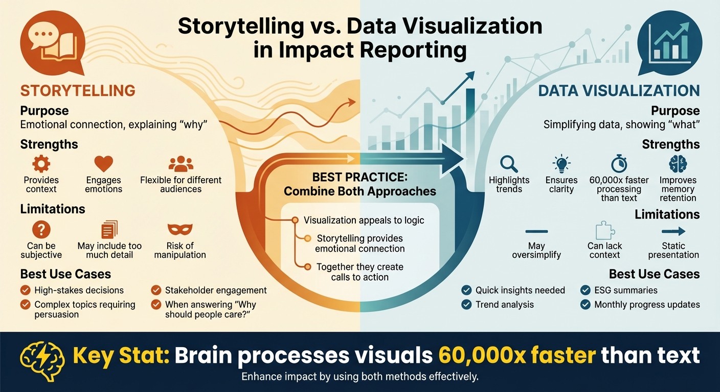
When it comes to presenting complex environmental and social impact data, organizations often rely on two methods: storytelling and data visualization. Each serves a unique purpose:
Storytelling: Focuses on emotional connections and human experiences, answering the question, "Why should stakeholders care?" It provides context and meaning to data, turning raw numbers into relatable narratives.
Data Visualization: Converts data into visual formats like charts and graphs, making complex information easier to understand. It helps audiences quickly identify trends, correlations, and key insights.
Both methods have strengths and limitations:
Storytelling excels at engaging audiences emotionally but can be subjective or overly detailed.
Data Visualization simplifies data for quick understanding but may lack context or oversimplify complex issues.
The most effective reports combine these approaches, using storytelling to provide depth and visualization to ensure clarity. Together, they create a balanced, engaging way to communicate impact and inspire action.
Quick Comparison
Feature | Storytelling | Data Visualization |
|---|---|---|
Purpose | Emotional connection, explaining "why" | Simplifying data, showing "what" |
Strengths | Provides context, engages emotions | Highlights trends, ensures clarity |
Limitations | Can be subjective or too detailed | May oversimplify or lack context |
Best Use | High-stakes, complex topics | Quick insights, trend analysis |
Storytelling vs Data Visualization in Impact Reporting: Key Differences
Benefits of Storytelling in Impact Reporting
Connecting with Audiences Through Emotion and Narrative
Storytelling transforms sustainability data into relatable human experiences, creating emotional connections that raw numbers alone often fail to achieve. As Brent Dykes aptly puts it, "People should always be the heroes of your story" [1]. Narratives resonate because our brains are wired to process stories more effectively, making them an engaging way to present information.
Adding Context and Meaning to Data
While data visualization highlights what occurred, storytelling delves into the reasons behind it, offering a causal structure that links facts to their underlying causes. This approach helps stakeholders grasp the decisions and events driving specific outcomes [1]. Hamsini Sukumar from Inforiver emphasizes this point: "The goal of data storytelling is always explanatory, rather than exploratory" [1]. For example, a sustainability report might highlight a 25% reduction in water usage, but storytelling enriches this data by detailing the operational changes that made it possible, the obstacles tackled, and how these efforts align with broader environmental objectives.
Adapting Reports Across Multiple Formats
Storytelling also allows sustainability insights to be communicated effectively across various formats. A single piece of data can be reimagined as an executive summary for board members, a detailed case study for program managers, or a concise social media post for the general public - each tailored in tone and complexity for its audience. This versatility ensures that sustainability metrics remain relevant and accessible, whether featured in annual reports, stakeholder presentations, or multimedia content. Up next, we’ll explore how data visualization complements storytelling by delivering clarity and instant comprehension.
Benefits of Data Visualization in Impact Reporting
Simplifying Complex Sustainability Metrics
Data visualization transforms raw numbers into visual formats like charts, graphs, maps, and infographics, making complex information far easier to understand. Instead of poring over endless rows in a spreadsheet, stakeholders can quickly grasp key insights at a glance. Cait Abernethy, VP of Marketing at UpMetrics, explains it succinctly:
Data visualization is the practice of transforming raw numbers into visual formats - think charts, graphs, maps, and infographics - that make patterns and insights easier to see [3].
The true strength of visualization lies in its ability to simplify complexity without losing the essence of the data. For example, a bar chart can instantly compare carbon emissions across facilities, while a line chart can track energy consumption trends over time. This clarity is especially beneficial for senior leaders who need actionable insights without getting bogged down in the raw data. By presenting information this way, organizations can uncover trends more effectively, as explored in the next section.
Identifying Trends and Correlations
Visual tools excel at uncovering patterns and relationships that might go unnoticed in traditional data formats. Line charts, for instance, are excellent for showing trends over time, such as whether carbon emissions are decreasing month by month or if water usage spikes during certain seasons. Heatmaps and geospatial maps take this a step further, revealing regional differences and highlighting which locations are delivering the strongest sustainability results.
Visualizations also help illustrate correlations between variables. A scatter plot, for example, might show how increased employee training hours reduce workplace safety incidents or how specific sustainability programs improve community health outcomes. These visual connections allow decision-makers to see not just what is happening but why, offering a clearer understanding of how various elements of their strategy interconnect. Beyond identifying trends, these visuals also ensure insights stick with stakeholders.
Improving Memory and Retention
Visuals don’t just make data easier to understand - they make it more memorable. When sustainability metrics are presented visually, stakeholders are more likely to recall the information, which can build trust with funders and speed up decision-making. As UpMetrics notes:
A well-crafted data narrative turns charts into calls to action [3].
The key is to align visuals with the specific objectives, ensuring they remain clean and focused on the data itself. When executed effectively, data visualization doesn’t just inform - it motivates stakeholders to act on the insights provided.
Limitations: Storytelling vs. Data Visualization
Subjectivity vs. Missing Context
Both storytelling and data visualization grapple with challenges that can impact their objectivity. Storytelling, by nature, is shaped by human choices - what details to highlight, what to exclude, and how to frame the narrative. As data scientist Michal Szudejko points out:
When only the data that serves the story gets told, it stops being insight and starts becoming manipulation [4].
This selective focus can lead organizations to showcase only their successes while downplaying or ignoring less favorable outcomes, ultimately distorting the true picture of their sustainability efforts.
On the other hand, data visualization often presents raw facts without weaving in the necessary narrative context. For example, a metric showing a "15% reduction in carbon emissions" might seem impressive at first glance. However, without additional details - such as whether this reduction aligns with industry benchmarks or regulatory expectations - stakeholders might misinterpret its actual significance. Szudejko raises a critical question:
what if our stories, instead of clarifying, mislead? [4].
These challenges underscore how both approaches must carefully navigate the balance between clarity and potential misrepresentation.
Information Overload vs. Oversimplification
Another common pitfall for both storytelling and data visualization is the risk of miscommunicating data through either excessive detail or oversimplification. Storytelling can overwhelm its audience by including too much information. Given that most people’s attention spans for data presentations hover around 15 to 20 minutes [5], cramming in every technical detail, failed experiment, or alternate scenario may disengage the audience. To maintain interest, sustainability reports often focus on a single key takeaway, omitting the broader complexities. This approach, sometimes referred to as the "oyster and pearl" dilemma, can make intricate processes seem deceptively simple [5].
Conversely, data visualization can oversimplify by condensing complex issues into single metrics or trend lines. For instance, a bar chart comparing emissions across facilities might fail to account for factors like outdated equipment, operational changes, or varying regional regulations. This reductionist approach risks leading stakeholders to conclusions based on incomplete or overly simplified data.
Striking the right balance between detail and clarity remains a challenge for both methods, particularly when considering how adaptable they are for different audiences.
Flexibility vs. Static Presentation
The ability to adapt messages for diverse audiences highlights a key difference between storytelling and data visualization. Storytelling allows for flexibility - messages can be tailored to suit the audience and context. For instance, a presentation to company executives might focus on the financial returns of sustainability initiatives, while a report for local communities might emphasize environmental improvements. However, this adaptability comes with a downside: the same data can be framed in different ways depending on the audience, raising concerns about consistency and transparency.
In contrast, data visualization is often static, making it less adaptable to changing audience needs or evolving narratives. A fixed design might limit opportunities to update or customize the presentation, potentially leaving it less relevant over time. This rigidity can make it harder to engage stakeholders effectively in dynamic or fast-changing contexts.
What is Data Storytelling, and How Does it Differ from Data Visualization?
When to Use Storytelling vs. Data Visualization
Understanding when to use storytelling or data visualization depends on whether you're trying to explore insights or explain them. Data visualization serves both purposes, while storytelling is purely explanatory - it’s best employed once a central insight has been identified and needs to be communicated effectively [1]. Let’s dive into how and when each approach excels.
Using Storytelling for Persuasion and Stakeholder Engagement
Storytelling is an excellent choice when the goal is to answer "Why should people care?" or "What action should be taken?" It's particularly effective in what experts call the "Story Zone" - situations where insights are complex, require significant investment or risk, and hold medium-to-high value [1]. For example, initiatives like transitioning to a circular economy demand emotional resonance and clear causal links to motivate stakeholders.
A great case study comes from June 2025, when the Marine Stewardship Council opened their sustainability report with a compelling personal story of a fisherman. This narrative was paired with quantitative data on fish populations and sustainability metrics. The blend of human connection and hard data illustrated the organization’s global impact while appealing to both emotion and logic [2]. In scenarios requiring high-stakes decisions, storytelling provides the emotional depth that raw data often lacks [1].
Using Data Visualization for Quick Insights
Data visualization is the best tool when you need to answer "What is the data telling us?" It’s perfect for showcasing trends, comparisons, or rankings. If an insight is straightforward to grasp and implement but still valuable, visualization alone can often persuade the audience [1]. It’s particularly useful for ESG summaries, facility performance tracking, or monthly progress updates, where stakeholders need to quickly identify patterns.
For instance, in June 2025, Oxfam Ireland used geospatial data visualizations in their annual report to highlight relief efforts across 27 countries. Instead of listing locations in text, they used maps to vividly demonstrate their global reach [2]. Given that the human brain processes visual information approximately 60,000 times faster than text [2], visualization is the clear choice when clarity and speed are priorities.
Combining Both Approaches for Maximum Impact
The most effective sustainability reports don’t rely solely on one method - they combine both. This hybrid strategy works because visualization appeals to logic, while storytelling provides structure and emotional connection.
For example, philanthropic boards often prefer high-level insights delivered through storytelling, while program managers benefit from detailed data presented through charts and tables [2]. Supporting a narrative with visual evidence strengthens the overall message. As Cait Abernethy, VP of Marketing at UpMetrics, explains:
A well-crafted data narrative turns charts into calls to action [2].
Conclusion
Crafting an impactful sustainability report means combining precise data with a story that resonates. The best reports don’t pit storytelling against data visualization - they bring them together to complement one another. While data visualization transforms numbers into clear patterns and trends [2], storytelling adds the emotional depth and context that inspire action.
Use visuals to highlight trends at a glance, and lean on storytelling for complex or high-stakes topics where emotional engagement is key. Together, these elements create reports that appeal to both logic and emotion, ensuring your message sticks.
Start by defining your goal - whether it’s celebrating achievements, identifying challenges, or pushing for progress - and tailor your approach to the audience. For example, high-level summaries might resonate with executives, while program managers could benefit from detailed dashboards packed with data. Keep visuals simple yet engaging, and include captions that guide readers toward the intended takeaway.
Structure your report with a clear narrative that answers the pressing question: "What actions should we take?" Without this, even the most compelling insights risk being overlooked. By positioning stakeholders as the protagonists of the sustainability journey and supporting their efforts with clear visuals, your reports can evolve from static documents into powerful tools for driving meaningful change.
FAQs
How do I choose between storytelling and charts?
When aiming to connect with your audience, storytelling offers a way to weave your data into a narrative that resonates on a personal level. On the other hand, charts are ideal for quickly showcasing patterns, trends, or comparisons in a straightforward manner. For maximum impact, consider blending the two - integrating charts into your story allows you to present clear insights while keeping the audience engaged.
How can I avoid misleading impact stories or visuals?
To maintain integrity in impact stories and visuals, prioritize accuracy and clarity in both the data you present and the narratives you craft. Regular audits of data and standardized collection methods are essential to ensure consistency and reliability. Leverage tools designed to detect anomalies, helping to identify and correct errors early.
When presenting data, select chart types that effectively communicate the information without confusion. Always provide necessary context to avoid misinterpretation, and steer clear of overstating or oversimplifying findings. Align your storytelling with verified data, steering away from cherry-picking or distorting information. This approach not only ensures transparency but also builds trust in your sustainability reporting.
What’s the best way to combine narrative and visuals?
Data storytelling offers a powerful way to communicate insights by combining clear narratives with visuals. This approach uses a structured story to guide the audience through visual representations, making even complex data easier to understand. The key to success lies in selecting visuals that align with the narrative, keeping them straightforward, and ensuring they support the story rather than distract from it. When used together, storytelling and visuals create compelling communication, particularly in areas like sustainability and impact reporting.
Related Blog Posts
Latest Articles
©2025


FAQ
01
What does it really mean to “redefine profit”?
02
What makes Council Fire different?
03
Who does Council Fire you work with?
04
What does working with Council Fire actually look like?
05
How does Council Fire help organizations turn big goals into action?
06
How does Council Fire define and measure success?
Apr 8, 2026
Storytelling vs. Data Visualization in Impact Reporting
ESG Strategy
In This Article
When to use storytelling or data visualization in sustainability reports—balance emotion, context, clarity and accuracy.
Storytelling vs. Data Visualization in Impact Reporting
When it comes to presenting complex environmental and social impact data, organizations often rely on two methods: storytelling and data visualization. Each serves a unique purpose:
Storytelling: Focuses on emotional connections and human experiences, answering the question, "Why should stakeholders care?" It provides context and meaning to data, turning raw numbers into relatable narratives.
Data Visualization: Converts data into visual formats like charts and graphs, making complex information easier to understand. It helps audiences quickly identify trends, correlations, and key insights.
Both methods have strengths and limitations:
Storytelling excels at engaging audiences emotionally but can be subjective or overly detailed.
Data Visualization simplifies data for quick understanding but may lack context or oversimplify complex issues.
The most effective reports combine these approaches, using storytelling to provide depth and visualization to ensure clarity. Together, they create a balanced, engaging way to communicate impact and inspire action.
Quick Comparison
Feature | Storytelling | Data Visualization |
|---|---|---|
Purpose | Emotional connection, explaining "why" | Simplifying data, showing "what" |
Strengths | Provides context, engages emotions | Highlights trends, ensures clarity |
Limitations | Can be subjective or too detailed | May oversimplify or lack context |
Best Use | High-stakes, complex topics | Quick insights, trend analysis |
Storytelling vs Data Visualization in Impact Reporting: Key Differences
Benefits of Storytelling in Impact Reporting
Connecting with Audiences Through Emotion and Narrative
Storytelling transforms sustainability data into relatable human experiences, creating emotional connections that raw numbers alone often fail to achieve. As Brent Dykes aptly puts it, "People should always be the heroes of your story" [1]. Narratives resonate because our brains are wired to process stories more effectively, making them an engaging way to present information.
Adding Context and Meaning to Data
While data visualization highlights what occurred, storytelling delves into the reasons behind it, offering a causal structure that links facts to their underlying causes. This approach helps stakeholders grasp the decisions and events driving specific outcomes [1]. Hamsini Sukumar from Inforiver emphasizes this point: "The goal of data storytelling is always explanatory, rather than exploratory" [1]. For example, a sustainability report might highlight a 25% reduction in water usage, but storytelling enriches this data by detailing the operational changes that made it possible, the obstacles tackled, and how these efforts align with broader environmental objectives.
Adapting Reports Across Multiple Formats
Storytelling also allows sustainability insights to be communicated effectively across various formats. A single piece of data can be reimagined as an executive summary for board members, a detailed case study for program managers, or a concise social media post for the general public - each tailored in tone and complexity for its audience. This versatility ensures that sustainability metrics remain relevant and accessible, whether featured in annual reports, stakeholder presentations, or multimedia content. Up next, we’ll explore how data visualization complements storytelling by delivering clarity and instant comprehension.
Benefits of Data Visualization in Impact Reporting
Simplifying Complex Sustainability Metrics
Data visualization transforms raw numbers into visual formats like charts, graphs, maps, and infographics, making complex information far easier to understand. Instead of poring over endless rows in a spreadsheet, stakeholders can quickly grasp key insights at a glance. Cait Abernethy, VP of Marketing at UpMetrics, explains it succinctly:
Data visualization is the practice of transforming raw numbers into visual formats - think charts, graphs, maps, and infographics - that make patterns and insights easier to see [3].
The true strength of visualization lies in its ability to simplify complexity without losing the essence of the data. For example, a bar chart can instantly compare carbon emissions across facilities, while a line chart can track energy consumption trends over time. This clarity is especially beneficial for senior leaders who need actionable insights without getting bogged down in the raw data. By presenting information this way, organizations can uncover trends more effectively, as explored in the next section.
Identifying Trends and Correlations
Visual tools excel at uncovering patterns and relationships that might go unnoticed in traditional data formats. Line charts, for instance, are excellent for showing trends over time, such as whether carbon emissions are decreasing month by month or if water usage spikes during certain seasons. Heatmaps and geospatial maps take this a step further, revealing regional differences and highlighting which locations are delivering the strongest sustainability results.
Visualizations also help illustrate correlations between variables. A scatter plot, for example, might show how increased employee training hours reduce workplace safety incidents or how specific sustainability programs improve community health outcomes. These visual connections allow decision-makers to see not just what is happening but why, offering a clearer understanding of how various elements of their strategy interconnect. Beyond identifying trends, these visuals also ensure insights stick with stakeholders.
Improving Memory and Retention
Visuals don’t just make data easier to understand - they make it more memorable. When sustainability metrics are presented visually, stakeholders are more likely to recall the information, which can build trust with funders and speed up decision-making. As UpMetrics notes:
A well-crafted data narrative turns charts into calls to action [3].
The key is to align visuals with the specific objectives, ensuring they remain clean and focused on the data itself. When executed effectively, data visualization doesn’t just inform - it motivates stakeholders to act on the insights provided.
Limitations: Storytelling vs. Data Visualization
Subjectivity vs. Missing Context
Both storytelling and data visualization grapple with challenges that can impact their objectivity. Storytelling, by nature, is shaped by human choices - what details to highlight, what to exclude, and how to frame the narrative. As data scientist Michal Szudejko points out:
When only the data that serves the story gets told, it stops being insight and starts becoming manipulation [4].
This selective focus can lead organizations to showcase only their successes while downplaying or ignoring less favorable outcomes, ultimately distorting the true picture of their sustainability efforts.
On the other hand, data visualization often presents raw facts without weaving in the necessary narrative context. For example, a metric showing a "15% reduction in carbon emissions" might seem impressive at first glance. However, without additional details - such as whether this reduction aligns with industry benchmarks or regulatory expectations - stakeholders might misinterpret its actual significance. Szudejko raises a critical question:
what if our stories, instead of clarifying, mislead? [4].
These challenges underscore how both approaches must carefully navigate the balance between clarity and potential misrepresentation.
Information Overload vs. Oversimplification
Another common pitfall for both storytelling and data visualization is the risk of miscommunicating data through either excessive detail or oversimplification. Storytelling can overwhelm its audience by including too much information. Given that most people’s attention spans for data presentations hover around 15 to 20 minutes [5], cramming in every technical detail, failed experiment, or alternate scenario may disengage the audience. To maintain interest, sustainability reports often focus on a single key takeaway, omitting the broader complexities. This approach, sometimes referred to as the "oyster and pearl" dilemma, can make intricate processes seem deceptively simple [5].
Conversely, data visualization can oversimplify by condensing complex issues into single metrics or trend lines. For instance, a bar chart comparing emissions across facilities might fail to account for factors like outdated equipment, operational changes, or varying regional regulations. This reductionist approach risks leading stakeholders to conclusions based on incomplete or overly simplified data.
Striking the right balance between detail and clarity remains a challenge for both methods, particularly when considering how adaptable they are for different audiences.
Flexibility vs. Static Presentation
The ability to adapt messages for diverse audiences highlights a key difference between storytelling and data visualization. Storytelling allows for flexibility - messages can be tailored to suit the audience and context. For instance, a presentation to company executives might focus on the financial returns of sustainability initiatives, while a report for local communities might emphasize environmental improvements. However, this adaptability comes with a downside: the same data can be framed in different ways depending on the audience, raising concerns about consistency and transparency.
In contrast, data visualization is often static, making it less adaptable to changing audience needs or evolving narratives. A fixed design might limit opportunities to update or customize the presentation, potentially leaving it less relevant over time. This rigidity can make it harder to engage stakeholders effectively in dynamic or fast-changing contexts.
What is Data Storytelling, and How Does it Differ from Data Visualization?
When to Use Storytelling vs. Data Visualization
Understanding when to use storytelling or data visualization depends on whether you're trying to explore insights or explain them. Data visualization serves both purposes, while storytelling is purely explanatory - it’s best employed once a central insight has been identified and needs to be communicated effectively [1]. Let’s dive into how and when each approach excels.
Using Storytelling for Persuasion and Stakeholder Engagement
Storytelling is an excellent choice when the goal is to answer "Why should people care?" or "What action should be taken?" It's particularly effective in what experts call the "Story Zone" - situations where insights are complex, require significant investment or risk, and hold medium-to-high value [1]. For example, initiatives like transitioning to a circular economy demand emotional resonance and clear causal links to motivate stakeholders.
A great case study comes from June 2025, when the Marine Stewardship Council opened their sustainability report with a compelling personal story of a fisherman. This narrative was paired with quantitative data on fish populations and sustainability metrics. The blend of human connection and hard data illustrated the organization’s global impact while appealing to both emotion and logic [2]. In scenarios requiring high-stakes decisions, storytelling provides the emotional depth that raw data often lacks [1].
Using Data Visualization for Quick Insights
Data visualization is the best tool when you need to answer "What is the data telling us?" It’s perfect for showcasing trends, comparisons, or rankings. If an insight is straightforward to grasp and implement but still valuable, visualization alone can often persuade the audience [1]. It’s particularly useful for ESG summaries, facility performance tracking, or monthly progress updates, where stakeholders need to quickly identify patterns.
For instance, in June 2025, Oxfam Ireland used geospatial data visualizations in their annual report to highlight relief efforts across 27 countries. Instead of listing locations in text, they used maps to vividly demonstrate their global reach [2]. Given that the human brain processes visual information approximately 60,000 times faster than text [2], visualization is the clear choice when clarity and speed are priorities.
Combining Both Approaches for Maximum Impact
The most effective sustainability reports don’t rely solely on one method - they combine both. This hybrid strategy works because visualization appeals to logic, while storytelling provides structure and emotional connection.
For example, philanthropic boards often prefer high-level insights delivered through storytelling, while program managers benefit from detailed data presented through charts and tables [2]. Supporting a narrative with visual evidence strengthens the overall message. As Cait Abernethy, VP of Marketing at UpMetrics, explains:
A well-crafted data narrative turns charts into calls to action [2].
Conclusion
Crafting an impactful sustainability report means combining precise data with a story that resonates. The best reports don’t pit storytelling against data visualization - they bring them together to complement one another. While data visualization transforms numbers into clear patterns and trends [2], storytelling adds the emotional depth and context that inspire action.
Use visuals to highlight trends at a glance, and lean on storytelling for complex or high-stakes topics where emotional engagement is key. Together, these elements create reports that appeal to both logic and emotion, ensuring your message sticks.
Start by defining your goal - whether it’s celebrating achievements, identifying challenges, or pushing for progress - and tailor your approach to the audience. For example, high-level summaries might resonate with executives, while program managers could benefit from detailed dashboards packed with data. Keep visuals simple yet engaging, and include captions that guide readers toward the intended takeaway.
Structure your report with a clear narrative that answers the pressing question: "What actions should we take?" Without this, even the most compelling insights risk being overlooked. By positioning stakeholders as the protagonists of the sustainability journey and supporting their efforts with clear visuals, your reports can evolve from static documents into powerful tools for driving meaningful change.
FAQs
How do I choose between storytelling and charts?
When aiming to connect with your audience, storytelling offers a way to weave your data into a narrative that resonates on a personal level. On the other hand, charts are ideal for quickly showcasing patterns, trends, or comparisons in a straightforward manner. For maximum impact, consider blending the two - integrating charts into your story allows you to present clear insights while keeping the audience engaged.
How can I avoid misleading impact stories or visuals?
To maintain integrity in impact stories and visuals, prioritize accuracy and clarity in both the data you present and the narratives you craft. Regular audits of data and standardized collection methods are essential to ensure consistency and reliability. Leverage tools designed to detect anomalies, helping to identify and correct errors early.
When presenting data, select chart types that effectively communicate the information without confusion. Always provide necessary context to avoid misinterpretation, and steer clear of overstating or oversimplifying findings. Align your storytelling with verified data, steering away from cherry-picking or distorting information. This approach not only ensures transparency but also builds trust in your sustainability reporting.
What’s the best way to combine narrative and visuals?
Data storytelling offers a powerful way to communicate insights by combining clear narratives with visuals. This approach uses a structured story to guide the audience through visual representations, making even complex data easier to understand. The key to success lies in selecting visuals that align with the narrative, keeping them straightforward, and ensuring they support the story rather than distract from it. When used together, storytelling and visuals create compelling communication, particularly in areas like sustainability and impact reporting.
Related Blog Posts
FAQ
What does it really mean to “redefine profit”?
What makes Council Fire different?
Who does Council Fire you work with?
What does working with Council Fire actually look like?
How does Council Fire help organizations turn big goals into action?
How does Council Fire define and measure success?